The network for creativity
Join 1.25M professional creatives like you
Connect with clients, get discovered, and run your business 100% commission-free
Creatives on Contra have earned over $150M and we are just getting started
Back to feedPost
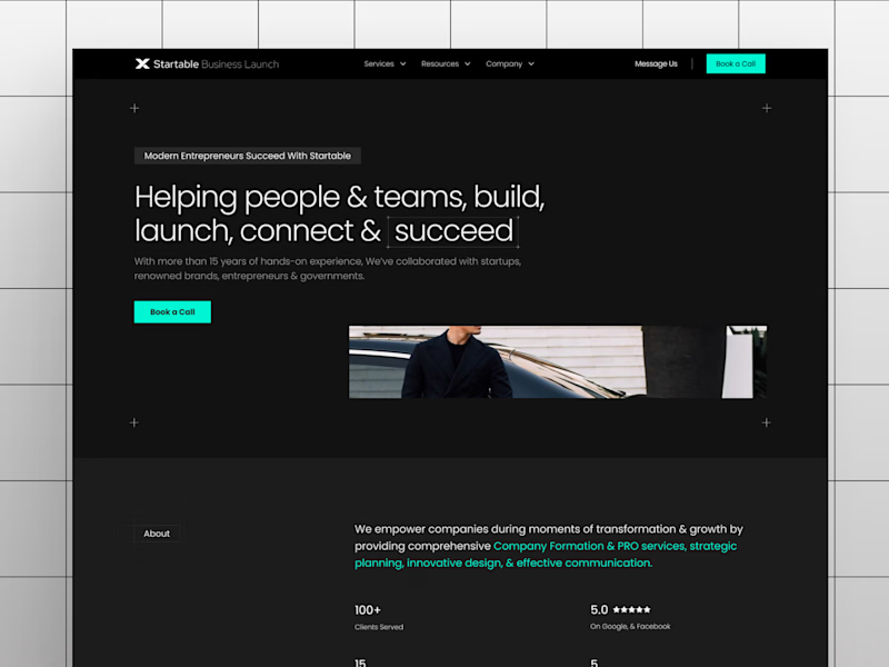
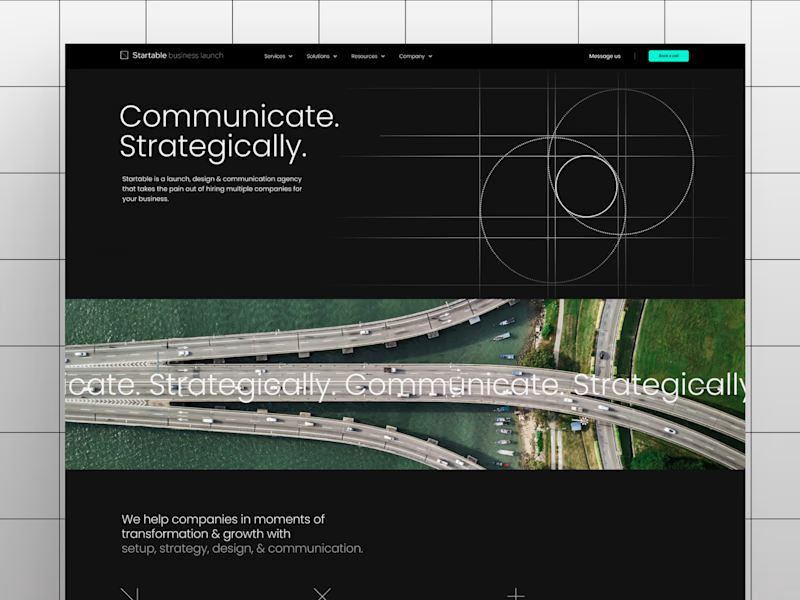
Taste Test
Which of these hero sections look visually more balanced and premium to you?
16 voted
53%
14 voted
47%
30 votes
Closed

i like the first one.

Glad it's winning 🙌

B for me. Looks unique and much more thoughtful

A looks more balanced , my eyes were well directed on where to start reading the content of the hero from , so yh great hierarchy
This is exactly the kind of feedback I want all my designs to get. Thank you so much!! 🙌

A got my vote
Thank you!! 🙌


I would go with B
Nice, very close competition between A and B haha. Thanks 😊

Thanks for voting man! 🙌


B for me, the green button pops more
Thanks for the vote!! 🙌🏻

I would go with B 😍
Thank youu for voting 🙌

Option A feels better IMO
It def is more cleaner, thanks Munzir 🙌

I'd pick B. It feels clearer from a conversion perspective. The value and CTA are much more obvious, while still feeling balanced and premium.
Thank you Shubhang! 🙌

Option A feeel more balaced
The network for creativity
Join 1.25M professional creatives like you
Connect with clients, get discovered, and run your business 100% commission-free
Creatives on Contra have earned over $150M and we are just getting started





Related posts

Which one would you go for and why? 🚀
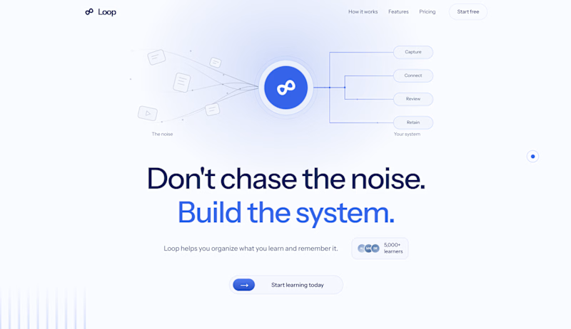
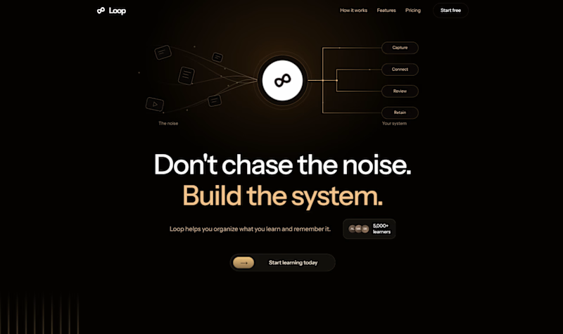
Rate this hero section? 👇
5 voted
83%
1 voted
17%
6 votes
Closed

Light mood is working better here than the dark one

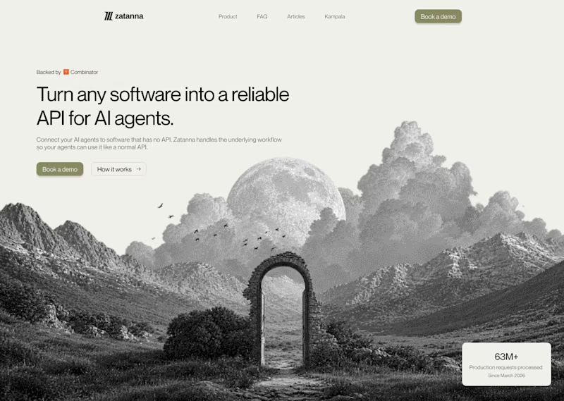
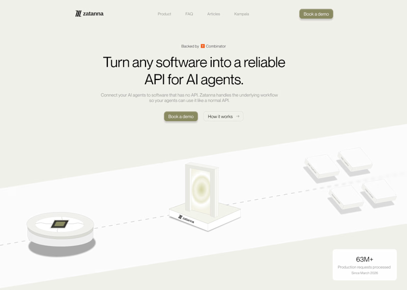
Which one brings more clarity to the hero section?
I was exploring a hero section concept for an AI product and tried two different visual directions.
Visual-led — focuses on explaining the idea through the interface/visual.
Isometric — uses a visual system to represent how the product works.
Both look good, but the real question isn't which one looks better.
Which one helps you understand the product faster?
That's something I always try to think about when designing hero sections — the visual should help explain the product, not just make the page look good.
Which one would you choose?
7 voted
58%
5 voted
42%
12 votes
Closed
The visual direction looks great, but I think Isometric does a better job of explaining the product.

Light or dark, which one wins? ☀️🌙
Same site, two moods. Warm stone and lacquer red, or the same build after dark.
Both are hand-built with a 3D paper crumple, real physics, a stick-figure film drawn in code, and a receipt that gets a bicycle kick. 🔊 Sound on.
Tell me which you'd ship: light or dark? 👇
26 voted
59%
18 voted
41%
44 votes
Closed

I really like how the light version looks, but it has some legibility issues. Since readability is more important for users than visual appeal, I think the dark version is the better option.
BTW, I initially voted for the light version, but after analyzing both options more closely, I changed my mind 😄