The network for creativity
Join 1.25M professional creatives like you
Connect with clients, get discovered, and run your business 100% commission-free
Creatives on Contra have earned over $150M and we are just getting started
Back to feedPost
FLVR is a fruit snack brand with a bold, single-ingredient product story,: "An entirely new fruit snack, made of fruit." I designed and built their website to match that same energy: clean, confident, and premium.
The site features smooth scroll interactions (powered by Lenis), scroll-triggered reveals (GSAP + ScrollTrigger), and a minimal, product-first layout that puts the brand's simplicity front and center no clutter, just clean typography and purposeful motion.
Key focus areas:
Smooth scroll experience for a premium, app-like feel
Scroll-triggered animations to guide attention section by section
Responsive design fully optimized across devices
Fast load times despite rich animation (performance-first approach)
Clean, minimal UI that reflects the brand's "one ingredient" philosophy
Tools used: Vanilla JavaScript, GSAP, ScrollTrigger, Lenis (smooth scroll)
This project reflects the kind of work I love doing taking a brand's core identity and translating it into an interactive, trustworthy website experience that doesn't just look good, but feels intentional at every scroll.


Thank you David ! 😊💫

Hi Averro, lovely design overall!
One thing I might change from a UX perspective: having a hamburger menu on desktop, where there's plenty of room to show all the navigation links, only creates friction. Even though it looks nice and feels like a great feature, it makes the user take more steps to access the link they want.
Hi Roman, Thank you so much for the thoughtful feedback , I really appreciate it ✨
I completely understand your point from a UX perspective. I’ll make the navigation links directly visible on desktop while keeping the hamburger menu for smaller screens. That should make the...
The network for creativity
Join 1.25M professional creatives like you
Connect with clients, get discovered, and run your business 100% commission-free
Creatives on Contra have earned over $150M and we are just getting started

Challenges
View all


Related posts


Engaging website for a New York–based architecture and construction studio, balancing bold typography, immersive imagery and a minimal editorial layout.


Two case studies, two totally opposite registers.
One is carved in stone and says nothing.
One drips off a spoon and won't shut up about which field it came from.
Which one do you want first?
vectis — zero-knowledge privacy, dithered like a forgotten statue
HIVE INDEX — raw honey with a paper trail. No two lots taste the same, and we don't correct for that.
45 voted
51%
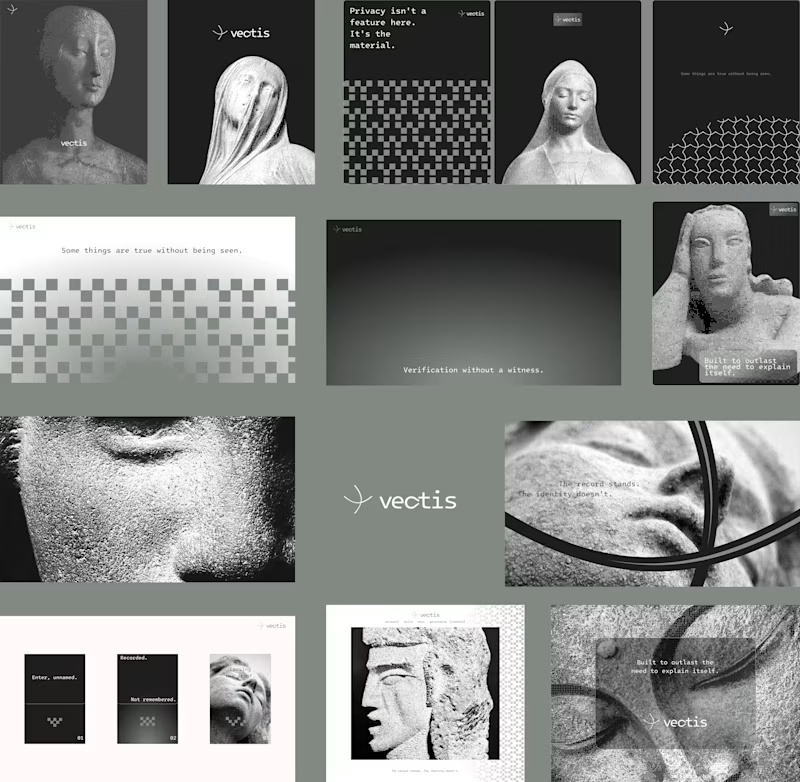
43 voted
49%
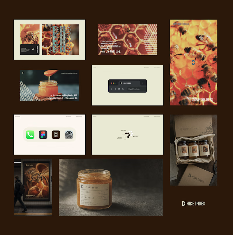
88 votes
Closed

Vectis

Custom liquid interaction built in Framer.
Turning a static hero into a responsive visual surface through cursor-driven distortion.


How do you adapt the cursor-driven effect for touch screens?


