The network for creativity
Join 1.25M professional creatives like you
Connect with clients, get discovered, and run your business 100% commission-free
Creatives on Contra have earned over $150M and we are just getting started
Back to feedPost

MARKS & FORMS began in 2025 with a simple idea: to explore the endless possibilities of marks and forms.
What started as the first edition gradually became an ongoing collection of identities, symbols, experiments, and visual decisions — a space to explore, refine, and keep pushing my approach to identity design.
The first edition brought its first recognition. Then another. And another.
But every edition eventually reaches its final mark.
THE LAST DANCE was created as the definitive closing piece of MARKS & FORMS 2025 — the final statement of a year of exploration.
And just one week after its release, on September 8, 2026, it received another Featured recognition on Behance.
A fitting way to close a chapter.
Now MARKS & FORMS continues into 2026, carrying everything that came before into a new edition, new marks, and new explorations.
One collection.
Two editions.
Countless forms.
Still evolving.
Explore the full MARKS & FORMS collection on Behance
And if you're looking for a designer to build an identity with intention, character, and a strong visual point of view — let's create something together.

The network for creativity
Join 1.25M professional creatives like you
Connect with clients, get discovered, and run your business 100% commission-free
Creatives on Contra have earned over $150M and we are just getting started





Related posts

Brand identity work for WesoftAI



Very well looking composition, good sinergy

Safe or bold, which one actually makes you stop scrolling? 🤔
Sans: the serif, tight tracking, one accent color playbook every skincare brand is running right now.
Bold: the same idea, redesigned with attitude. 💅
25 voted
32%
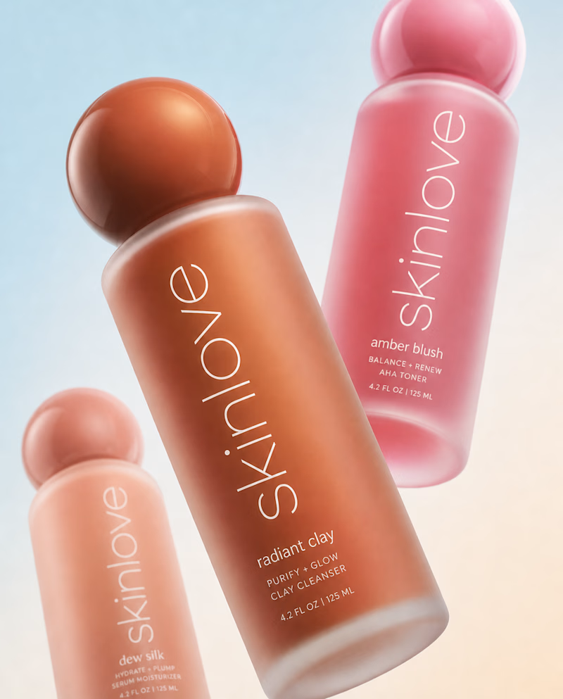
53 voted
68%
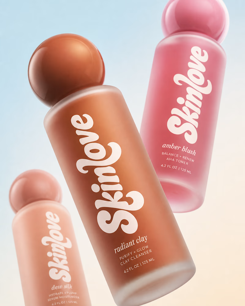
78 votes
Closed

Still waiting to hear back from @Contra HQ
So I did what any designer would do: I made the card myself 😂
Brushed metal. Laser-engraved logo. Holographic Mastercard rings. Full 360° spin. I'm going to keep polishing this until the real one shows up in my mailbox. Your move, Contra 👀
(Concept / fan design, not an official Contra product..Yet 🙌 )


“Okay, this looks WAY too good 🔥 Contra needs to make this real 👀”