The network for creativity
Join 1.25M professional creatives like you
Connect with clients, get discovered, and run your business 100% commission-free
Creatives on Contra have earned over $150M and we are just getting started
Back to feedPost
Taste Test


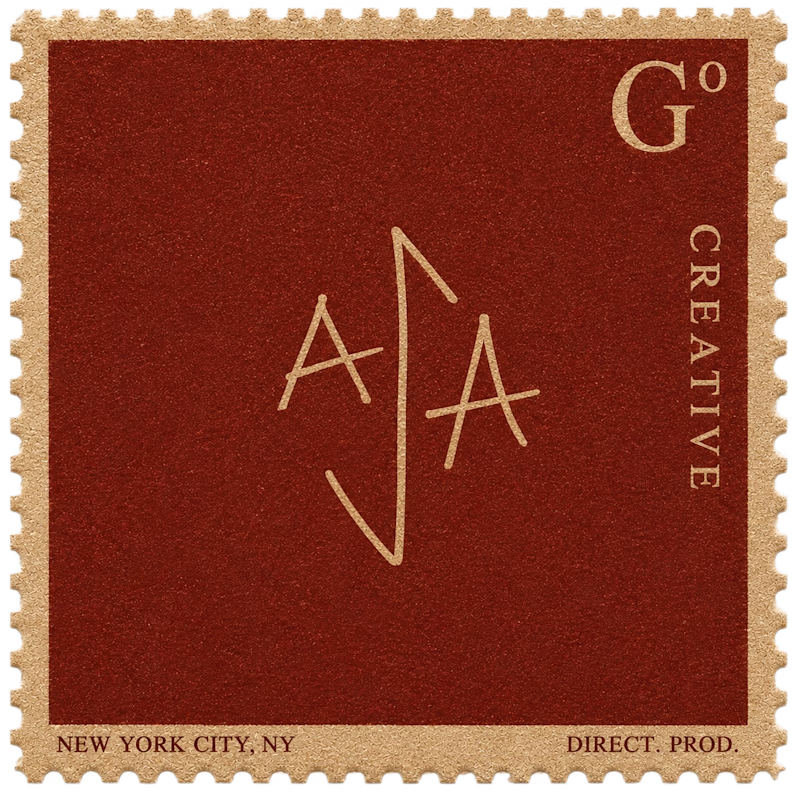
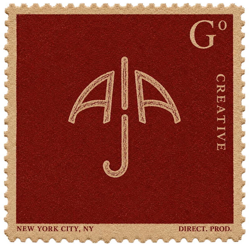
Logo Options in action for a Creative Director & Producer in NYC

106 votes
Ends in 7h

big fan of logo B! the clearer umbrella image that the brain puts together is a nice allusion to potential copy: this creative's the sort that has you covered in tough, unpredictable situations.
Thanks! I should have mentioned the clients name is AJA as well ;) can see her name in the umbrella, thats my favorite one as well

thanks! Yea her name is Aja, the first logo is based partially on her signature, and the second umbrella logo hides her name in it :)

Really love logo B
thanks Sekinat! thats my fav too
her name is aja, so hid that into the logo :)

Damn, this is the first time im seeing a post on contra that looks like psychology test - 'What do you see first, read the caption to understand' 😂
My creative side wants to go with A, but i still feel it needs some working. B looks great but.. I can see the uniqueness in A 🙌
Thanks! ya i feel you, the clients name is aja as well which i embeded in the umbrella

I love B because it’s more meaningful to me “it give the feeling of protecting” because umbrella protects from the rain
the clients name is aja as well which is hidden in the umbrella

B🔥

Love the colors man!

Logo B ✨✨✨

Var B

Logo B. Building the umbrella out of the AJA letters gives you a mark people actually remember, where A reads as a decorative monogram that is harder to place at a glance. B also holds up better small, since the umbrella silhouette survives when the fine linework in A would break.

B for me. In A the middle stroke reads as a divider before it reads as a J, so the name lands as two letters with a rule between them. B ligatures into one mark, which is what you want the moment it leaves the stamp frame and has to sit alone on a slate or a title card.

B is nice has this umbrella vibe

Logo A seems good, B seems like a umbrella

Logo A


Great

Logo is the best

Yes, definitely B! There's something so pleasing about this one! It's like a silhouette of an umbrella.
The network for creativity
Join 1.25M professional creatives like you
Connect with clients, get discovered, and run your business 100% commission-free
Creatives on Contra have earned over $150M and we are just getting started
Trending
retrofuturism
Share your favorite designs from the past exploring the distant future. Or your own take on the aesthetic 🚀
halftone
Dots. Texture. Grain. Let's see your designs using the halftone technique.

Midjourney
Creatives are showing off what they're making with Midjourney.
colorgrade
Video editors sound off: How do you enhance the mood of your video in color grading?


Related posts

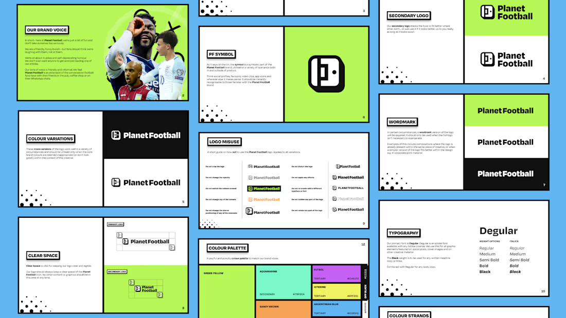
Planet Football Rebrand ⚽️
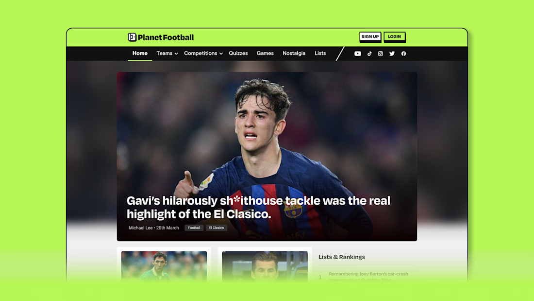
Planet Football is a celebration of everything the game has to offer beyond the scoreline. While traditional football media focuses on match reports and opinion-led coverage, Planet Football highlights the humour, nostalgia and culture of the sport, capturing the moments that make us love our beautiful game.
I led the rebrand and creative direction to help reposition Planet Football for a younger, more social-first audience. The goal was to rediscover the brand’s playful identity and evolve it into a more engaging and distinctive presence across digital platforms.
The identity needed to feel energetic, expressive and unmistakably football, while standing apart from more conventional news outlets. It had to support fast-moving social content while maintaining a clear and recognisable brand system across all touchpoints.
The final identity introduces a refreshed visual system, animation style and content direction designed for social-first storytelling. Supported by a new TikTok and Reels strategy and a redesigned website, the rebrand transforms Planet Football into a more dynamic and engaging brand built for modern football audiences.



The colors are so good!

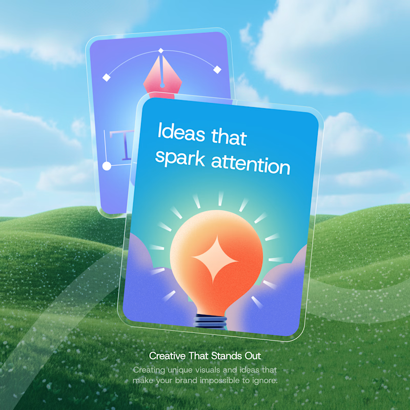
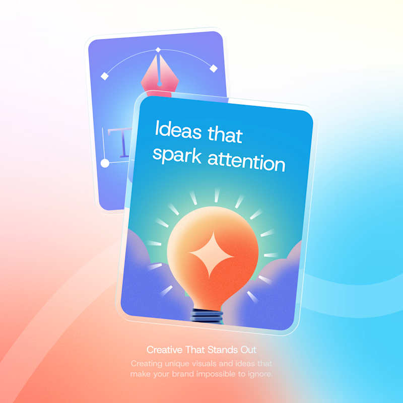
I’ve got 2 directions for this one. Which background would make you stop scrolling?
55 voted
61%
35 voted
39%
90 votes
Closed
ohh it's tough both

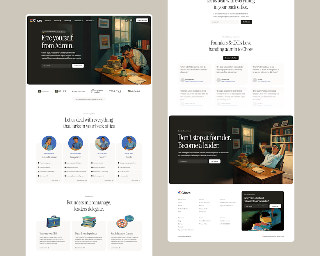


Really love this style, has so much personality.