The network for creativity
Join 1.25M professional creatives like you
Connect with clients, get discovered, and run your business 100% commission-free
Creatives on Contra have earned over $150M and we are just getting started
Back to feedPost
Taste Test

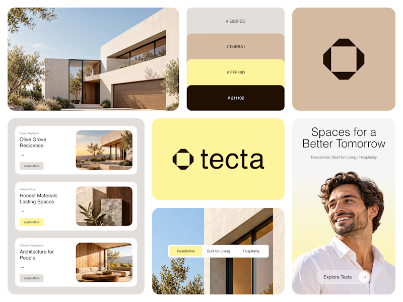
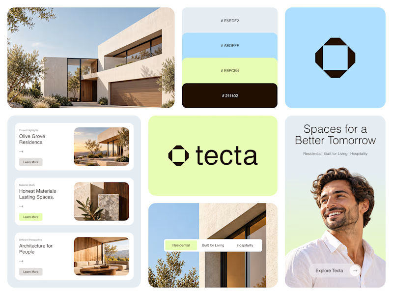
Color Direction Test - Tecta Architecture
Exploring two visual directions for Tecta, a contemporary architecture brand built around clarity, form, and human-centered spaces.
Direction 01 - Warm, calm, and timeless.
Direction 02 - Fresh, modern, and expressive.
Same identity. Different atmosphere.
Which direction feels stronger for an architecture brand - 01 or 02?
22 votes
Ends in 1d


Direction 02

Love Direction 2.


direction 2 theme is clam, will go with that

I like the second color palette...Light blue and green also gives sustainable and environmental vibes....The first one is more of a brutalist and functional taste.
The network for creativity
Join 1.25M professional creatives like you
Connect with clients, get discovered, and run your business 100% commission-free
Creatives on Contra have earned over $150M and we are just getting started







Related posts

I’m testing two different creative directions and would love your honest opinion.
Version A focuses on a bright, minimal gallery experience with circular visual experiments.
Version B explores a darker, more cinematic product direction for Montairé with hardware-focused visuals.
Which one feels cooler, more premium, and more memorable — A or B?
I’d also love feedback on the typography, layout, animation, and overall art direction.
10 voted
53%
9 voted
47%
19 votes
Closed

I’d lean toward Version B. The darker direction gives the hardware more presence and makes the whole experience feel more intentional and engineered. Version A is visually interesting, but B gives Montairé a much clearer identity at first glance.


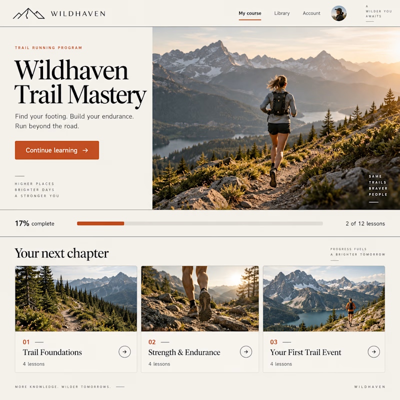
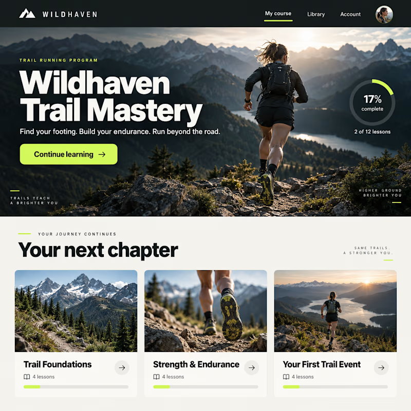
Same course. Two completely different vibes.
Exploring two design concepts for a Kajabi course experience: warm and editorial, or bold and cinematic.
Same curriculum. Different typography, layout, and visual direction.
Which one would you rather learn inside—1 or 2?

10 voted
19%
44 voted
81%
54 votes
Closed


Two logo concepts for the same brief.
Both built around the same idea which is unlocking hidden value for New York co-op and condo boards who are owed tax savings they've never claimed.
One leaned architectural and place-specific, a NYC skyline with a keyhole as negative space in the primary building. One went cleaner and more minimal, exploring the lock and key metaphor directly.
The client chose the skyline. I agreed. When your entire audience lives in New York City buildings, the skyline earns its place.
Which would you have chosen? A or B?
6 voted
60%

4 voted
40%

10 votes
Closed

I'd have gone with the skyline too, tying the mark straight to the audience it's speaking to is hard to beat. Was the keyhole negative space something you nailed early, or did it take a few passes to read clearly at a small size?