The network for creativity
Join 1.25M professional creatives like you
Connect with clients, get discovered, and run your business 100% commission-free
Creatives on Contra have earned over $150M and we are just getting started
Back to feedPost
Taste Test


Same course. Two completely different vibes.
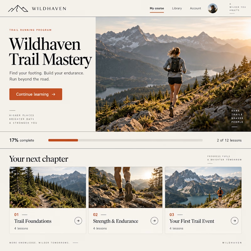
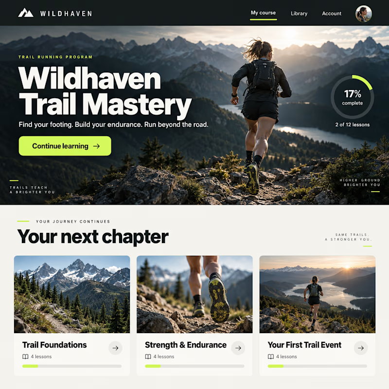
Exploring two design concepts for a Kajabi course experience: warm and editorial, or bold and cinematic.
Same curriculum. Different typography, layout, and visual direction.
Which one would you rather learn inside—1 or 2?

54 votes
Ends in 19m

Showing the same curriculum through two distinct visual systems is a smart test—option 1 feels more editorial, while option 2 brings stronger cinematic energy. The side-by-side makes the tradeoff really clear.

Going with 2 on this. The dark cinematic version has a pull to it that makes trail running feel like an adventure, not a workout routine. The light version is cleaner but feels more generic.


the trail cards look good. which one is your favorite?

1 Bro 😊

I’d go with 2. It feels more engaging and exciting for a learning experience

2 for me, there's a premium feeling in it

Going with 1 on this one. A course is something people sit inside for hours, so I'd rather the interface stay calm and get out of the way than compete for attention like a trailer does. Cinematic is great for a sales page, less so seven modules deep.

2 is impressive (the way of using colour and theme)


The cinematic layout creates immediate immersion, but the editorial approach gives long form learning content incredible readability. Framing the same curriculum through distinct visual directions shows how heavily UI tone influences student engagement. Fantastic contrast, Kraig!


Both looks great !


2 fits the niche much better

Going for 2 Because of the Colour


editorial one, easy


Typography on 2 makes a huge difference

I would choose "warm and editorial" for outdoor training

2 👍 I like the color contrast and visual hierarchy

The network for creativity
Join 1.25M professional creatives like you
Connect with clients, get discovered, and run your business 100% commission-free
Creatives on Contra have earned over $150M and we are just getting started

Challenges
View all


Related posts


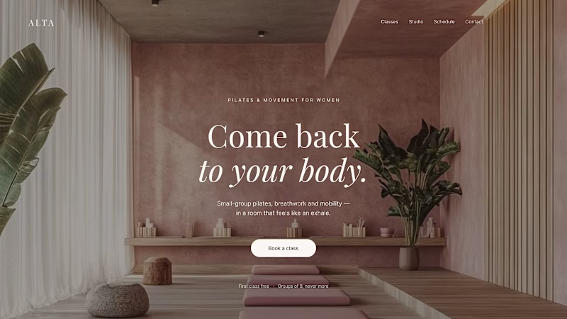
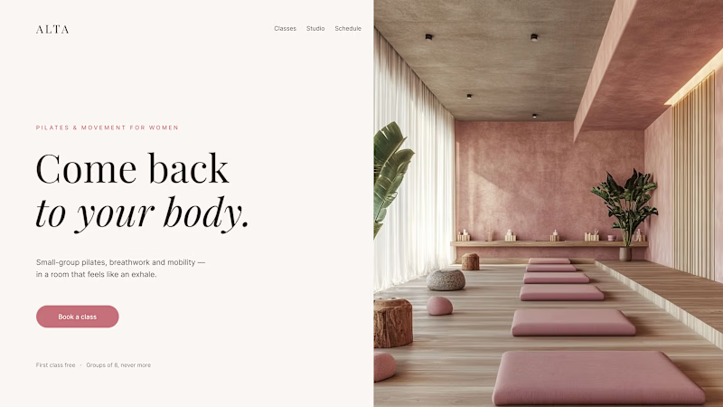
Where should the photo live - behind the words or beside them?
Same pilates studio, same headline.
01 - Photo as the background. Full-bleed atmosphere: the room wraps around the words. Immersive and cinematic, but the text only survives thanks to a darkening overlay laid over the image.
02 - Photo beside the text. A clean split: words on calm ground, the room in its own column. Everything readable at a glance, the trade is a little less drama.
One sells the feeling. The other sells the clarity. Which hero would make you book the class?
80 voted
75%
27 voted
25%
107 votes
Closed

1 nails it

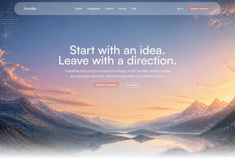
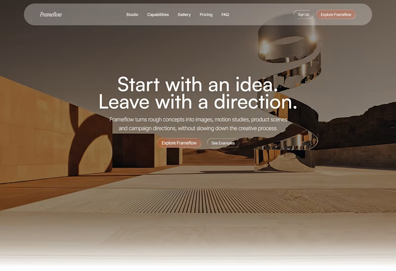
Explored two different visual directions for the same SaaS landing page.
The structure stays consistent, while the imagery, mood and art direction shift the overall brand feel.
Interested to know which direction feels stronger.

11 voted
73%
4 voted
27%
15 votes
Closed

Woww... What a precious design priyansh bro.😍 💯 🔥 🎉

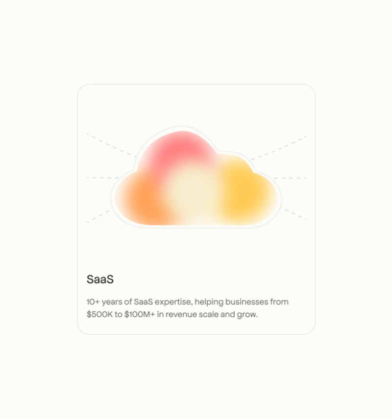
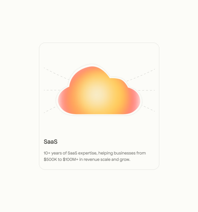
I’d pick A. The stronger gradient gives the card more visual impact.