The network for creativity
Join 1.25M professional creatives like you
Connect with clients, get discovered, and run your business 100% commission-free
Creatives on Contra have earned over $150M and we are just getting started
Back to feedPost
Taste Test

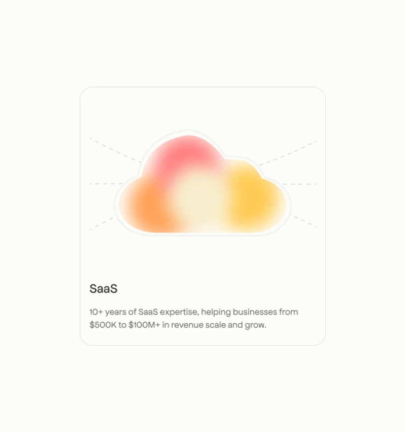
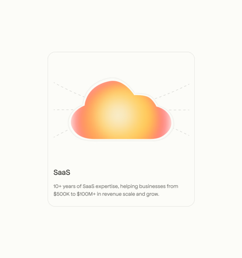

B gives the card concept more breathing room, and the warmer treatment makes the hierarchy feel especially approachable. A has a strong editorial mood too—the choice really depends on whether you want calm or warmth.

I’d pick A. The stronger gradient gives the card more visual impact.
The network for creativity
Join 1.25M professional creatives like you
Connect with clients, get discovered, and run your business 100% commission-free
Creatives on Contra have earned over $150M and we are just getting started

Challenges
View all


Related posts


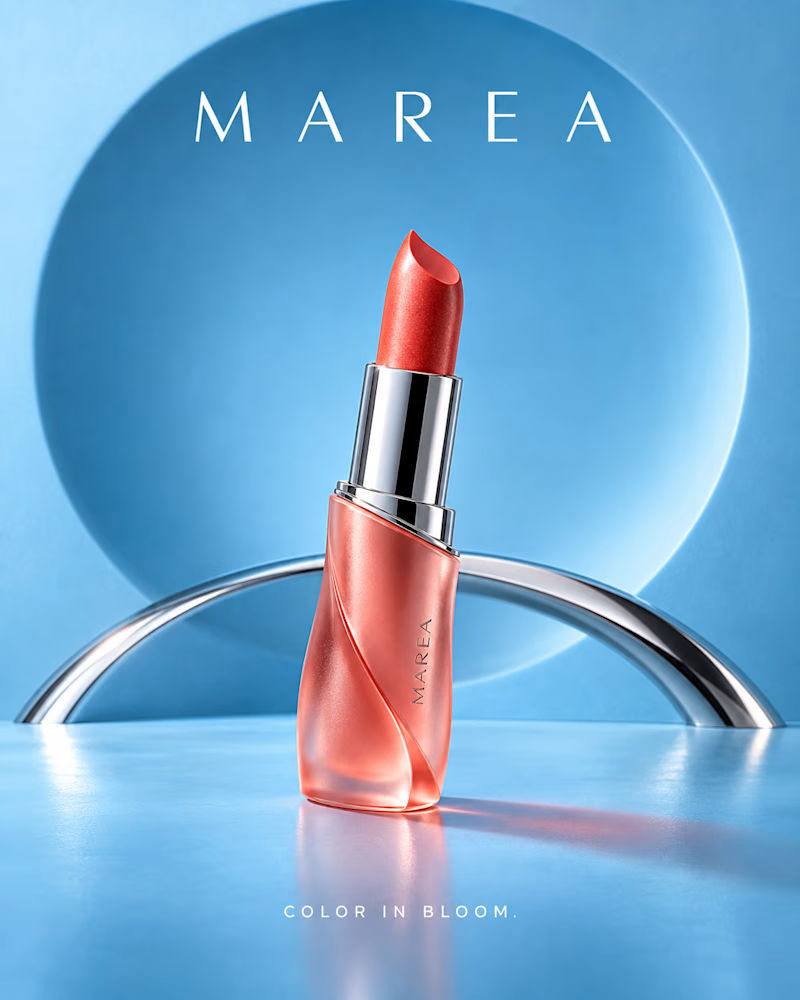
Which shade would you shoot? One is cool and airy: coral pearl in a frosted twisted case, chrome collar and a steel arc, ice blue set with a soft lit circle behind it.
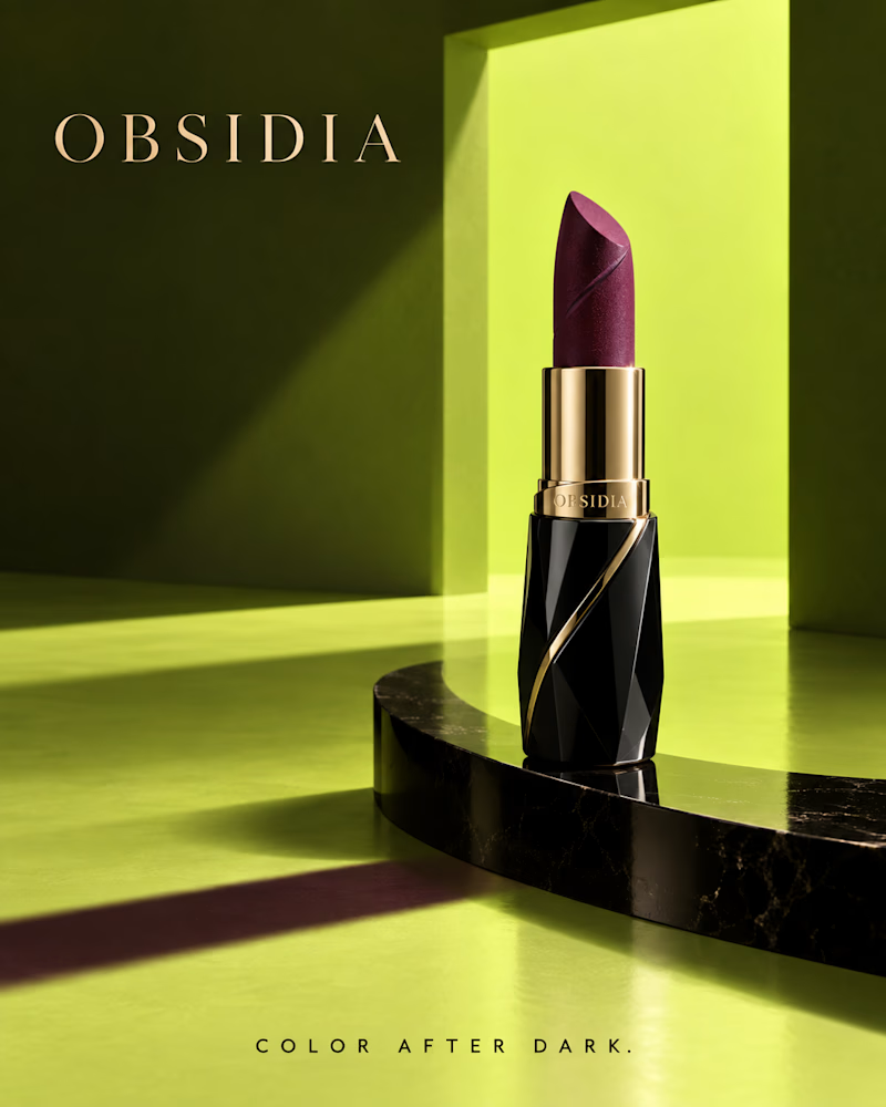
The other is warm and severe: deep plum on a faceted black case with gold banding, black marble disc, acid green walls and one hard shaft of light cutting across the floor.
One opens up. The other closes in. 👇 #brandconcept #beautybranding #artdirection
3 voted
60%
2 voted
40%
5 votes
Closed

Design/Background wins Obsidia and the product Marea Lipstic is more appealing!!
Which one would you put on shelf?
The first is a cocoa cherry bar on a chartreuse block, hard light cutting blue shadow across the floor with a red slab burning behind it. The carton is acid yellow with a heavy woodcut wordmark, a mill wheel, a field engraving at the base. The bar itself is dense and dark, cherries and oats pressed tight, every edge sharp enough to count.
The second is blueberry almond on cream terrazzo, daylight through leaves, a soft green wall behind. The wrapper is lilac and forest green, the sleeve peeled back to show the oats, blueberries and almond slivers suspended mid fall around it. Nothing in frame is louder than the food.
One wants to be seen from across the aisle. The other wants to be picked up.
👇 #packagingdesign #foodphotography #brandconcept
3 voted
33%

6 voted
67%

9 votes
Closed
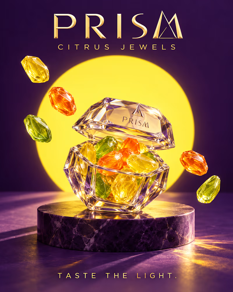
Which one would you put on shelf? One is cut like jewellery: a faceted crystal case on purple marble, citrus gems glowing inside, a yellow disc burning behind it and gold type at the top.
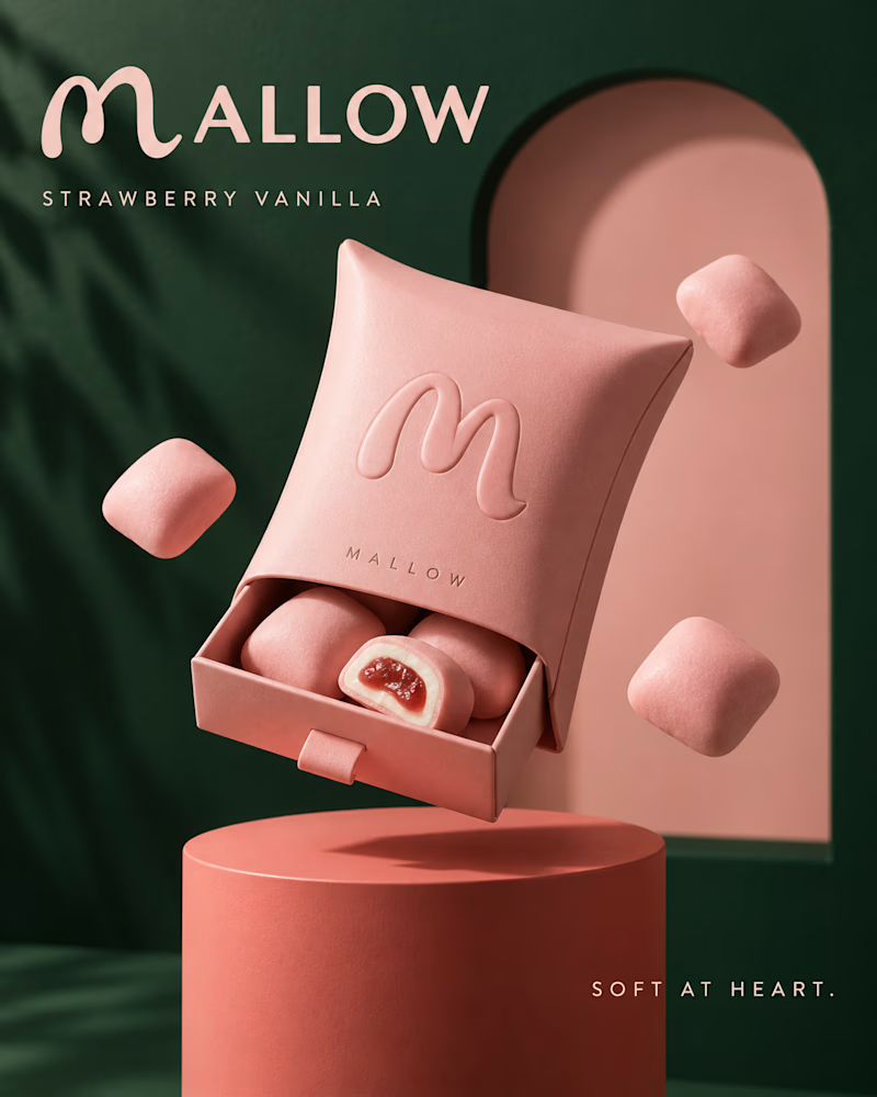
The other is soft to the touch: a matte pink pillow pack with an embossed monogram, one piece cut open to show the centre, deep green walls and palm shadow behind.
One trades on brilliance. The other trades on texture. 👇 #brandconcept #packagingdesign #artdirection
1 voted
33%
2 voted
67%
3 votes
Closed

mallow