The network for creativity
Join 1.25M professional creatives like you
Connect with clients, get discovered, and run your business 100% commission-free
Creatives on Contra have earned over $150M and we are just getting started
Back to feedPost
Taste Test
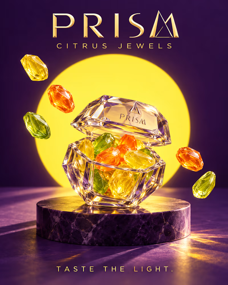
Which one would you put on shelf? One is cut like jewellery: a faceted crystal case on purple marble, citrus gems glowing inside, a yellow disc burning behind it and gold type at the top.
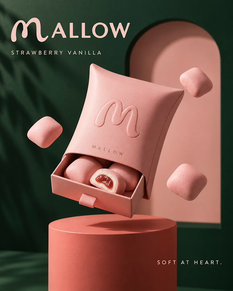
The other is soft to the touch: a matte pink pillow pack with an embossed monogram, one piece cut open to show the centre, deep green walls and palm shadow behind.
One trades on brilliance. The other trades on texture. 👇 #brandconcept #packagingdesign #artdirection
1 voted
33%
2 voted
67%
3 votes
Closed

The split between jewel-like brilliance and soft packaging texture is a great comparison; the citrus palette and centered type give Prism a strong focal hierarchy.

mallow
The network for creativity
Join 1.25M professional creatives like you
Connect with clients, get discovered, and run your business 100% commission-free
Creatives on Contra have earned over $150M and we are just getting started
Trending
retrofuturism
Share your favorite designs from the past exploring the distant future. Or your own take on the aesthetic 🚀
halftone
Dots. Texture. Grain. Let's see your designs using the halftone technique.

Midjourney
Creatives are showing off what they're making with Midjourney.
colorgrade
Video editors sound off: How do you enhance the mood of your video in color grading?
Challenges
View all


Related posts


Which one would you put in the room?
One is stacked slabs: mustard planes at three heights on brass feet, a cobalt fin holding them together, purple walls and an arch cutting in behind.
The other is a single sweep: glossy cobalt curling into scrolled ends on an orange plinth, a dark circle recessed above it, one diagonal of light across the wall.
One is assembled. The other is poured. 👇
#brandconcept #furnituredesign #artdirection
7 voted
37%

12 voted
63%

19 votes
Closed
brava




Lovely design !


Pops out better in Light