The network for creativity
Join 1.25M professional creatives like you
Connect with clients, get discovered, and run your business 100% commission-free
Creatives on Contra have earned over $150M and we are just getting started
Back to feedPost
Taste Test


Pops out better in Light


Both is cool but i will go light mode on this one!

dark one..

GOing with the black version

The design looks awesome. Great project!

Both gives different emotions and looks.

The light and dark directions both keep the editorial grid strong, but Light gives the portrait sequence more breathing room. I’d be curious how the choice changes with real photography crops and accessibility contrast checks.


Dark mood

The designs are great but the dark one looks better.

Dark mode

Grad attention towards Light


The network for creativity
Join 1.25M professional creatives like you
Connect with clients, get discovered, and run your business 100% commission-free
Creatives on Contra have earned over $150M and we are just getting started











Related posts

WIP - Brand Identity
Which one?
9 voted
47%
10 voted
53%
19 votes
Closed

B is more suitable for these textures ❤️❤️
Great job Gaber🎉🎉🔥🔥

The only glow on the Kestra page is the reflective strip on the jacket. It comes from the image itself, so the Framer layers on top stay flat: grey, white and mono text, no glow effects on buttons or headings. That keeps the page easy to edit, because nothing in the UI depends on one lighting setup. If you swap the photo, the glow goes with it. Would you add a glow effect in Framer or keep it in the image?


wow, nothing but top notch

Built this in Framer as a concept project. Goal was to make it feel run by ex-journalists. Choices: editorial serif (Libre Baskerville), a dark photo with one color accent, and copy that positions against blast-style PR.
Where I’m unsure: text legibility over the photo and whether the two CTAs compete. What would you change?

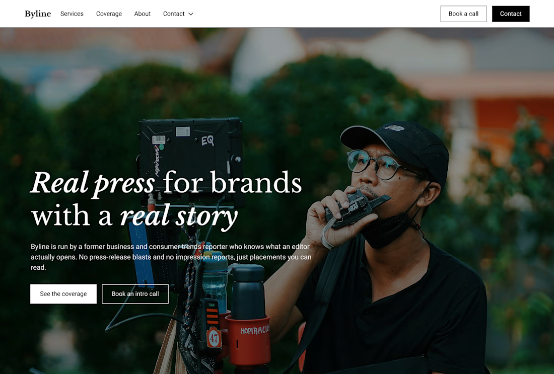
That's great design it feels professional I like how the background mixed with interface ❤️❤️
Great job Cheree🎉🎉