The network for creativity
Join 1.25M professional creatives like you
Connect with clients, get discovered, and run your business 100% commission-free
Creatives on Contra have earned over $150M and we are just getting started
Back to feedPost
Taste Test


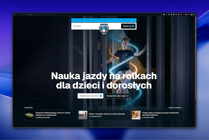
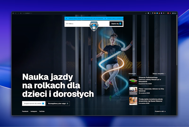

Left aligned for sure! For this layout with the strong visual on the right, left-aligned text balances it perfectly and guides the eye better. Centered would compete with the imagery. Great execution btw!

Left aligned looks more sophisticated for eyes

left aligned give a smooth cleaned looks

Left aligned for me. With that much body copy next to the headline it reads cleaner.

Left aligned works best


left aligned. in the centered one the headline sits right on top of the skater, on the left he actually gets room to be the hero

Left aligned. The text gets its own column and the visual keeps the right side, so both read better. Centered, the headline sits right on top of the busy part.

Centered works nicely here since the skater sits right in the middle of the frame, but left aligned would give the motion trail more room to breathe. I'd go left aligned.

Left-aligned layout looks better.


Left aligned is more professionally designed

In my opinion, left-aligned text looks much neater and is easier on the eyes. Amazing work!

The alignment study shows how strongly composition shapes focus.

in centered the background img is not visible clearly, so will go with left aligned one. Looks much more clean and better

Left aligned, reads cleaner. Great work
The network for creativity
Join 1.25M professional creatives like you
Connect with clients, get discovered, and run your business 100% commission-free
Creatives on Contra have earned over $150M and we are just getting started
Related posts

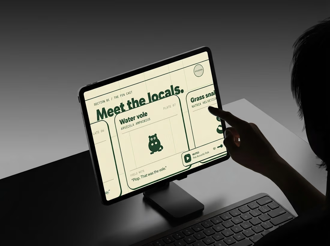
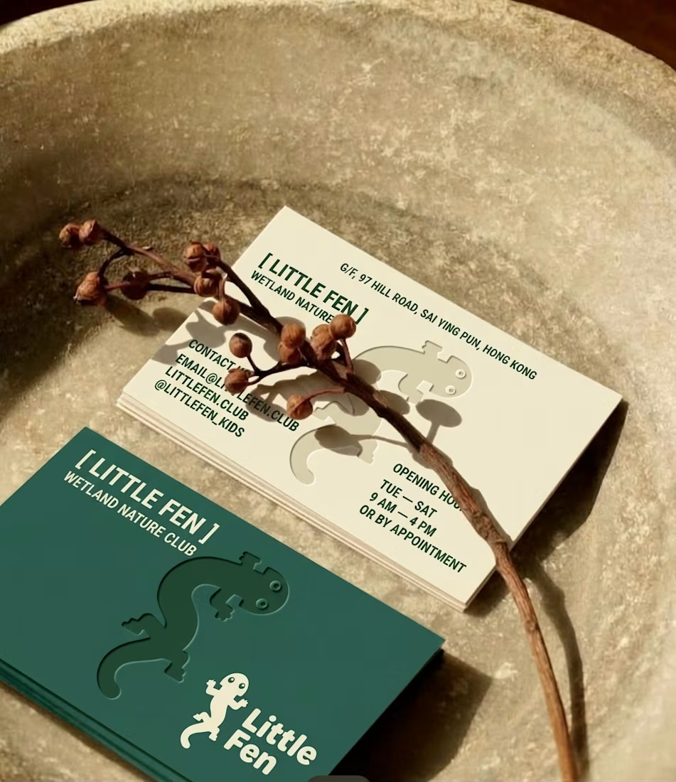
Every creature in this identity is watching you.
Little Fen, a wetland club for kids. 50 creatures. 3 colors. Everyone gets eyes.
Case study drops soon.
Which creature goes first?
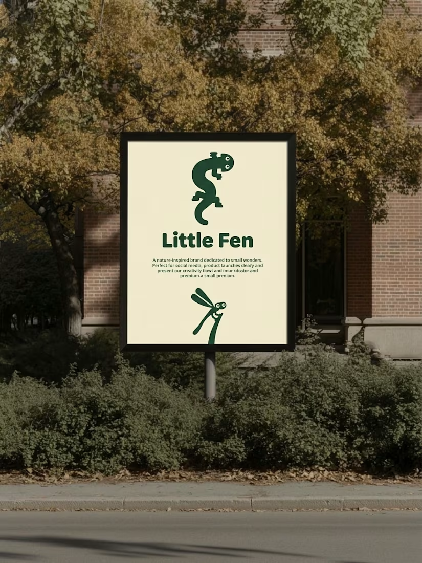

Hey Little Fen,
Can you see me?

From static footer to motion.
It's crazy how adding motion can take something from OK to premium in an instant.


Good choice putting the motion in the footer. By the time someone scrolls that far they're already interested, so it rewards them without slowing down the first impression. For a health records app it also helps that the motion stays calm and doesn't feel flashy.

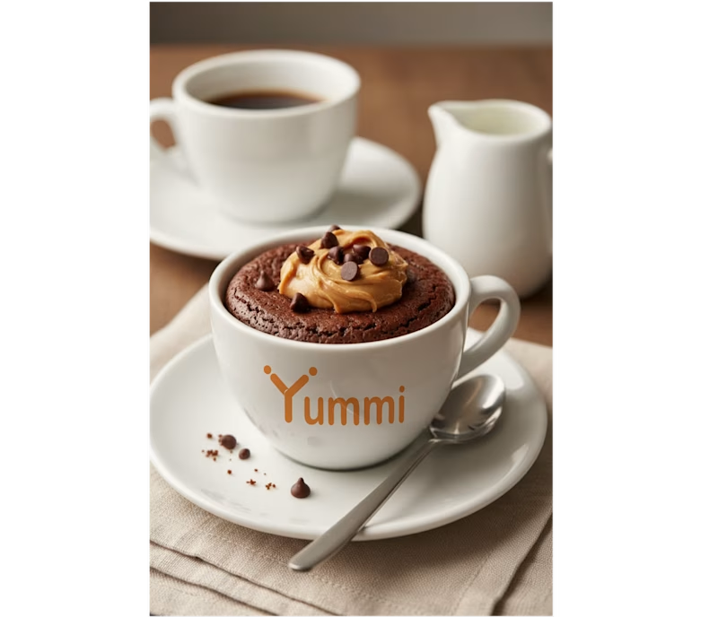
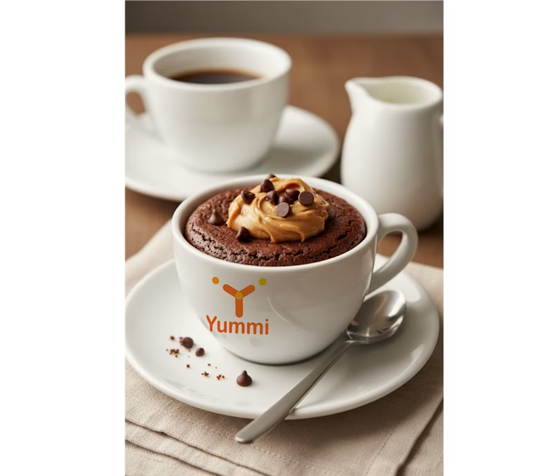
Brand identity concept for Yummi! 🍊 Which presentation do you like more for this brand?
👉 Option A: Clean minimalist log
👉 Option B: Real cafe logo
It's really hard for me to manage which logo is best to look in mokcup designs.
Let me know your thoughts in the comments!
3 voted
43%
4 voted
57%
7 votes
Closed
Smaller is better