The network for creativity
Join 1.25M professional creatives like you
Connect with clients, get discovered, and run your business 100% commission-free
Creatives on Contra have earned over $150M and we are just getting started
Back to feedPost
Taste Test
Design decision poll 👇
Which product detail page layout would you prefer?
Two different approaches.
Two different page layout.
Which one would you ship and why?
7 voted
64%
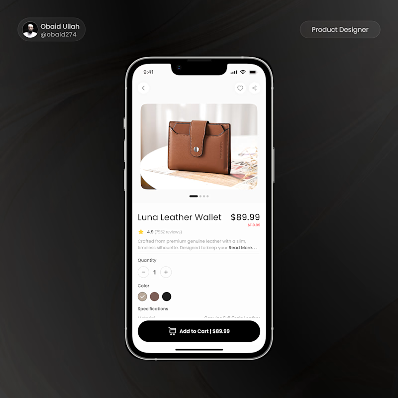
4 voted
36%
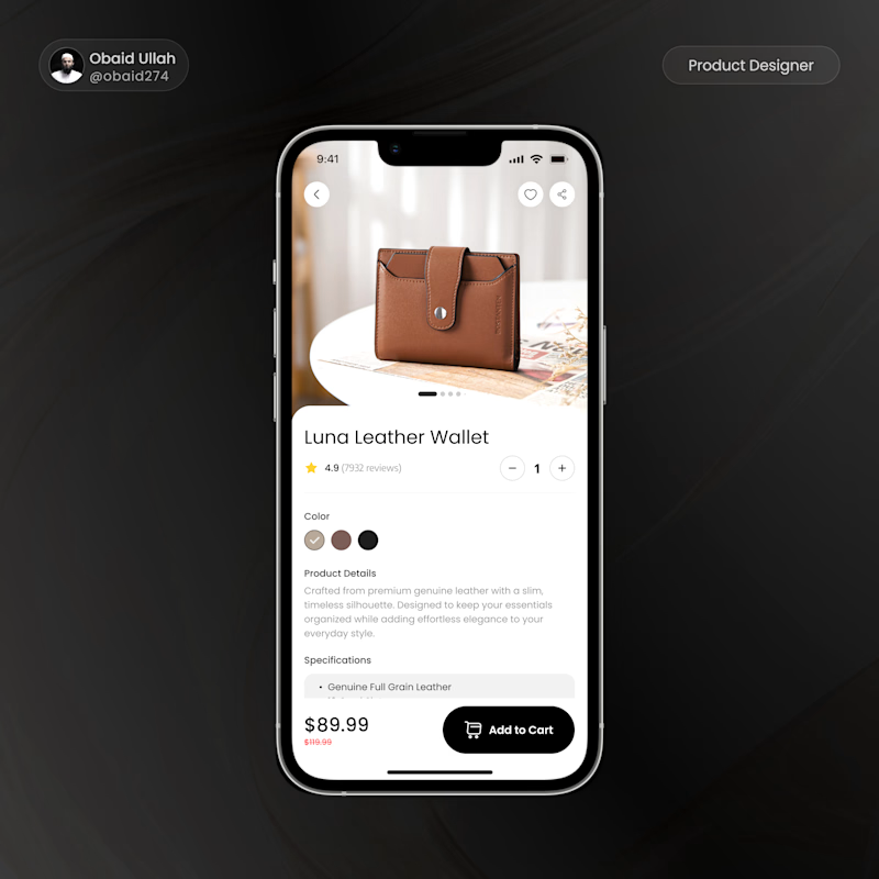
11 votes
Closed

Voted Big CTA, on a product detail page the add to cart button shouldn't have to compete with anything else for attention. Small CTA reads more editorial but riskier for conversion.


Small CTA


Hai @Obaid Ullah those two are amazing works! What I like the most is frameless / full width image in small button options. But your larger button give it higher conversion in UX stand point.

Thank you @Amirul Hakim
I just want to know what design makes more conversions. beautiful design with no coversion or less good design with coversions.

contra.com
Amirul Hakim - Product Designer & Illustrator | Contra
Product Designer & Illustrator. View Amirul Hakim’s Profile on Contra. The Independent-first, commission-free freelance marketplace shaping the future of work.

Big CTA, makes for good user experience.
Awesome, insightful

Cool design
Thank you

I would go with big CTA. Full width buttons are much easier to hit with your thumb on mobile which usually means better conversions. Though if conversion is the main goal are you thinking about adding a secondary "Buy Now" button above or next to "Add to Cart"?
Nice consideration
Thank you
The network for creativity
Join 1.25M professional creatives like you
Connect with clients, get discovered, and run your business 100% commission-free
Creatives on Contra have earned over $150M and we are just getting started





Related posts


Collage

This year, I worked on a mental health app where I explored using water to represent brainwaves and quality sleep.
I think it communicates the idea much better than the typical green energy orb. 🌊
What do you think?
27 voted
43%
36 voted
57%
63 votes
Closed

Love the energy orb. which one is your pick here?

The 2027 calendar won't draw itself, and the printing won't order itself either 🐐 It's the Year of the Goat, so this one has to be the GOAT. Question of the day: 1 — a cartoon goat with attitude 2 — an artsy one, like last year's Drop a number below, and I'll go sharpen my pencils (and horns)
#midjourney
6 voted
30%
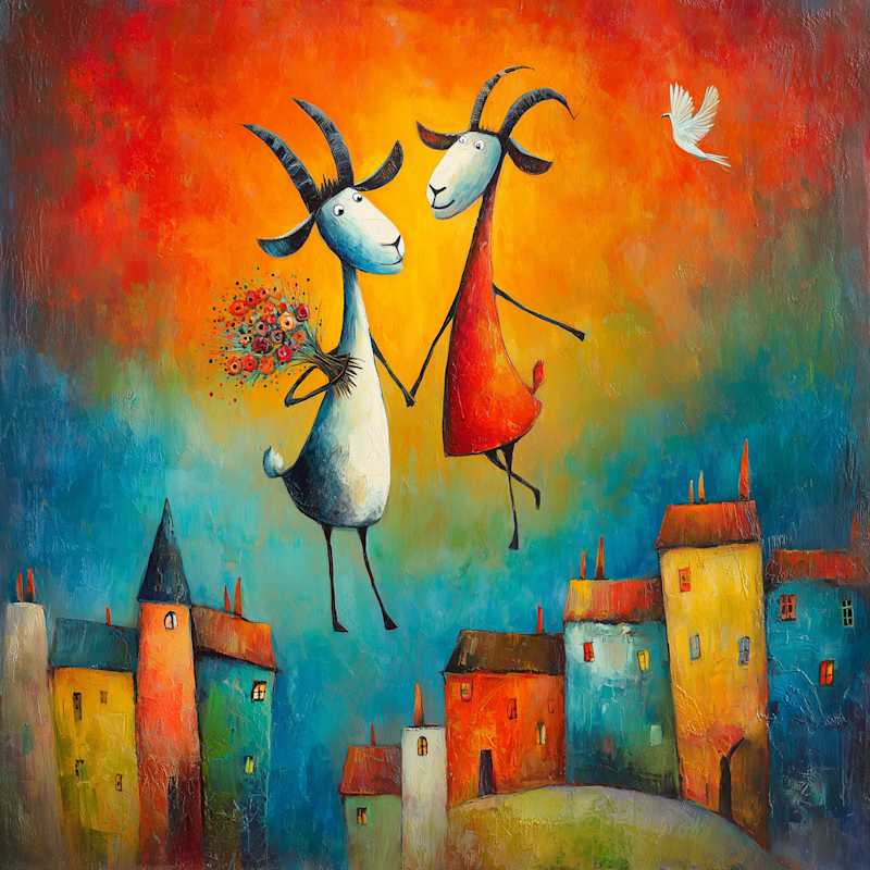
14 voted
70%
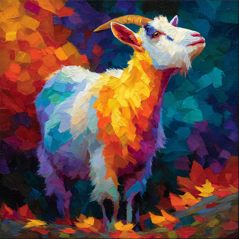
20 votes
Closed

The cartoon style has so much character!