The network for creativity
Join 1.25M professional creatives like you
Connect with clients, get discovered, and run your business 100% commission-free
Creatives on Contra have earned over $150M and we are just getting started
Back to feedPost
Taste Test
AI can generate a dashboard. But can it give a product its own identity?
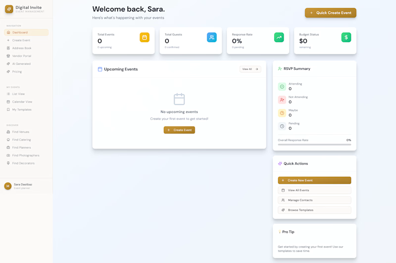
The first design was created by my client using AI a familiar dashboard style you've probably seen across countless AI-generated products.
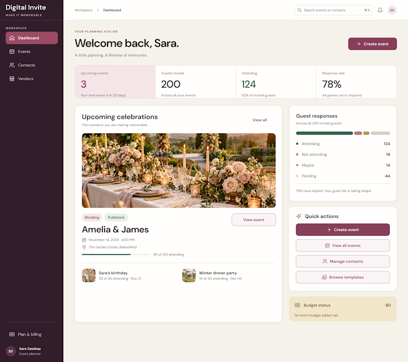
I redesigned it to feel less generic and more intentional, with a distinctive visual identity, clearer hierarchy, and an experience built around meaningful celebrations.
The goal wasn't just to make it look better. It was to make it feel like its own product.
What do you think is missing from most AI-generated interfaces?
#ProductDesign #UIDesign #AI

5 voted
23%
17 voted
77%
22 votes
Closed

What's usually missing is a point of view. AI defaults to the same safe card grid every time. Your version tells me what the product is for before I read a single label, the celebration photo and the warm palette do most of that work. After, easily.

Exactly! The goal was to make the design reflect the product’s purpose, not just organize its features. Really appreciate your insight!

Clean!
Thank you!

100% agree with this. AI can generate layouts but identity comes from intentional decisions. Your redesign feels way more warm and human — fits perfectly for a digital invite product where emotion matters, not just data. Love the softer palette and typography choices!
Thank you! The design should reflect the emotions behind the product, not just the data it displays.
Exactly! You captured it perfectly. Emotion is what makes a product memorable, not just visuals. Excited to see how you evolve it further!

I think personality is what makes a product stand out. A clean design is good, but it should also feel unique and memorable. 👏
Absolutely! Clean is the baseline, but personality is what makes a product memorable. Appreciate you!

Voted After. For me, AI dashboards miss a point of view. Yours has a mood and real photography instead of the same blue cards everywhere.
Exactly! I wanted the design to communicate the product’s purpose at first glance, not just display data. Glad the difference stood out!

Really lovely, Amir!
Thank you!

Definitely after
Thank you!

AI works well as a rough starting point but it always defaults to cold, generic SaaS cards. The real design work is injecting brand tone, warmth and emotion, which the redesign nails.
Exactly! AI is a great starting point, but the real value comes from making intentional design decisions that give a product its own identity. Appreciate it!


the event photo card carries a lot of the warmth in the after. curious how it holds up before someone uploads a photo, does the empty state keep that same feel?
Absolutely! The warmth should come from the entire design, not just the photography.

Real content is what's missing. AI dashboards fill every card with the same neutral placeholders. Your version shows photos and actual events, so you know what the product does in a second.
That’s a great point! Real content turns a generic interface into an experience people can actually relate to.

For me it's usually context. AI interfaces all show the same stat cards no matter who's using them. Building the experience around celebrations is a smart way to give it personality. After version for sure.
That was the intention: making the interface reflect the experience people come for, not just the data they need. Appreciate your take!

Balance work
Thank you!

The redesign replaces generic polish with a clearer product identity.

The After feels like a real product, nice
The network for creativity
Join 1.25M professional creatives like you
Connect with clients, get discovered, and run your business 100% commission-free
Creatives on Contra have earned over $150M and we are just getting started



Related posts


Check it out
New case study: Industrial IoT platform redesign with AI integration ⚡
Spent 5 weeks redesigning Lumicent’s industrial IoT platform. The headline change: cut alarm resolution from 4 taps to 1.
Started with a design audit that uncovered three UX failures burying the information operators actually needed to act. Mapped 3 personas (Technician, Risk Manager, Site Executive) and rebuilt the alarm, investigation, and home flows around how they actually make decisions under pressure.
AI assistant woven in at the right moments: contextual chat during investigation, daily brief on the home page, remedy suggestions at the point of alarm.

Putting the AI assistant at specific decision points, like remedy suggestions right at the alarm and a daily brief on the home page, feels much more useful than a generic chat box. Cutting alarm resolution from 4 taps to 1 is a strong result for operators working under pressure.

If your members pay premium. Your website should look like it.
Animation really changes the way you look at a website.
The premium is in the details. 🤌
Hero section with animation for a Tennis Sports Club Membership Platform.
Full landing page WIP; gonna share it very soon.


The animation adds a lot to the premium feel for a tennis club membership platform. Looking forward to seeing the full landing page.

We're currently working on this animation for a mobile app. We're debating whether to use fall colors, like seasonal ones or stick with the app's current color scheme.
Community, which color scheme would you vote for?

8 voted
38%
13 voted
62%
21 votes
Closed

Option 2 was stunning🔥🔥🔥🔥


