The network for creativity
Join 1.25M professional creatives like you
Connect with clients, get discovered, and run your business 100% commission-free
Creatives on Contra have earned over $150M and we are just getting started
Back to feedPost


Your rebrand isn't going to fix your pipeline.
I've sat in the kickoff call where a founder says it out loud: "Our brand doesn't match the product anymore, and I think that's why deals are stalling."
Sometimes it's true. Most of the time, the brand is the one thing they can control when the harder stuff feels stuck.
Here's the test I run before I'll take the project:
If your sales team started saying a sharper version of your positioning tomorrow, would deals move? If yes, you don't need a rebrand. You need a messaging fix and a website that actually reflects it.
A real rebrand is for companies at an inflection point: new category, new buyer, new stage, new product surface area. Not companies with a slow quarter.
The reason most rebrands don't move the needle is that they were never the bottleneck. The brand got blamed for a positioning problem, and six months later the logo is prettier and the pipeline looks the same.
Strategy before aesthetics. Always. Even if it means telling a client they don't need what they came to buy.
I've turned down more "rebrands" in the last 12 months than I've taken. It's the most counterintuitively good thing I do for my pipeline.
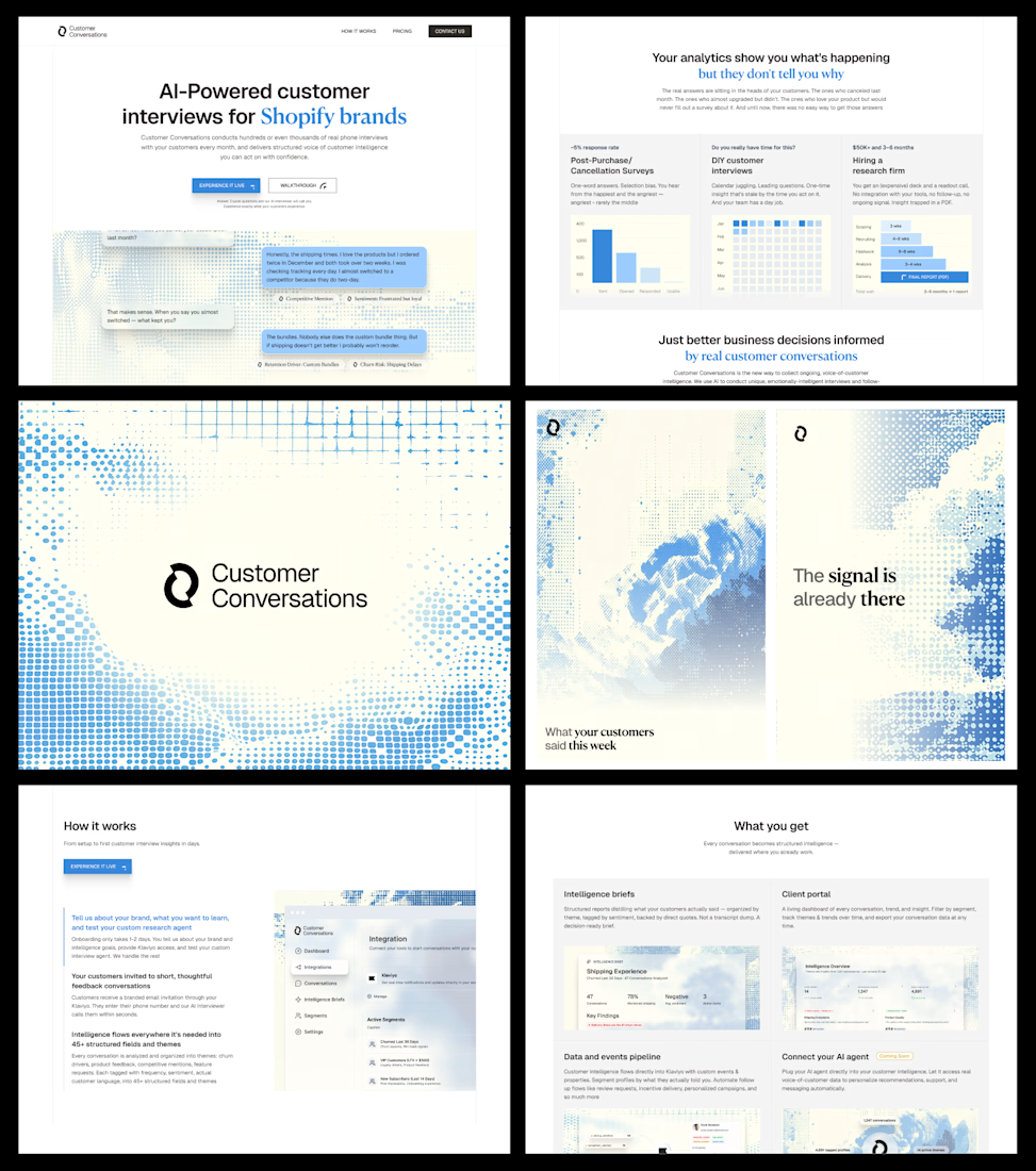


Amazing

🙌

Looks wonderful, feels airy, communicates well! Nice job Daniel!

Great!

I think this is a very good approach,
first it saves you from falling into the loop of constantly try to solve a problem which can't be solved
and also it's a good humane trait to tell people this isn't your problem, So I can't help rather than taking their money and coming up with a solution that ain't useful
Thank you!

Nice work Daniel

Not everyone is willing to turn down work for the greater good of the project as a whole. Love your commitment to integrity 🙌
I try my best

You for sure right… Sometimes, rebranding is not the answer to low conversions or sales, it can just be something as little as customer’s reassurance

Amazing

Awesome

Great Work.

This is a great point. Many teams think a rebrand will fix growth issues, but the real problem is often product positioning or messaging. Aligning brand with the actual value of the product makes a huge difference.


Strategic and high-clarity.

Cool

So true about the rebrand trap. The work here is really strong though, love how the brand feels like it grew out of the product instead of being layered on top.
Curious, how did you approach the imagery and backgrounds?
They tie everything together really well and I'd love to...


Hot take: most founders don’t actually want “strategy before aesthetics” — they want a visible change they can point to while avoiding uncomfortable sales conversations.
You’re right that rebrands often get blamed for positioning issues… but I’d argue the opposite happens too:...
contra.com
Is Aesthetic Web Design Hurting Your Conversion Rates?
Connect with next-gen talent and tools to get work underway. Hire more independents. Start more projects. Get more creative.
The network for creativity
Join 1.25M professional creatives like you
Connect with clients, get discovered, and run your business 100% commission-free
Creatives on Contra have earned over $150M and we are just getting started

Challenges
View all


Related posts

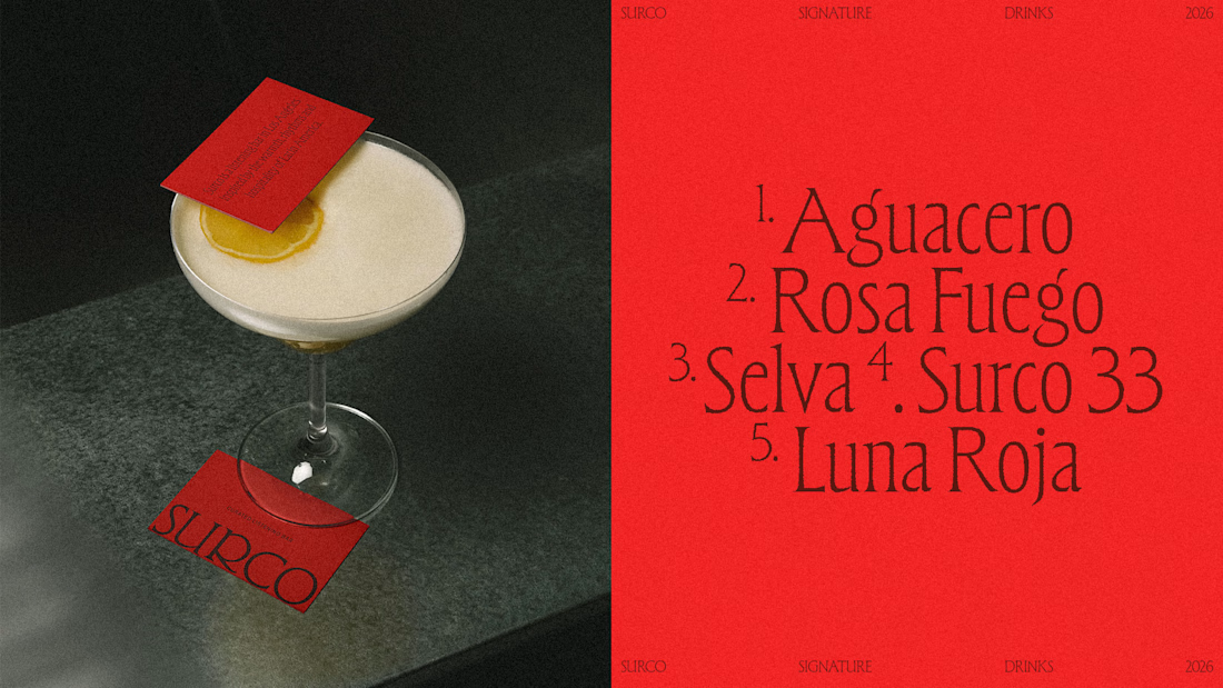
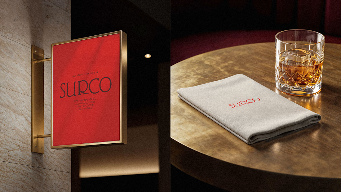
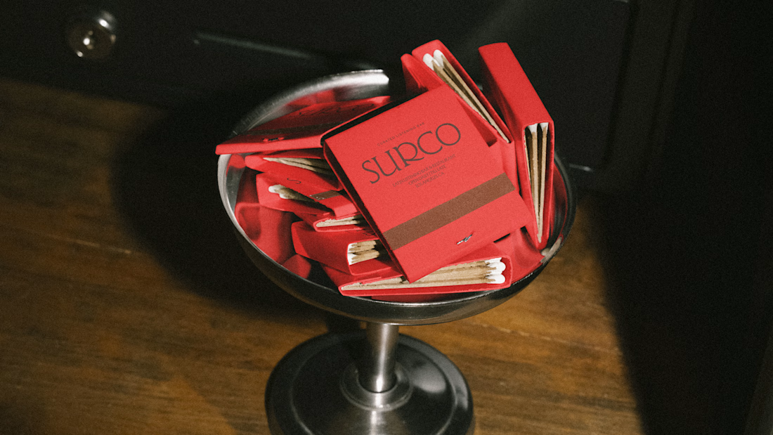
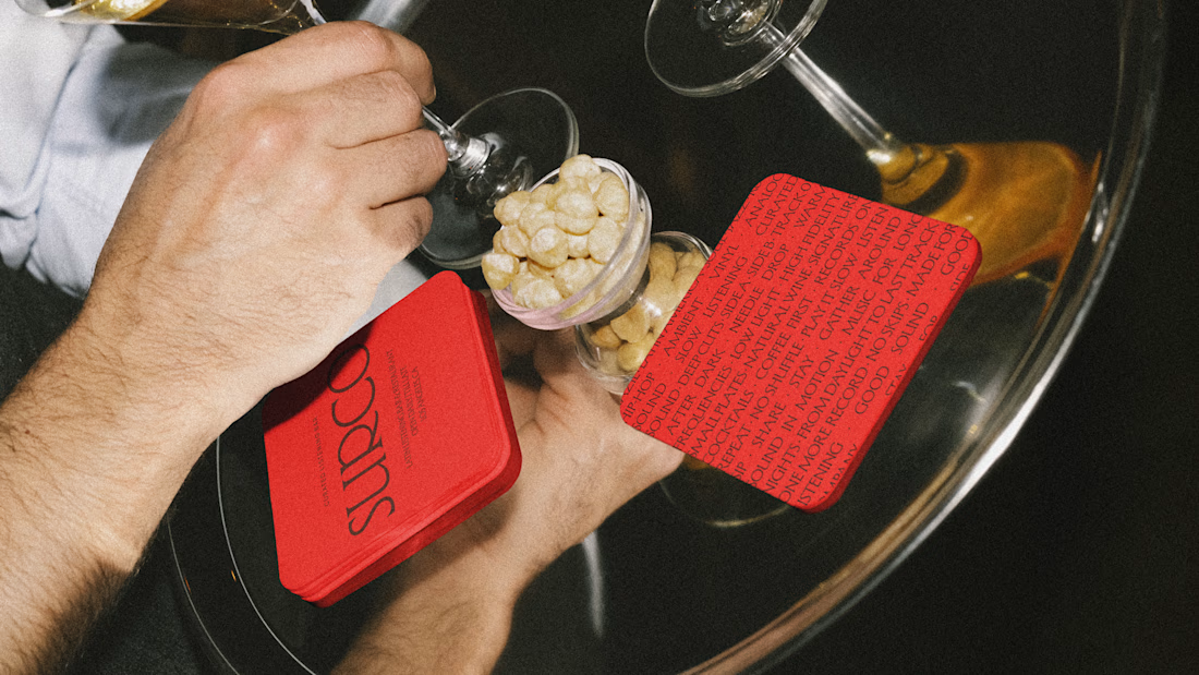
SURCO | Latin Bar & Restaurant Brand Identity
SURCO is a Latin bar and restaurant in Los Angeles where food, cocktails, vinyl and nightlife come together.
I developed a complete visual identity designed to feel warm, energetic and contemporary, without relying on the usual visual clichés associated with Latin restaurants. The system combines bold typography, a rich color palette, and art direction inspired by late nights, shared tables, music and the atmosphere of the bar.
The identity was extended across menus, signage, social media, printed materials and environmental applications, creating a flexible system that feels recognizable across every touchpoint.
Services: Brand Identity, Logo Design, Art Direction, Visual System, Graphic Design
Full project:
https://www.behance.net/gallery/255628447/Surco

Beautiful work!

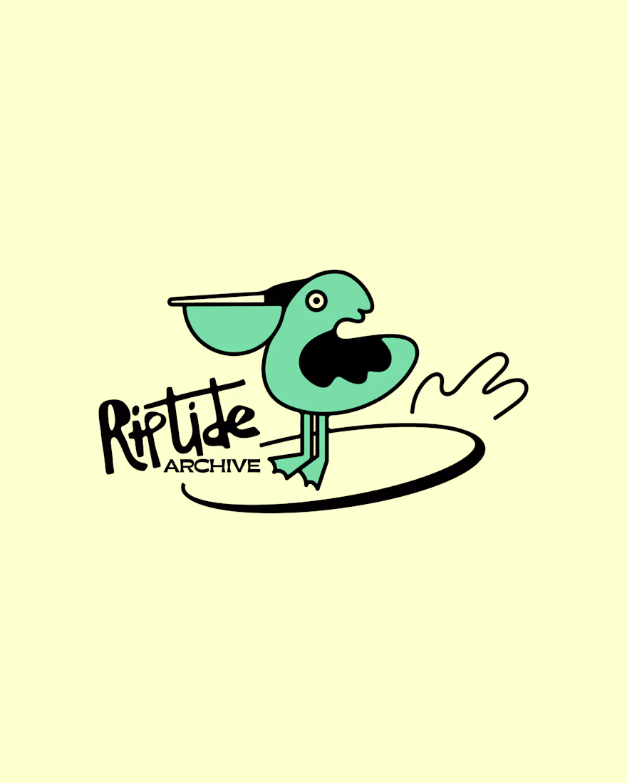
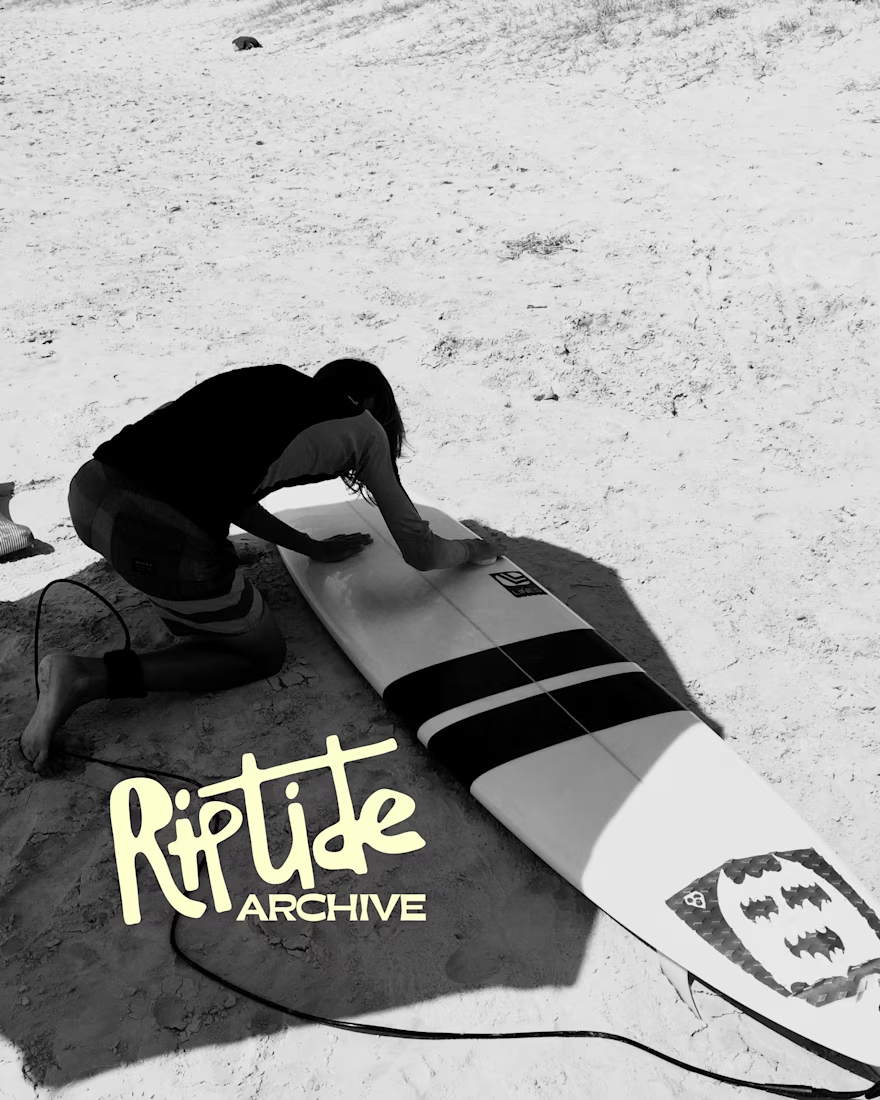
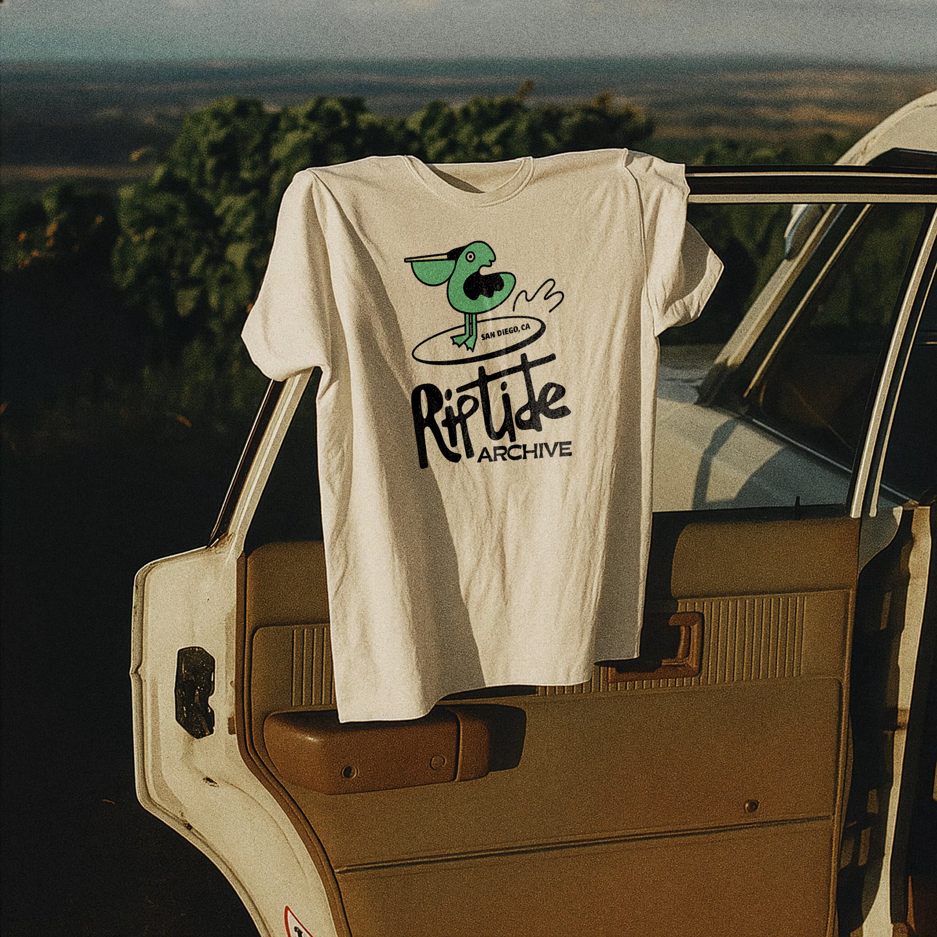
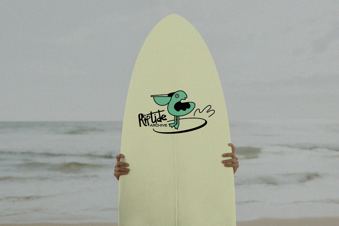
Logo for Riptide Archive. They document underground surf culture through limited run apparel, photo zines and short films.

Love this!

did some home cleaning - works page is now my homepage
i've lost over 50% of traffic because people dropped off on my previous homepage (about now) that didn't give any value
check it out yourself: https://seb-astian.com


looking great! i love that loading animation.