pro
Daniel Castellanos
Industrial Design | Brand Identity & Audiovisual
New to Contra
Daniel is ready for their next project!
THREE WEBSITES. THREE INDUSTRIES. ONE RULE: THE TOOL FOLLOWS THE BRIEF.
Landing pages are not a single discipline. The visual decisions, the information architecture, the build method — all of it changes depending on who the client is, what they need to communicate, and how much control they'll need after delivery.
These three projects made that clear.
The Challenge
EndoWell is a comprehensive endocrinology practice based in New York. Impuestos & Soluciones is a tax advisory firm. NiAuditor is a financial audit software platform. Three different industries, three different audiences, three different definitions of what "trust" looks like on a screen.
The brief for each was the same at its core: build a web presence that communicates authority and converts. The execution was not.
The Solution
EndoWell — WordPress + Elementor
The brand identity was already defined — clouds as a metaphor, lavender and teal as the color system, a visual language built around calm and precision. The website's job was to translate that into a functional medical site without losing the warmth.
The architecture decision was straightforward: WordPress with Elementor. The client needed to manage her own content after delivery. A custom build would have created dependency. Elementor gave us precise control over spacing, typographic hierarchy, and section structure — while keeping the backend accessible for a non-technical user. Every section was sequenced around a single conversion path: who she is, what she treats, how to book.
Impuestos & Soluciones — Built with Claude
An accounting firm needs to feel rigorous without feeling bureaucratic. The visual challenge here was making fiscal services readable to a non-specialist audience — people who are intimidated by the subject before they even read the first line.
Building with Claude meant starting from zero on every component. No inherited theme styles to override, no default spacing to fight. The layout was designed section by section with deliberate intent: a clear hero that names the service directly, a services block structured for scannability, and a contact section that removes friction. The typography stays conservative. The grid is tight. Nothing decorative that doesn't carry information.
NiAuditor — Built with Claude
A B2B software platform for financial auditors. The audience here is technical and detail-oriented — they'll read the fine print and notice if something feels off. The design language had to match that standard.
Same build method as Impuestos & Soluciones, different visual logic. The hierarchy leans harder into precision: more negative space, stricter alignment, a restrained color palette that signals software rather than service. The information flow was structured around the product's core value first, features second, and conversion last — because this audience doesn't respond to pressure, they respond to clarity.
The Result
Three live sites. Each one built with the method that fit the project, not the method that was most convenient. The technical difference between a WordPress build and a Claude build isn't a preference — it's a decision that affects everything from delivery timeline to client autonomy to design flexibility.
Knowing which stack to use is part of the work.
What I delivered:
Information architecture · Visual design · WordPress / Elementor development · AI-powered custom web development · Copywriting structure
endo-well.com (http://endo-well.com) · impuestosysoluciones.com (http://impuestosysoluciones.com) · niauditor.com (http://niauditor.com)
4
82
THE BRIEF WAS A NICKNAME.
David had been called MUTT for years. It stuck from a period of his career shooting street, festivals, raves — places where the camera goes where it fits, not where it's planned. The name carried texture. The problem was communicating it visually without it looking rough.
The tension in the logo comes from that constraint. MUTT as a word reads raw, underground, unfinished. The mark had to hold that energy without letting it spill over into something that looked cheap.
I kept the typography bold and geometric — no serifs, no decorative cuts, full weight. The letterforms needed to feel confident and urban at the same time. The decision to break "MUTT" into "MUT" and "T" with a centered dot in between was structural, not decorative. The dot reads as a lens at first glance, which works for photography. It also functions as a pause, a breath inside the name, which gives the wordmark rhythm without adding any visual noise.
Black on white. No gradients, no texture overlays, no effects trying to approximate the street quality of the work. The cleanliness of the mark is the contrast — David's photography lives in chaotic environments, so the brand sits at the opposite end. Controlled. Precise. Recognizable at any size.
"POTHOGRAPH" in spaced light caps anchors the bottom. The letterspacing there does the work that a heavier font would overdo.
The whole mark fits on a business card or a festival screen with the same read.
Deliverable: Logo design · Brand mark · Typography system
Working on identity projects for creatives, artists, and photographers. Let's talk.
1
74
There’s nothing quite like the energy of a high-level creative session. We recently had the pleasure of hosting Sony Music and the talented Penelope Robin at our studio for a professional production day.
As a creative director and studio owner, my goal has always been to provide a space where technical precision meets artistic freedom. Seeing our 4-meter high ceilings, professional lighting rigs, and specialized areas being utilized by industry leaders to bring a vision to life is exactly why we built this space.
This BTS look captures the synergy between a top-tier artist, a world-class label, and the production environment we’ve meticulously designed here. It’s more than just a studio; it’s where sound, emotion, and professional standards converge to create something impactful
3
8
581
From a cloud to a brand.
EndoWell started with a single image: clouds. Not as decoration, but as a metaphor. The doctor behind the brand, an endocrinologist based in New York, described her work as learning to adapt to what you can't control, the way weather changes and you adjust. That became the foundation for everything.
I built the full brand identity from that idea. The logo grew from the abstraction of clouds into a stethoscope, the symbol of endocrinology hidden inside something familiar and soft. The color palette — lavender, sky blue, warm peach, and teal — was chosen to communicate calm, trust, and healing without feeling clinical or cold.
From there, the visual system expanded across every touchpoint: corporate manual, typography hierarchy, pictogram system, business cards, letterheads, and print-ready files. Then the website. Then a logo animation built in After Effects, where the colored circles travel through light, pass behind a cloud, and settle into the brand mark as the name appears.
Every piece was designed to hold together. The kind of consistency where a business card and a social post feel like they came from the same place, because they did.
"We don't try, we achieve it."
That's the EndoWell slogan. It's also the standard I held the work to.
What I delivered:
Brand identity and strategy · Logo design + animation · Corporate manual · Typography system · Pictogram library · Business cards · Letterheads · Print-ready files · Website design
Open to branding projects. If you're building something from scratch or need a visual system that holds across formats, let's talk.
1
92
Capturing the human element behind major talent requires more than just technical execution; it demands emotional intuition. Alongside my team—Daniela Santamaria and David Salgado—we led the live content creation and event coverage for Universal Music artist Ela Tauber. Designed exclusively for her most dedicated fanbase, our objective was to break away from traditional corporate staging and deliver an authentic, raw, and intimate look at the artist. We focused on capturing her simplicity and natural essence, translating the energy of a live event into passion-driven, high-engagement content.
This project allowed us to explore a deeply human approach to live production, proving that a brand's or artist's strongest asset is their authenticity. Managing real-time asset creation under the high pressure of a live music event further refined our agility and storytelling capabilities. I am eager to connect with innovative creators and brands on Contra to bring this same level of premium, human-centric visual direction to your upcoming projects.
2
129
Visual Identity for MOLDE. — 3D Design & Production Studio
The Challenge MOLDE. is a studio that designs and manufactures functional, everyday products using 3D printing technology. The goal was to create a visual identity that clearly communicates structural architecture, volumetric form, and technical precision without sacrificing a premium, modern aesthetic suited for lifestyle product markets.
The Solution The brand’s visual system is rooted in pure geometry. By combining heavy, solid geometric blocks to form the custom typography of "MOLDE.", the logotype structurally represents the core process of the company: molding physical raw materials into functional shapes. A key element of the identity is the punctuation point at the end, which scales independently as an abstract minimalist icon for small placements, product embossing, and tactile tags.
The Application The identity was developed alongside its physical applications, testing structural legibility across high-end 3D printed objects (such as matte polymeric lighting structures) and premium packaging. The contrast between deep matte black graphics and raw material textures ensures the brand feels industrialized yet sophisticated.
12
27
868
Media Coverage & Visual Assets: McDonald’s "Espacios Azules" Initiative
Overview
I collaborated alongside filmmaker David Salgado to deliver comprehensive audiovisual coverage, professional photography, and high-end graphic assets for the launch of "Espacios Azules" (Blue Spaces)—a landmark initiative by McDonald's in partnership with LICA. The project’s core mission was to design, implement, and raise visibility for safe, sensory-friendly spaces within restaurants tailored for neurodivergent individuals.
The Challenge
An initiative of this scale required a visual narrative that balanced corporate branding with deep human empathy. The goal was to capture the real-world impact of the launch event while producing polished, versatile marketing assets ready for digital distribution and corporate visibility.
My Role & Execution
Working as part of a high-performance creative duo, I focused on turning a live corporate launch into a compelling visual story:
Audiovisual & Event Coverage: Co-directed and executed the on-site filming and photography, capturing key moments, ambient design, and human interactions with premium cinematic quality.
Graphic Production: Designed custom graphic assets tailored specifically for the event’s launch day, ensuring seamless brand integration between McDonald's global identity and LICA’s organizational guidelines.
Asset Optimization: Delivered a curated package of high-resolution stills and optimized video formats designed to maximize engagement across corporate communication channels.
The Result
A cohesive, polished archive of visual assets that perfectly documented a major milestone in inclusive spaces. The deliverables successfully elevated the visibility of the "Espacios Azules" initiative, providing both brands with high-value content that reflects genuine social impact and modern corporate responsibility.
1
174
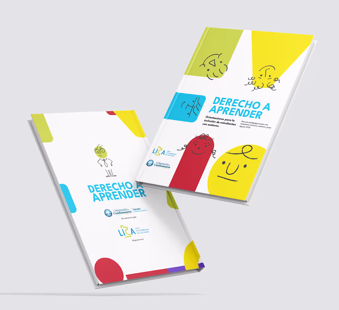
Design for Inclusion: Crafting Educational Tools for Neurodiversity
I’m proud to share my work on a key initiative for the Gobernación de Cundinamarca in partnership with LICA (Liga Colombiana de Autismo). I led the editorial design and layout of the central pedagogical guidebook, a vital resource created to support inclusive education for students with neurodevelopmental disorders (ASD) across the region.
My role focused on transforming complex technical content into a highly functional, visually accessible editorial piece. By bridging the gap between specialized information and practical classroom application, I ensured that teachers and families had a clear, intuitive roadmap for implementing inclusive strategies.
While this was part of a larger toolkit, the guidebook served as the visual and structural anchor for the printed materials. This project reinforced my belief that design is a powerful tool for social change, especially when it comes to making education more accessible for every mind.
1
3
315
From blueprint to screen. 💻🛸 Here is the visual ecosystem we built for Daniela Acevedo, a brand focused on land sales and real estate development.
A project in this sector demands a technical approach that blends signature design with digital production:
🛠️ Structural iconography designed from scratch in Adobe Illustrator.
🎬 Motion graphics to bring dynamism and rhythm to the brand identity.
🦅 Aerial drone footage to capture the true scale of the land.
The result is a solid, sophisticated brand identity ready for the high-end real estate market. Swipe to see the corporate stationery mockup and the logo animation in video. What do you think about the flow of this logo? Let me know in the comments below! 👇
2
190
& Design Boutique has always been more than an agency; it’s the definitive bridge between ideation and execution. Built on the core concept of the ampersand, this project stands for connection: connecting ideas & reality, vision & products, and ultimately, your brand & market success. It is the very engine that brought in my first clients, sustained my early creative career, and remains fully active today as a premium hub for high-end content creation, brandbooks, and audiovisual production.
To honor its ongoing legacy, I executed a purely aesthetic rebranding—a visual refinement designed to elevate its presence without losing the strategic core that defines it. This evolution streamlines our geometric identity to reflect maturity, precision, and the senior authority required to keep transforming complex corporate visions into seamless, high-impact realities.
2
131
My Creative Journey with LICA
Since the foundation of LICA (Liga Colombiana de Autismo), I have served as their lead Audiovisual Creative, spearheading the brand's visual evolution through high-impact storytelling and cinematic video production. My work has been central to translating their social mission into engaging digital content, focusing on a 'sound and emotion-led' editing philosophy that ensures every project resonates deeply with their audience while maintaining a high-end, professional aesthetic.
The success of LICA’s digital presence is the result of a seamless, long-term synergy between my creative execution and the social media strategy team. By consistently delivering original video assets that align with evolving market trends, we have achieved significant community growth and engagement, proving that a cohesive partnership between design and strategy is the key to building a brand that truly makes a real-world impact.
Check out some of our latest work on their Instagram: @ligautismocol (https://www.google.com/search?q=https://www.instagram.com/ligautismocol) .
1
263
Fundación Saldarriaga Concha is a leading Colombian social organization dedicated to the social and productive inclusion of older adults and people with disabilities. For the 2023 International Federation on Ageing (IFA) Conference in Bangkok, the foundation required a high-impact master presentation and an accompanying video to present the key findings of their major research paper, 'Misión Colombia Envejece'."
My Role & Systematic Solution
As the Video Editor and Systems Designer for this project, my goal was to transform dense academic and statistical research into a visually compelling, cohesive narrative for an international audience.
Information Hierarchy: I structured the motion elements and video sequencing to ensure that complex data from 'Misión Colombia Envejece' was accessible, engaging, and clear during the keynote.
Brand & Visual Continuity: I applied the organization's brand guidelines strictly across both the video and the presentation assets, maintaining technical rigor and professional alignment.
Global Output: I delivered polished, production-ready assets tailored for an international stage, balancing dynamic pacing with the sensitivity and prestige required by a global entity.
Deliverables
Keynote Presentation Design & Layout
Information Architecture & Data Visualization Assets
Video Editing & Sequencing (Motion Overlays & Audio Sync)
Multi-platform Export Optimization (1080p)
⚠️ DISCLAIMER / COPYRIGHT NOTICE
This video and its contents are the exclusive property of Fundación Saldarriaga Concha. All rights reserved. This material cannot be copied, distributed, or used in any manner by any third party. It is displayed on this platform strictly and solely as a professional case study and portfolio sample of work performed.
3
210
AudioVisual Project
0
138
2 de abril día mundial de la concienciación sobre el Autismo
1
138
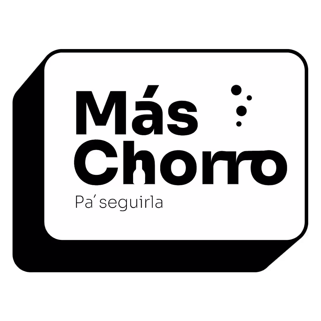
Brand Design - Más Chorro
1
108
Brand identity
0
142
Brand design, producto photography
1
101
Liga colombiana de autismo 15 años
0
114
10+ brands, 10+ unique challenges, 1 comprehensive creative solution. Over the years, my career has been defined by versatility and results, serving as the strategic partner behind a diverse portfolio of companies. From visual production, high-impact motion graphics, and software-integrated presentation systems in After Effects, to targeted campaign design and paid media management, I have engineered custom systems that bridge the gap between creative vision and market performance.
This journey is far from over. I am continuously expanding my capabilities and looking for ambitious projects that push boundaries. I am eager to collaborate with the Contra community, leveraging my senior expertise to help new brands translate their objectives into highly optimized, premium assets. Let’s connect and build your next milestone together.
Hector Daniel Castellanos
4
99