The network for creativity
Join 1.25M professional creatives like you
Connect with clients, get discovered, and run your business 100% commission-free
Creatives on Contra have earned over $150M and we are just getting started
Back to feedPost
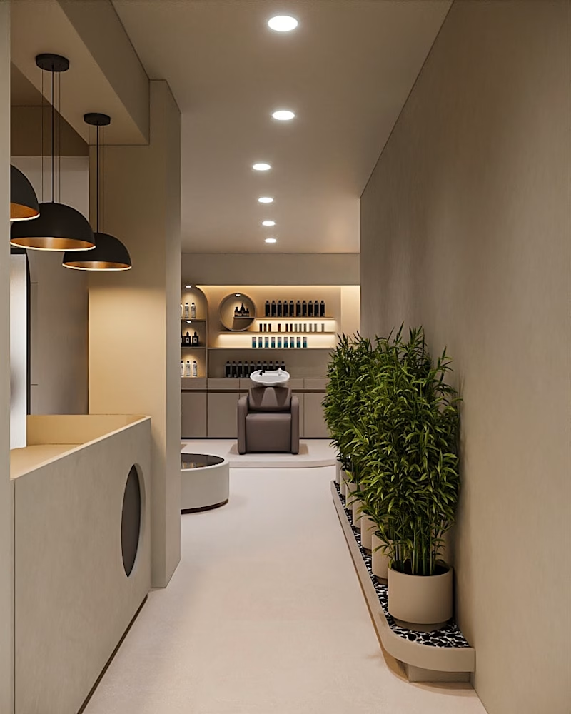
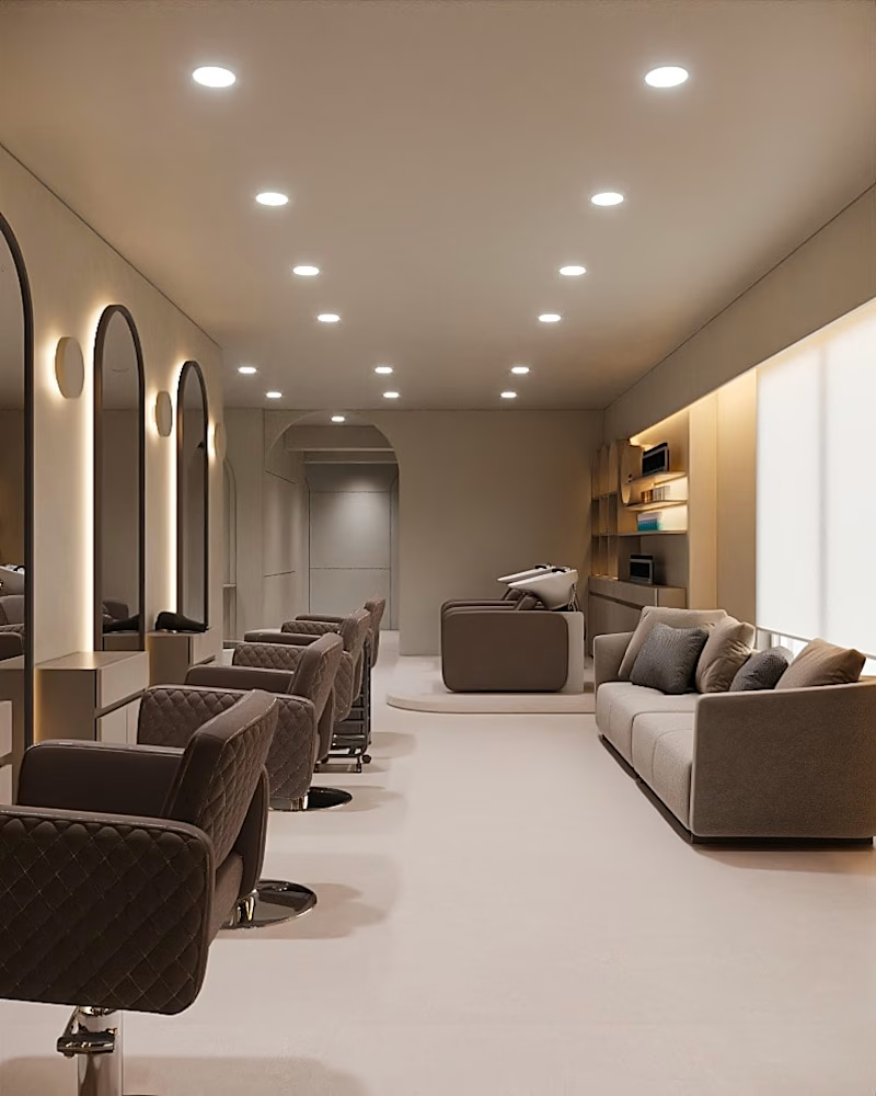
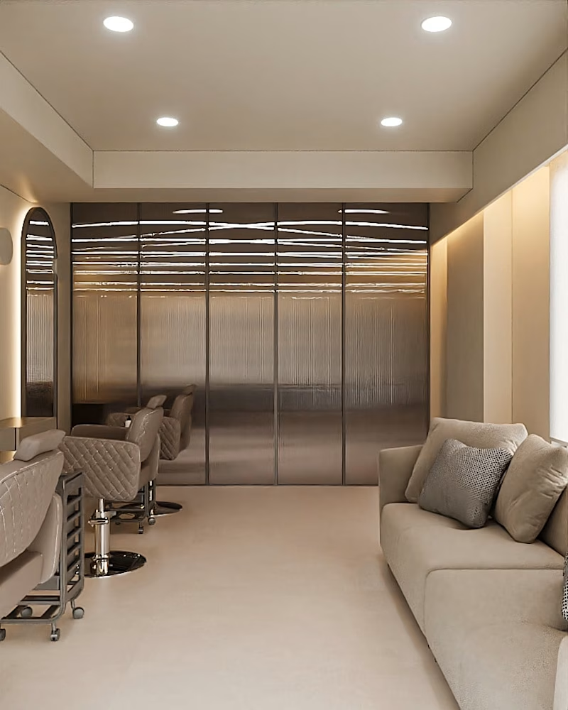
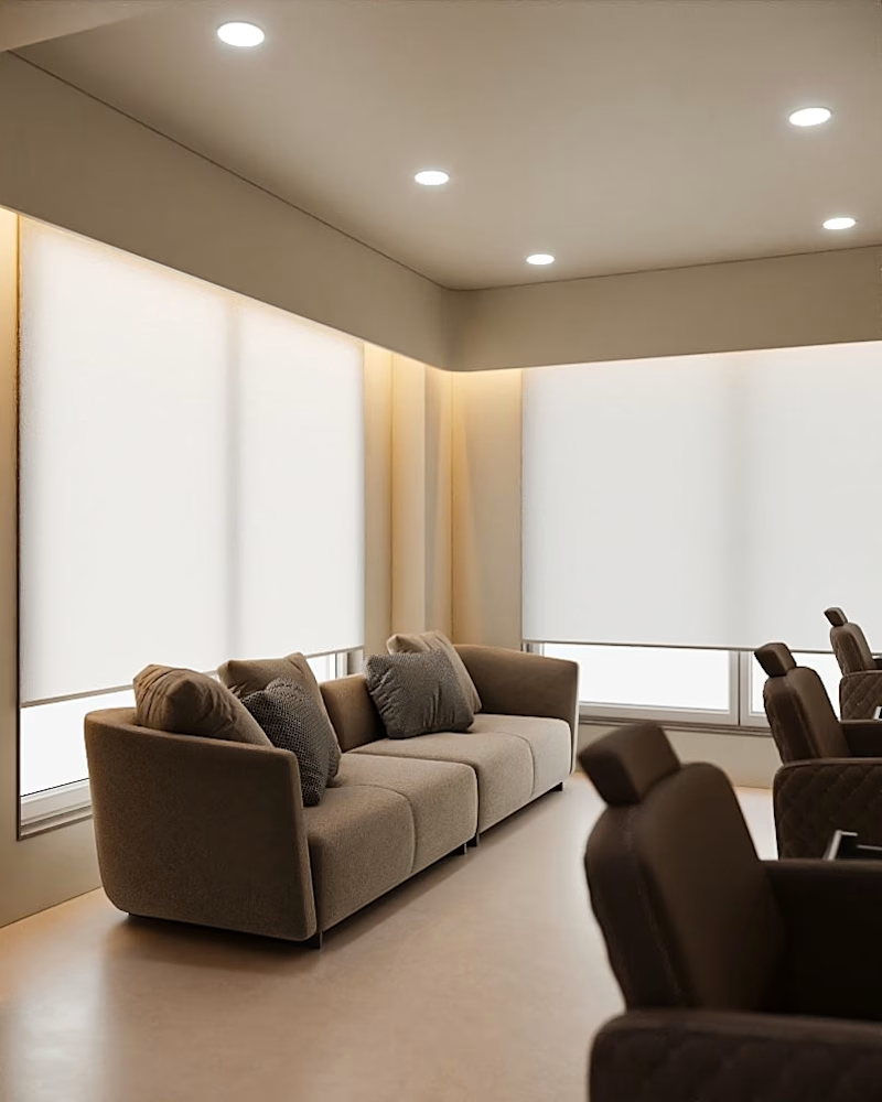
A calm, human-centric salon designed with spatial clarity, soft materials, and controlled lighting. The layout flows through defined zones—reception, hair stations, wash area, and lounge—connected seamlessly for intuitive movement.
Repetitive arched mirror bays create rhythm and identity, while warm neutral tones, matte textures, and subtle greenery add depth. Layered lighting enhances comfort and precision, resulting in a refined, timeless space rooted in warm minimalism.



looks fantastic, great work

Thanks 👍

marvelous
The network for creativity
Join 1.25M professional creatives like you
Connect with clients, get discovered, and run your business 100% commission-free
Creatives on Contra have earned over $150M and we are just getting started











Related posts




Cream trailer is better because the cargo light creamy color has better contrast with an environment it and black truck feels dangerous🔥🔥🔥
Great job Vaskrsije🎉🎉🎉

Figma Football
An unofficial football concept inspired by Figma and its visual language.
The ball was created using a custom 3D generator I built in ChatGPT, with animated interface icons and graphics developed with Claude.
Part design experiment, part exploration of how custom AI-powered tools can become part of the creative process.


The interface icons translate surprisingly well into a football identity.

Aurum 2.0: Interactive 3D Luxury Watch Website
A website for a fictional Swiss watch brand where the product is the experience. The watch is a real-time 3D model built in code. It assembles itself when the page loads, comes apart layer by layer as you scroll, flips over to show its working movement, and changes finish while you watch.
What you’ll see in the video:
Assembly intro: after a gold loading ring, the watch flies together from its separate parts.
Live dial: the hands show your real local time, and the light on the metal follows your cursor.
Exploded view: seven layers separate as you scroll, each with a label that tracks it in 3D.
The movement: the watch flips to show the movement through the sapphire caseback, with meshing gears, a swinging balance wheel and a turning rotor.
Configurator: three case finishes and three dials, with the reference code and price updating live.
Viewing request: a “request a private viewing” form with validation.
It works on desktop and phone, and respects reduced-motion settings. There’s also a fallback for older browsers.
Aurum is a fictional brand. The concept was designed and built by Meji Builds.


Wow, the scroll bound exploded view is definitely going to look flawless on the website.