The network for creativity
Join 1.25M professional creatives like you
Connect with clients, get discovered, and run your business 100% commission-free
Creatives on Contra have earned over $150M and we are just getting started
Back to feedPost

Chillix® — Essentials Brand Identity + Packaging Design
Overview
Chillix® is a modern dessert and ice cream brand created to make indulgence feel playful, premium, and memorable. The goal was to build a complete visual identity and packaging system that instantly stands out on shelves while creating a strong emotional connection with younger audiences.
The project focused on combining rich flavor storytelling, lifestyle-driven visuals, and clean premium branding into one cohesive experience.


The network for creativity
Join 1.25M professional creatives like you
Connect with clients, get discovered, and run your business 100% commission-free
Creatives on Contra have earned over $150M and we are just getting started









Related posts

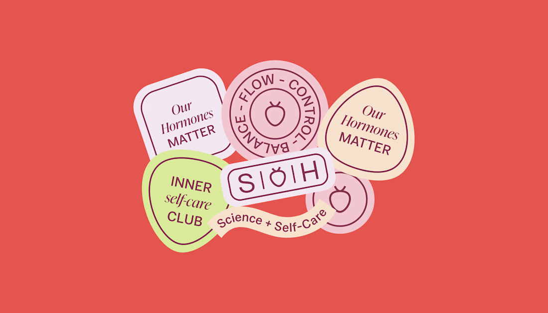
How can branding make people feel part of a community?
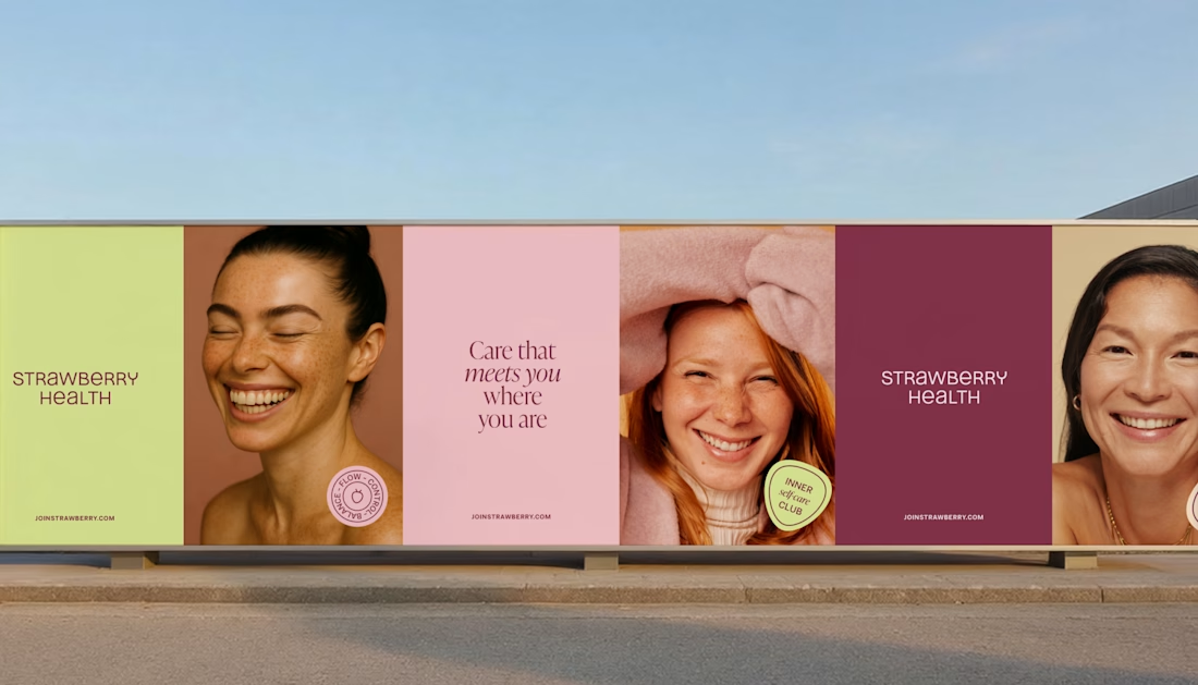
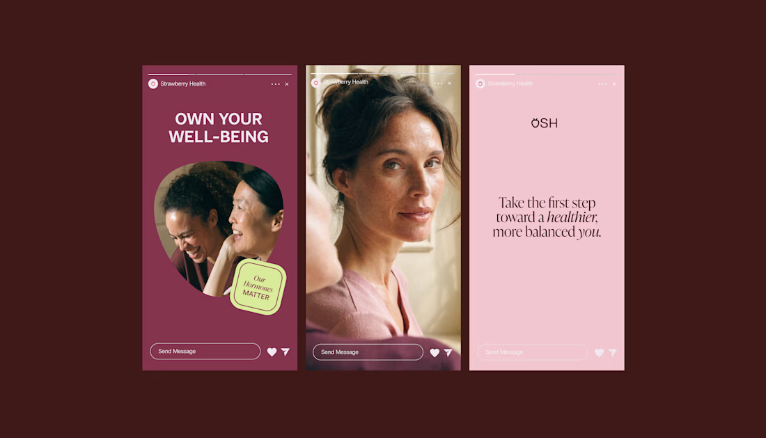
When working on Strawberry Health, we explored how visual identity could make women’s health feel more approachable and collective.
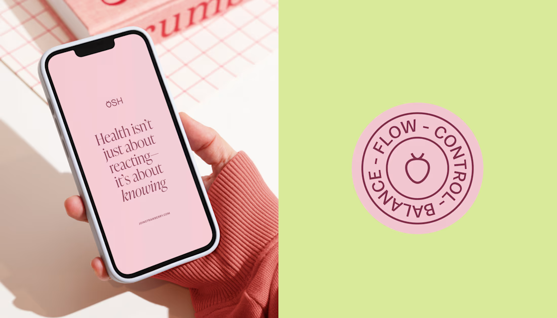
One of the ways was through supporting brand elements: stickers, badges and phrases that could live beyond the logo and become expressions of belonging.
These elements turned the identity into something people could interact with, share and make their own.
It’s a small detail, but I think it’s an important part of building brands around communities: the identity shouldn’t only identify the brand. It should give people something to identify with.

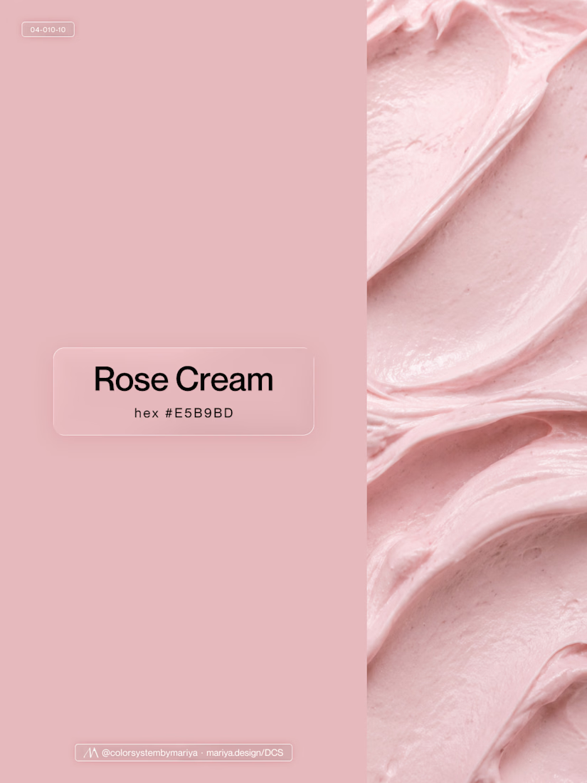
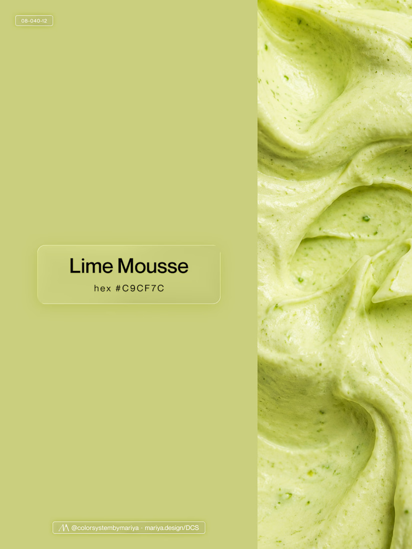
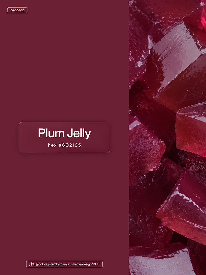
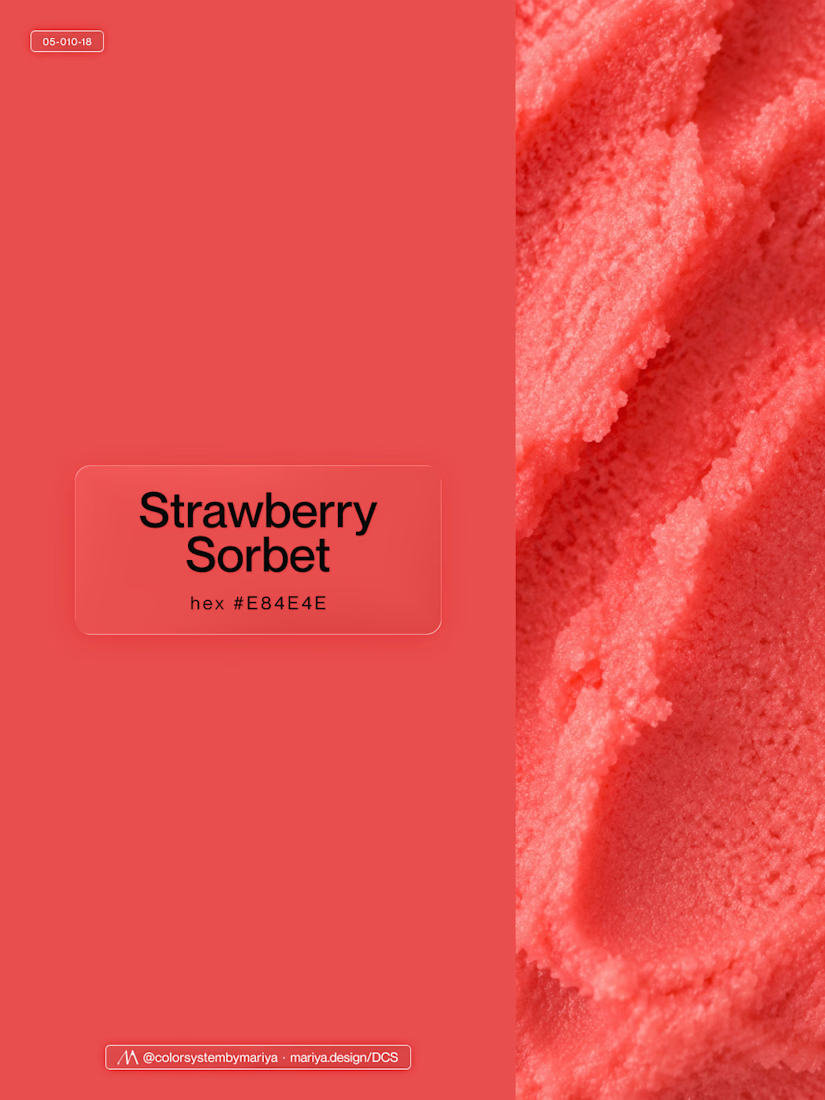
Love, love, love the colors. My mind goes: Rose Cream, Lime Mousse and Plum, hmmmm, which Plum... Plum Jelly. And of course, Strawberry Sorbet.
Let me match the vibe using my delicious swatches 😊

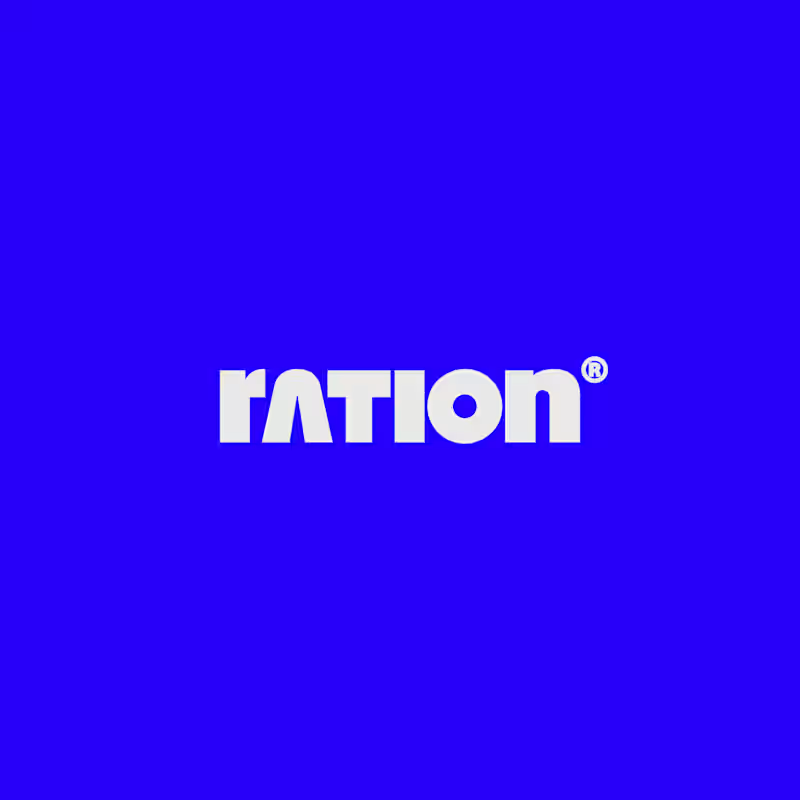
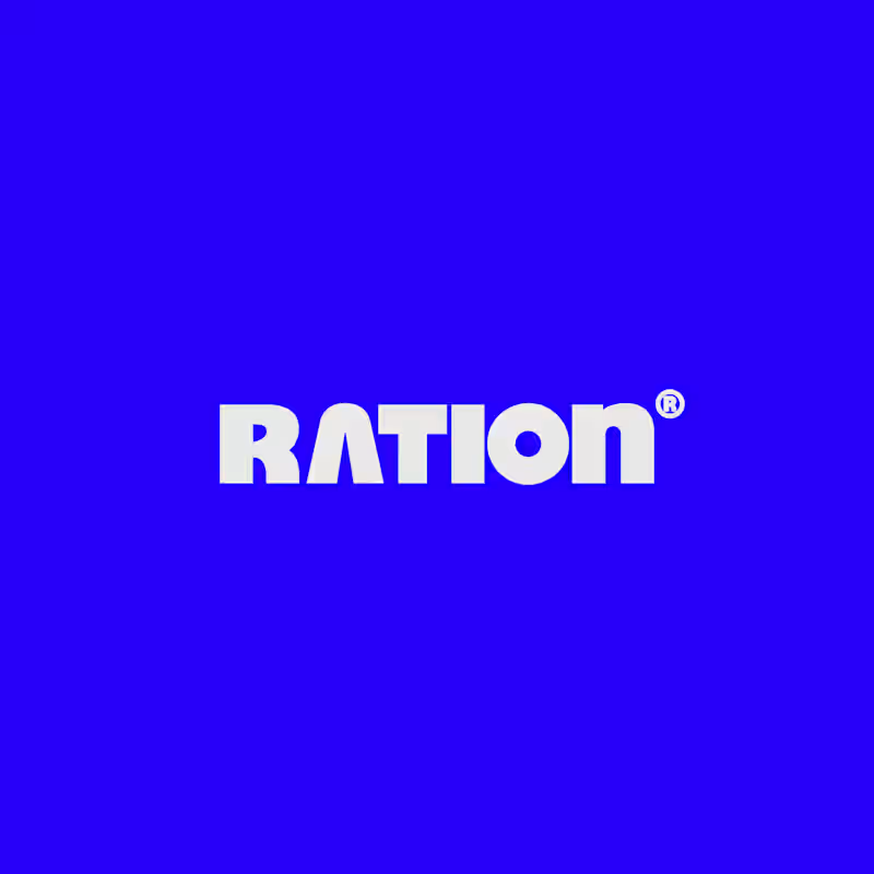
I’ve been working on a bold, modern-retro logotype and can’t decide between these two options.
🆘 Which one feels more aesthetically pleasing to you?

11 voted
26%
31 voted
74%
42 votes
Closed

CAPITAL is great but SMALL is unique great job Nawras 🔥🔥


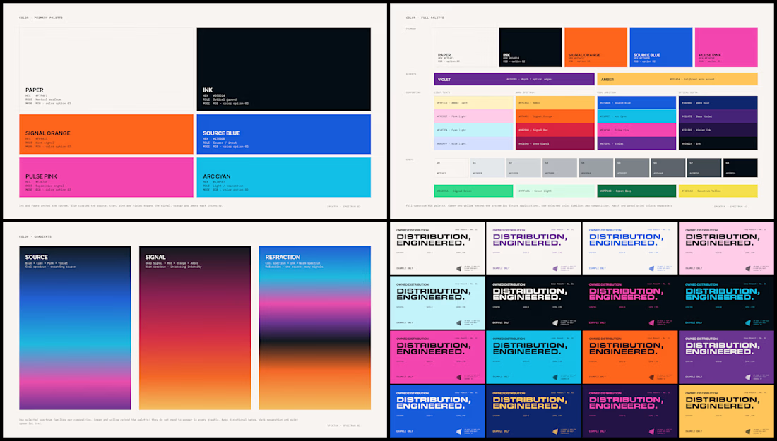
Spektra's founder had a practical question during the identity work: if the team needed green one day, would there be a green that belonged?
So I defined every color in the system, including green, with shades and pairings for each. When that day comes, the green is already there.