The network for creativity
Join 1.25M professional creatives like you
Connect with clients, get discovered, and run your business 100% commission-free
Creatives on Contra have earned over $150M and we are just getting started
Back to feedPost

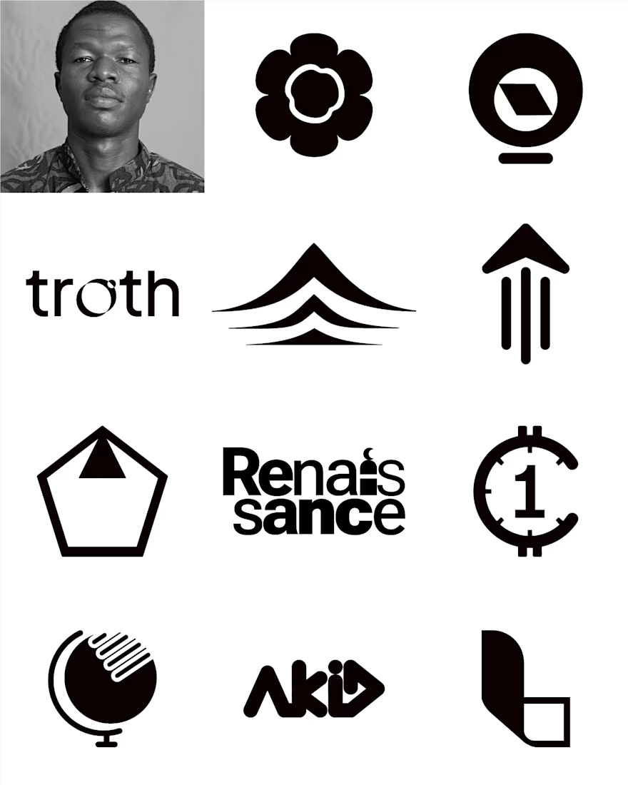
Each of this pieces represents different interests, however, they share one thing in common—intention.
Each mark was intelligently crafted to carry a story, a feeling.
The network for creativity
Join 1.25M professional creatives like you
Connect with clients, get discovered, and run your business 100% commission-free
Creatives on Contra have earned over $150M and we are just getting started





Related posts

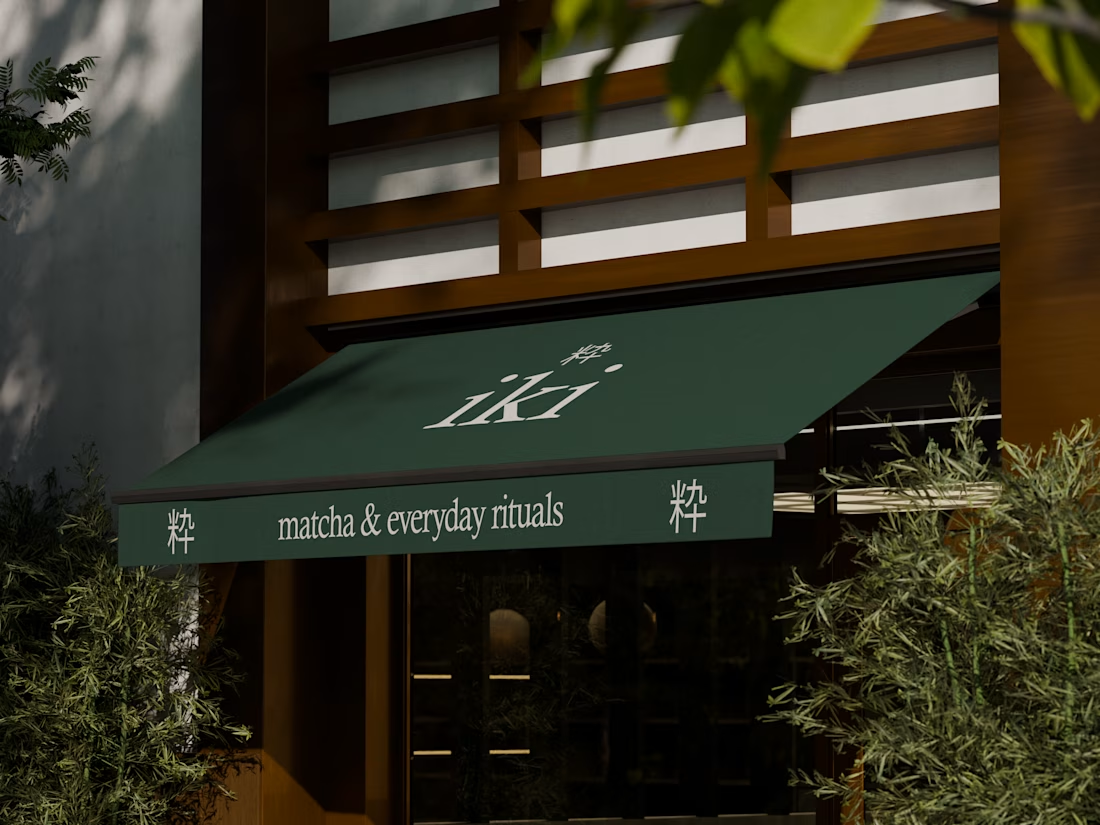
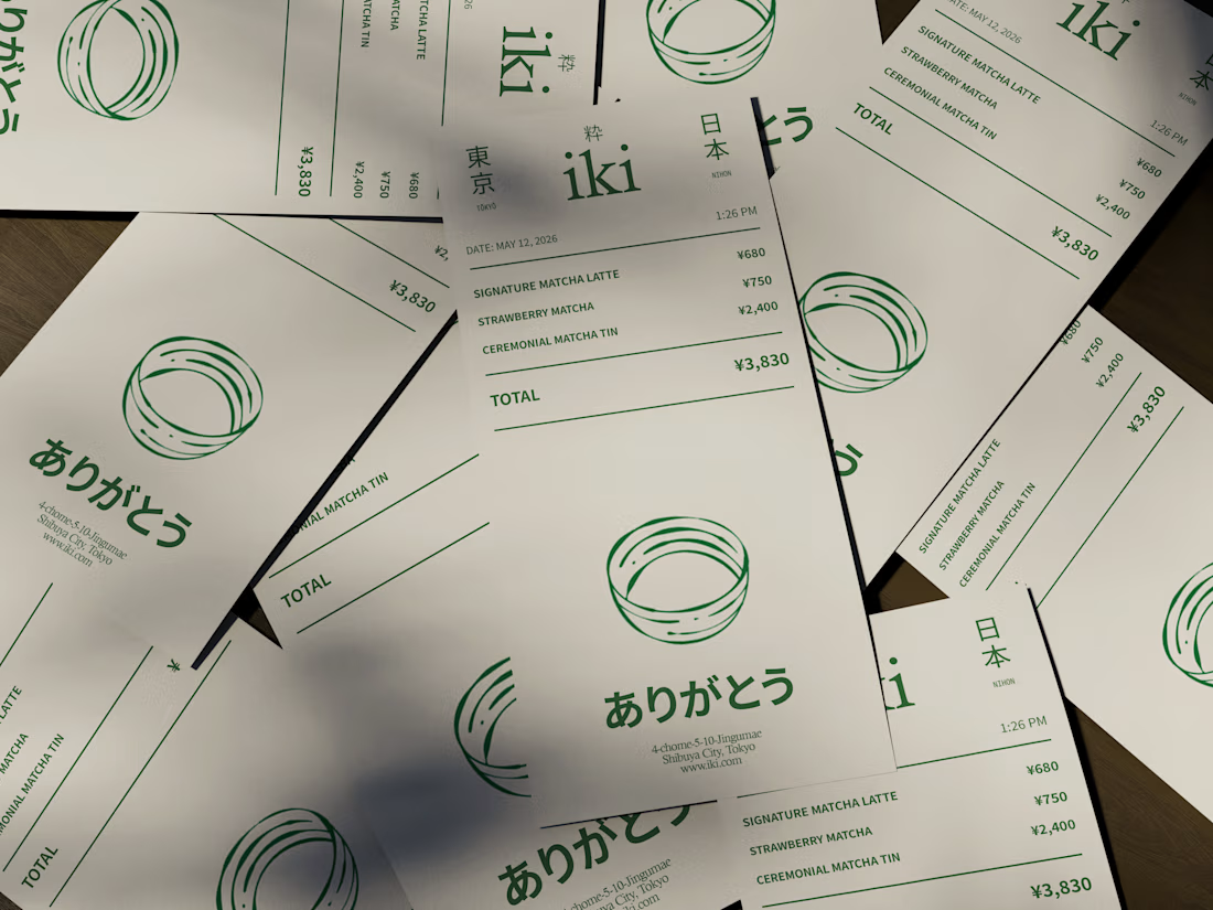
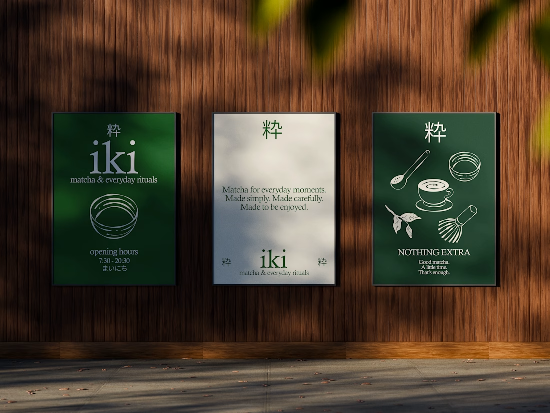
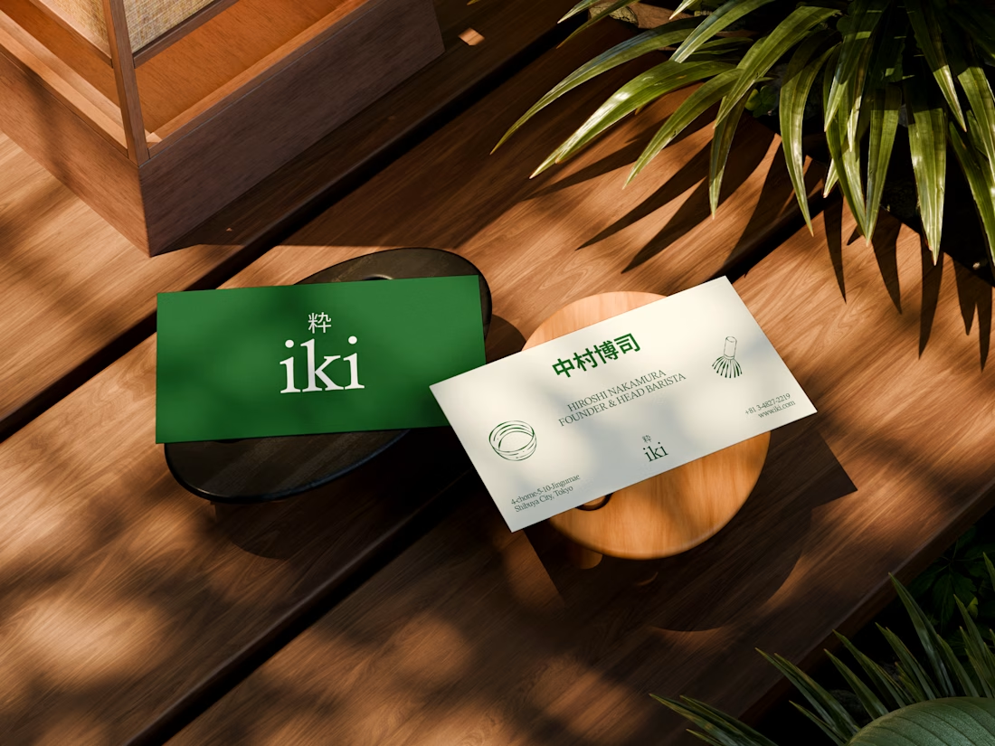
some visuals from iki, a matcha shop i’m currently working on 🍵
one of the most interesting parts of this project has been figuring out how to turn an abstract concept into something people can actually see and feel.
from the typography to the illustrations and overall visual language, every element is an opportunity to give the brand more personality and make it feel like its own world.
still exploring, but i’m really enjoying where this is going.

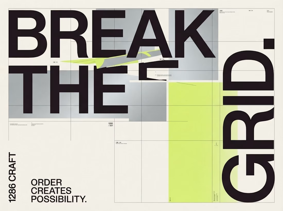
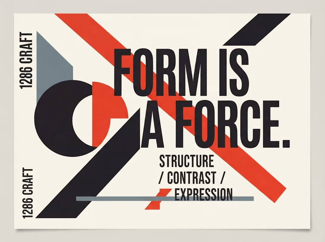
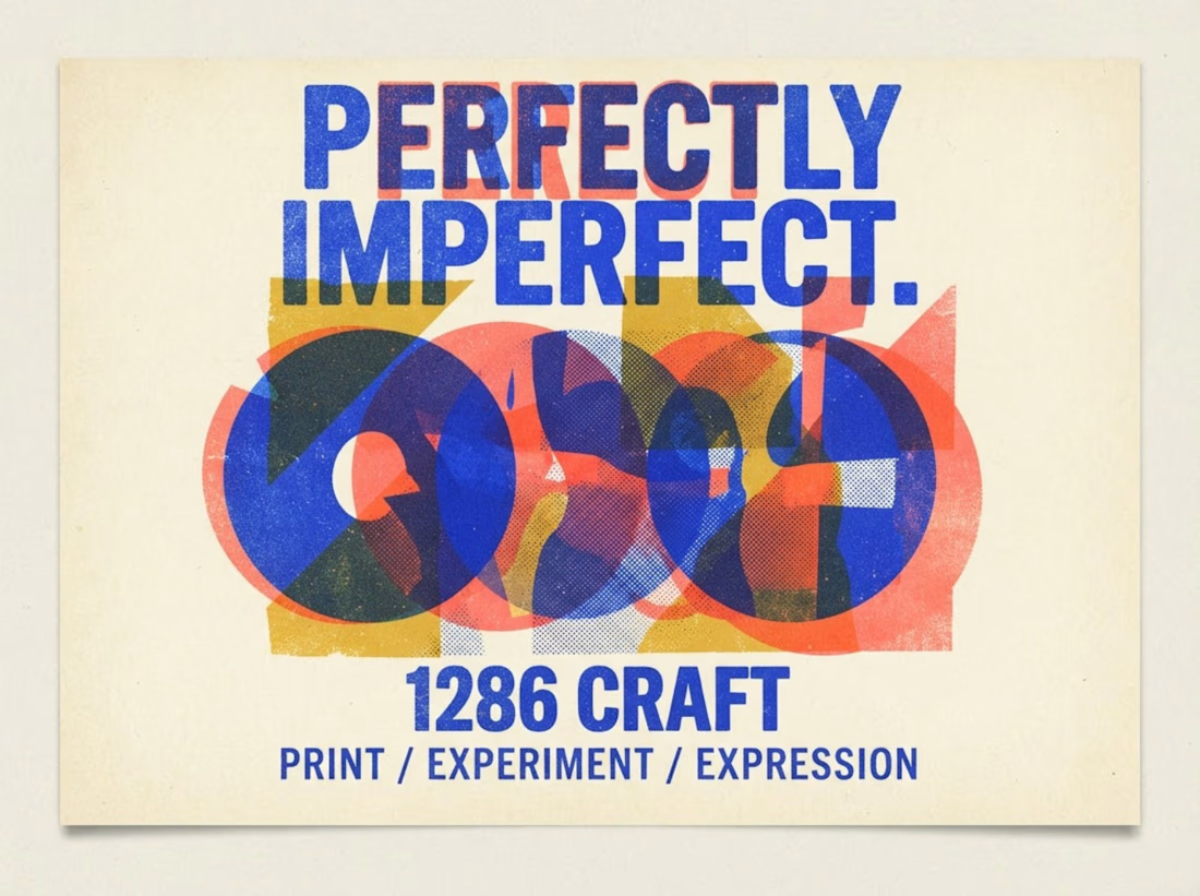
1286 CRAFT | Exploring Form, Nature & Experimental Design
Three distinct visual explorations, each with its own creative language.
From bold geometric typography and expressive color layering to intricate botanical compositions, this collection explores how structure, contrast, texture, and imagination shape powerful visual identities.
Every composition is an experiment in balancing artistic expression with thoughtful design.
Different styles. One creative vision.
#1286CRAFT #GraphicDesign #VisualDesign #ExperimentalDesign #Typography #CreativeDirection


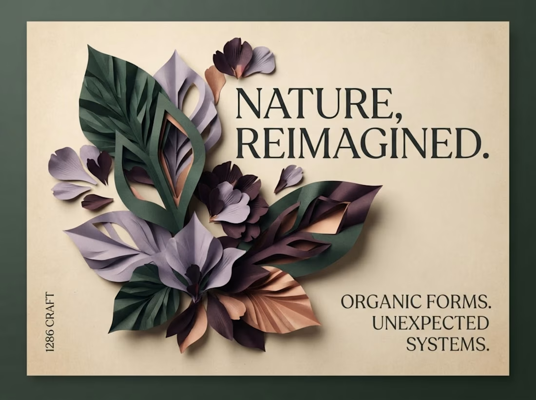

The botanical composition part caught my eye - layering those leaf textures against the type creates a surprisingly tactile contrast.
1286 CRAFT | Design in Motion
From bold typography and experimental print textures to organic paper-cut compositions, this motion showcase explores how static graphic design transforms through movement.
Each animation brings a different visual language to life while preserving its original creative identity.
Three visual styles. One creative vision.
#1286CRAFT #MotionDesign #GraphicDesign #KineticTypography #VisualStorytelling #CreativeDirection
