The network for creativity
Join 1.25M professional creatives like you
Connect with clients, get discovered, and run your business 100% commission-free
Creatives on Contra have earned over $150M and we are just getting started
Back to feedPost

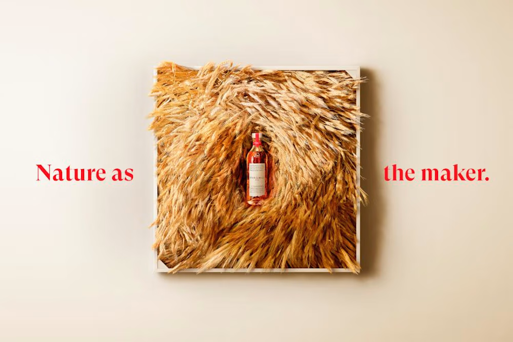
What happens when you build a brand identity using the actual materials behind the product?
Turner Duckworth's latest work for Maker's Mark takes the brand's iconic red wax beyond the bottle.
The designers pressed wheat, oak rings, and plants from the distillery's Star Hill Farm into wax, creating a collection of tactile graphic elements.
They've also introduced custom typography inspired by co-founder Margie Samuels' handwriting.
I really like this approach because the identity isn't just trying to look handcrafted. The design process itself is handcrafted.
There's something refreshing about that when so many brand systems are becoming increasingly polished, digital, and interchangeable.
Sometimes the most distinctive visual assets are already part of the brand's history.

So cool!!

to me this one is awesome - would love to see more of the actual product but its probably what the customer wanted.
The network for creativity
Join 1.25M professional creatives like you
Connect with clients, get discovered, and run your business 100% commission-free
Creatives on Contra have earned over $150M and we are just getting started


Related posts


Built to become an icon.
First or Nothing came to us with ambitions beyond their first product. They wanted a brand mark that could live on a supplement bottle, across apparel, or even become someone's next tattoo.
The result? A bold, distinctive identity with four layers of meaning and a hidden '1' in the wordmark.
Once you see it, you can't unsee it.
A brand built for where they're going, not just where they started.


The hidden 1 in the wordmark is a clever find. I can see that mark working as a tattoo too.

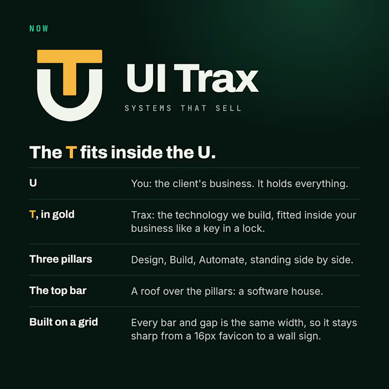
We redesigned the UI Trax logo, and this time every part has a meaning.
The U is you, the client's business. The gold T is Trax, the technology we fit inside it like a key in a lock. The three pillars are Design, Build and Automate. The top bar is a roof over them: a software house.
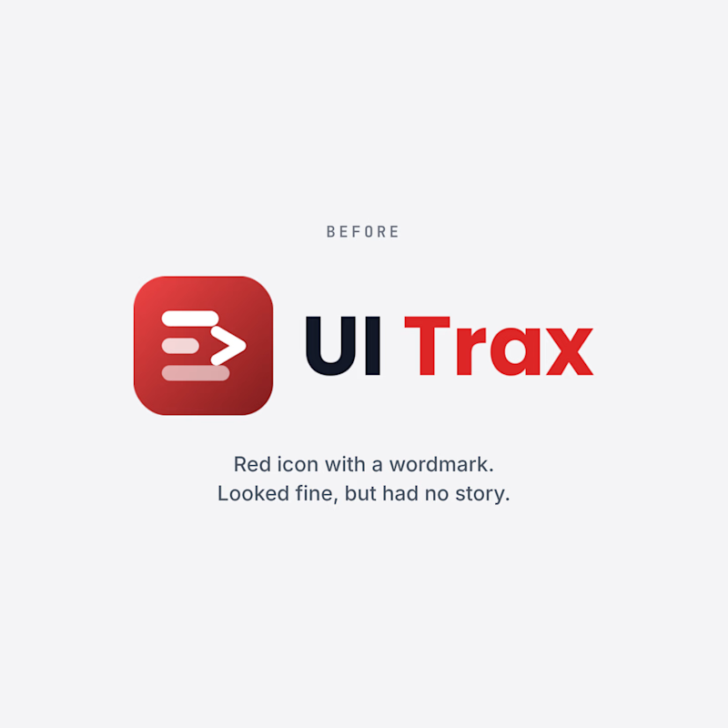
The old logo was a red icon with a wordmark. It looked fine, but it had no story.
Which one would you trust with your project? Vote, and tell me why in the comments.
#Branding #BeforeAndAfter #UITrax
0 voted
0%
3 voted
100%
3 votes
Closed

Now — the UT badge tells the story better.


How far can you take a logo beyond the first draft?
I started with Recraft's Logo Maker and a fictional idea: Bibu's Paws, a cosy little dog rescue and adoption shelter.
I wanted the identity to feel warm, homely and full of character, so I explored a few logo directions before settling on the little dog tucked inside a house.
From there, I took the idea further, building out the visual identity with an earthy colour palette, typography, illustrations and a few real-world applications: the shelter space, dog merchandise and an adoption welcome kit.
I enjoyed seeing how a small starting point could grow into a brand with its own personality and world.
Now I'm curious: if you were building a brand around this logo, what would you create next?






It turned out so cozy, you did great


