The network for creativity
Join 1.25M professional creatives like you
Connect with clients, get discovered, and run your business 100% commission-free
Creatives on Contra have earned over $150M and we are just getting started
Back to feedPost
Taste Test

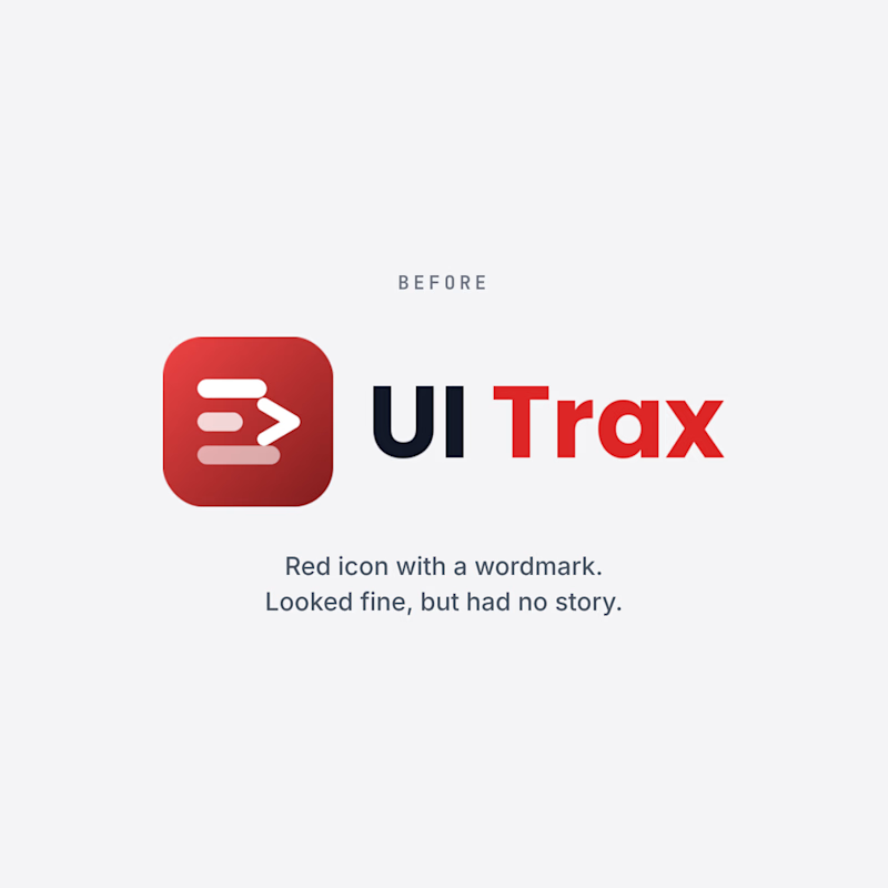
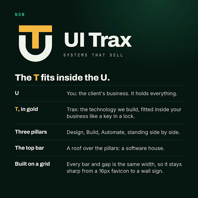
We redesigned the UI Trax logo, and this time every part has a meaning.
The U is you, the client's business. The gold T is Trax, the technology we fit inside it like a key in a lock. The three pillars are Design, Build and Automate. The top bar is a roof over them: a software house.
The old logo was a red icon with a wordmark. It looked fine, but it had no story.
Which one would you trust with your project? Vote, and tell me why in the comments.
#Branding #BeforeAndAfter #UITrax
2 votes
Ends in 1d

Now — the UT badge tells the story better.

Meaningful design details make this brand identity truly stand out.
The network for creativity
Join 1.25M professional creatives like you
Connect with clients, get discovered, and run your business 100% commission-free
Creatives on Contra have earned over $150M and we are just getting started



Related posts

Which brand would you rather spend a year with?
A. Zvezda Works
Zvezda means star. It’s an invented maker of heavy-duty tools and field systems for people who weld, rig, haul and repair. Space-race poster ink, constructivist diagonals, riveted steel, two plates that never quite line up. Loud on headlines, quiet everywhere else.
B. Herbarium Hours
Plant-based skin and body care that treats every ingredient like a specimen. Pressed leaves, field notes, hand-labelled bottles, zero rush.
One feels like a poster pulled fresh off a press. The other feels like a page from a naturalist’s notebook.
21 voted
48%
23 voted
52%
44 votes
Closed

Nice!

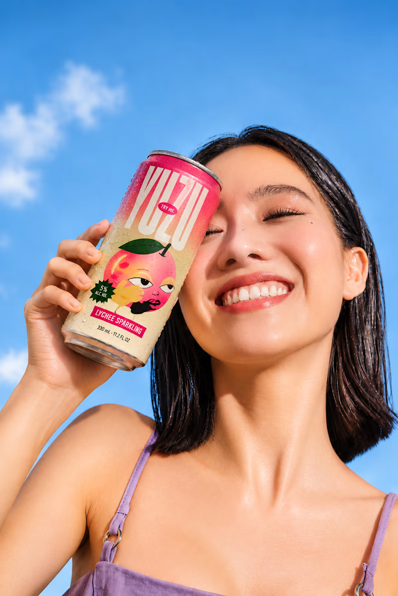
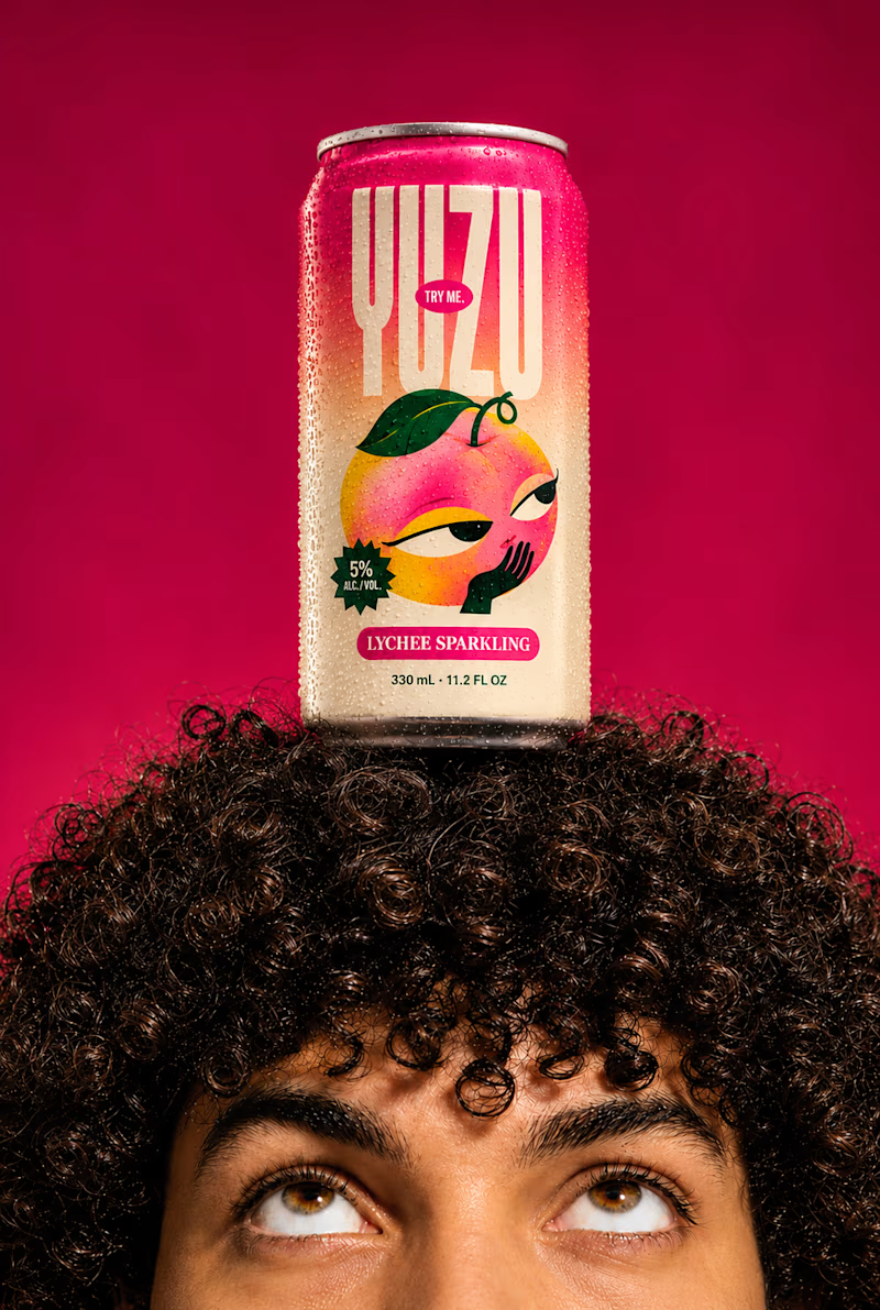
YUZU Flavor Face-Off — Which One Wins?
39 voted
48%
43 voted
52%
82 votes
Closed

Fresh & Bold gets my vote. That deep red makes the can impossible to miss, and the design lets the product do the talking instead of the lifestyle shot around it. Sweet & Playful is lovely photography, but on a shelf I think the red one is the one you'd actually pick up first.


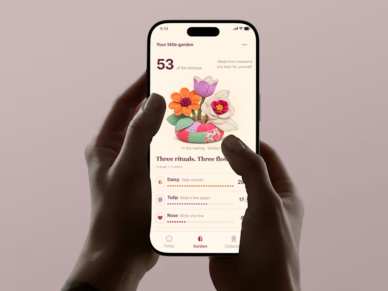
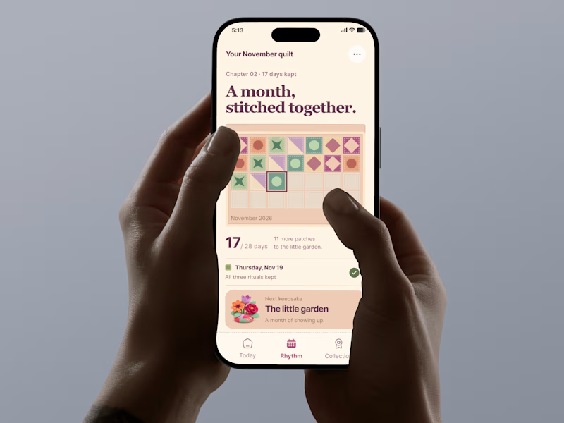
🌸 What drives long term retention in wellness apps: emotional ownership or visible progress?
Two approaches to the same product challenge.
🅰️ The Garden: Emotional Ownership
Every completed ritual grows a personal keepsake. Progress becomes something beautiful to care about.
🅱️ The Quilt: Visible Momentum
Every completed day adds a patch to a bigger story. Progress becomes tangible, cumulative, and rewarding.
Both turn everyday habits into something users create, not just track.
If you were building a wellness app, which approach would you bet on for long term retention?
🌸 A: Emotional ownership
🧵 B: Visible momentum
Why?
#TastyTest #GrowthUX #WellnessApp #Gamification #ProductDesign #AsolDesign #MobileAppDesign
28 voted
76%
9 voted
24%
37 votes
Closed


emotional ownership is a smart angle for retention