The network for creativity
Join 1.25M professional creatives like you
Connect with clients, get discovered, and run your business 100% commission-free
Creatives on Contra have earned over $150M and we are just getting started
Back to feedPost

Why do half the skincare and fashion brands launching this year look like they share the same designer?
Serif logotype, tight tracking, one accent color. ✅ It reads as elevated the first time. By the twentieth brand, it reads as a template, not a decision.
Safe typography isn't neutral, it's a choice too, sometimes one that avoids taking a position 🤭.
So I designed a set of mockups with custom letterforms built to argue the opposite: type with weight, texture, and enough attitude to hold its ground on a shelf full of quiet logos. 💅
What's the last fashion or skincare brand whose type actually made you stop scrolling?

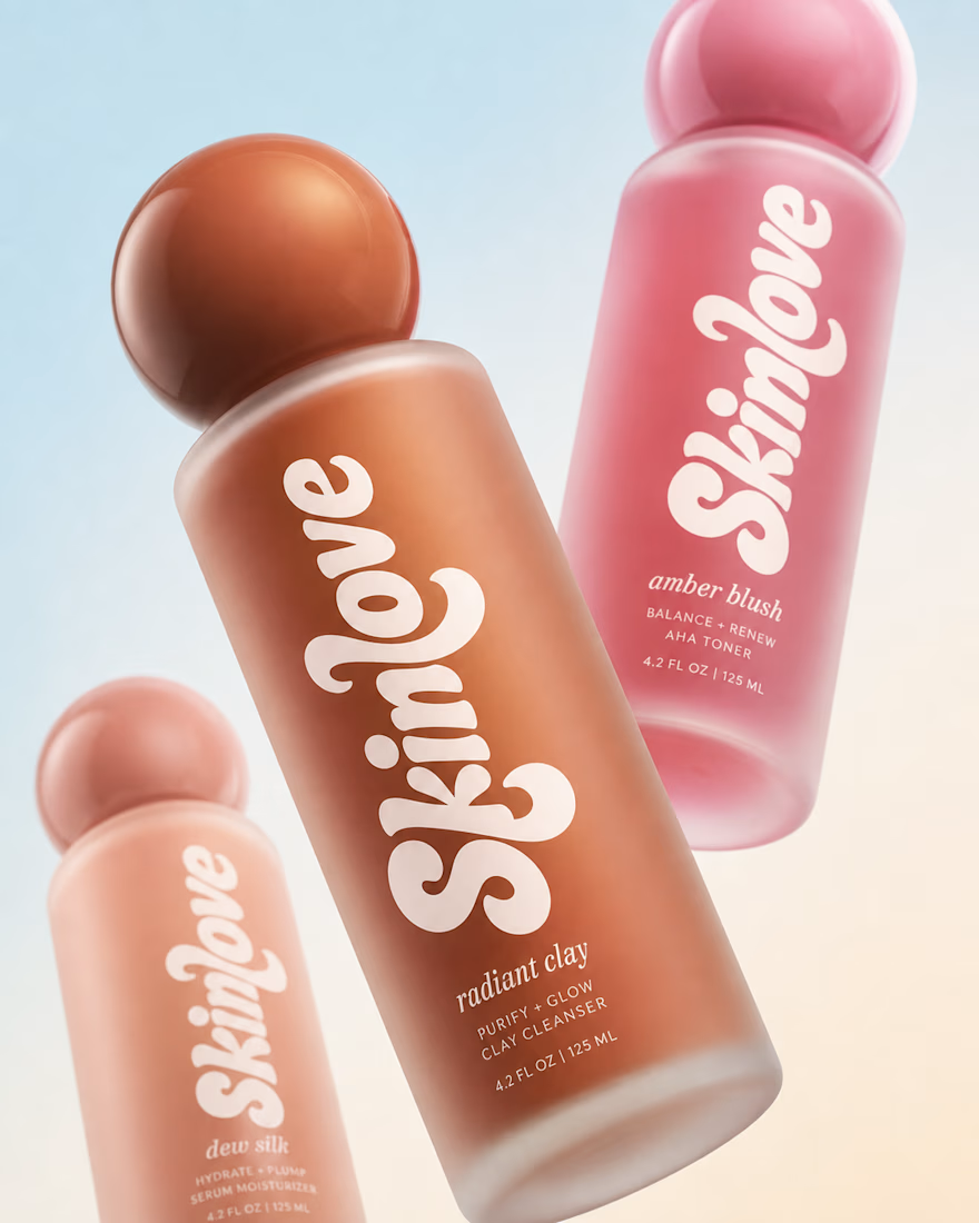
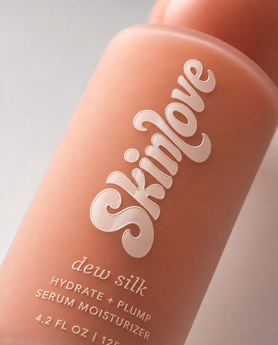
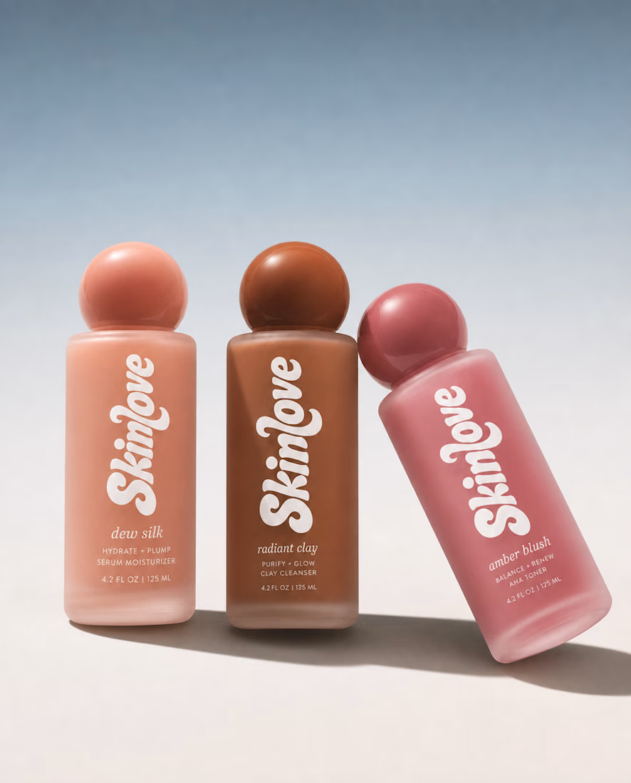


That cap, texture and typography fits very well together. This really is different, yet safe. Good work!
Thank you!

Nice

Awesome!

Amazing 👏

Love how the bold lettering works with those rounded bottles. So much personality! ✨

The line between elevated and template isn't the serif logotype itself, it's repetition — the twentieth brand makes the same safe choice read as a template, not the first one.

wow,super👍
The network for creativity
Join 1.25M professional creatives like you
Connect with clients, get discovered, and run your business 100% commission-free
Creatives on Contra have earned over $150M and we are just getting started

Challenges
View all


Related posts


Product first or brand first? 🤔
We're cutting the promo reel for our case study and can't agree on its start. ✨
Which product ad opening would make you stay past the first 3 seconds?
Vote and tell why! 👇
Product DesignSoftware DevelopmentAdobe After EffectsCinema 4DFigmaBrand DesigncreativeaiworkflowUX Design


15 voted
25%
46 voted
75%
61 votes
Closed

I think both is important, but good product first.

Ram Mascot Logo Design




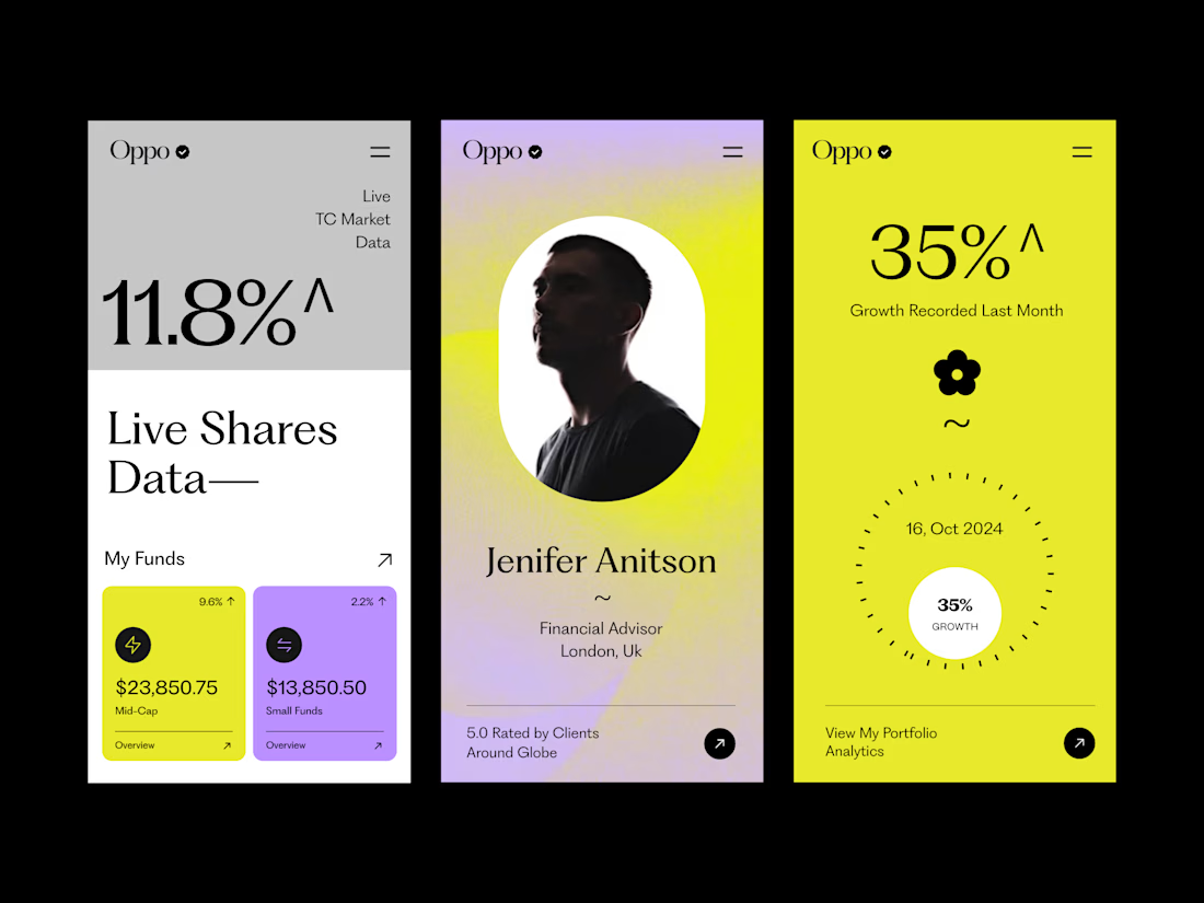
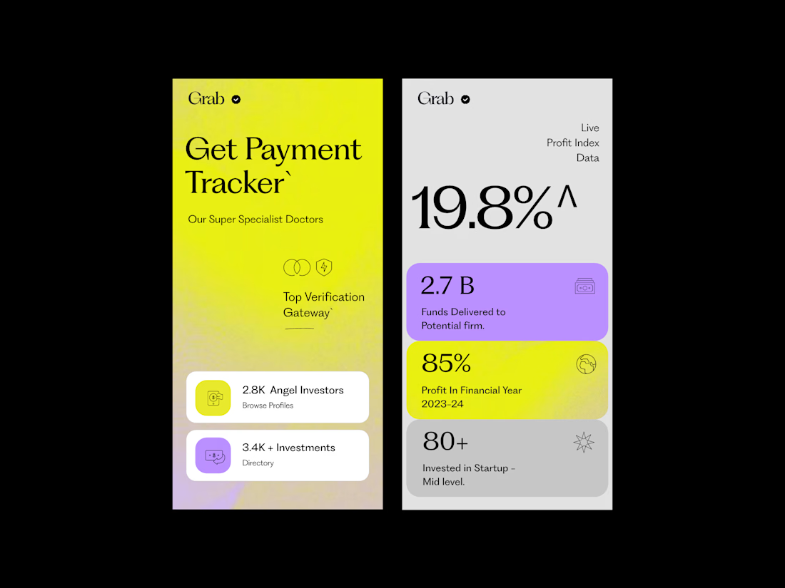
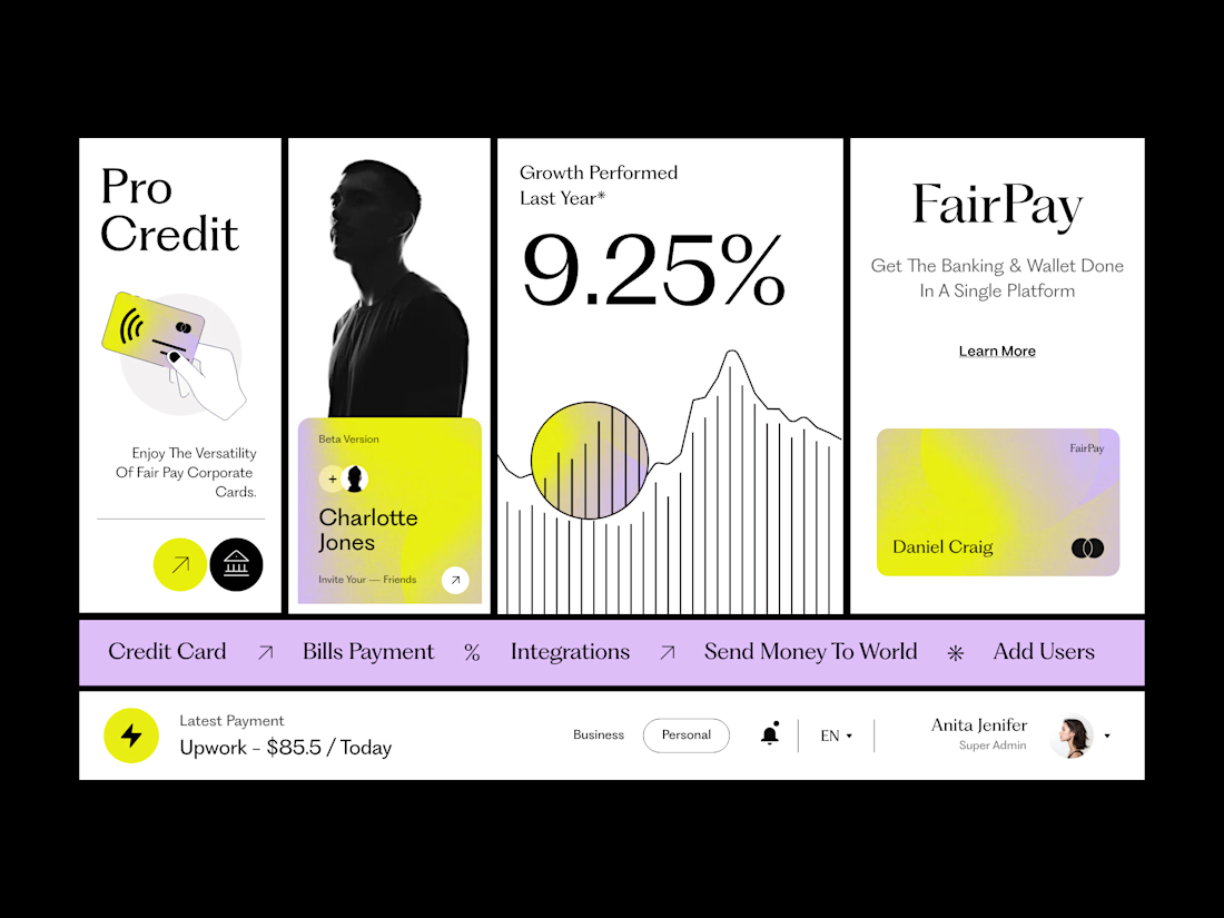
The typography is doing most of the heavy lifting here. The large type, strong contrast, and simple font choices give the screens a very confident look.
The oversized numbers and headlines create an immediate focal point, while the smaller text is kept simple so it doesn’t compete. The different type sizes create a clear hierarchy, making it easy to understand what to look at first and what to read next.
What makes it work is that the typography isn’t trying too hard. There are no unnecessary font styles or excessive weights — just the right scale, line height, and spacing between elements.
That simplicity is what makes the overall design feel premium, modern, and well considered.


Clean work !