The network for creativity
Join 1.25M professional creatives like you
Connect with clients, get discovered, and run your business 100% commission-free
Creatives on Contra have earned over $150M and we are just getting started
Back to feedPost
Taste Test

What would you need to see before you call something a full brand?
Today I made two.
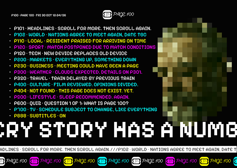
Page 100, a news brand that runs on a ticker and transitions.
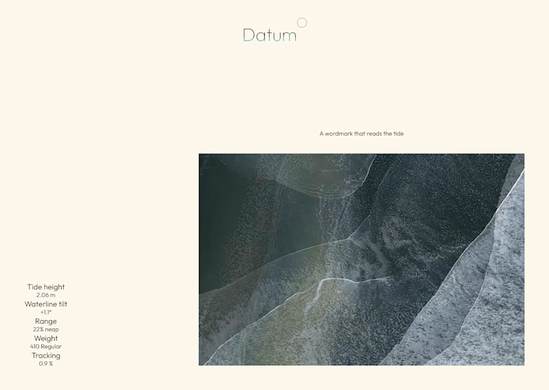
Datum, a wordmark half underwater that reads the tide, so it is never the same twice.
Both are becoming full case studies. What goes in?
12 votes
Ends in 1d

Lovely work.

Version one looks clean and sick, idnk why, but it looks intresting for me, like smth special. Nice job!

lovely

For me a full brand has to show the system in use. Type, color, motion and a few real touchpoints. The tide idea for Datum is so clever, would love to see how it behaves across applications.
The network for creativity
Join 1.25M professional creatives like you
Connect with clients, get discovered, and run your business 100% commission-free
Creatives on Contra have earned over $150M and we are just getting started
Related posts

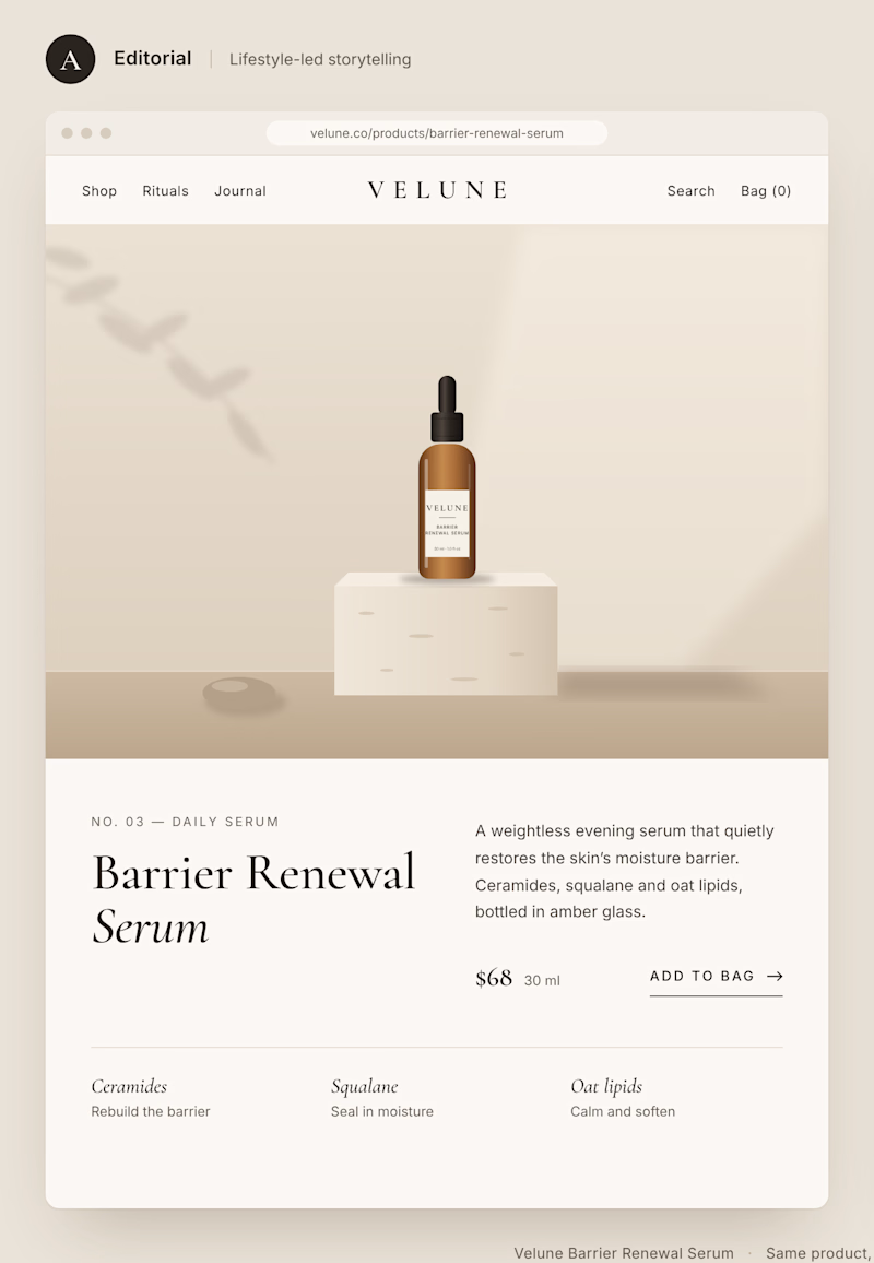
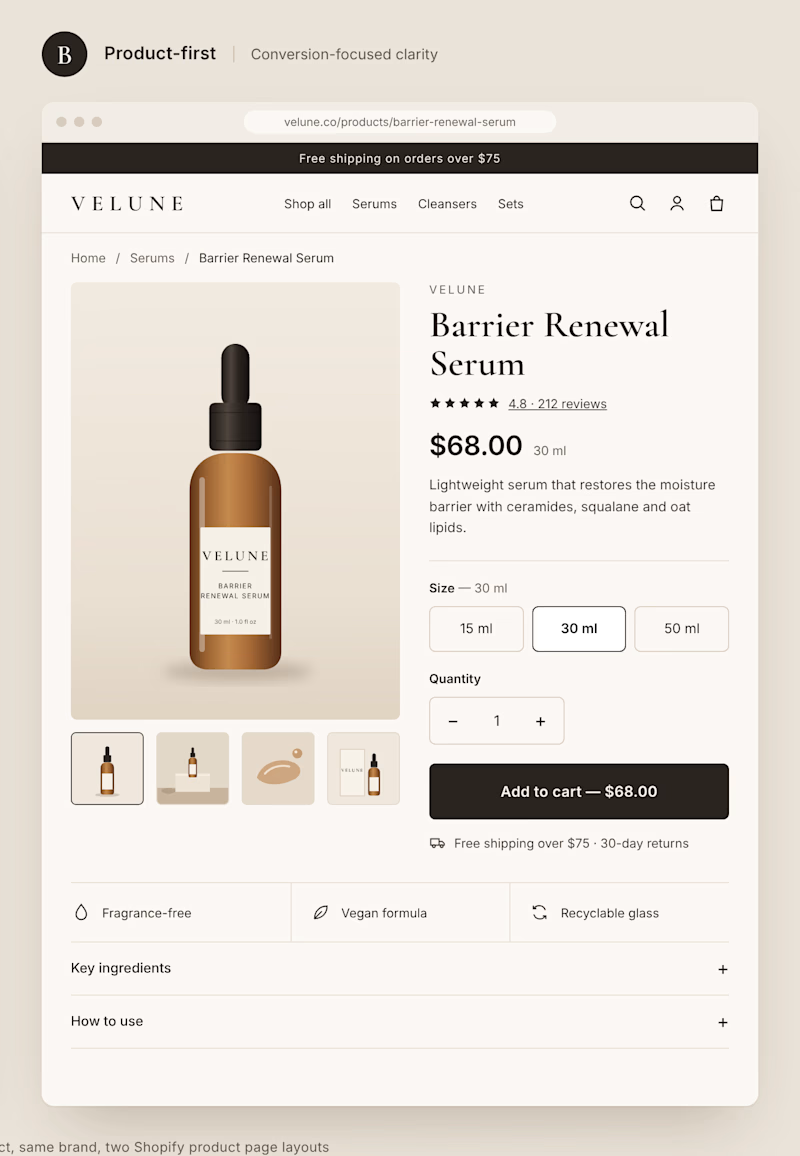
Two different approaches to the same Shopify product page.
Option A: Editorial layout. Large imagery, generous spacing, and a stronger focus on brand storytelling.
Option B: Product-first layout. Clear pricing, visible product options, and a prominent Add to Cart button.
Both can look great, but they create very different shopping experiences.
If you were building a premium DTC brand, which direction would you choose?
A or B? And why?
1 voted
11%
8 voted
89%
9 votes
Closed


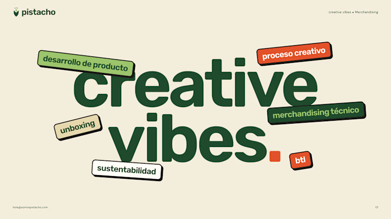
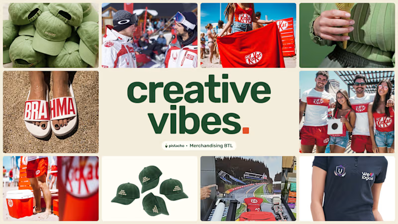
Which cover for a brochure's creative company?
8 voted
30%
19 voted
70%
27 votes
Closed

Went with A. The type does the work on its own, and B's photo grid fights with the headline.


We’re testing two filtering layouts for a template library.
Top Filters
The filters are placed above the content. This option feels lighter, leaves more space for the cards, and works well when there are only a few main categories.
Sidebar Filters
The categories remain visible in the sidebar. This makes the available options easier to scan and works better for more complex filtering, but takes up some of the content space.
Which layout would help you find the right template faster?

24 voted
39%
37 voted
61%
61 votes
Closed

Such a clean presentation. You can tell a lot of thought went into this.