The network for creativity
Join 1.25M professional creatives like you
Connect with clients, get discovered, and run your business 100% commission-free
Creatives on Contra have earned over $150M and we are just getting started
Back to feedPost

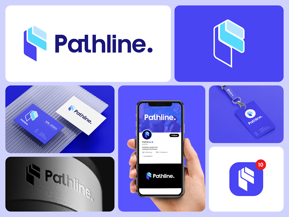
Pathline is a modern trading-focused brand identity featuring a distinctive geometric logo, a bold purple-and-blue color palette, and a cohesive visual system across digital and print applications.


The network for creativity
Join 1.25M professional creatives like you
Connect with clients, get discovered, and run your business 100% commission-free
Creatives on Contra have earned over $150M and we are just getting started

Challenges
View all


Related posts

Returning to foundational assets is always a valuable exercise in brand scalability. Currently, I am preparing and structuring the master delivery files for a new sub-brand—built upon a visual identity system I originally designed a couple of years ago. Designing adaptable brand frameworks from day one is what allows a business to expand seamlessly over time while maintaining complete visual coherence. Looking forward to sharing the final execution soon.
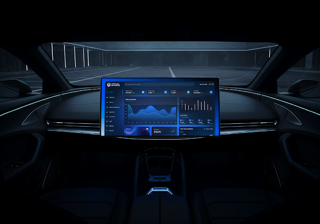
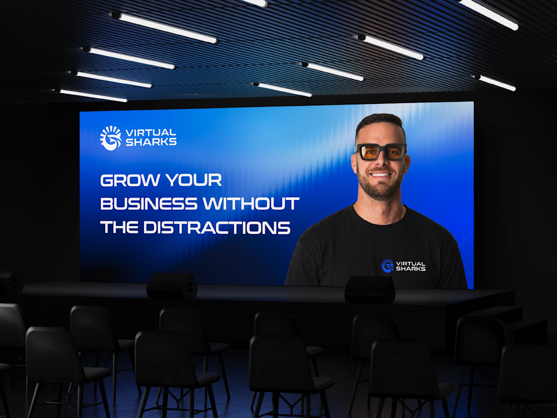


So excited to see Creative Intelligence 2026 by @Contra Labs out in the world!
At @Heed Collective , we had the pleasure of designing both the website and the report. We’re incredibly grateful for this collaboration!
Our creative exploration started with a question:
What does Creative Intelligence mean today?
We believe it lives at the intersection of creativity and analysis, imagination and insight.
We translated this into a visual story that begins in space — vast, dreamy, full of possibility — and gradually moves closer to Earth, grounding imagination in something tangible and human.
Huge congrats to the whole team, @Erin Horner, @Ben Huffman, @Mark Vassilevskiy, @Alex Karpodinis, @Stacy · Heed Collective, @Heed Collective , and the entire @Contra Labs team 👏


Incredible work, congrats!

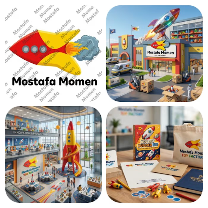
That's my modern minimalist joyful logo that's my case study for it Everything has its joy and kids toys has its own I design this logo because I want to try something different
This logo is mix between vibrant pure yellow and red colors with bold curvy cartoony rocket with cartoony fire and smoke
this logo focus on emotion fun and joy it help to solve the problem of (building trust, showing professionalism & value of brand, memorization, recognition) specially creating attention to attract kids and potential clients