The network for creativity
Join 1.25M professional creatives like you
Connect with clients, get discovered, and run your business 100% commission-free
Creatives on Contra have earned over $150M and we are just getting started


The network for creativity
Join 1.25M professional creatives like you
Connect with clients, get discovered, and run your business 100% commission-free
Creatives on Contra have earned over $150M and we are just getting started




Related posts

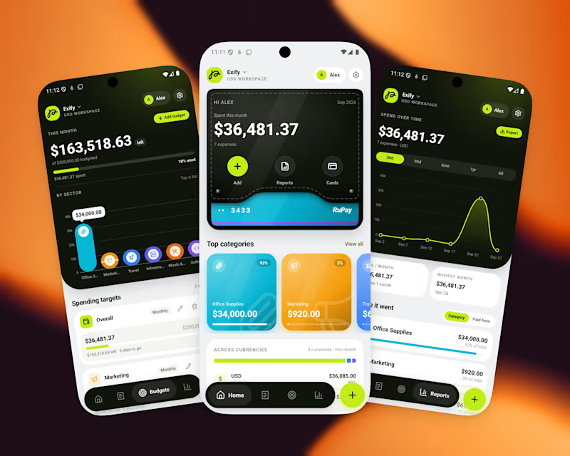
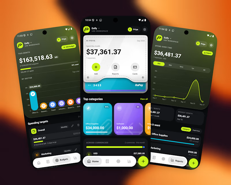
A great app should not just function, It should feel visually distinct
When the market is full of similar-looking products, design becomes part of the product’s well identity
For this finance project, we focused on a sleek UI, intuitive UX, and a visual language that doesn’t feel generic
Both dark and light modes were designed to feel equally intentional.
Which one do you prefer?

16 votes
Ends in 1d

Dark for me. It gives the finance product a more refined and focused feel, while the contrast helps the key numbers and actions stand out naturally. The visual language feels especially strong in dark mode.

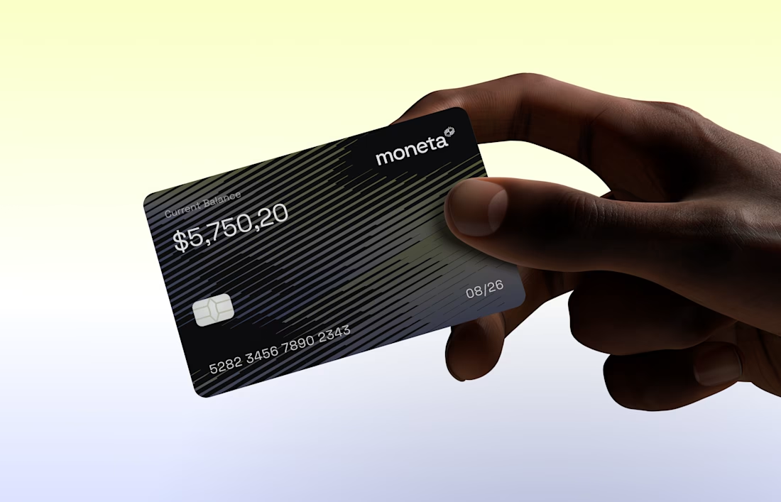
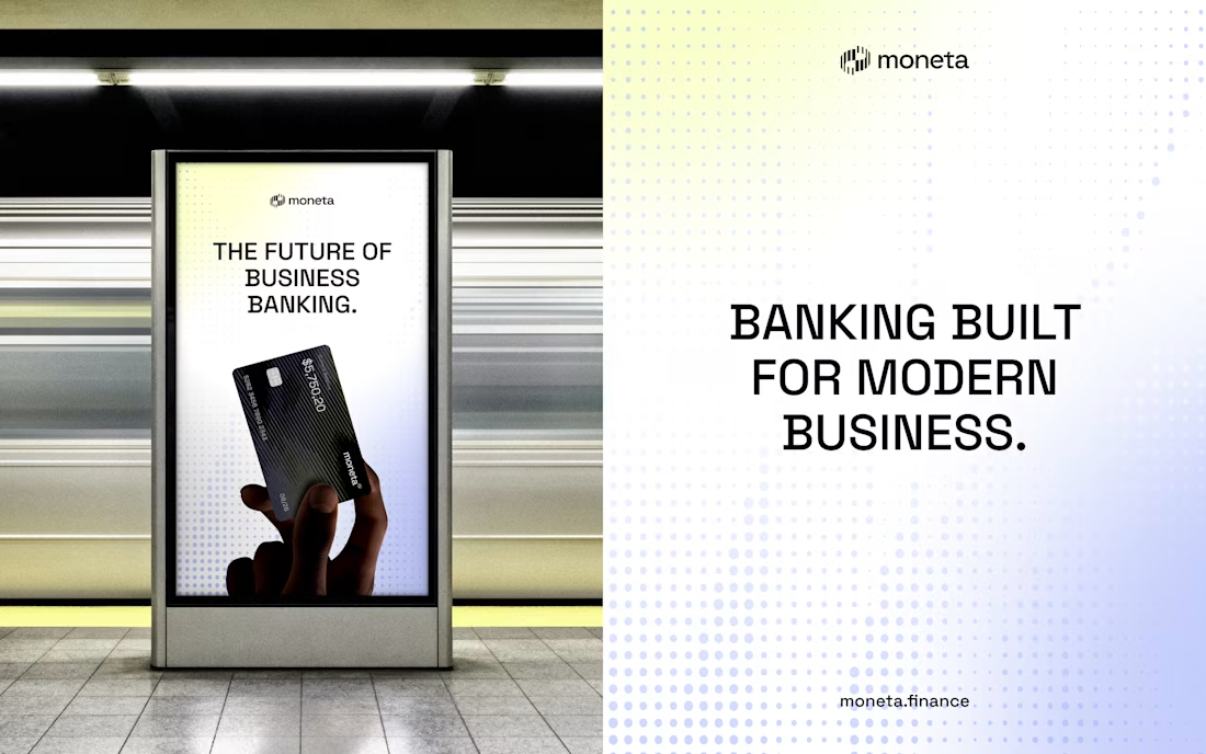
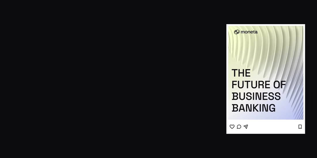
Introducing Moneta, a digital banking brand concept for modern businesses, built around clarity, confidence, and simplicity through a refined visual identity designed for digital experiences and business touchpoints.
👉🏼 Check it out