The network for creativity
Join 1.25M professional creatives like you
Connect with clients, get discovered, and run your business 100% commission-free
Creatives on Contra have earned over $150M and we are just getting started
Back to feedPost

Redesign proposal for a chess-for-money platform: a new logo with the $ built into the knight, plus home, log in and sign up with cinematic AI video.✨♟️
The challenge
Every screen had its own style and logo, and the home was just an image with two buttons. Not enough to trust a site with your money.
What I did
A new logo: no shield, the $ lives in the knight’s curve.
A home that explains it: “Play chess. Win money.”, how it works and fair play.
Shorter log in and sign up, with chess.com rating checks.
AI video panels and mobile versions.
The network for creativity
Join 1.25M professional creatives like you
Connect with clients, get discovered, and run your business 100% commission-free
Creatives on Contra have earned over $150M and we are just getting started





Related posts

Designed a site for an AI data company that doesn’t sell data, it sells what data becomes.🫶🏼


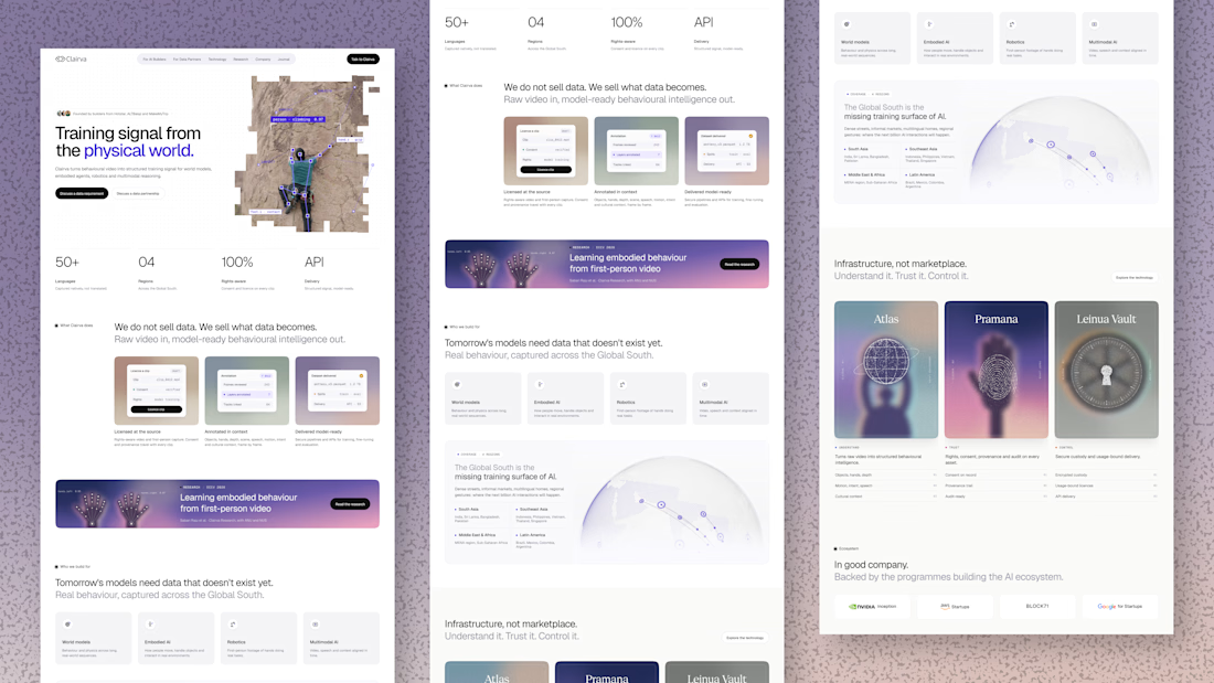
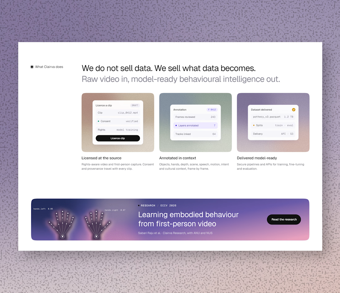
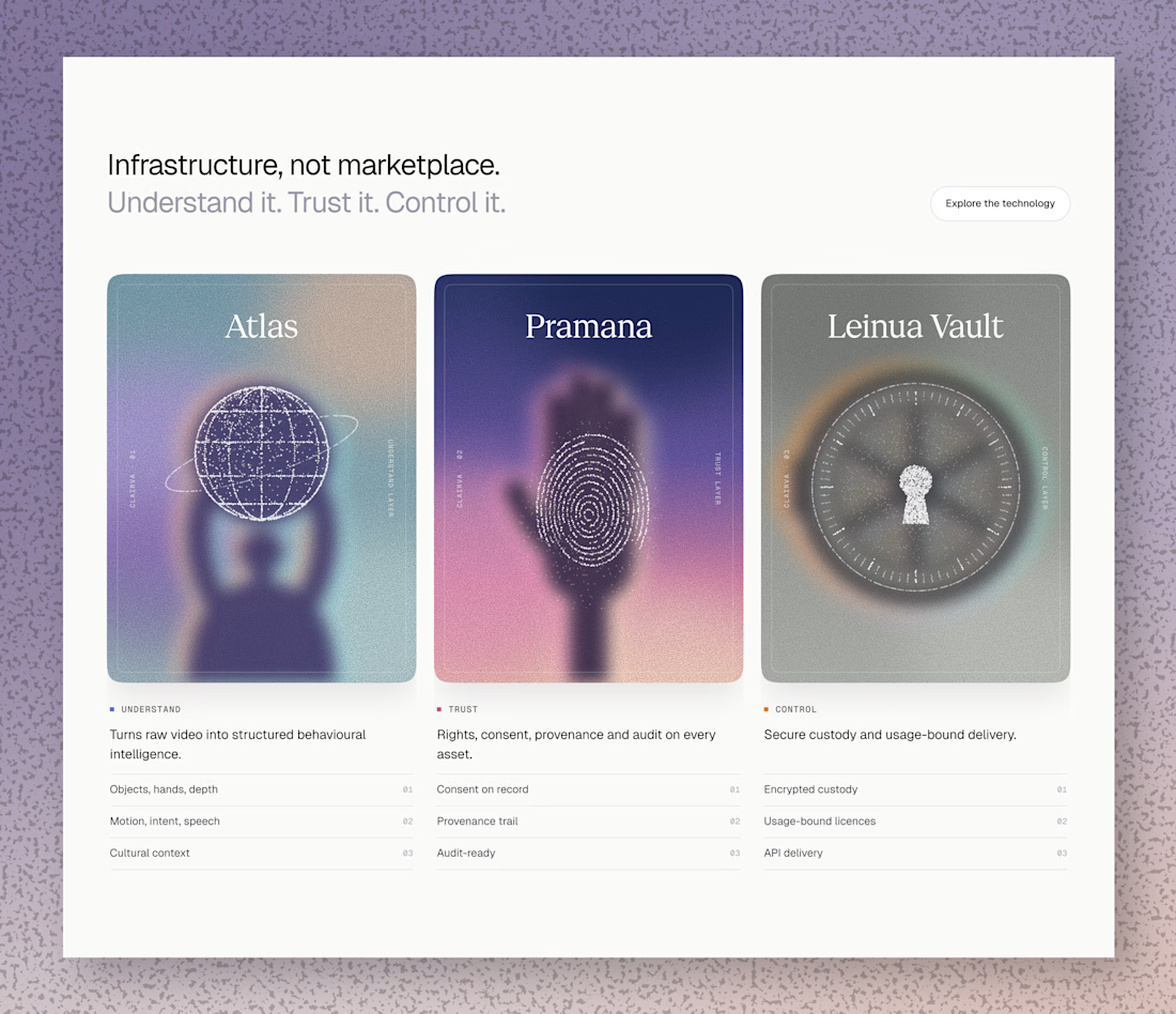

Those purple cards look like tarot cards for data, I'd pick Atlas 😄 Really nice soft colors

Pull into the drive-in and save three spots for your friends. 🚘
I built LOT 66, a custom Video.js v10 skin for the Contra challenge. Start a live watch room...


Has AI taken my job yet? 👀
As a designer, I feel like I constantly need to keep up with new tools and products, if only to keep my "has a computer replaced me already?" anxiety under control
At first, we expected AI to do everything with one click
Then we moved on to writing ridiculously long and detailed prompts
And now I feel like we're finally getting to a healthier place with our expectations: build a good system → get good results
I went to play with Recraft's new Logo Maker to see if AI can actually make decent logos now
Weeeeell, you can see the result for yourself! 🤩
Sure, it's not a magic button that reads your mind and does everything for you. But if you have a clear sense of your brand's style and personality, the results can be surprisingly good
Left - my usual aesthetic. Right - Recraft's take on me
So, what do you think of my one-click logo?
Does it feel like me? 🪩✨


“Build a good system, get good results” is exactly where I’ve landed too. The tool only goes as far as your sense of what you’re after. How many tries did it take to get there?

