The network for creativity
Join 1.25M professional creatives like you
Connect with clients, get discovered, and run your business 100% commission-free
Creatives on Contra have earned over $150M and we are just getting started
Back to feedPost

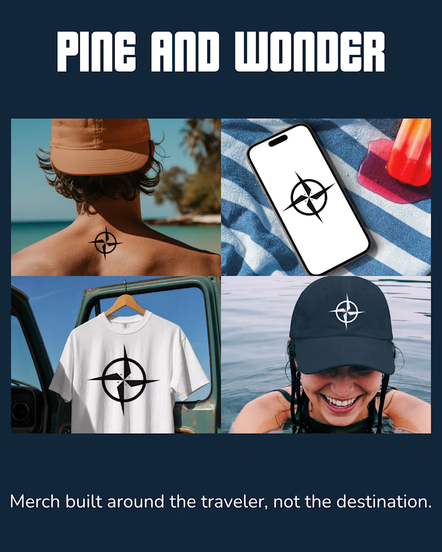
Meet the Pine and Wonder compass, a mark I built around one idea: travellers aren't all the same, so why does travel merch always look like it 😅
Most travel brands lean into the destination. Mountains, palm trees, "wanderlust" in cursive. I wanted to flip that.
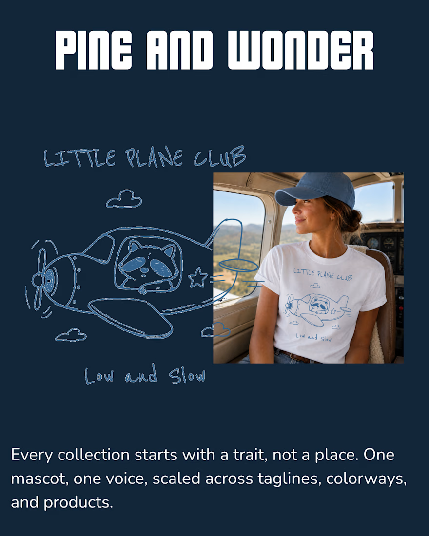
So instead of building around places, I built around people. Every collection starts with a trait, not a spot on a map. Take the raccoon, that's for the traveler who flies low key and takes it slow. No rush, no itinerary packed to the minute, just along for the ride. That one trait became the whole "Little Plane Club" mascot, down to the sleepy grin and the "low and slow" tagline.
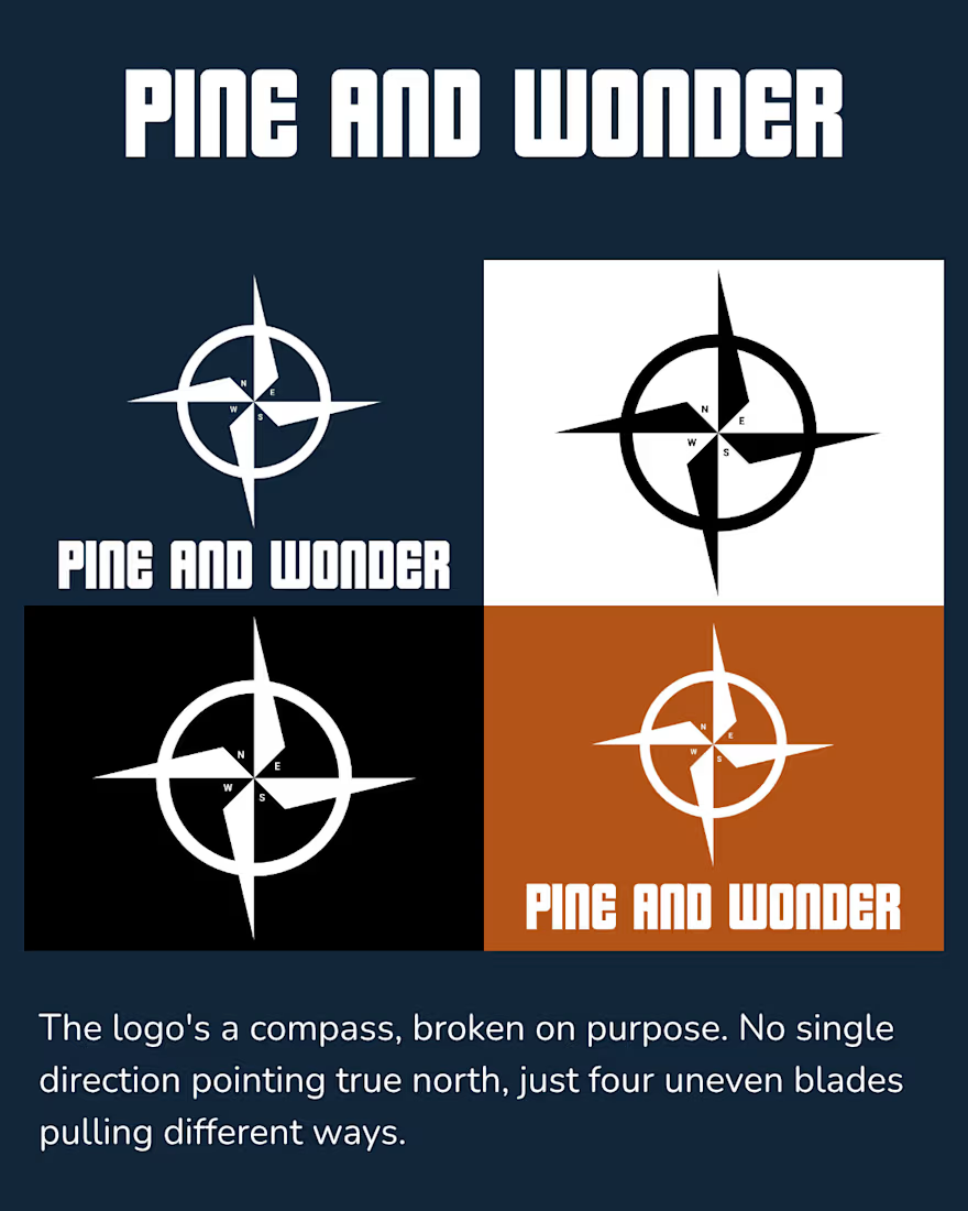
Even the logo plays into it, it's a compass but broken on purpose. No single direction pointing true north, just four uneven blades pulling different ways. Because that's what wandering actually looks like.
The idea was simple: if someone can look at the mascot and go "yeah that's so me," the brand's doing its job before the tagline even kicks in.
Logo, mascot, mockups, taglines, it all had to feel like it understood the traveler, not just sold to them.
This is the kind of project that pulled me toward brand identity in the first place. Taking something generic (travel merch) and giving it an actual point of view.
Full case study in comments 👇
The network for creativity
Join 1.25M professional creatives like you
Connect with clients, get discovered, and run your business 100% commission-free
Creatives on Contra have earned over $150M and we are just getting started










Related posts

Rhyen Lab: Brand Identity & Packaging for a Skincare Brand
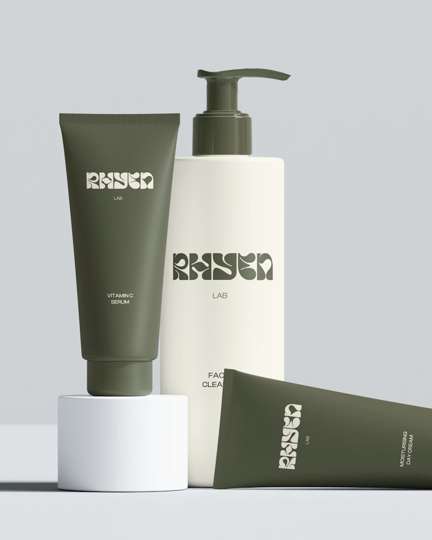
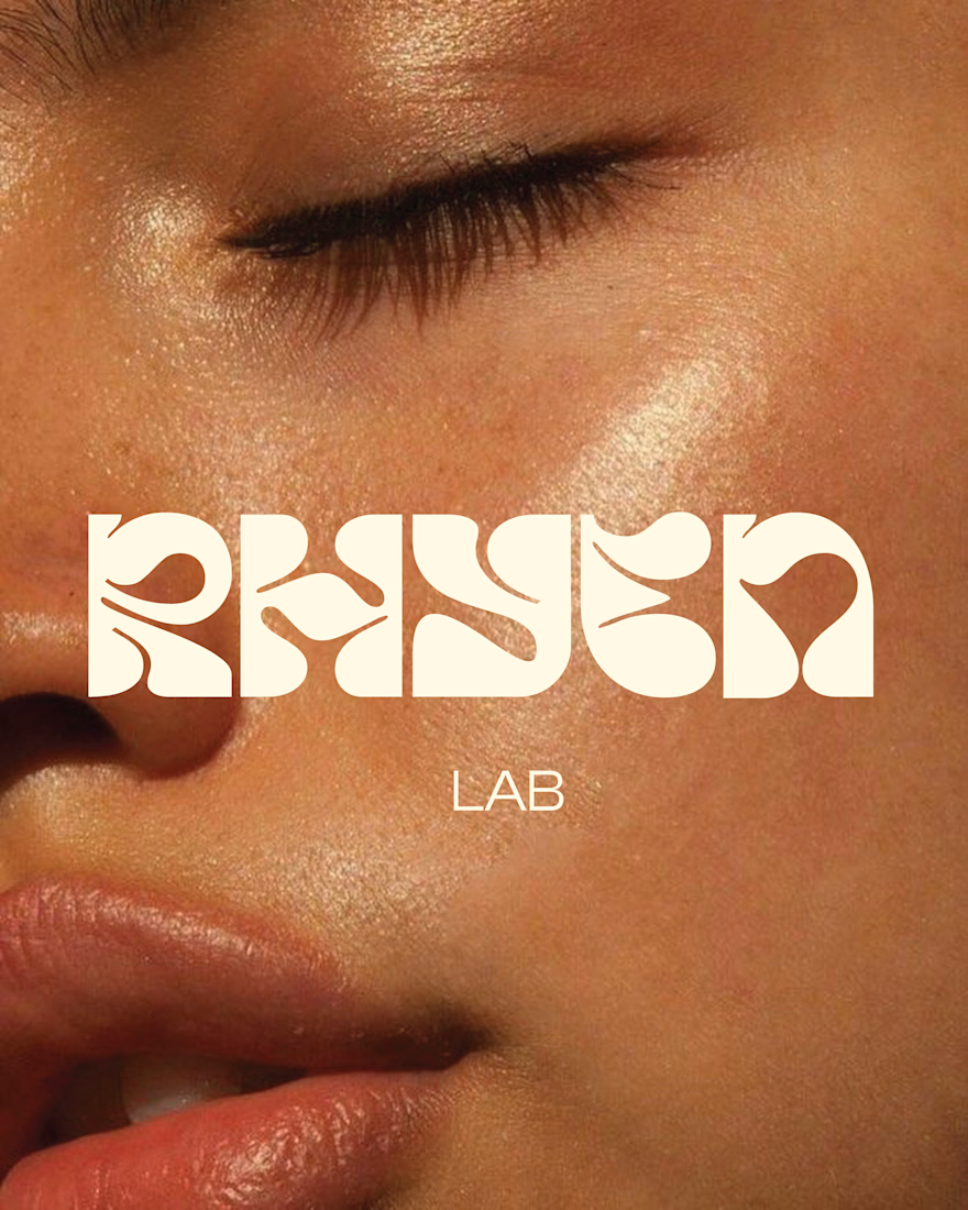
Rhyen Lab is a skincare brand built around science-backed formulas and a sensorial, human approach to beauty. The challenge was to create an identity that feels clinical enough to be trusted, yet warm and expressive enough to stand out in a crowded market.
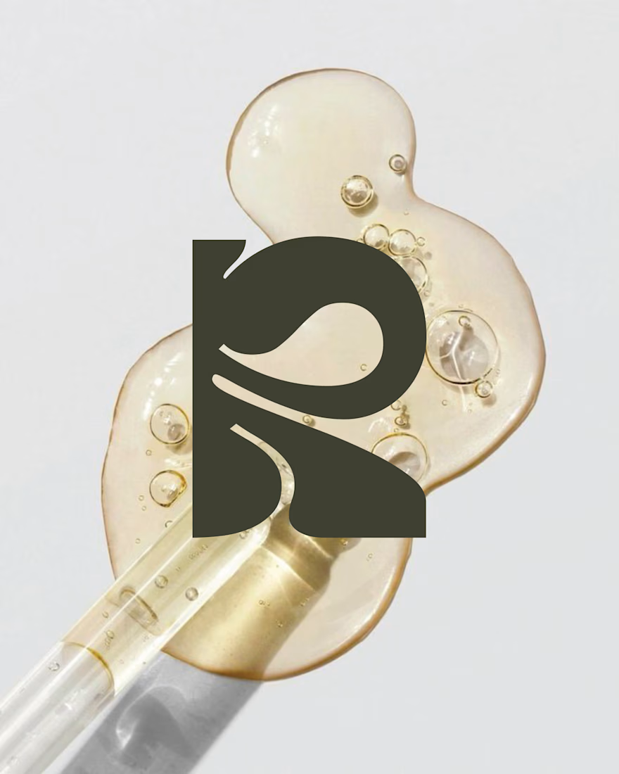
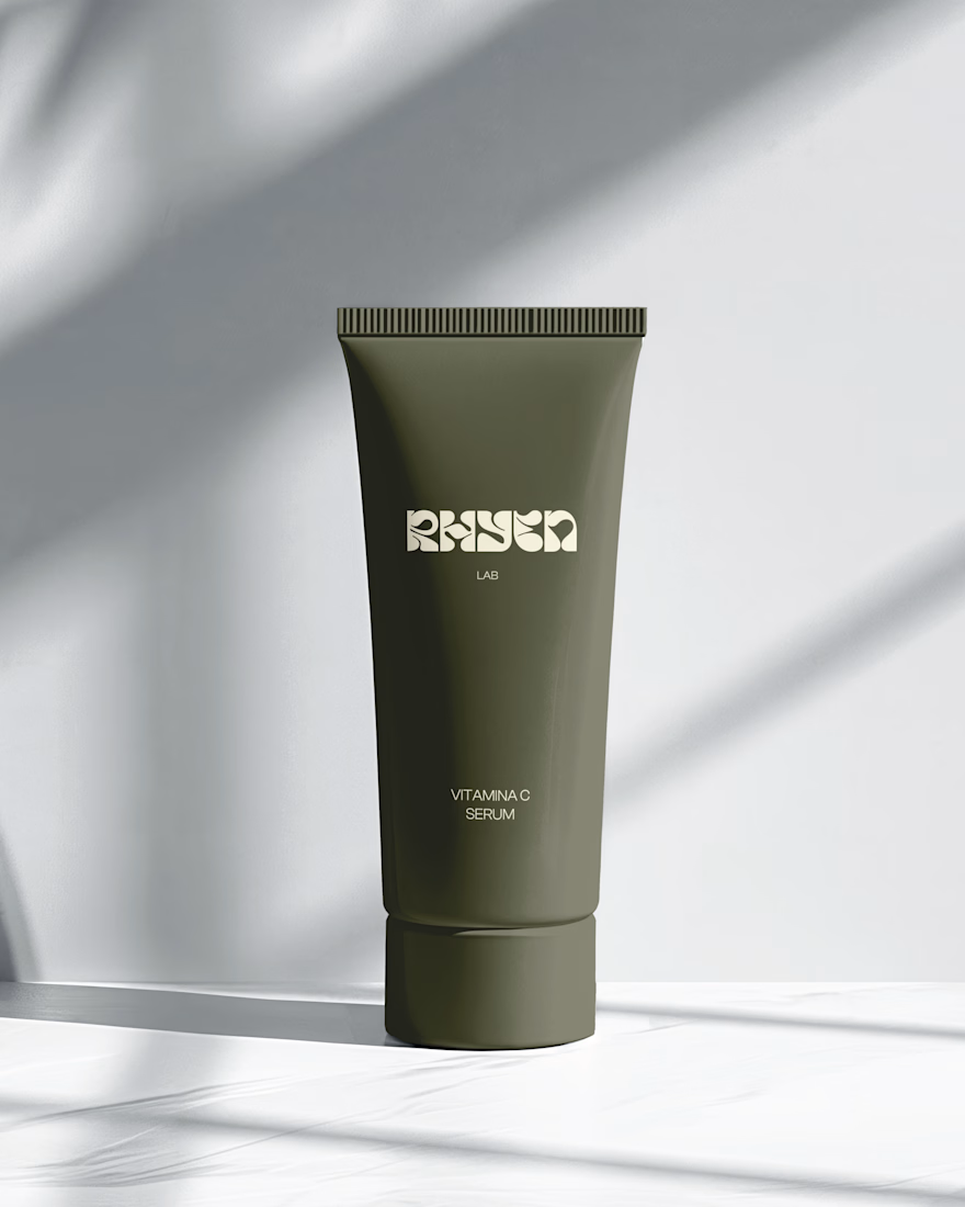
I designed a custom wordmark with fluid, organic letterforms that echo the texture of serums and oils, paired with a bold monogram “R” for compact applications. A palette of deep olive green and soft cream keeps the brand grounded, natural and premium, while macro photography of skin and product textures reinforces the sensorial tone.
The system was applied across packaging for the Vitamin C Serum, Facial Cleanser and Moisturising Day Cream, ensuring consistency across tubes and bottles.
Deliverables: Logo & monogram · Visual identity · Color palette · Packaging design · Art direction




🌶️ Spicy take from my latest identity project
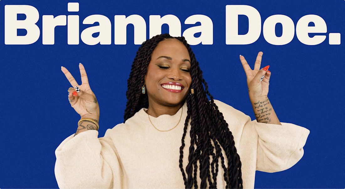
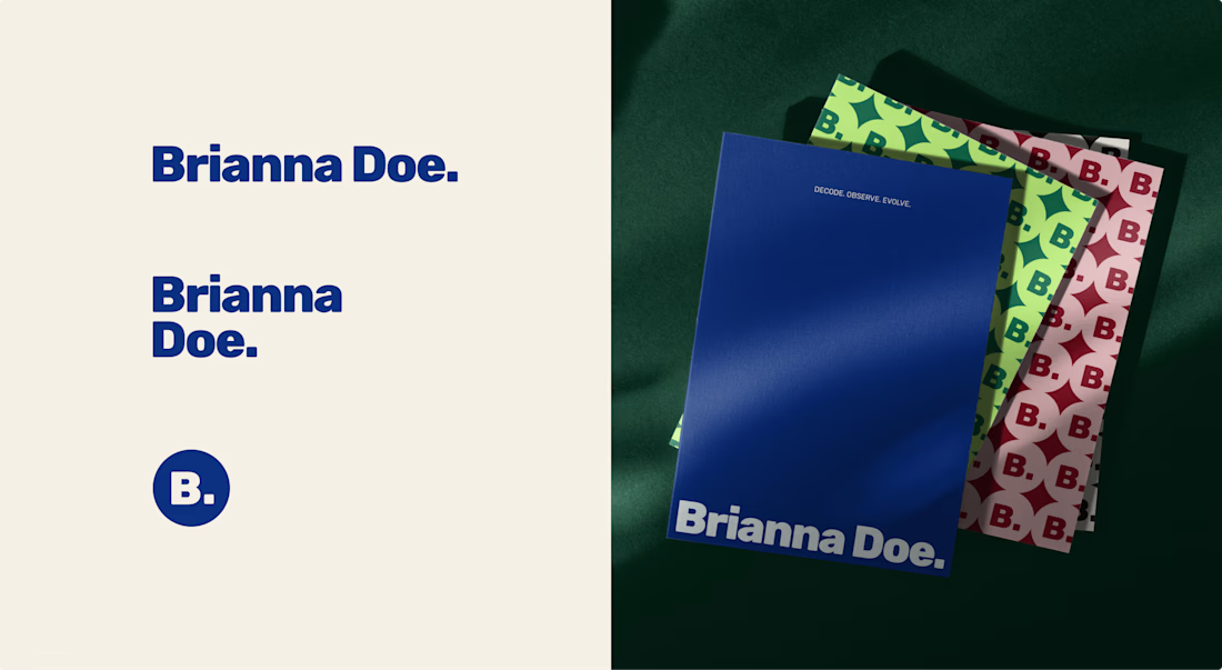
Brianna Doe’s entire logo is her name and a dot. And it does more work than most of the “unique” logos I scroll past on socials.
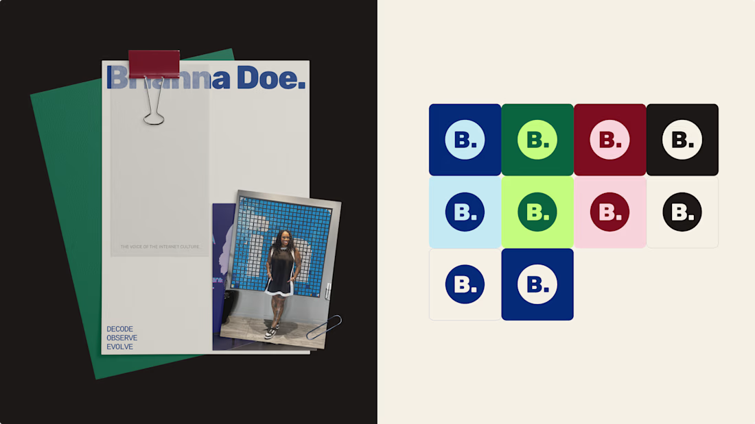
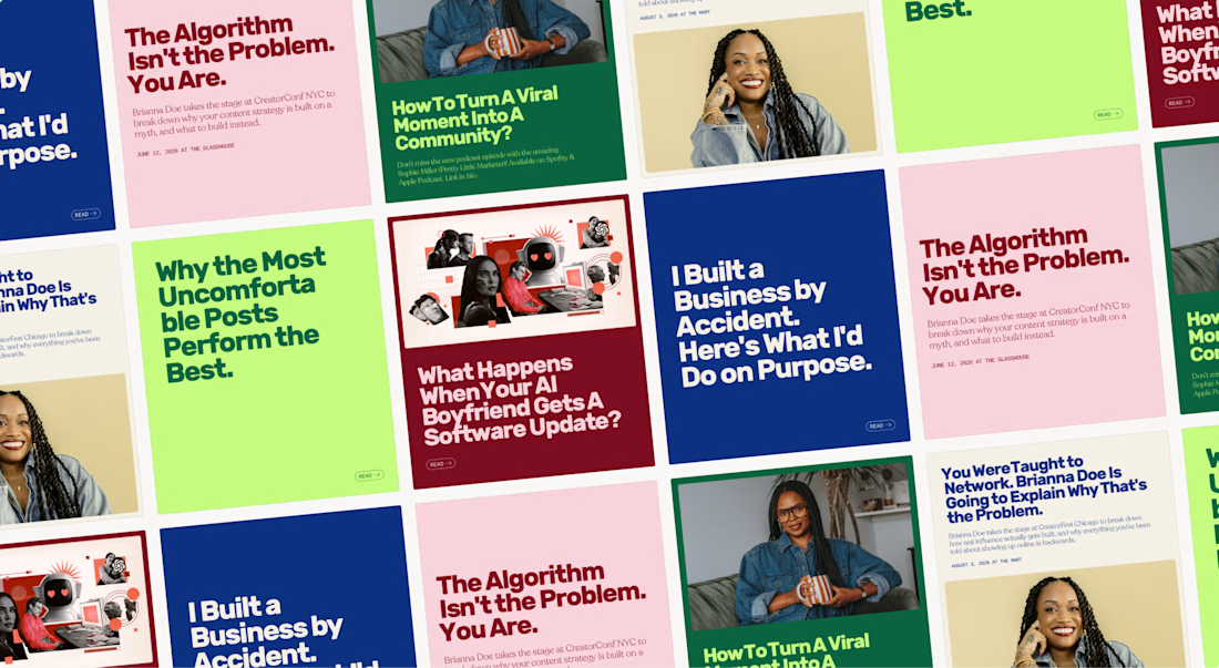
A logo only has to IDENTIFY a brand. Defining it is the job of everything else: creative direction, color & font systems, imagery.
Complicated logos impress other designers, simple ones work for the client.
Check out the full case study to see how a simple logo carries an entire brand identity

Lovely palette. I'm sure the client is stoked.

One of our older branding projects, but it still feels surprisingly fresh.
Cashbox started with a very simple idea: a box-shaped logo.
The identity went a little more out of the box.
Still a good example of how we like to work: keep the core idea simple, then push the visual system much further.


the design here is so immersive & innovative, love it.