The network for creativity
Join 1.25M professional creatives like you
Connect with clients, get discovered, and run your business 100% commission-free
Creatives on Contra have earned over $150M and we are just getting started
Back to feedPost
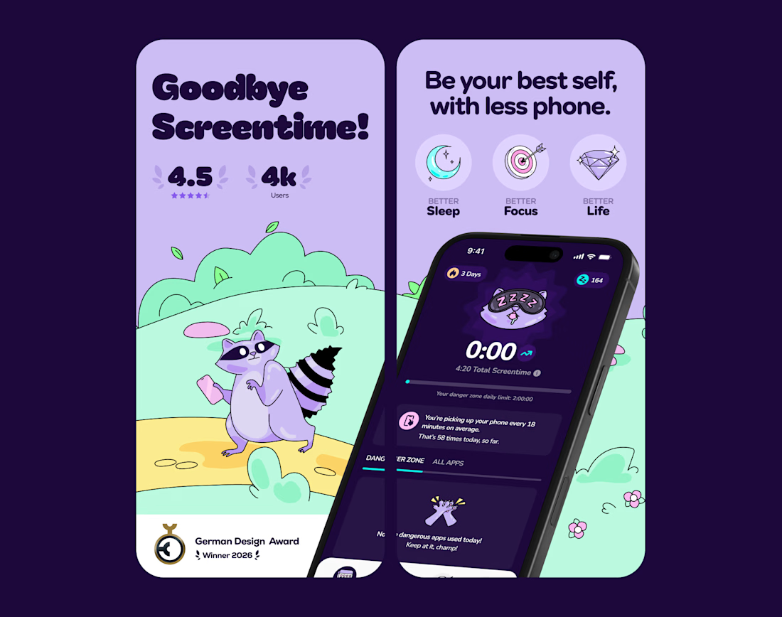
Back to working on Detach! here's a sneak peek of the new Appstore Screens!

this is amazing design

this mascot is everything, adorable & a perfect representation of lost screen time without at all feeling too 'severe' or negative. love it!


app store screens are so underrated

Yeah i think its one of my favorite things to work on! Scope is somewhat tiny but you can do quite a bit with it

The raccoon mascot is such a fun choice for a screentime app, most of these go clinical and cold. Did the illustration style come before or after you landed on Detach as the name?
The name Detach was decided on client side! The raccoons stormed the brand after :)

Such a refined and thoughtful design approach!

Love this

Fantastic font choice, its blending with the overall design style.

Beautiful design and great presentation!

screens looking sharp


Good work👏🔥🔥

Can't stop looking at this!


Love this, Amazing Mascot😍

Amazing

Awesome!

😍 😍
The network for creativity
Join 1.25M professional creatives like you
Connect with clients, get discovered, and run your business 100% commission-free
Creatives on Contra have earned over $150M and we are just getting started





Related posts




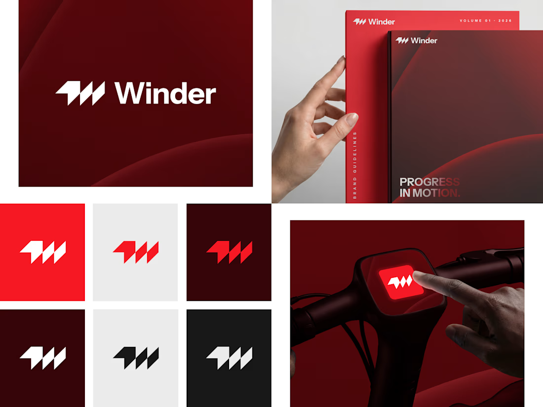
Winder is a bold brand identity built around a geometric W-inspired symbol, combining sharp angles and forward movement to represent progress, speed, and direction.
The identity uses a striking red and deep burgundy palette, supported by clean typography and a consistent visual system across brand guidelines, digital applications, and product mockups.
Progress in Motion.

Great logo it feels it really has an identity 🎉🎉


Rejected logo concepts exploring collaboration, shared expertise & working side by side