The network for creativity
Join 1.25M professional creatives like you
Connect with clients, get discovered, and run your business 100% commission-free
Creatives on Contra have earned over $150M and we are just getting started
Back to feedPost

Complete Shopify Store Design & Development


The network for creativity
Join 1.25M professional creatives like you
Connect with clients, get discovered, and run your business 100% commission-free
Creatives on Contra have earned over $150M and we are just getting started



Related posts

A fashion storefront needs to show the outfit and make its individual pieces easy to find.
For FORM, I paired a warm, editorial lookbook with clearly grouped product names, prices, and size choices.
Cream surfaces, charcoal typography, and consistent product cards connect the homepage with the desktop and mobile screen concepts.
One useful design principle from this project: give campaign imagery and shopping details their own readable zones. The collection can have a strong visual presence while the next product decision stays clear.
Explore the complete design case study:
https://contra.com/p/rNPRqooQ-form-fashion-e-commerce-website-design
When exploring a clothing collection, what helps you most: a styled outfit or an individual product grid?

Adorable

Shopify Abandoned Cart Recovery Automation 🛒
Ever wondered how many potential orders an online store could miss when customers add products to their cart but leave without completing checkout?
I built an abandoned cart automation workflow using Activepieces, Shopify, Google Gemini, Gmail, and WhatsApp Business.
⚙️ How It Works
🛒 Cart Trigger: Detects an abandoned checkout event from Shopify.
🔀 Conditional Routing: Routes the workflow based on configured conditions.
🤖 AI-Powered Messaging: Gemini generates a personalized reminder message.
💬 WhatsApp Reminder: Sends a cart reminder through WhatsApp Business.
📧 Email Reminder: Sends a follow-up email to encourage the customer to complete checkout.
💡 How It Can Help E-commerce Businesses
Remind customers about products left in their carts.
Reduce repetitive manual follow-up work.
Make customer communication more consistent.
Create an opportunity to recover potentially lost sales.
Tools Used: Activepieces | Shopify | Google Gemini | Gmail | WhatsApp Business
Project Type: Personal Automation Project
I built this workflow to demonstrate how automation can support abandoned cart recovery for Shopify and D2C businesses.
Interested in automating your store's customer follow-ups? Let's connect.


The 30–60 minute delay then 24-hour follow-up is a sensible cadence. The part I would harden next is the stop conditions: once the cart converts or the customer replies, every channel should cancel, and WhatsApp especially needs a clear opt-in trail before the first send....

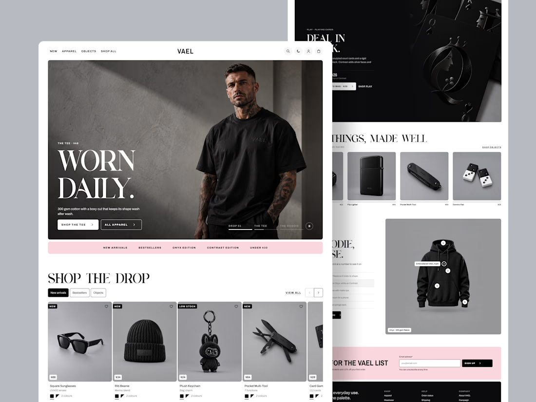
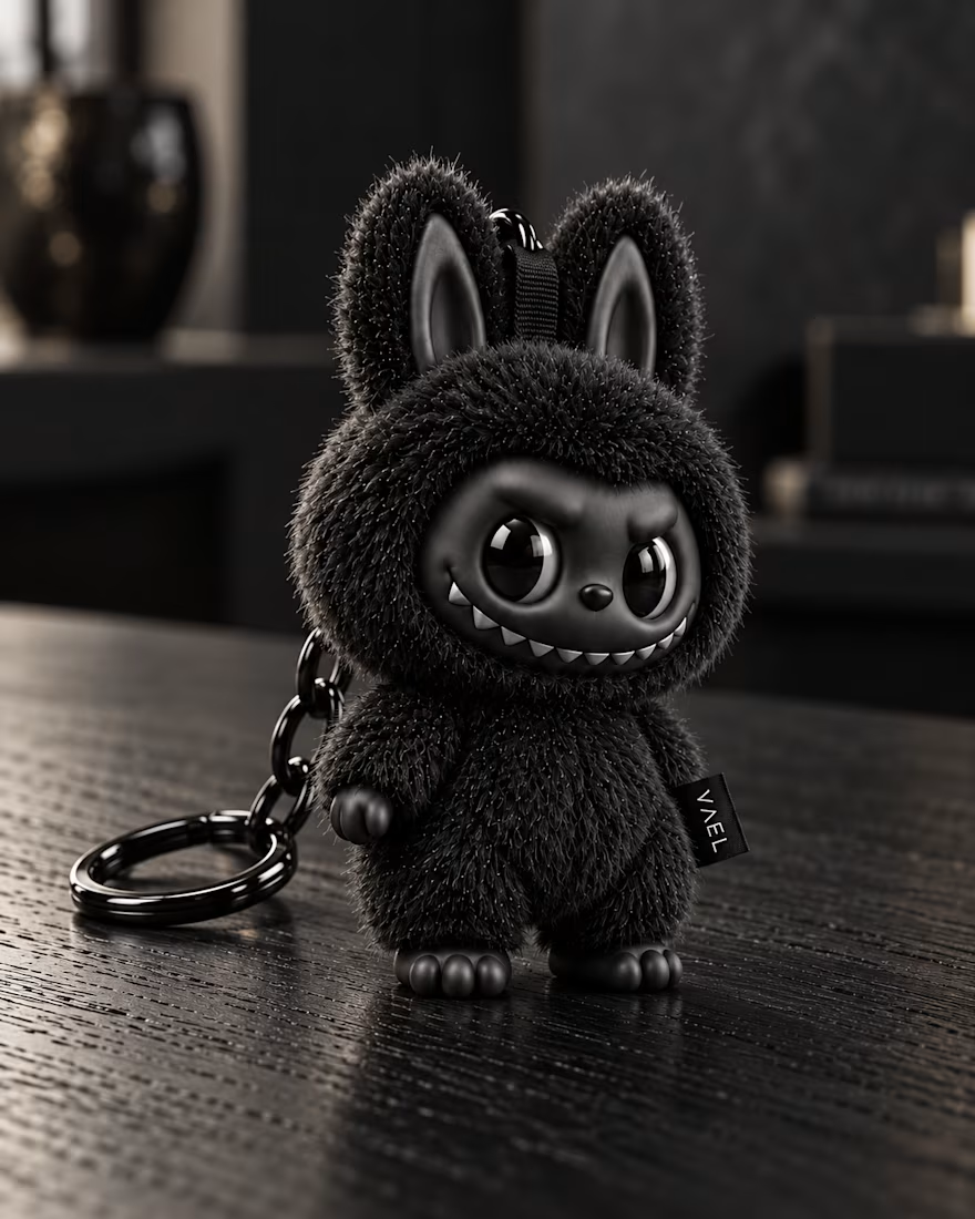
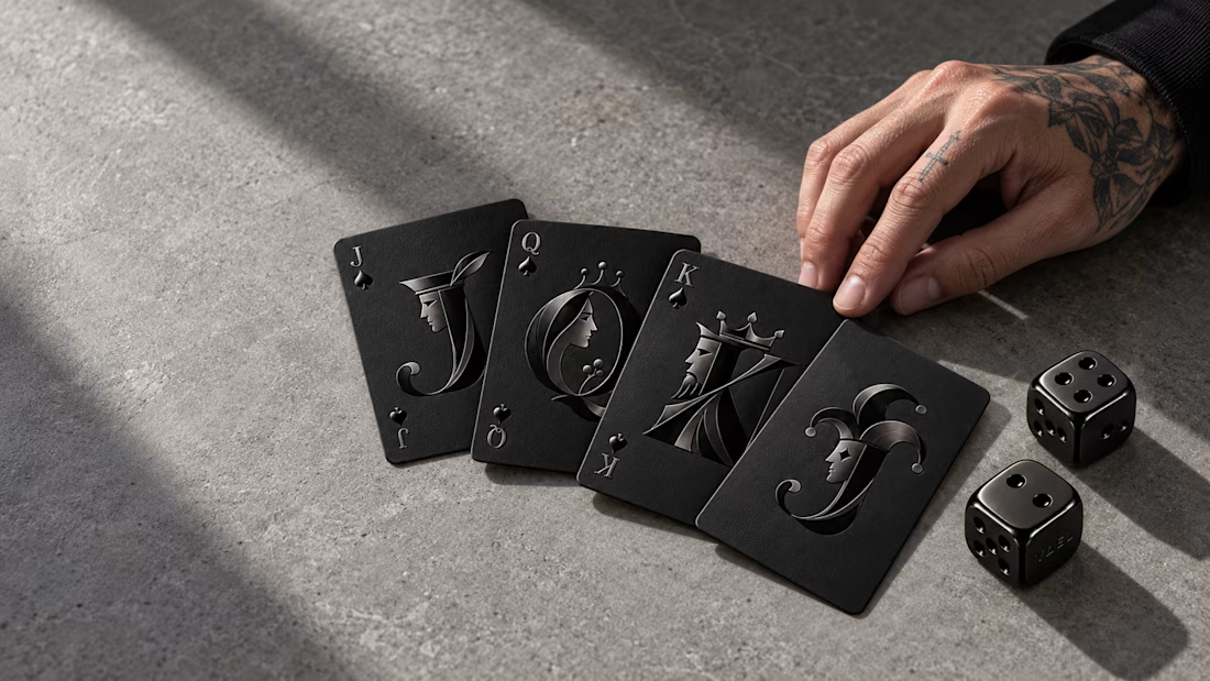
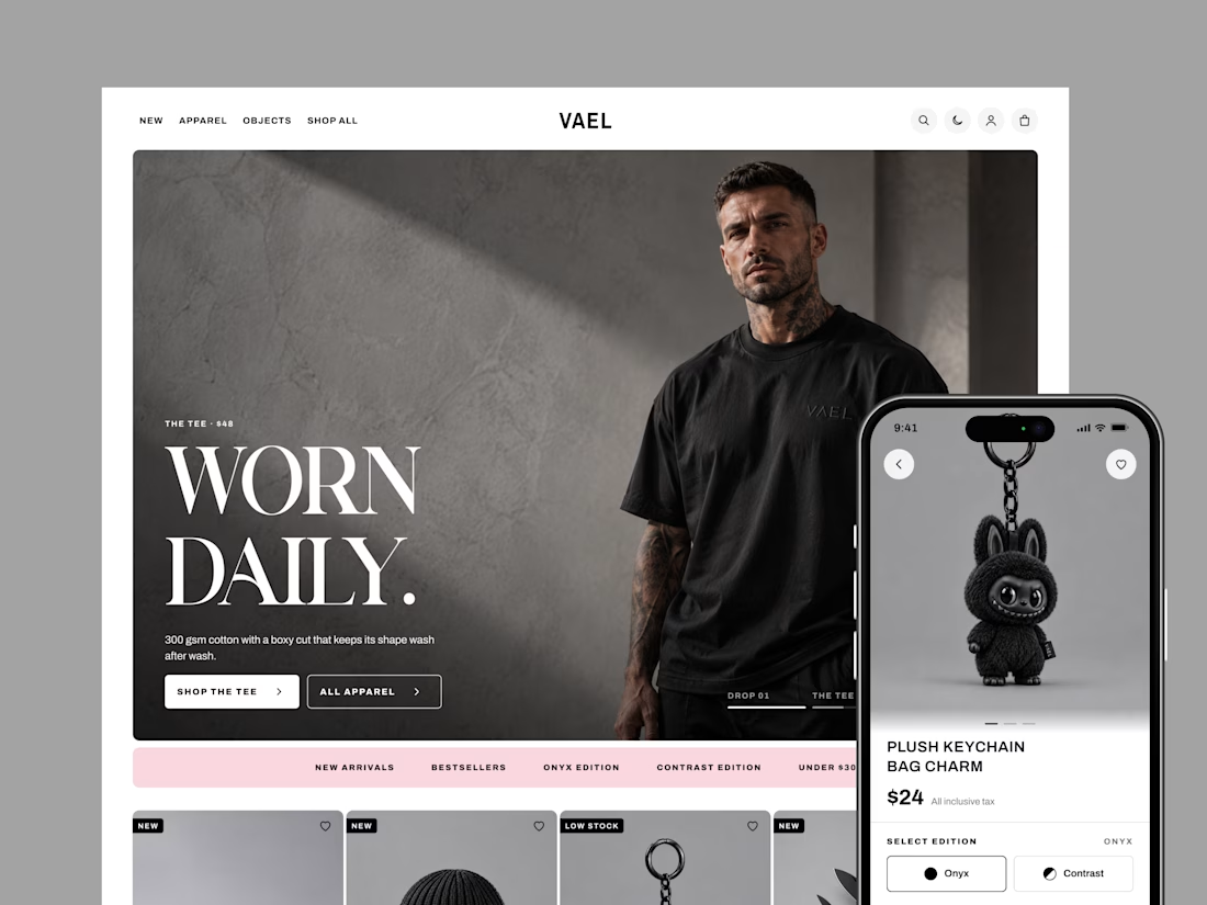
How do you design a store when every product is black? That was the challenge behind VAEL, a brand selling 15 pieces in two editions: Onyx and Contrast.
With no colour to guide shoppers, the design had to do it. Bold condensed type sets the tone, clean outlines show what's selected, and one soft pink highlights sales and rewards.
I designed 20 screens for desktop and mobile, in light and dark mode, from the homepage all the way to checkout.
The result is a store as sharp as the product, and easy to shop. Live demo: https://claude.ai/code/artifact/4e953fd5-47c5-4429-ae8f-e6550690f47b

The single pink accent against an all-black catalog does the guiding really well. How did you pick that one color, and did you test other options?