The network for creativity
Join 1.25M professional creatives like you
Connect with clients, get discovered, and run your business 100% commission-free
Creatives on Contra have earned over $150M and we are just getting started
Back to feedPost
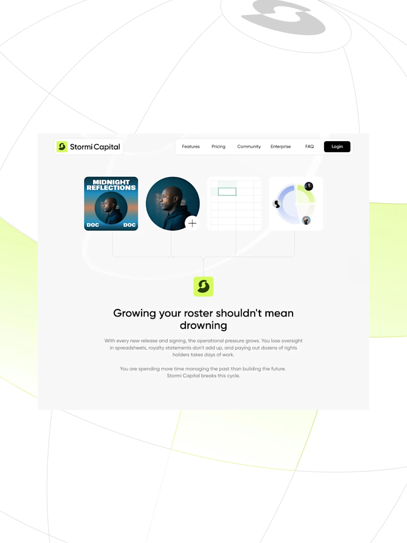
Your career deserves better. (2/2)
Easy to say. Harder to feel.
On Stormi Capital, every micro-interaction turn the promise into a feeling.


Beautiful work Pawel

Thanks Oluwatobi!

looks fantastic
That's fantastic!

eyecatching work, Pawel!


This looks clean and well thought out. How long did it take you to bring everything together?
Thank you. It took around 2 weeks to assemble everything together.
Impressive work for just 2 weeks — really well executed.


Super sharp layout! The way the UI elements float and interact with the photography creates a really immersive experience for the user.


Perfect!

Animations are sick af!


Clean and thoughtful execution.
The network for creativity
Join 1.25M professional creatives like you
Connect with clients, get discovered, and run your business 100% commission-free
Creatives on Contra have earned over $150M and we are just getting started








Related posts


Which feels more established to you?
22 voted
30%
52 voted
70%

74 votes
Closed


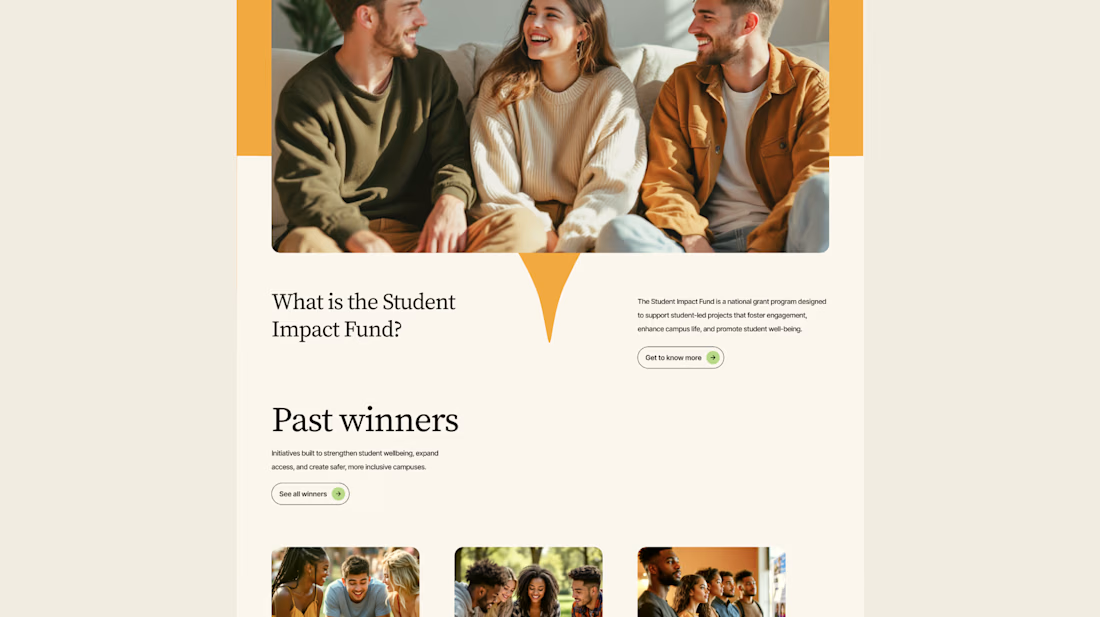
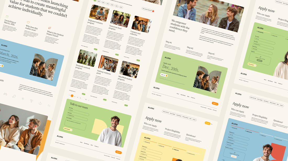
The Client: Alumo is a student impact fund that pools collective influence from influencers and partner schools to deliver a $250,000 annual grant program for student-led projects across Canada.
The Issue: The fund needed a website that could communicate trust and purpose to two very different audiences — students applying for grants and partner schools or influencers considering joining — while also showcasing past winners and guiding applicants through the process clearly.
The Solution: A multi-page website was designed with a warm, approachable visual identity using earthy tones, generous imagery, and clear information hierarchy. Each section — About, Past Winners, and How to Apply — was structured to reduce friction and build confidence, making it easy for students to understand eligibility and take action before the deadline.

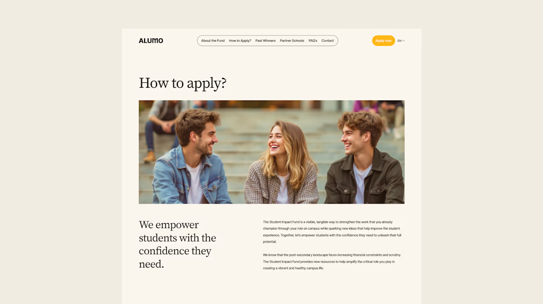
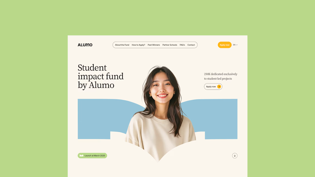

Love how you're tackling trust + purpose for a $250K fund - that's a tough balance with two audiences. Communicating credibility for a student-led initiative across Canada is huge. Would love to see how you solved it!

New template for craft studios, pottery studios and creative workshops. Meet Handsel.
Visitors find a class, see which dates are open, nearly full or sold out, and either book through your own booking tool or send a request that lands in your inbox. Tutors, crafts, open studio plans, private groups and gift cards each get their own page, all in the Framer CMS.
16 pages, 7 CMS collections, real content, no lorem.
Get it here → https://contra.com/products/lHTpjaNx-handsel-creative-workshop-and-pottery-studio-framer-template

Omg this is very clean and creative, interactive love the text spacing and overall design concept