The network for creativity
Join 1.25M professional creatives like you
Connect with clients, get discovered, and run your business 100% commission-free
Creatives on Contra have earned over $150M and we are just getting started
Back to feedPost
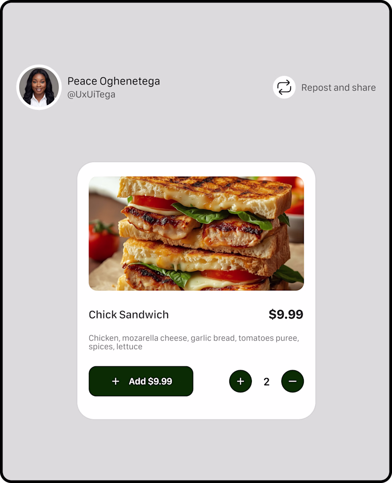
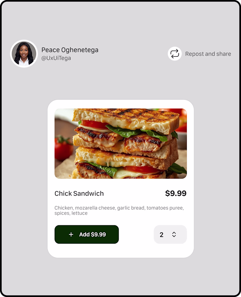
Taste Test
Took a short break but I am happy to be back to my contra community.
I am working on a new project, and I need your input for this A and B TESTING OF A PRODUCT CARD,
Which has better UX?
52 voted
76%
16 voted
24%
68 votes
Closed
Option A works really well when the items a user will order is not much (in this instance, according to reports, majority of users adds an item once, and maybe twice if with a friend), the typical B2C scenario.
Option B will work for scenarios where someone will need to add above 7 items, usually in B2B settings.
A
In my opinion
Option A but i think the plus and minus buttons could take another color, maybe grey?
Option A Looks more Intuitive for a UX Stand point
Wow Top Level Work
option A is more intuitive, the + and - button like adds more visual balance to the left button.
Option A
Option A, Action Quickly.
👍 👍
I have a question that applies to both - if an individual sandwich is $9.99, then what is the benefit of showing that price again on the add button if it isn't dynamic to represent how much you're adding to the order? I could see it being helpful to have it there to represent...
A user experience >>
Adding quantity in Option A is much better and accessible. Good UI and UX side.
A but switch positions of the + and -
i would go for option A
Option B for some reason looks neater and calm🤔
Great Work!
Nice vary nice
The network for creativity
Join 1.25M professional creatives like you
Connect with clients, get discovered, and run your business 100% commission-free
Creatives on Contra have earned over $150M and we are just getting started
Related posts
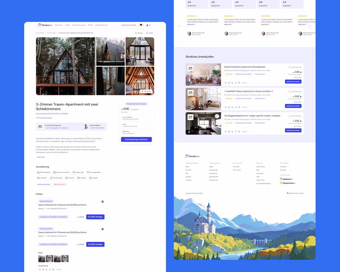
I often enjoy working on cleaner UX/UI work like this rental listing page I designed for Pension!
That's really beautiful, good job, man.
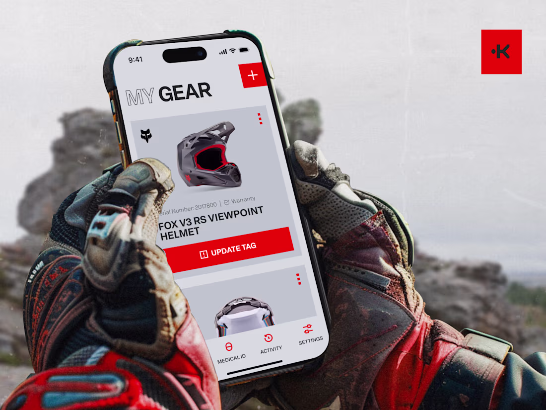
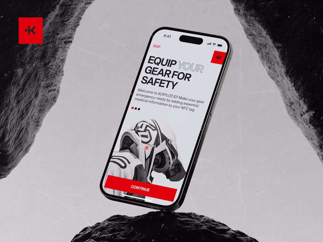
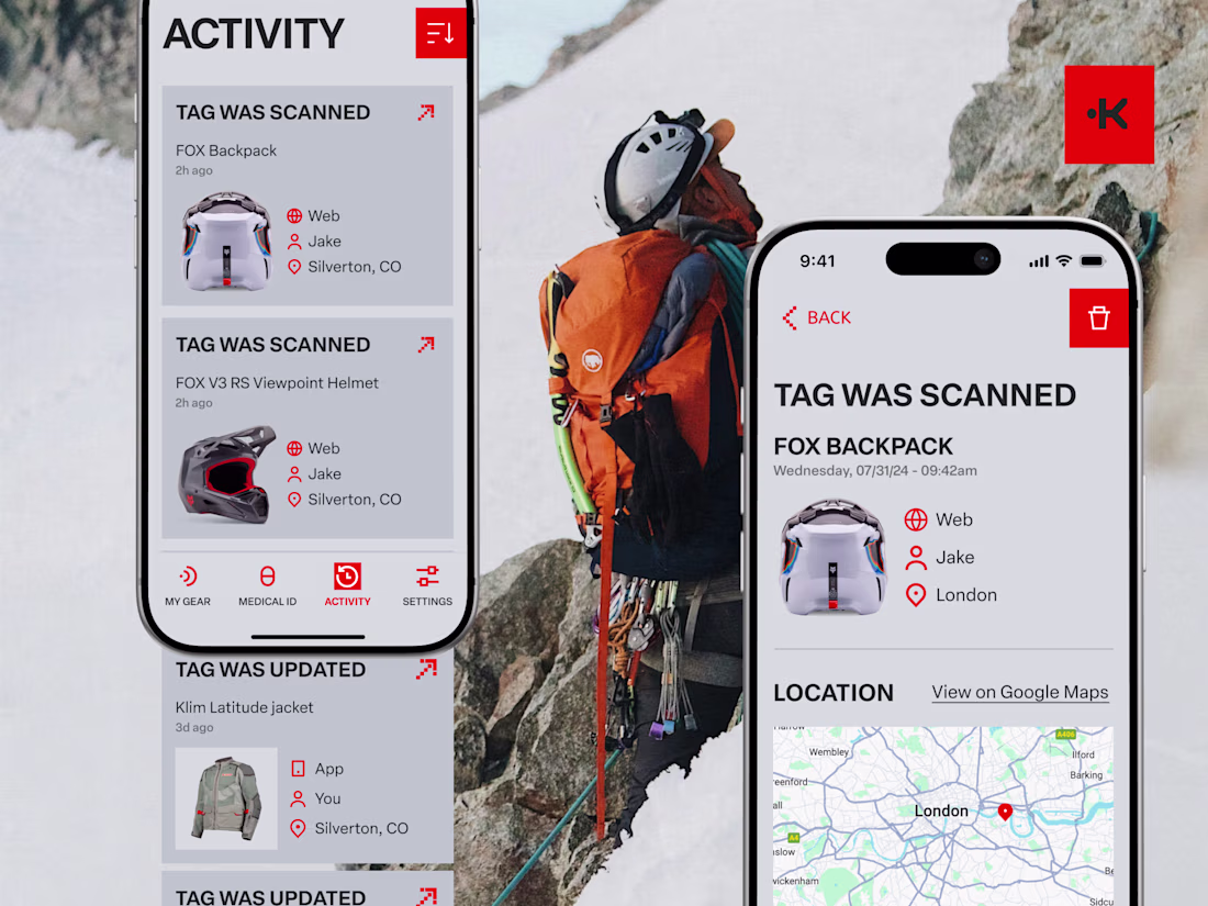
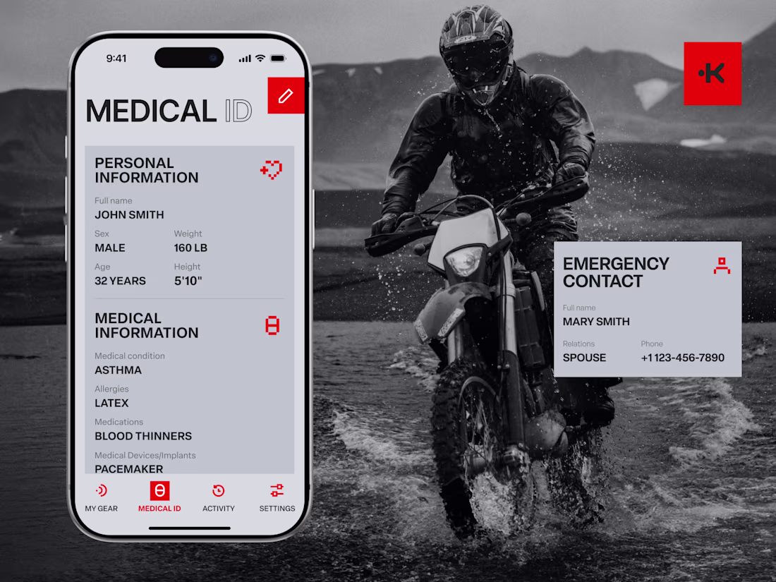
We've worked on the product redesign for KOPILOT.ID, a medical emergency assistant for outdoor enthusiasts.
The product combines a thumbnail-sized NFC tag with an AI system that instantly shares and voices critical medical data in any language when tapped by a smartphone.
What we actualy did here:
- focused on clarifying the product story,
- designed trustworthy UX for high-stress scenarios,
- refined onboarding for medical data input,
- shaped a clear, safety-first visual identity that communicates reliability, speed, and global accessibility.
Built a small tool with Claude Code for designers and devs who are tired of fighting with font-feature-settings in CSS.
Font Freezer lets you bake OpenType features (tabular numbers, small caps, ligatures) and variable font axes directly into the font file itself — so the font just works everywhere, no CSS required at render time.
Useful when email clients, After Effects, or native mobile apps ignore your CSS entirely.
Trending
Claude
Claude has entered the design space. How are you using Claude Design?
Contra University
Learn from expert creatives how to earn more using next-gen AI tools.
creativeaiflow
Creative AI workflows are evolving. What tools do you use, and what are their strengths and weaknesses?
portfolioreview
The best portfolios tell a story, not just show a grid. Share yours for feedback.
freelancerlife
Freelancer life is wins, pivots, and everything in between. What’s yours right now?