The network for creativity
Join 1.25M professional creatives like you
Connect with clients, get discovered, and run your business 100% commission-free
Creatives on Contra have earned over $150M and we are just getting started
Back to feedPost
Taste Test
Took a short break but I am happy to be back to my contra community.
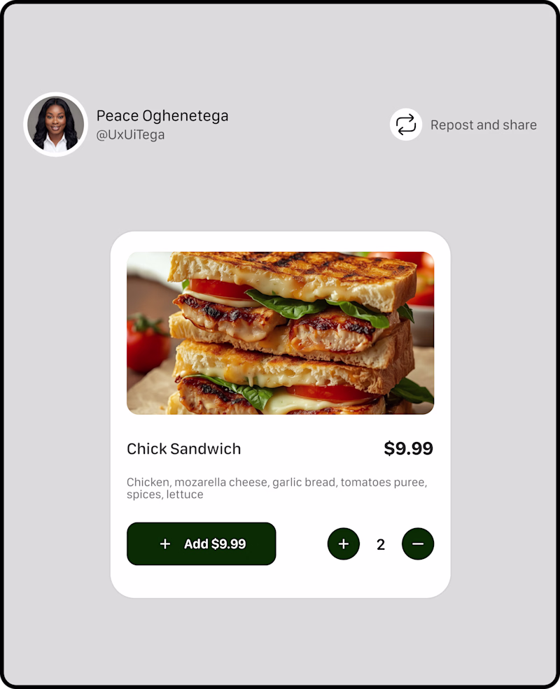
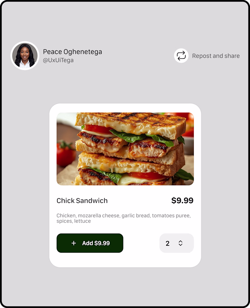
I am working on a new project, and I need your input for this A and B TESTING OF A PRODUCT CARD,
Which has better UX?
52 voted
76%
16 voted
24%
68 votes
Closed
A user experience >>
A
In my opinion
Option A but i think the plus and minus buttons could take another color, maybe grey?
Option A Looks more Intuitive for a UX Stand point
Wow Top Level Work
option A is more intuitive, the + and - button like adds more visual balance to the left button.
Option A
Option A, Action Quickly.
👍 👍
I have a question that applies to both - if an individual sandwich is $9.99, then what is the benefit of showing that price again on the add button if it isn't dynamic to represent how much you're adding to the order? I could see it being helpful to have it there to represent...
Adding quantity in Option A is much better and accessible. Good UI and UX side.
A but switch positions of the + and -
i would go for option A
Option B for some reason looks neater and calm🤔
Great Work!
Nice vary nice
Option A works really well when the items a user will order is not much (in this instance, according to reports, majority of users adds an item once, and maybe twice if with a friend), the typical B2C scenario.
Option B will work for scenarios where someone will need to add above 7 items, usually in B2B settings.
The network for creativity
Join 1.25M professional creatives like you
Connect with clients, get discovered, and run your business 100% commission-free
Creatives on Contra have earned over $150M and we are just getting started
Related posts
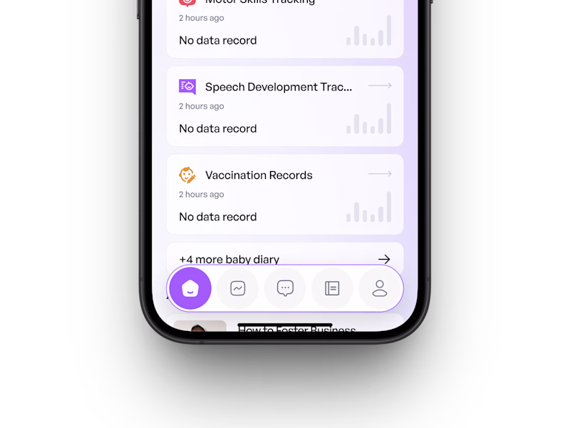
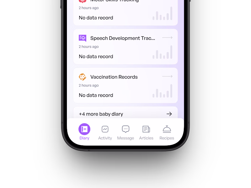
Can you guess which design the client finalized? 👀
This concept was created for a baby care app designed to help parents and caregivers track and support their child's early growth and development. 🍼
The only difference here is the navigation bar. Which one do you think the client picked? 👇
62 voted
60%
41 voted
40%
103 votes
Closed
for the design option 1 much better but the developer hated this. LOL
Always a good feeling to see a project featured on the Contra homepage. Real talk though...this one had a BUMPY start.
If you've ever had a project that felt shaky out of the gate, you know the feeling of dread and disappointment. What turned it around was building a genuinely strong relationship with the client (fitting, since they're a matchmaker). We collaborated with them, worked through the finer details, and by the end, we were both thrilled with the result.
Check out the project here where you can even see a live flip-through of their new brand guide. Leave us a 🖤 or a 🐐 if you like it.
Love this!
👀 Need your feedback!
If you landed on this page for the first time, which design would make you stay longer?
Left or 💜 Right?
Tell me your choice below!
52 voted
37%
89 voted
63%

141 votes
Closed
The right looks more okay to me 😊
Challenges
View allTrending
Claude
Claude has entered the design space. How are you using Claude Design?
Contra University
Learn from expert creatives how to earn more using next-gen AI tools.
creativeaiflow
Creative AI workflows are evolving. What tools do you use, and what are their strengths and weaknesses?
portfolioreview
The best portfolios tell a story, not just show a grid. Share yours for feedback.
freelancerlife
Freelancer life is wins, pivots, and everything in between. What’s yours right now?
