
Ambrose Nwaoha
UI/UX Designer - Mobile Apps Designs & Websites Designs.
Profile in progress
Ambrose is building their profile!
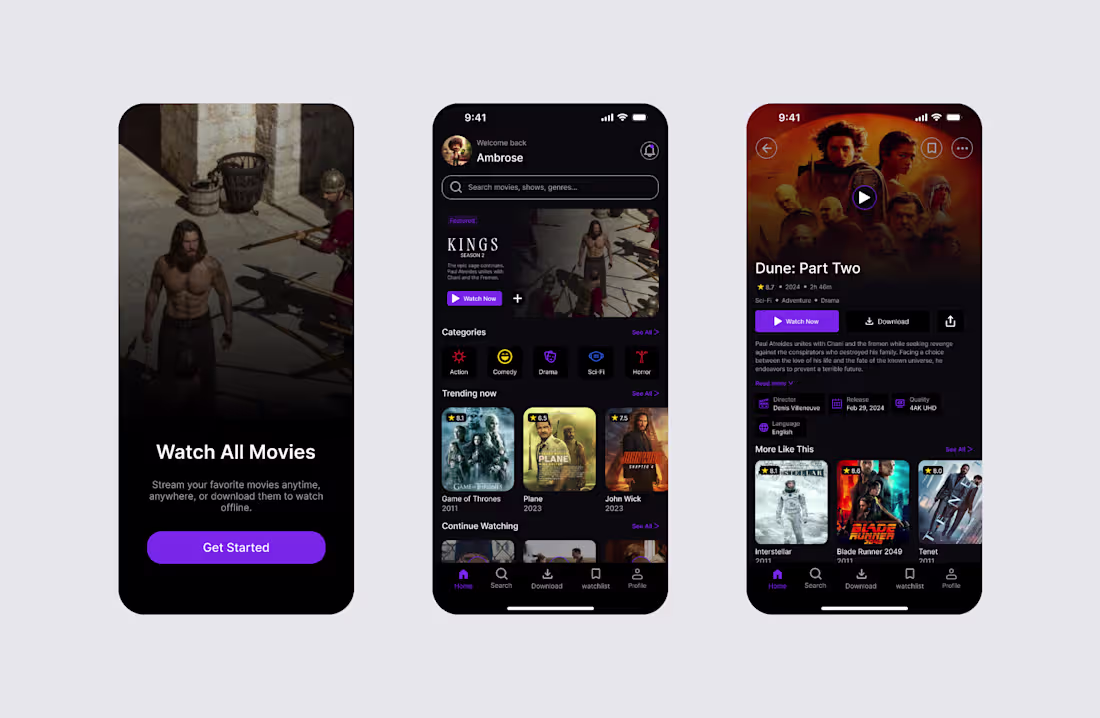
Movie Streaming App Design
Overview: A modern movie streaming app designed to help users discover, watch, and download their favorite movies anytime.
Problem: Many streaming apps can feel cluttered, making it difficult for users to quickly find and enjoy the content they want.
Solution: I designed a clean and intuitive interface with an onboarding experience, a personalized home screen, and a detailed movie page featuring Watch Now and Download action.
Outcome: The final design provides a smooth, and engaging users experience with simple navigation, clear content organization, and modern visual style.
1
5
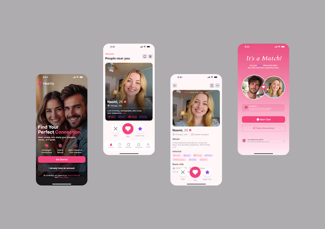
Dating App Design.
Overview: This project is a modern dating app designed to help people discover, connect, and build meaningful relationships through a simple and engaging experience.
Goal: To create a simple, clean, and enjoyable user experience.
Solution: Designed an intuitive with onboarding, profile discovery, detailed profiles, and a match screen for a smooth user journey.
Outcome: A modern, user-friendly design that makes meeting new people easy and engaging.
1
14
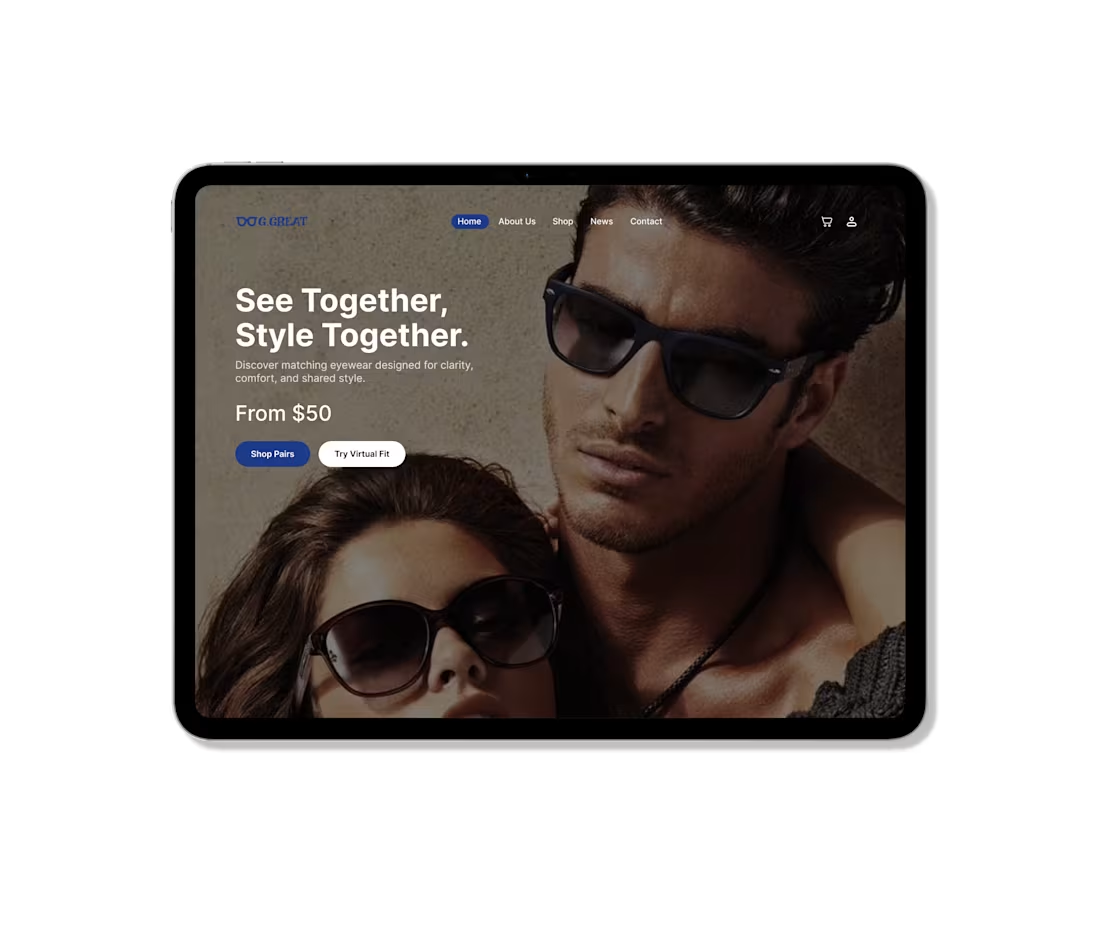
Eyewear for Two - Modern Hero Section
Overview: This project is a modern hero section design for an eyewear brand focused on couples and shared style.
Goal: To create a clean and engaging layout that highlights both fashion and connection, while keeping the interface simple and easy to understand.
Problem: Keeping the design simple while making it feel unique and not produce-heavy.
Solution: Used a strong couple image, clear typography, and subtle overlay for readability, with focused CTAs.
Outcome: A clean, modern design that feels stylish, clear, and different from typical eyewear layouts.
1
34
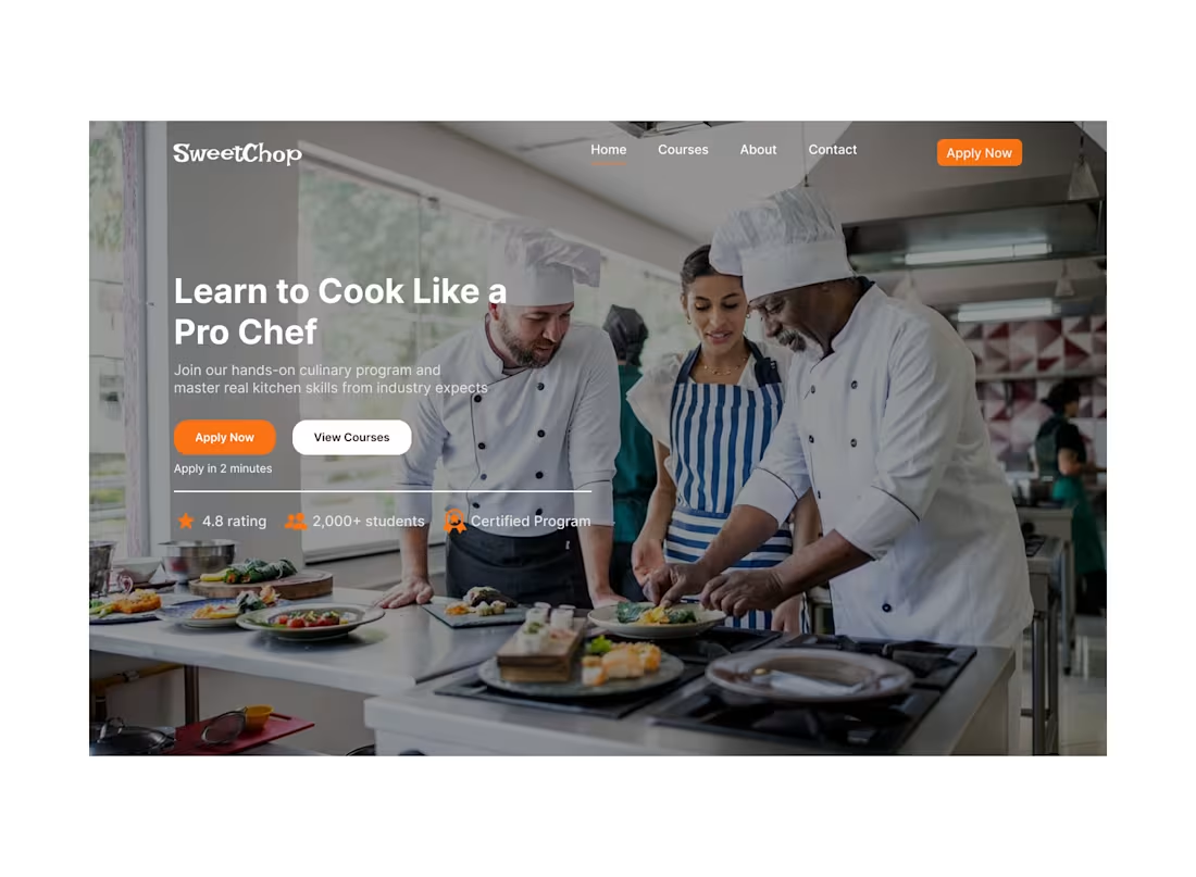
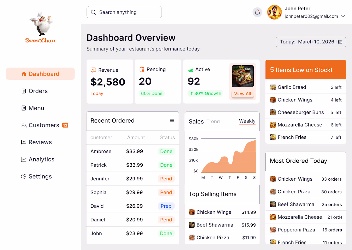
SweetChop - Hero Section for a Cooking Learning Platform
Overview: SweetChop is a platform designed for anyone who wants to learn how to cook and build real kitchen skills from professional chefs.
Goal: To design a clean and engaging hero section that encourages users to easily apply and start their cooking journey.
Problem: Many cooking platforms feel confusing or lack clear direction, making it difficult for users to take action.
Solution: A clean hero section with a strong CTA, clear layout, and trust indicators. Adding "Apply in 2 minutes" to reduce friction.
Outcome: The final design improves clarity, build trust, and make it easier for users to take action quickly.
1
37
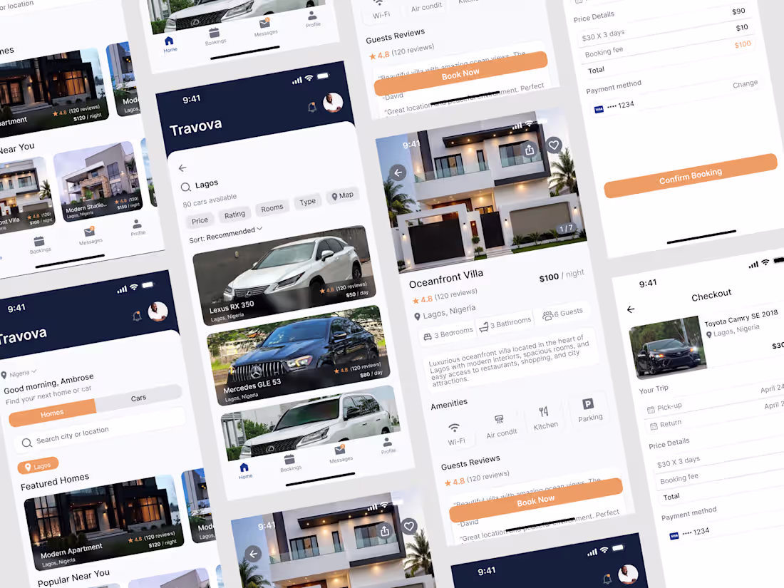
Rent Homes & Cars in One Simple App
Overview: Travora is a mobile app that lets users rent homes and cars in one place, making booking simple and convenient.
Goal: Make it easy for users to find, compare, choose, and book quickly.
Challenges: Combining homes and cars in one app, keeping the design simple and making the booking process clear.
Solution: Clean search and simple filters. Clear details screen. Easy checkout with price breakdown.
Outcome: A simple and user-friendly app that help users book faster and without confusion.
1
73
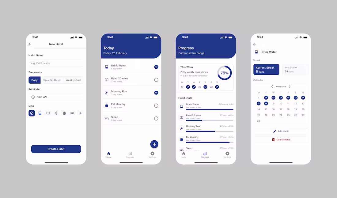
Minimal Habit Tracking App
Overview: A minimal habit tracking app designed to help users stay consistent through a clean interface and distraction-free experience.
Goal: Create a simple daily tracking experience with clear progress visibility.
Challenges: Balancing simplicity with useful feedback such as streaks and monthly tracking without overwhelming the interface.
Solution: Build a clean daily dashboard, intuitive habit setup with flexible frequency options, and a visual monthly calendar to track consistency.
Outcome: A focused and easy to use experience that supports long-time habit building through clarity and structure.
1
83
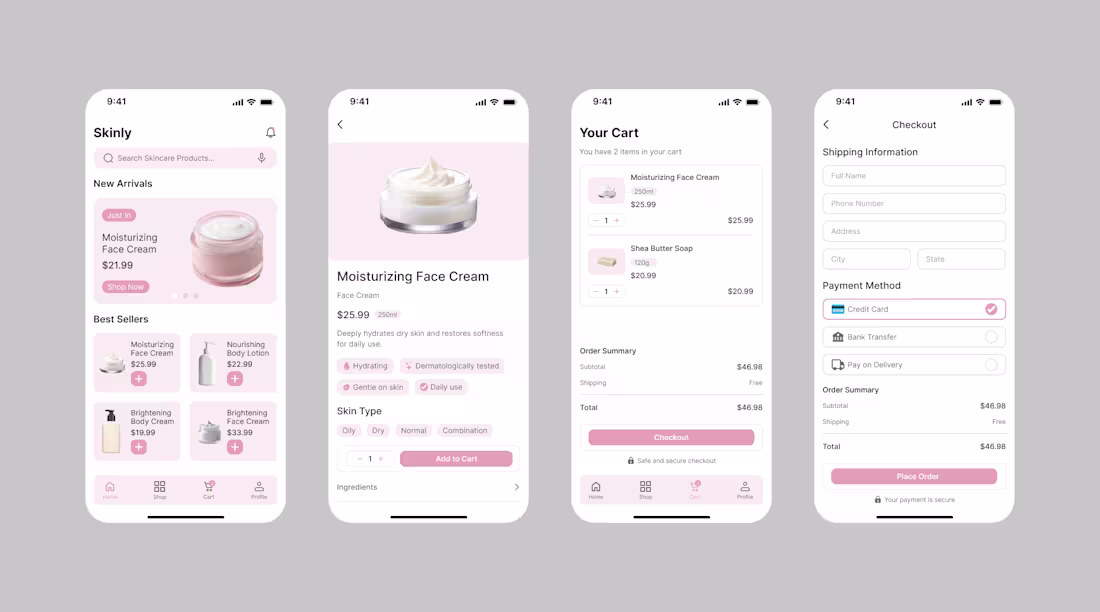
Skincare Mobile App
Overview: A mobile skincare app that helps users easily find products and place orders without confusion.
Goal: Create a clear, smooth flow that helps users browse products and complete purchases quickly.
Challenges: Preventing clutter on product pages, keeping navigation simple, reducing friction during checkout.
Solution: Designed 9 connected screens covering onboarding, browsing, product details, cart, checkout, and account creation. focused on clear layout, strong hierarchy, and easy navigation.
Outcome: Created a user-friendly flow that make shopping faster, clearer, and more convenient.
1
71
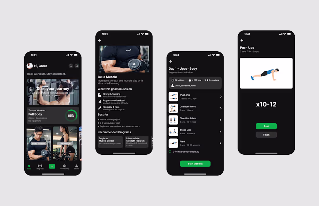
Gym App - Social Workout Experience
Overview: A mobile fitness app that allows users to workout alone or with friends by creating groups, inviting others, and competing through a shared leaderboard.
Goal: Create a structured workout system that increases motivation through social competition.
Challenges: Many fitness apps lack accountability, causing users to lose consistency.
Solution: I designed level-based workout programs with guided exercise flow, rest timers, group creation, and a points leaderboard to encourage friendly competition.
Outcome: This final design combines clear workout guidance with social motivation to improve engagement and consistency.
1
87
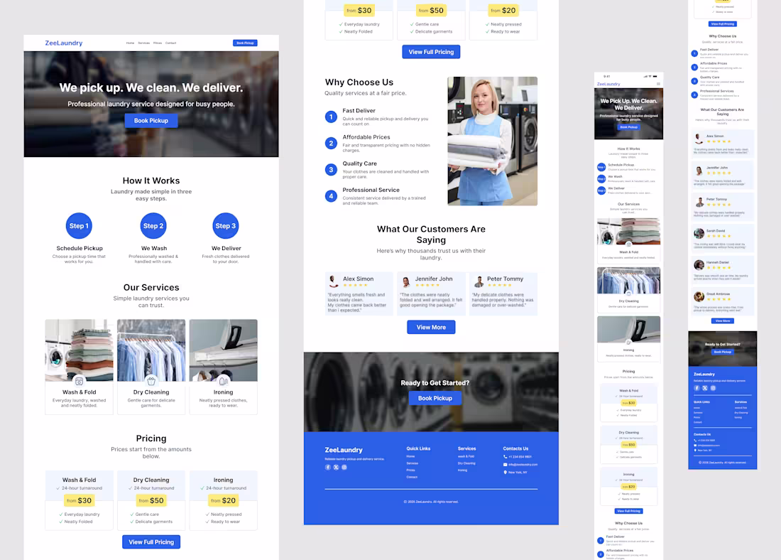
Laundry Service Website
Overview: A responsive website for a local laundry service to improve brand credibility and create a smoother booking experience across desktop and mobile device.
Goal: Create a clear service focused landing page, improve trust through testimonials and structured sections, design a fully responsive experience, make booking actions visible and simple.
Challenges: Many local laundry businesses rely heavily on offline marketing and social media, which often lack structure and credibility. Users struggle to quickly understand services, prices, and how to book.
Solution: Developed a conversion focused layout with clear section flow, strong typography, visible CTAs, and fully responsive design.
Outcome: A professional, user-friendly website that improves clarity, builds trust, and simplifies the booking process.
1
80
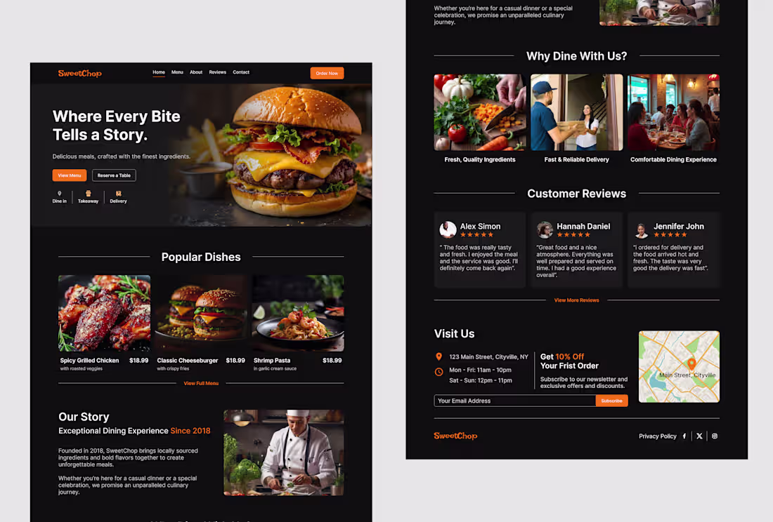
SweetChop Restaurant Landing Website.
Overview: SweetChop is a restaurant brand that needed a clean desktop website to show its food and help customers order easily.
Goal: Design a structured landing experience that clearly communicates the brand's identity, showcases popular dishes, and drives users toward a single primary action: ordering food.
Challenge: Many restaurant websites look crowded and confusing. The challenge was to keep the design clean while still showing food, information, and strong call-to-action buttons.
Solution: Structured the page with simple sections and repeated the "Order Now" CTA in key areas to reduce friction.
Outcome: The final design is clean, easy to understand, and focused on helping users order without stress. It presents the restaurant in a modern and professional way
1
79