The network for creativity
Join 1.25M professional creatives like you
Connect with clients, get discovered, and run your business 100% commission-free
Creatives on Contra have earned over $150M and we are just getting started
Back to feedPost

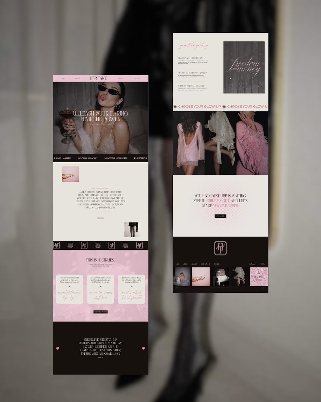
Her Take - Web Design
A bold digital space for women building confidence, careers, and businesses on their own terms.
Her Take is a conceptual website for a female-focused coach and entrepreneur offering mindset, business strategy, signature programs, and 1:1 coaching.
The goal was to create a digital experience that felt feminine without being overly delicate, confident without feeling corporate, and editorial without sacrificing usability.


The balance of softness and confidence is really well judged here. The editorial pacing in the page flow makes the experience feel distinctive without sacrificing usability.
The network for creativity
Join 1.25M professional creatives like you
Connect with clients, get discovered, and run your business 100% commission-free
Creatives on Contra have earned over $150M and we are just getting started






Related posts

The best part of this website might be the page nobody is supposed to see.
About 4 months ago, we launched the new website for STORY Design Amsterdam.
STORY is all about giving homes personality, so we wanted the website to have some too.
Including their 404 page.
Naturally, I put the owner's dog on it.
If you end up on the wrong page, you might as well enjoy it.
But the fun details only work if the website itself does too.
Before the launch, most of their website traffic came through Instagram.
Today, around 60% comes from Google.
And now we've taken the next step by adding a little shop, so people can buy their kitchen handles directly from the site.
Next up: a great about us page; photoshoots are already planned.
I don't design websites that often.
But when I do, I don't want to create something that could belong to any business.
It should feel like their business. Do you think I achieved that?

Great work, Bram


Turning complex AI workflows into a calm, monochrome experience, brought to life with motion. We'd love to hear your thoughts!


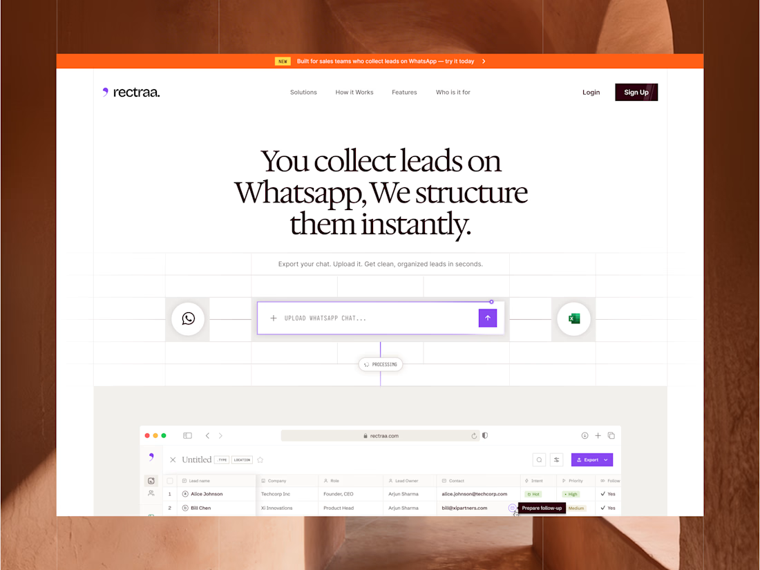
Rectraa helps sales teams extract, classify and organize leads collected through WhatsApp. I designed and developed its marketing website to explain the product clearly, demonstrate its workflow and encourage visitors to try it.
Project information:
Role: Website Designer & Framer Developer
Scope: Website strategy, UI design, responsive design and development
Tools: Figma and Framer
Deliverable: Responsive SaaS marketing website


High end design