The network for creativity
Join 1.25M professional creatives like you
Connect with clients, get discovered, and run your business 100% commission-free
Creatives on Contra have earned over $150M and we are just getting started
Back to feedPost

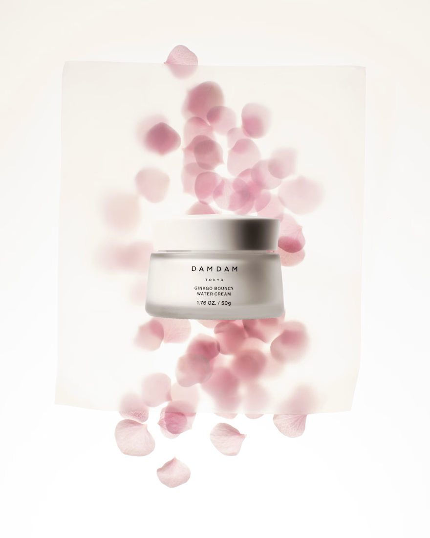
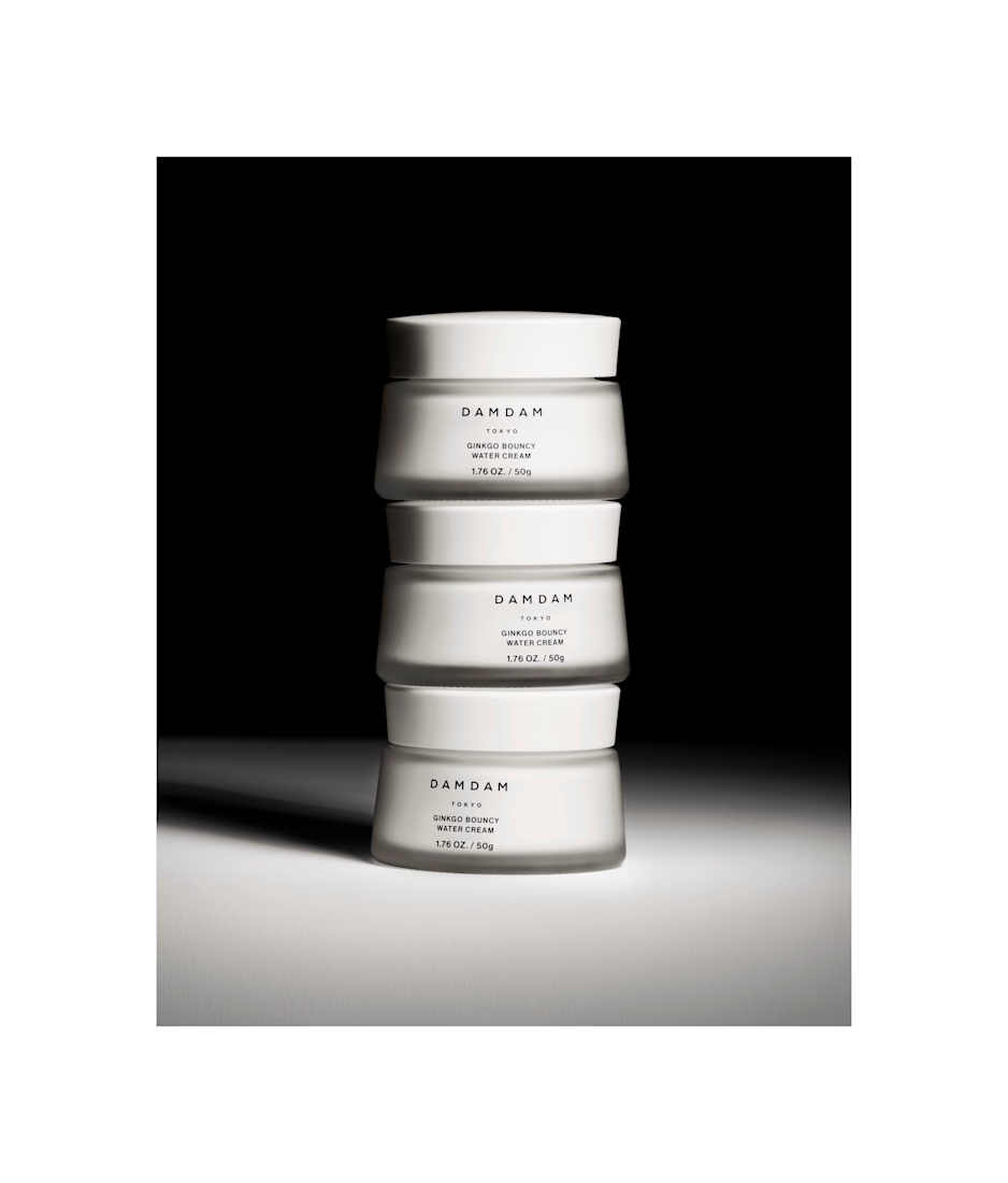
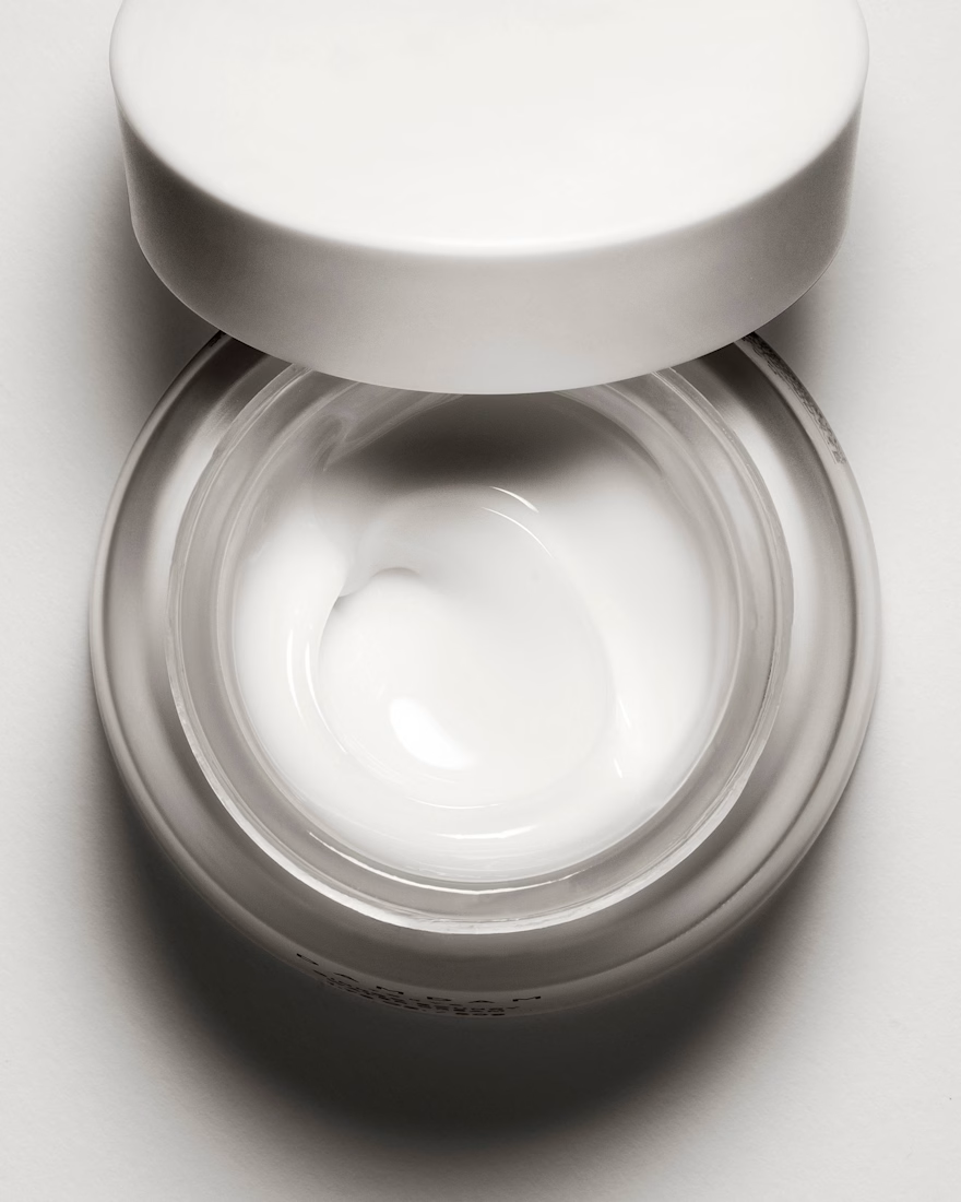
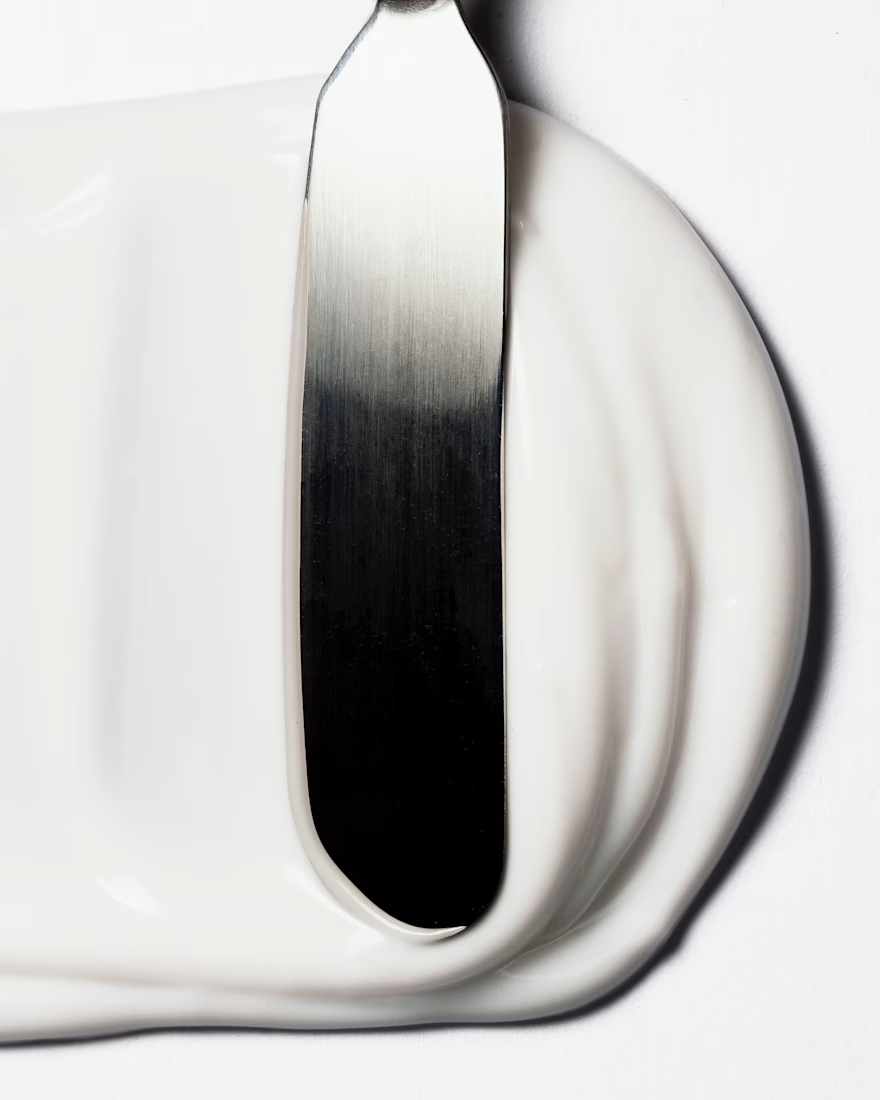
A refined product photography series for DAMDAM Tokyo, translating the brand’s skincare philosophy into calm, minimal, and atmospheric still life images.

The network for creativity
Join 1.25M professional creatives like you
Connect with clients, get discovered, and run your business 100% commission-free
Creatives on Contra have earned over $150M and we are just getting started





Related posts


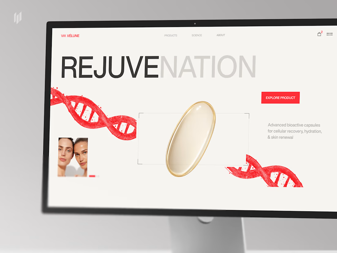
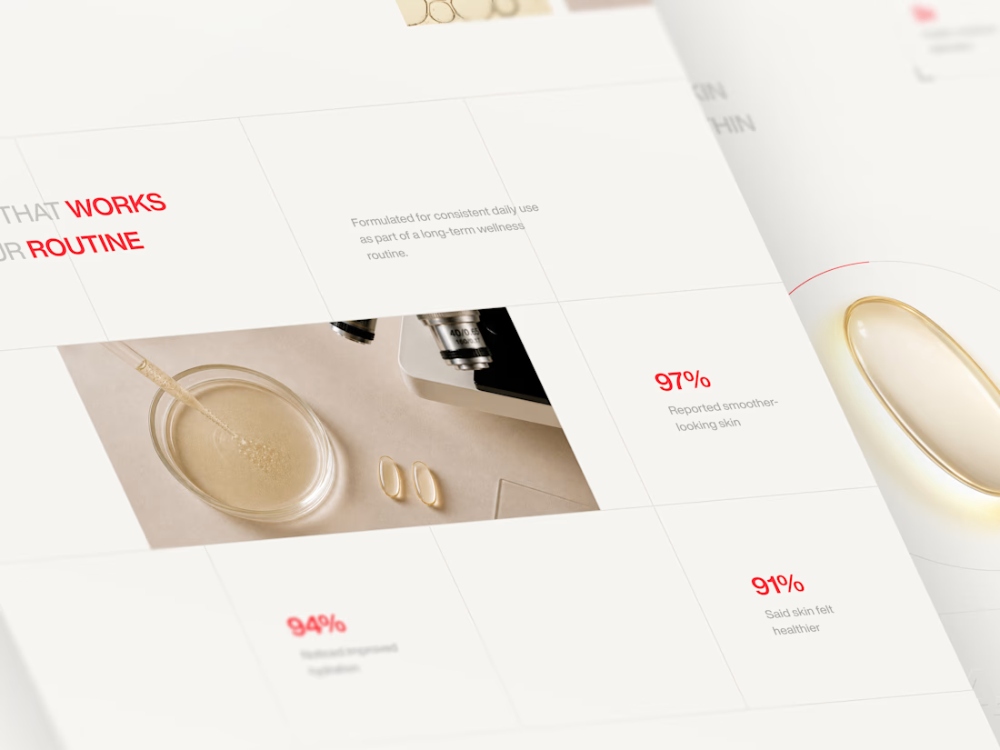
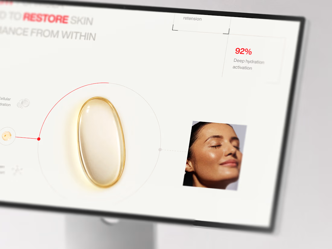

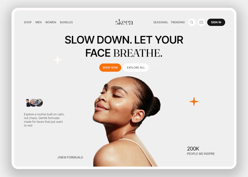
Skeen sells skincare online. People shopping for skin products are often unsure and overwhelmed by choices. The homepage has to make them relax first, and only then help them shop.
I kept the layout simple so the eye goes to one place and nothing fights for attention. Then I tested the mood with two backgrounds.
A is neutral grey, so nothing distracts from the product.
B is a warm peach that feels closer to skin and more caring.
Which one would make you trust a skincare brand more?
3 voted
33%
6 voted
67%

9 votes
Closed

On one will like normal bg in this context, B feels alive and actually grab focus ⭐

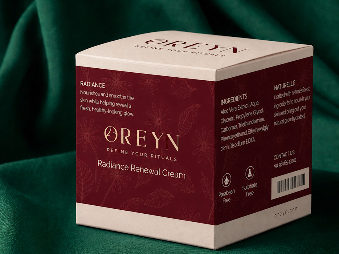
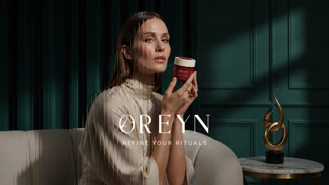
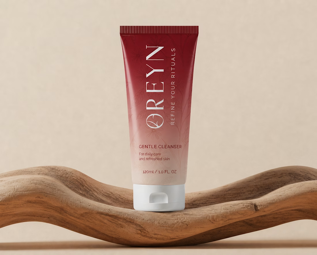
The goal with OREYN was to create a skincare brand that felt luxurious, calm, and refined without making it feel too cold or clinical.
During the moodboard phase, I kept coming back to rich burgundy tones, soft neutrals, botanical details, and elegant typography. That direction felt like the right balance between nature and sophistication.
From there, the visual identity started to take shape around one simple idea: making everyday skincare feel more intentional.
The botanical elements brought in a natural, softer side, while the serif typography and deeper tones helped give the brand a more elevated feel.
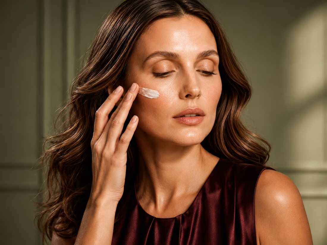
That mix became the foundation for the packaging, campaign visuals, and the overall look of OREYN.

Good 😊 work 💯