The network for creativity
Join 1.25M professional creatives like you
Connect with clients, get discovered, and run your business 100% commission-free
Creatives on Contra have earned over $150M and we are just getting started
Back to feedPost
The logo of Techpay, a concept for a digital payment app, revolves around the theme of seamless and secure financial transactions driven by modern technology.
At the center of the design is a flowing currency paper element, crafted to appear dynamic and fluid, symbolizing the effortless movement of digital money. Surrounding this core shape are connected technology nodes, representing the smart, secure infrastructure that powers each transaction. Enhancing the idea of transfer dynamics, two arrows are positioned on either side of the design, facing outward in opposite directions. This outward-facing placement suggests movement, exchange, and expansion, highlighting the app’s role in enabling swift, two-way transactions.
The visual language is clean and futuristic. Altogether, the logo captures Techpay’s essence as a forward-thinking, tech-enabled payment solution.
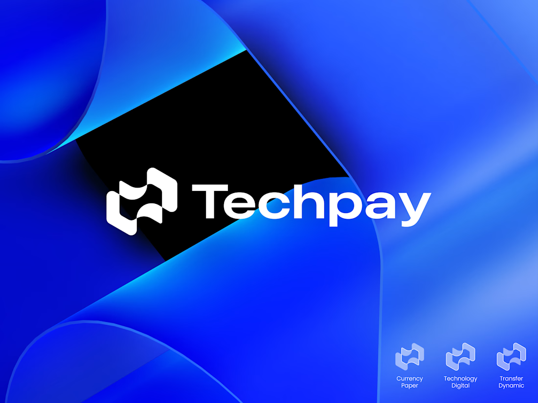

Hiding the two opposing arrows inside the fold carries the transfer idea without a literal icon. Did you test the mark alone at favicon size? With the nodes sitting that close together, I'd guess the inner detail fills in first.

Thanks for the thoughtful feedback! Yes, I’ve tested the mark at smaller sizes, including favicon scale. The inner detail is intentionally kept minimal so the arrows and overall form still read clearly, while the nodes reinforce the technology aspect. Really appreciate you pointing this out!
The network for creativity
Join 1.25M professional creatives like you
Connect with clients, get discovered, and run your business 100% commission-free
Creatives on Contra have earned over $150M and we are just getting started







Related posts

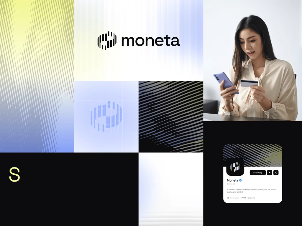
Introducing MONETA, a digital banking brand concept designed for modern businesses that need a banking experience built around clarity, speed, and confidence.



wow the branding is surprisingly premium

A new visual identity for Reroll.
We turned the O in the name into a die and built the wider brand language around that simple idea.
The project includes:
• Logo design
• Social media identity
• Logo animation
• Custom playing card back
• 3D visual assets
Creative direction: Dmitry Lepisov
Identity design + motion: Arthur Skripnik
Created by Lepisov Branding
Some of the 3D visuals and animation were made in Spline.


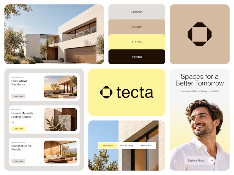
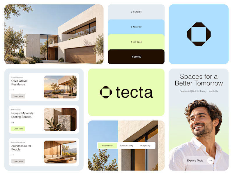
Color Direction Test - Tecta Architecture
Exploring two visual directions for Tecta, a contemporary architecture brand built around clarity, form, and human-centered spaces.
Direction 01 - Warm, calm, and timeless.
Direction 02 - Fresh, modern, and expressive.
Same identity. Different atmosphere.
Which direction feels stronger for an architecture brand - 01 or 02?
21 voted
38%
35 voted
62%
56 votes
Closed

Great branding! The presentation is top-notch. Learned something new from this.