The network for creativity
Join 1.25M professional creatives like you
Connect with clients, get discovered, and run your business 100% commission-free
Creatives on Contra have earned over $150M and we are just getting started
Back to feedPost

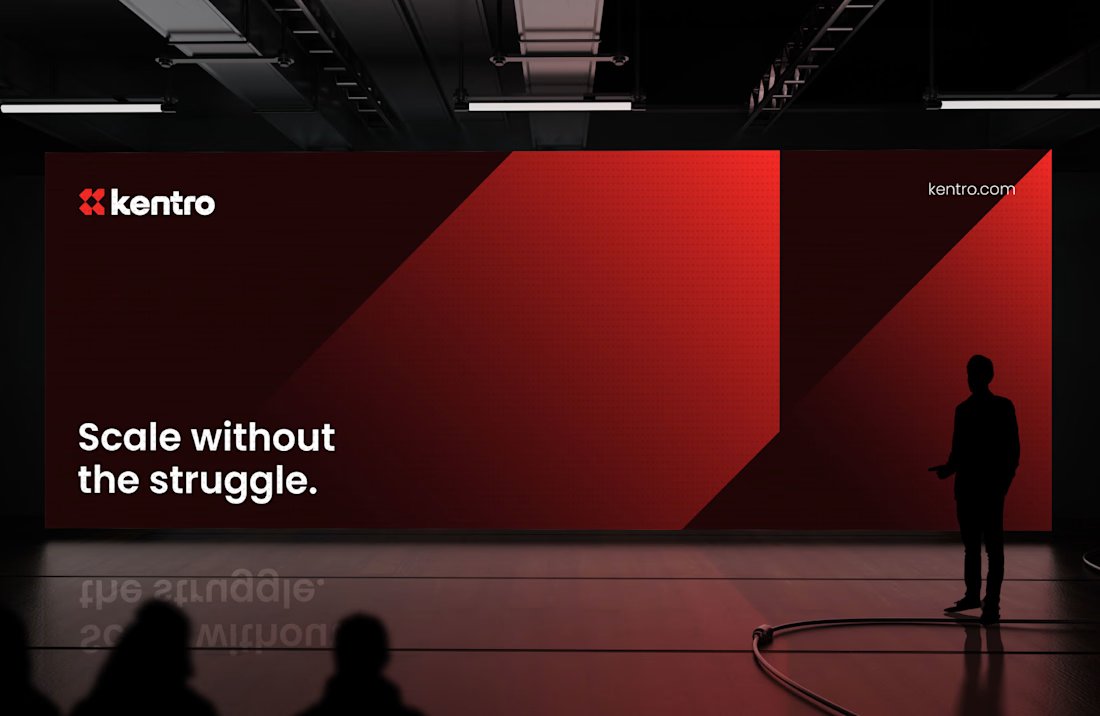
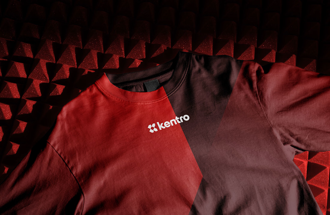
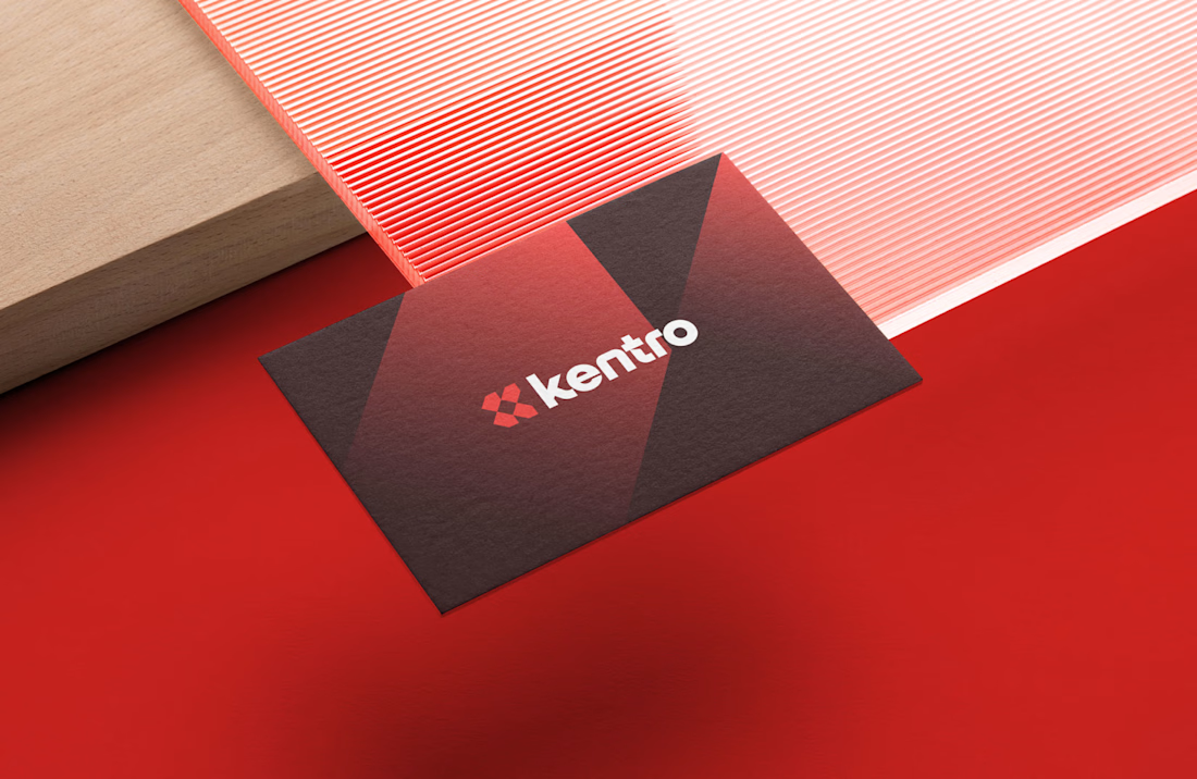
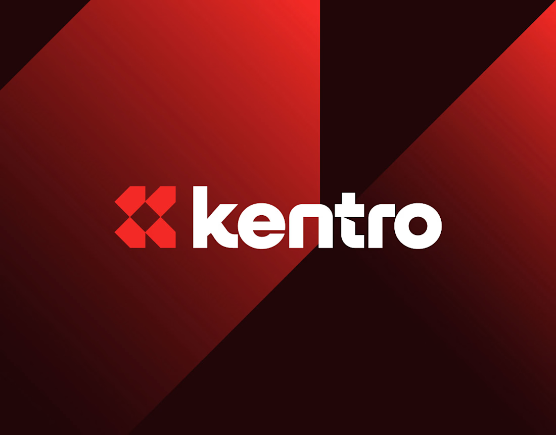
Kentro — Unlock growth with intelligent automation.
The logomark combines the letter K with forward-facing arrows, creating a clean geometric symbol that represents growth, progress, and continuous acceleration. The goal was to build an identity that feels modern, intelligent, and confident, reflecting how automation helps businesses move faster and scale with purpose.
Simple in form, memorable in execution, and designed to perform across every touchpoint.
What was the first thing you noticed in the mark: the "K" or the arrows? 👀

Elegant
Thank you

The K with forward arrows reads instantly, and stopping at two arrows rather than three keeps it clean. Nice restraint. Does it hold up as a favicon at 16px, or do the arrows start to merge?
Thank you

Brilliant design!
Thank you

Thank you
Nice balance between visuals and explanation.
Thank you
The network for creativity
Join 1.25M professional creatives like you
Connect with clients, get discovered, and run your business 100% commission-free
Creatives on Contra have earned over $150M and we are just getting started
Related posts

How do you turn a brand mascot into a visual system people actually remember?
🐆 Our lynx represents sharp thinking, curiosity, and attention to detail.
For this motion experiment, we pushed the mark into a softer, unexpected direction - rebuilding it with different textures.
Same identity, different emotion.
Which texture fits the Lynksen identity best - flowers, grass, or something else? 👇✨



I personally love the soft blue and white version the most. Nice to scale it into the brand campaign or ad video 😃

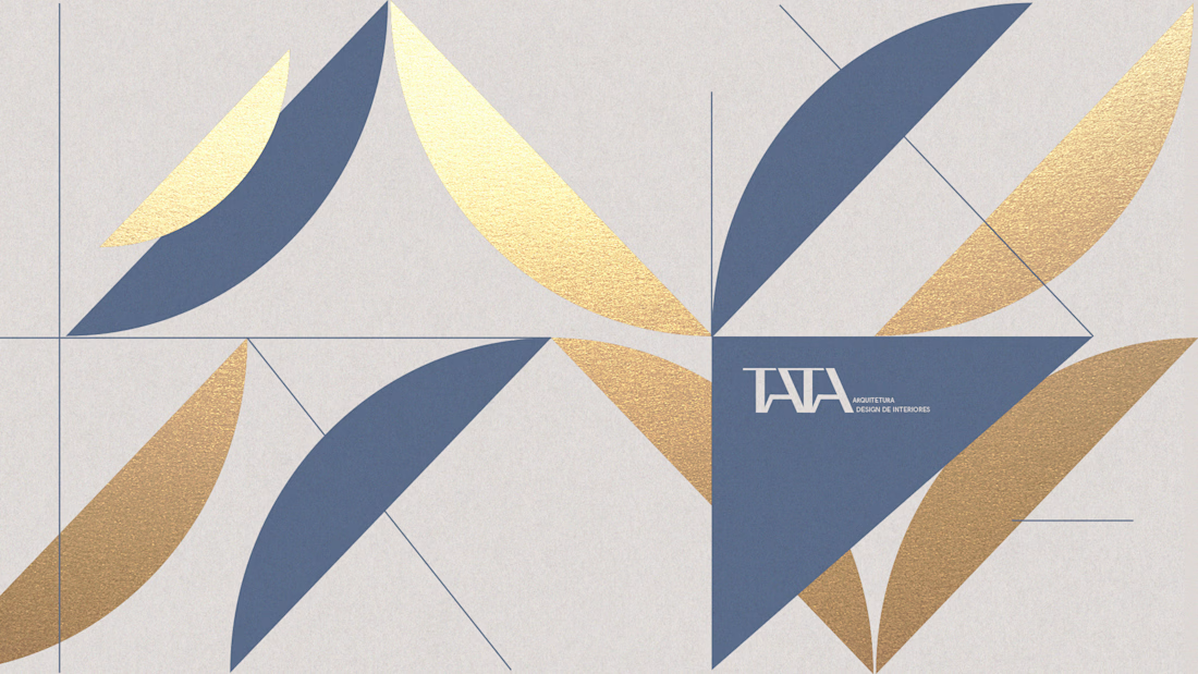
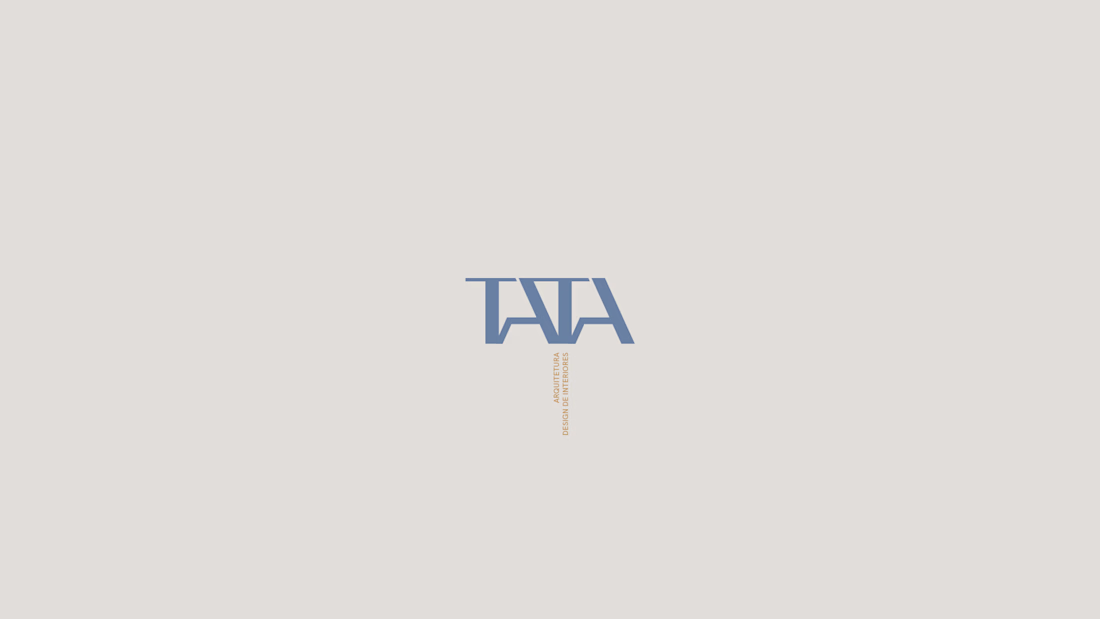
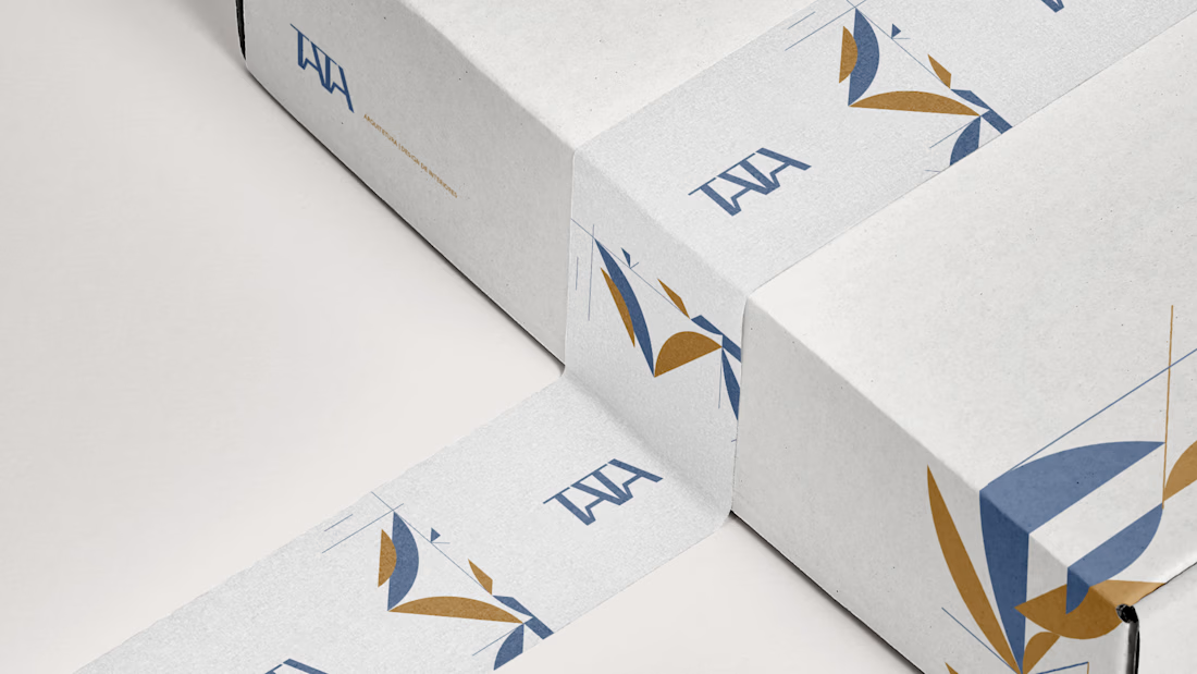
When creating the identity for TATA Arquitetura, my goal wasn't just to design a logo, it was to translate the way Tata creates spaces.
Her work blends modern art, boho influences, and natural materials into environments that feel personal, warm, and full of character. I wanted the brand to express that same feeling.
The visual system was built around modular shapes that connect, separate, and recombine, just like the objects, textures, and elements that come together to shape an interior. Every piece has its own role, but together they create something unique.
This project is a reminder that the strongest identities don't simply decorate a business, they reflect the way it thinks, creates, and connects with people.



Originally conceived for a completely different space, this identity found its true calling and repurposed for Asymptote a conceptual quantitative speculation firm and strategic think-tank.
Built around the mathematical interplay of the integral symbol (∫) and π, the system bridges the fluid tracking of volatile macro trends with the unyielding, foundational parameters of quantitative science.
A masterclass in transforming abstract mathematical logic into a premium, structure-led visual identity system.

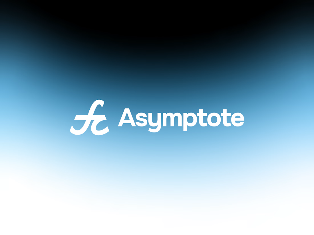
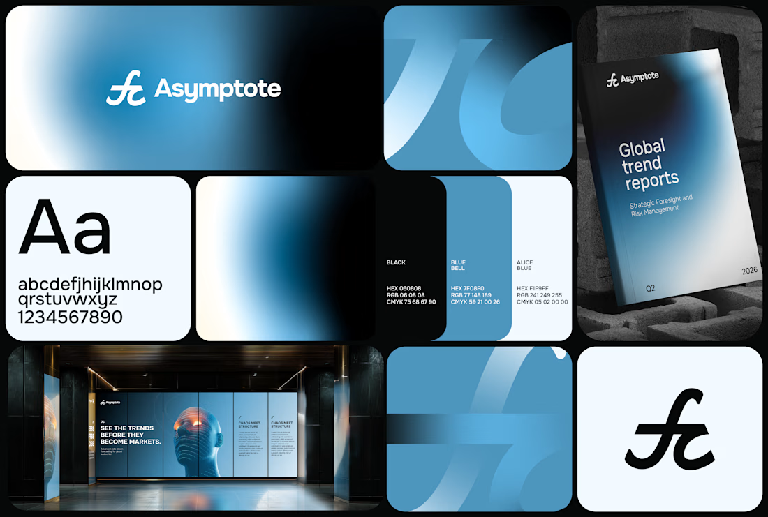
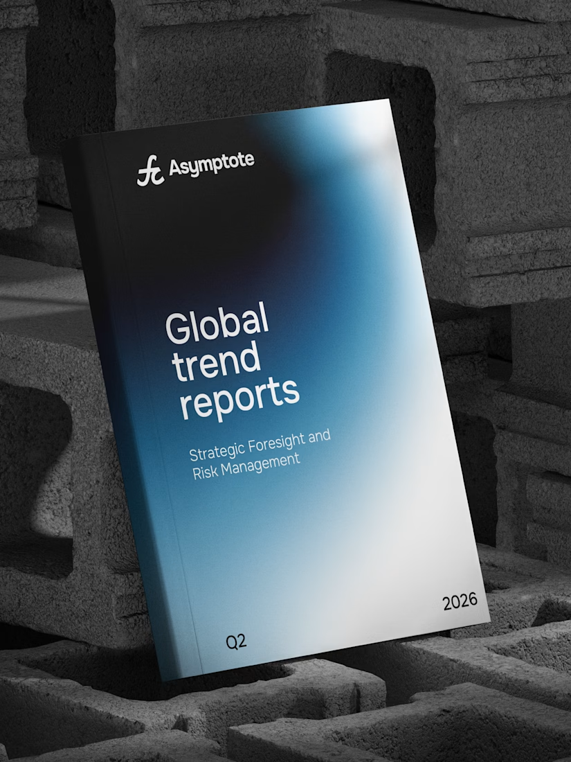
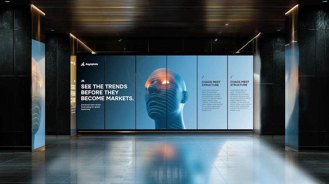

How mindful gradients are they! 👌👀
Challenges
View all



Trending

Claude
Claude has entered the design space. How are you using Claude Design?

Contra University
Learn from expert creatives how to earn more using next-gen AI tools.
fifaworldcup2026
The World Cup is here and the whole world's watching. How are you designing for the world stage?
creativeaiflow
Creative AI workflows are evolving. What tools do you use, and what are their strengths and weaknesses?
freelancerlife
Freelancer life is wins, pivots, and everything in between. What’s yours right now?