The network for creativity
Join 1.25M professional creatives like you
Connect with clients, get discovered, and run your business 100% commission-free
Creatives on Contra have earned over $150M and we are just getting started
Back to feedPost
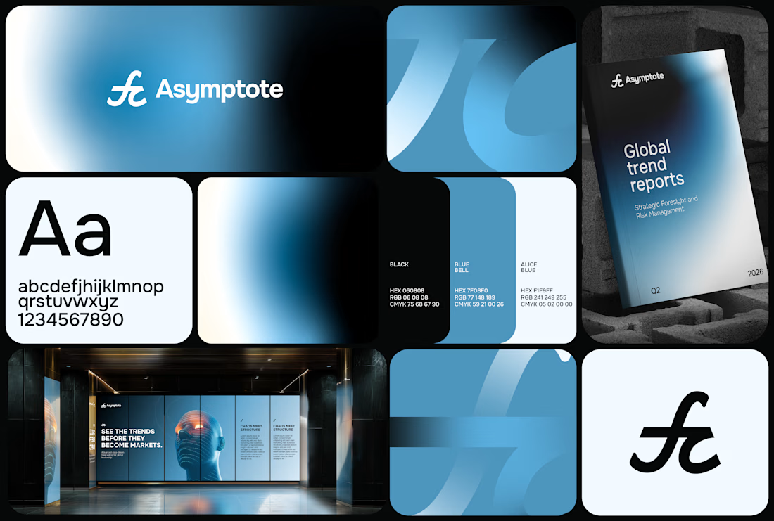
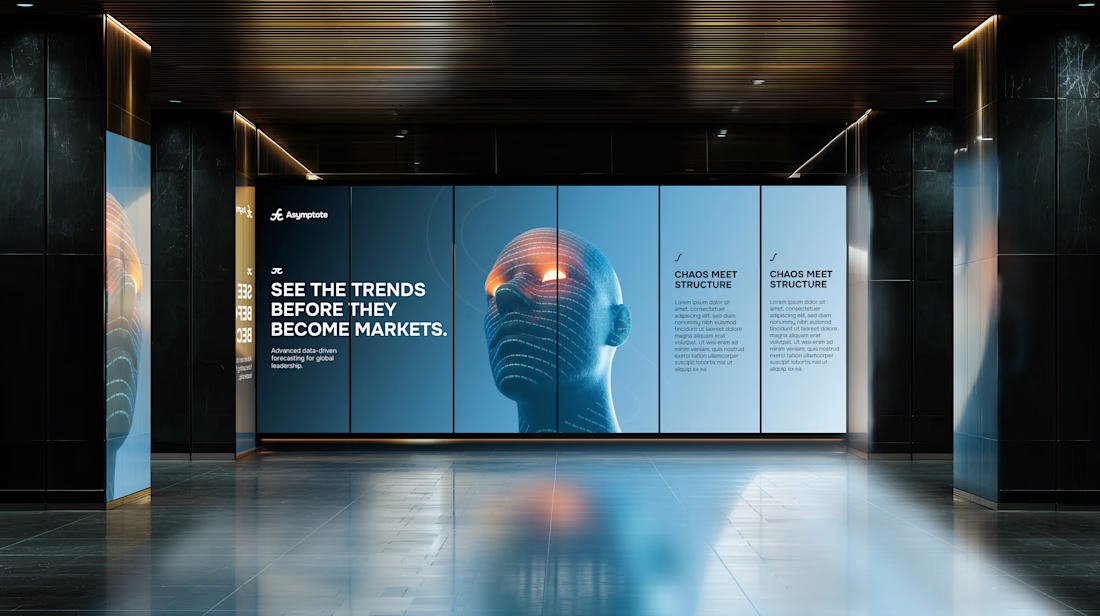
Originally conceived for a completely different space, this identity found its true calling and repurposed for Asymptote a conceptual quantitative speculation firm and strategic think-tank.
Built around the mathematical interplay of the integral symbol (∫) and π, the system bridges the fluid tracking of volatile macro trends with the unyielding, foundational parameters of quantitative science.
A masterclass in transforming abstract mathematical logic into a premium, structure-led visual identity system.





Thank you Samuel !!


Creativity at it peak 😉
Thank you Victor, really appreciate 😁

nice colors!
Thanks Annie !

How mindful gradients are they! 👌👀
Very tasty isn't it ! 🤌🏽
Fully agree! 🙌

seriously
The Gradient is one thing i can not overlook honestly this is great work
Thanks really appreciate!

Freshy
Thanks !!

amazing work !
Thank you Zaoui !!!
The network for creativity
Join 1.25M professional creatives like you
Connect with clients, get discovered, and run your business 100% commission-free
Creatives on Contra have earned over $150M and we are just getting started





Related posts





Rejected logo concepts 2026 - Which one did you like the most?
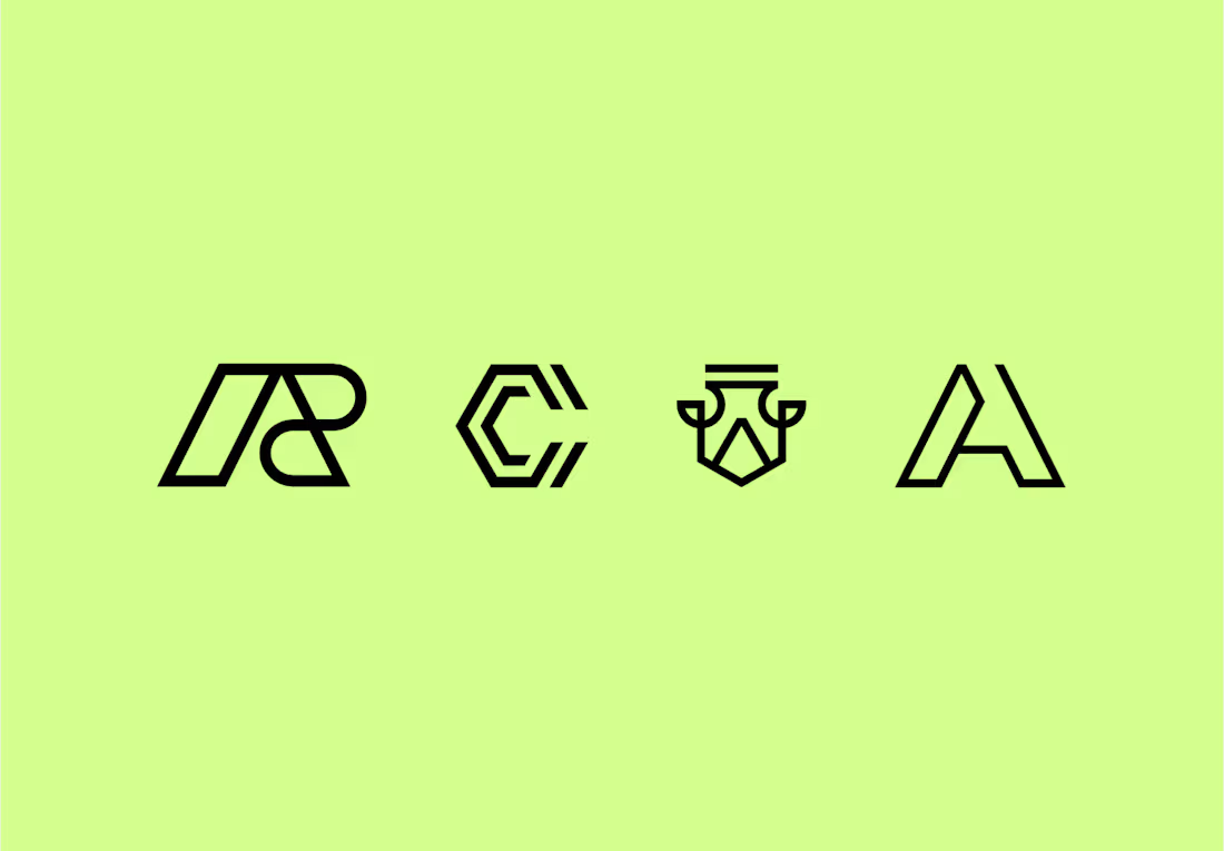

The C-shaped mark is my pick. The notched outline stays readable even when it gets small. Did the rejections come down to concept, or to how they held up at tiny sizes?

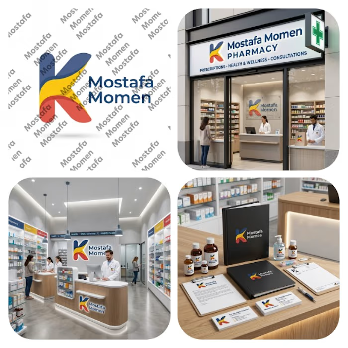
That's my pharmacy logo design it was special by it's color palette and smooth shapes
This design focus on (professionalism, trust, authenticity, showing business identity)
This design is special because it's color palette can be used in the business itself from furniture notes it will be suitable on them
Thanks for everyone who support me ❤️