The network for creativity
Join 1.25M professional creatives like you
Connect with clients, get discovered, and run your business 100% commission-free
Creatives on Contra have earned over $150M and we are just getting started
Back to feedPost

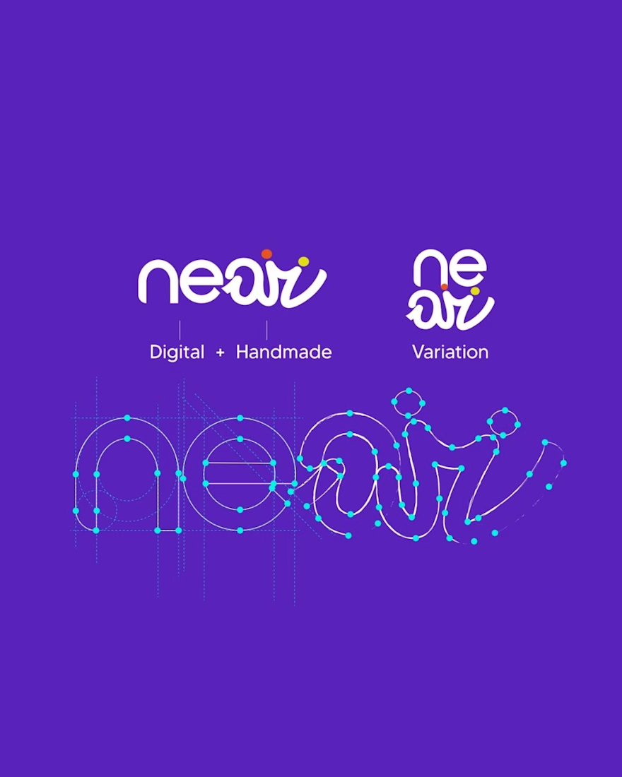
Near - Brand Identity & Strategy
A Canadian client came to us with one clear challenge: build a brand with genuine human energy in an increasingly automated world.
We started where we always do. Research. Who is this audience, what have they already seen too much of, and what would make them trust something new.
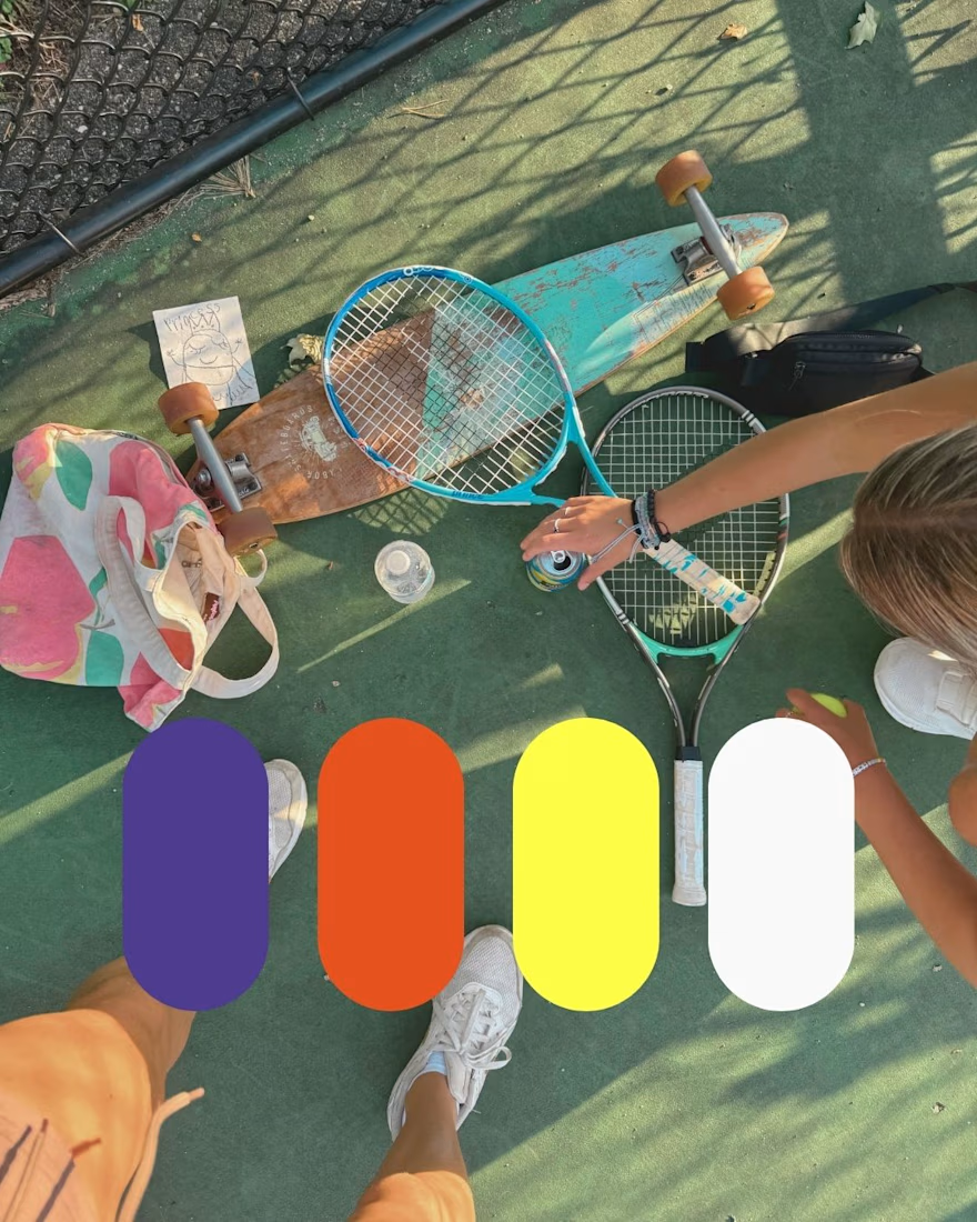
From that study came the brand strategy. Then the visual identity. Purple, orange, and yellow weren't chosen because they look good together (though they do 👀), they were chosen because they translated exactly what the brand needed to say: human energy, proximity, and the contrast between digital and real.
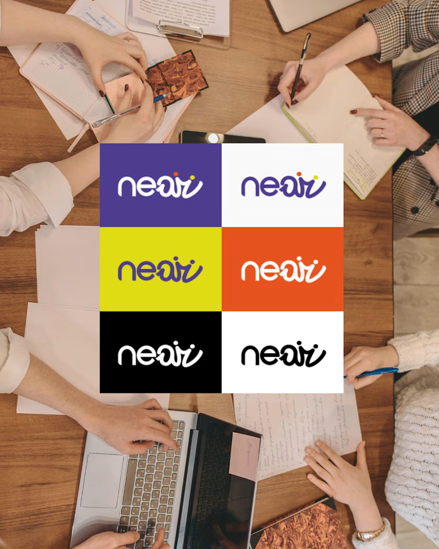
The full delivery included brand strategy documentation, moodboard, brand manual, visual identity, and motion design. A complete package that anyone on the team can open and immediately understand not just what the brand looks like, but why every choice was made.
That's what turns a visual identity into actual brand consistency.

Love this!
The network for creativity
Join 1.25M professional creatives like you
Connect with clients, get discovered, and run your business 100% commission-free
Creatives on Contra have earned over $150M and we are just getting started
Trending
retrofuturism
Share your favorite designs from the past exploring the distant future. Or your own take on the aesthetic 🚀
halftone
Dots. Texture. Grain. Let's see your designs using the halftone technique.

Midjourney
Creatives are showing off what they're making with Midjourney.
colorgrade
Video editors sound off: How do you enhance the mood of your video in color grading?
Related posts



1, great work 🙌

A set of mobile app icons exploring various visual styles from Y2K aesthetic and 3D skeuomorphism to retro pixel art and vector mascots.
Special thanks to Dana for helping out with one of the logos for the icons! 🙌
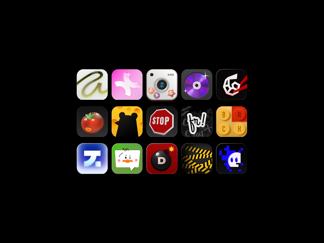
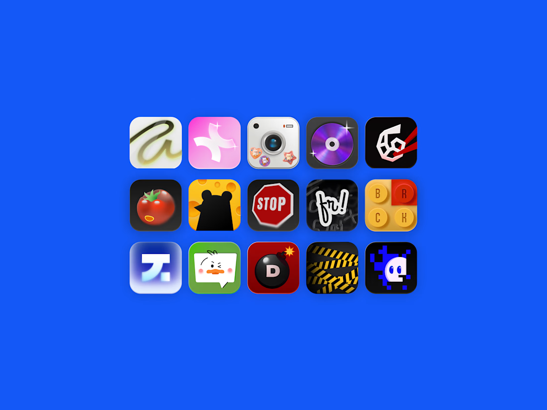

I'm so excited to be part of such an awesome project! Watch out for the bomb, Marho!🔥

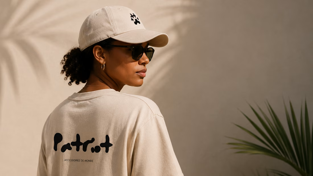
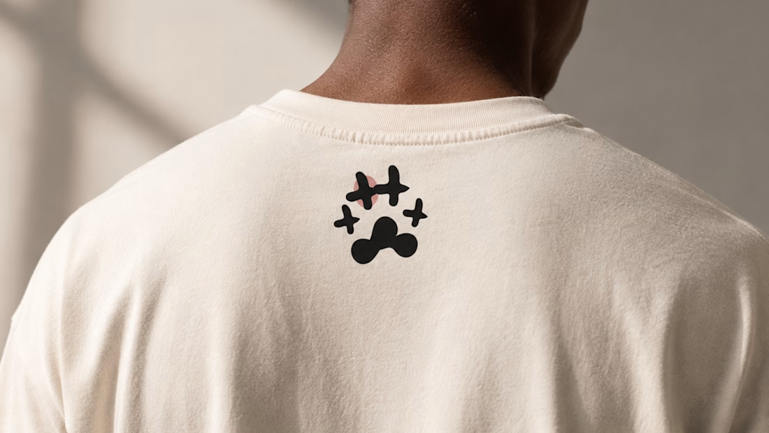
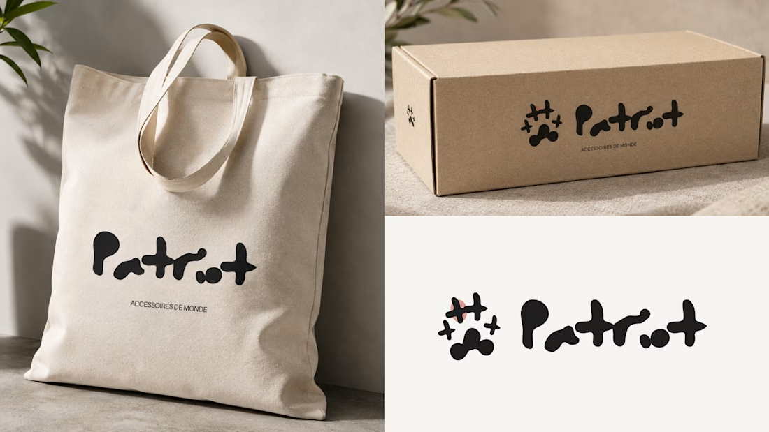
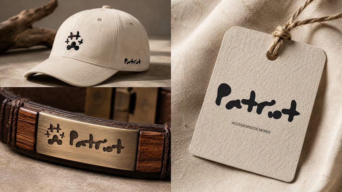
A logo identity for Patriot, a French boutique inspired by the Caribbean.
The goal was to create something that felt playful, expressive and contemporary, while still carrying a sense of warmth and culture.
The identity is built around an organic icon and wordmark designed to feel distinctive across everything from packaging and product tags to apparel and accessories.


Woww that's super unique! Absolutely love that concept 🔥