The network for creativity
Join 1.25M professional creatives like you
Connect with clients, get discovered, and run your business 100% commission-free
Creatives on Contra have earned over $150M and we are just getting started
Back to feedPost
I am continuing to work on a test project for Mercer St. and decided to improve the first impression—the loading process.
I created an animated preloader for the main screen to make the waiting time seem purposeful rather than empty.
I focused on rhythm, smooth transitions, and brand-appropriate movement to set the tone before users even reach the interface. I think these small details shape the impression of the product from the very first second.
I wonder how much attention you usually pay to preloaders
and micro-interactive elements in web products? Are they
still important, or are they becoming an invisible part of the
user experience?
Follow up for the next updates.
Love the pacing and subtle transitions. Feels very intentional 👌
Thanks!
Glad it resonated.
The network for creativity
Join 1.25M professional creatives like you
Connect with clients, get discovered, and run your business 100% commission-free
Creatives on Contra have earned over $150M and we are just getting started
Related posts
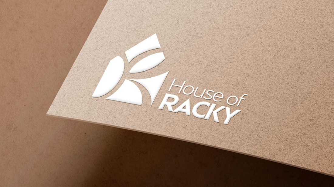
Envato AI gave me a house. It took human instinct to turn it into a home.
For the #envatochallenge, I wanted to put the "Human by Design" philosophy to the test by creating a complete premium brand identity for House of Racky.
My goal was to use Envato’s creative toolkit to push past the cold, mathematically sterile outputs of AI and inject real emotional luxury into the visual assets.
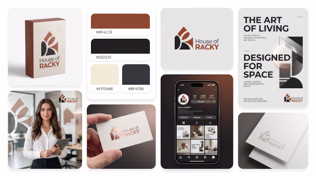
The Process:
The Spark: I used AI generation to start exploring shapes, but the initial outputs felt emotionally empty and lacked structural balance.
The Human Touch (My 'Human by Design' Moment): I stripped out the generic, messy layouts and manually rebuilt the logo's geometric structure in my design suite. I chose a sophisticated, sharp custom typography layout to bridge the gap between high-end architecture and human warmth.
The Final Polish: Using Envato Elements, I sourced cinematic stock footage, deep Foley sound design effects, and professional mockups to build a fully realized brand ecosystem that feels grounded in the real world.
AI is an incredible starting block, but it takes human taste, eye for detail, and instinct to make a brand truly powerful.
Check out the full workflow breakdown and the final high-res brand kit below 👇
This is stunning!!!
Project:
A promo reel for a real client. A LinkedIn brand consultant who helps serious professionals show up online without the noise.
The Human by Design moment:
I built the loud version first. Big text, fast cuts, hype music. Exactly what a LinkedIn promo is expected to look like. It was competent work. Then I watched it back and deleted it.
Not because it was badly made. Because it was wrong for her. Her clients come to her to get away from that noise. A loud promo would have contradicted the thing she's known for.
AI could generate something polished. It couldn't know that polished was the wrong call for this particular client. I knew, because I built her website and I know her brand.
The decision that carries it:
Her brand has exactly one accent color. So in a 28-second reel, that color appears once, on a single word. Everything else stays calm. AI would have spread it everywhere for "visual interest." Using it once was the whole point.
Envato as the toolkit:
Stock video, music, fonts, and AI-generated textures. All from Envato. Four asset categories in one deliverable.
Real client:
Not a spec project. She's an active consultant, I built her website, and she reviewed and approved this reel.
Social links: https://www.instagram.com/reel/Da5GRSnTkj9/?utm_source=ig_web_copy_link&igsh=MzRlODBiNWFlZA==
Really great walkthrough video
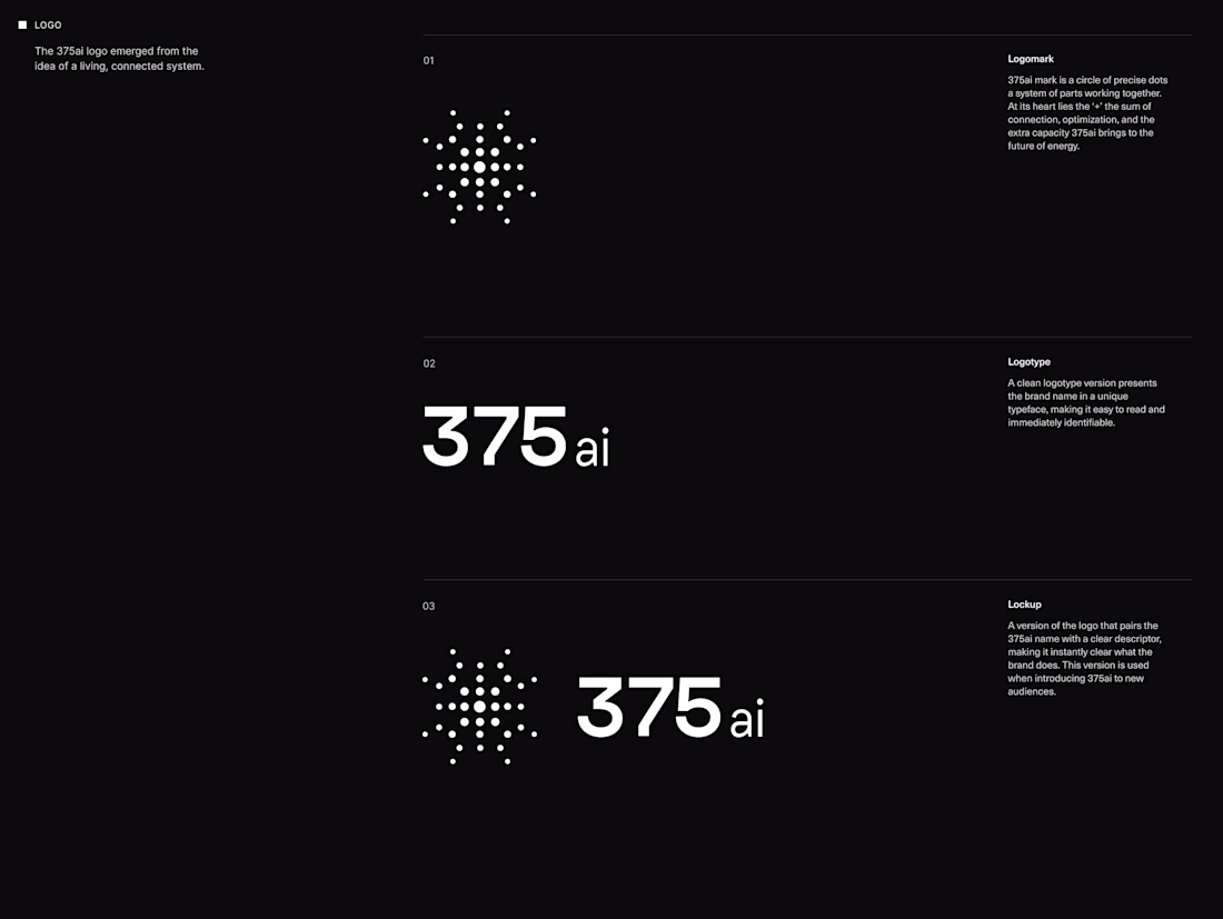
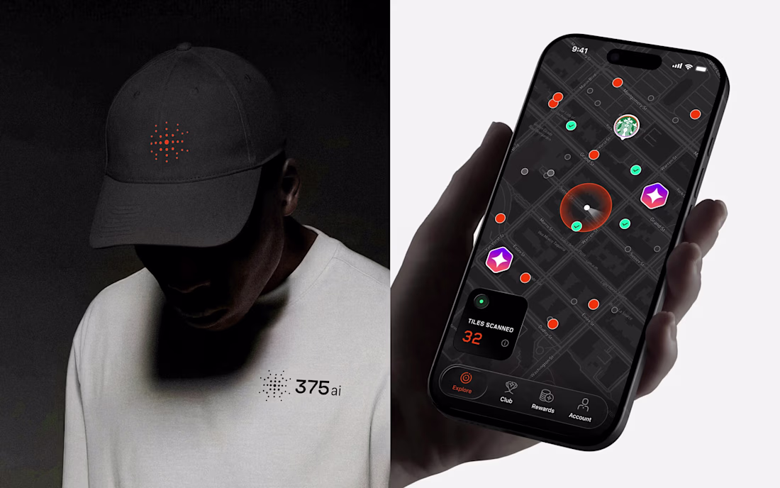
The 375ai logomark is a radar. Not a metaphor, the actual product: their devices scan millions of cars and objects in real time, so the identity simply names that behaviour.
From there everything pulls in the same direction. A custom typeface tuned for engineering seriousness but warm enough to live alongside consumers. 3D renders that bring the hardware to life. Motion that mirrors the real-time data stream underneath.
Full case is on my profile. Question for the other brand designers here: when you brand deeply technical products, do you reach for abstraction, or point straight at the thing?
This is a good one
Trending
Claude
Claude has entered the design space. How are you using Claude Design?
Contra University
Learn from expert creatives how to earn more using next-gen AI tools.
creativeaiflow
Creative AI workflows are evolving. What tools do you use, and what are their strengths and weaknesses?
freelancerlife
Freelancer life is wins, pivots, and everything in between. What’s yours right now?