The network for creativity
Join 1.25M professional creatives like you
Connect with clients, get discovered, and run your business 100% commission-free
Creatives on Contra have earned over $150M and we are just getting started
Back to feedPost
Dashboard design for PlanetaryX, a way to simply manage Biodiversity assets and their backing information. 🐝 🌳


Biodiversity asset management isn't a dashboard category I run into often, most finance-style dashboards default to bars and line charts by habit. What did PlanetaryX's users actually need to see at a glance, and did that push you away from the usual patterns?

Hey Maty, good question. What people needed at a glance wasn't performance, it was proof of impact: how much you've purchased, how much you've retired, and which real projects that's tied to. Bar and line charts imply something you're tracking over time, like a stock. This...
The network for creativity
Join 1.25M professional creatives like you
Connect with clients, get discovered, and run your business 100% commission-free
Creatives on Contra have earned over $150M and we are just getting started











Related posts

The team is cooking
Motion design for the logo we are making for Nation e-commerce

Wou

The most serious brand I’ve ever worked on mails you a phone shaped like a shell.
Deadpan voice. Inflated letters. One strange object a month.
STILL LIFE SERVICE, case study out now.
Would you open the box?


I'd open the box for sure! Inflated letters with a deadpan voice is such a fun mix.

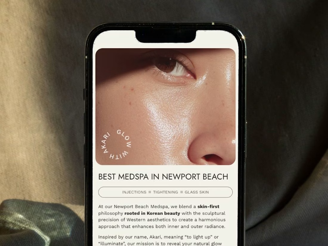
A restructured, clean website for Akari Medspa that turns scattered information into an intuitive experience as precise as the treatments they offer.


Too perfect buddy