The network for creativity
Join 1.25M professional creatives like you
Connect with clients, get discovered, and run your business 100% commission-free
Creatives on Contra have earned over $150M and we are just getting started
Back to feedPost
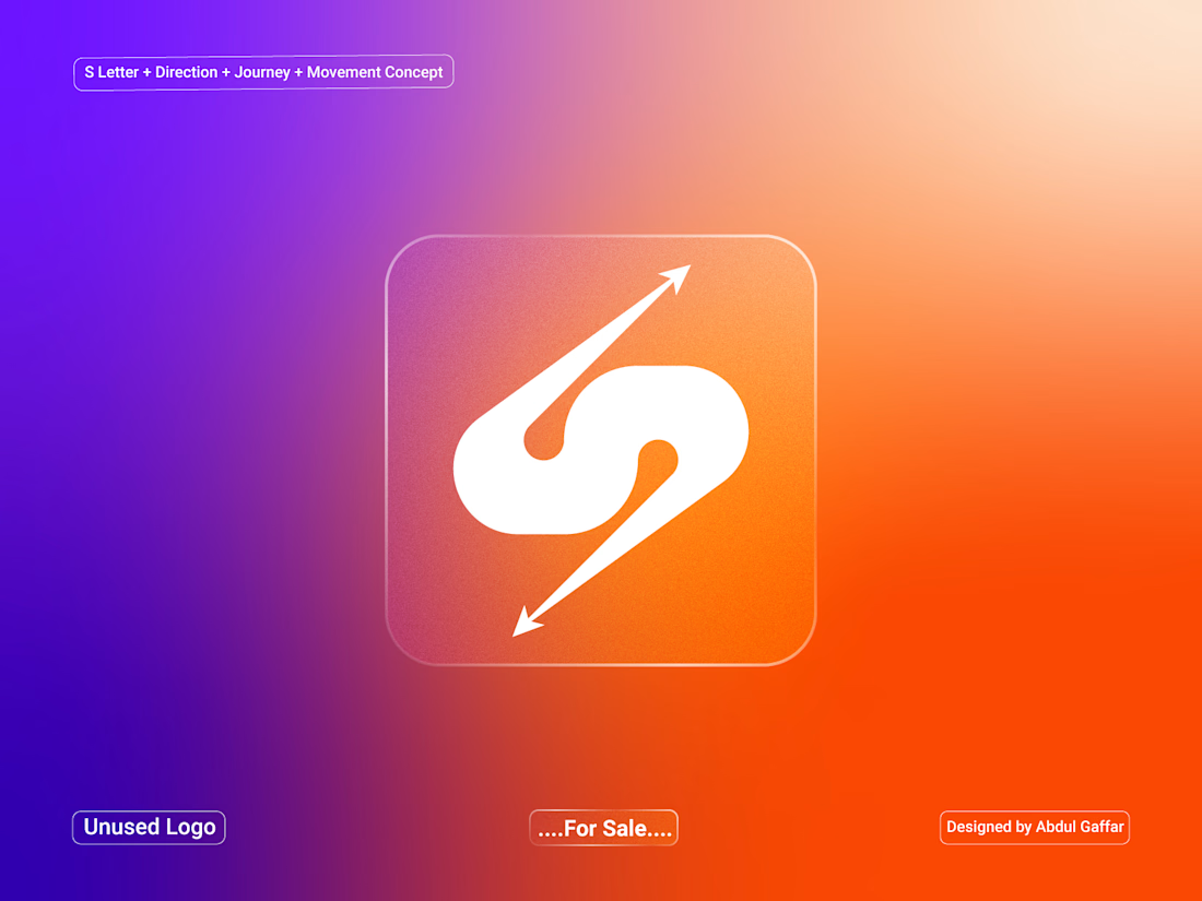
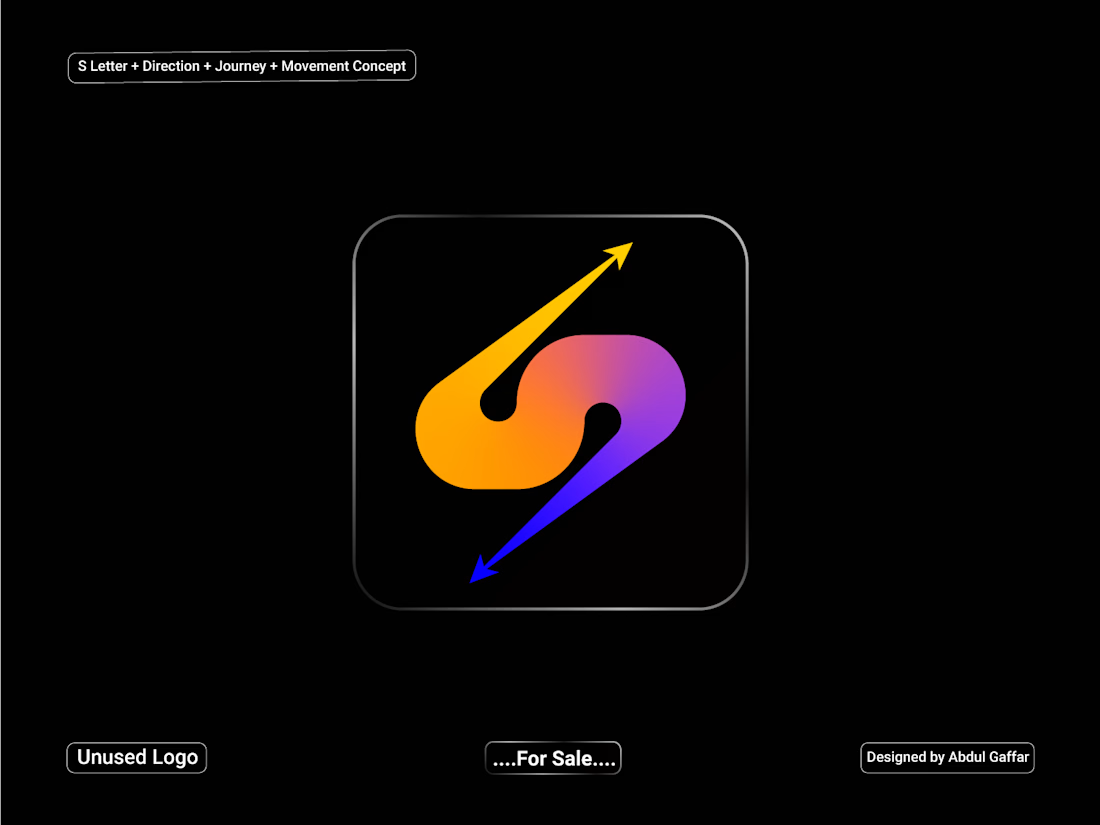
A dynamic S lettermark logo created for the travel and transportation industry, combining a smooth flowing form with directional arrows to represent direction, journey, movement, and forward progress.
The arrow elements symbolize travel routes and movement between destinations, while the flowing S-shaped structure creates a sense of speed and continuous motion. The clean and modern symbol is suitable for travel agencies, transportation companies, tour operators, travel apps, mobility services, car rentals, and logistics businesses.



Branding 😍

Thank you so much

The double-headed arrow is the part earning its keep here. An S loops back on itself, so left alone it reads circular rather than forward, and the arrow is what breaks the loop. Curious how you handle it at favicon size, whether the arrowheads stay or you keep a simplified cut for small use.
I went with a simplified version for small-size use, keeping the double-headed arrow as the main element while reducing the finer details. This should help the mark stay clear and recognizable even at favicon size.

Thank you so much

Stunning work 😍
Thanks


Nice work👏🔥🔥
Thanks


The S shape flows really nicely. The arrow details make the travel and movement idea come through without feeling too obvious.
Thank you so much for the feedback!


the arrow tucked in the S is smart. orange one is my pick
Thank you so much for the feedback.

So nice bro! Love the logomark and the colours! 🧡
Thank you so much for the feedback.

Reading it as a flowing S from a distance and as a single directional arrow up close is the harder trick than picking one metaphor — most travel marks commit to a route symbol or a letterform, not both at once.
Thank you so much for the feedback.
The single stroke doing double duty — reading as an S and as two opposing arrows at once — is the part that'll survive being shrunk onto a truck side or an app icon, which is where most "movement" logos actually get tested.
Thanks, Mark! That’s exactly what I was aiming for. one simple stroke that keeps the S and movement clear even at smaller sizes. Appreciate you pointing that out!

Love this mark! 🚀
Thanks

Great Branding and logo design concept, I can imagine the transitioning animation you can use, even only from these two images I am getting the idea of it. Great work 🙌
Thank you so much for the feedback!
The network for creativity
Join 1.25M professional creatives like you
Connect with clients, get discovered, and run your business 100% commission-free
Creatives on Contra have earned over $150M and we are just getting started

Challenges
View all


Related posts

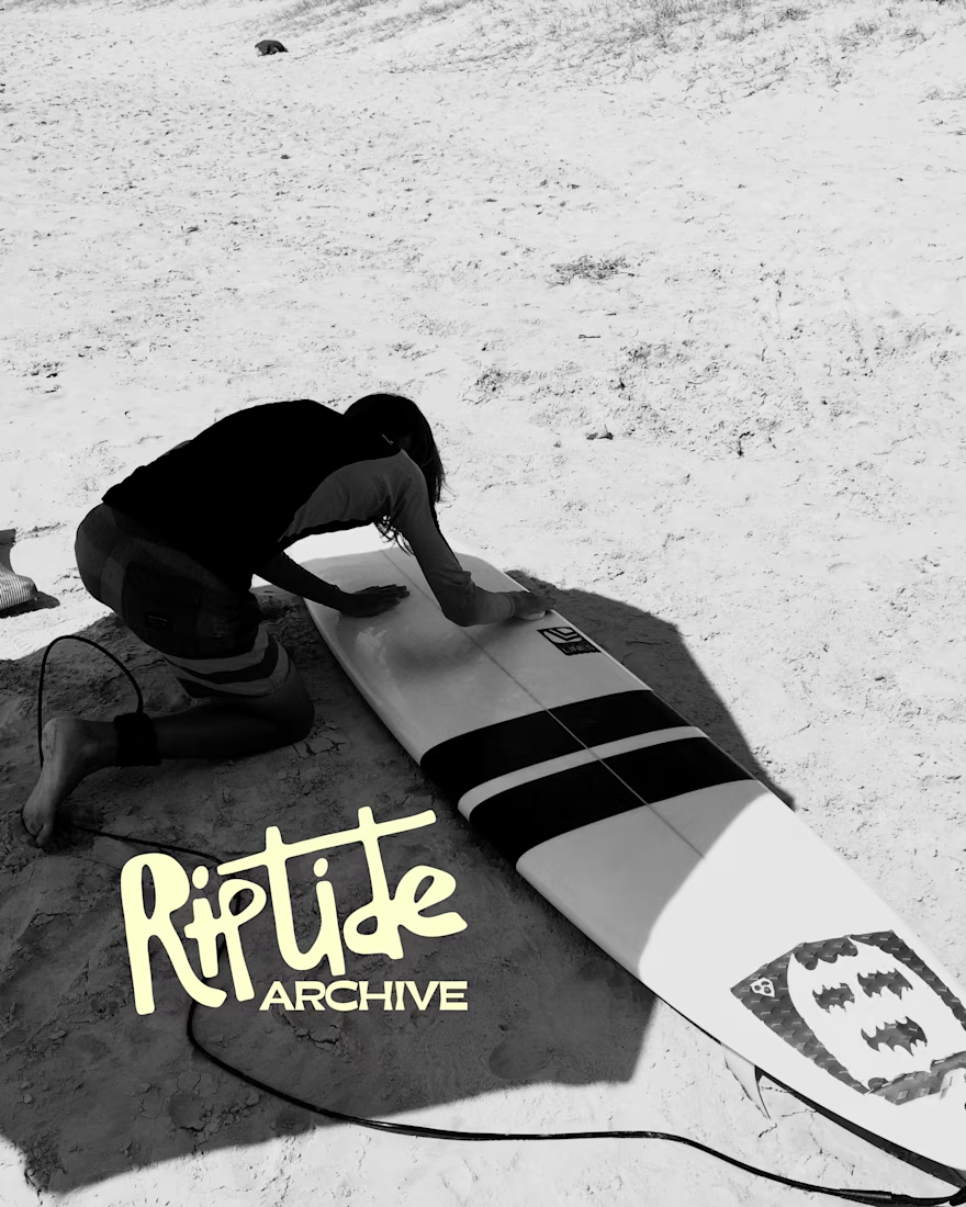
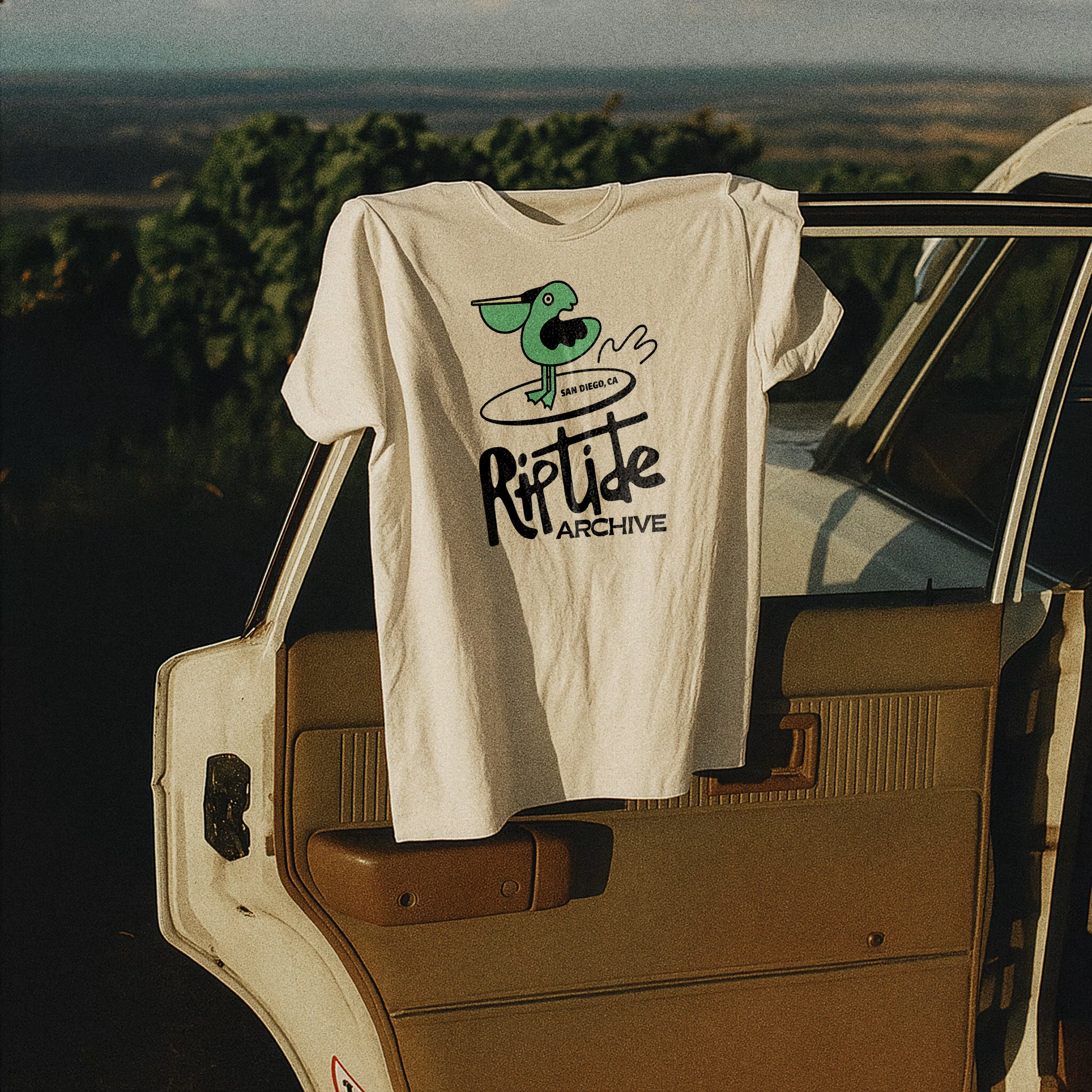
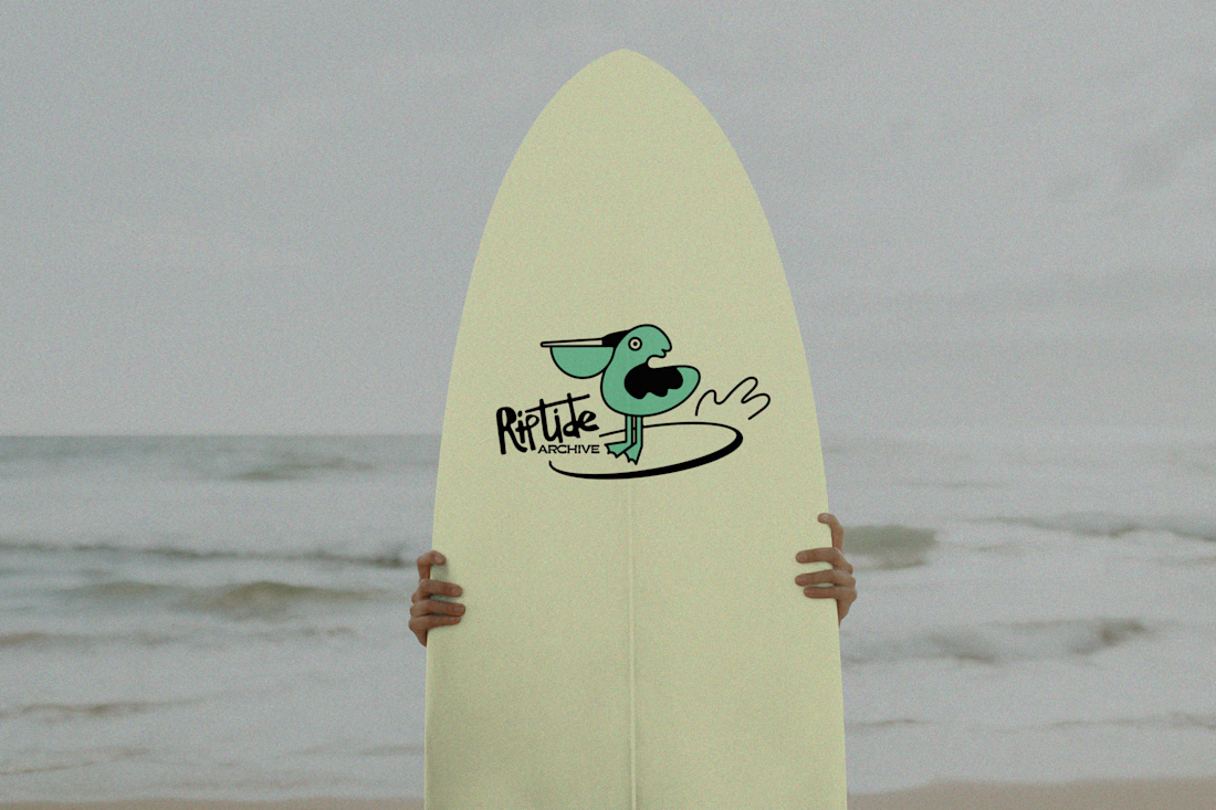
Logo for Riptide Archive. They document underground surf culture through limited run apparel, photo zines and short films.

Love this!


A logo should do more than look good.
It should tell a story before a single word is spoken.
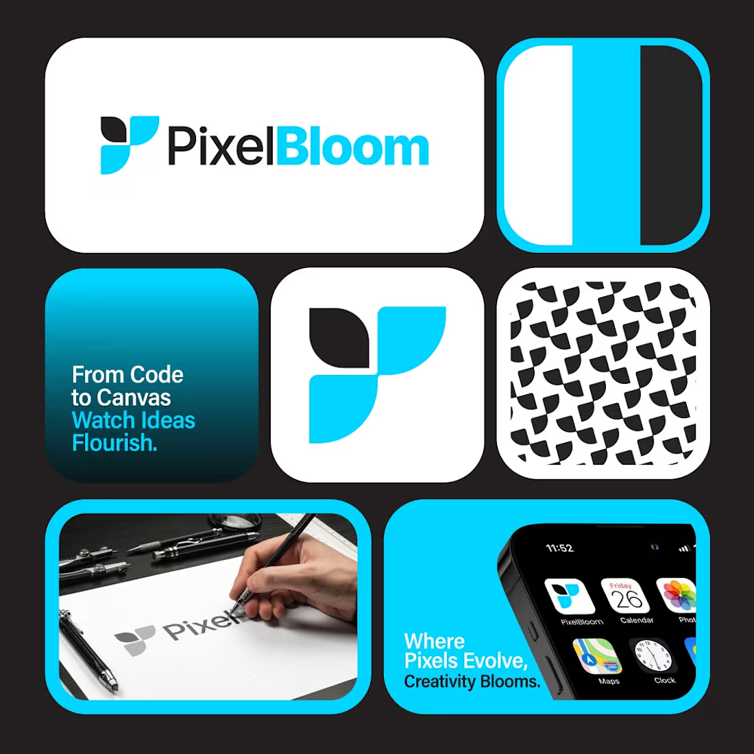
PixelBloom was created for a modern creative brand that values simplicity, innovation, and growth. The clean geometric icon represents ideas coming together, while the vibrant color palette adds energy without sacrificing professionalism.
Every curve, proportion, and application was carefully refined to build a brand identity that feels memorable across both digital and print.
Strong brands aren't built overnight.
They start with one unforgettable logo.
💬 What's the first word that comes to your mind when you see PixelBloom?
If your business deserves a professional identity that stands out, let's build it together.
#logodesign #branding #brandidentity #graphicdesign #visualidentity #modernlogo #creativebranding #minimaldesign #branddesigner #identitydesign #logoideas #graphicdesigner #designinspiration #designsburner #logopresentation


Outstanding work

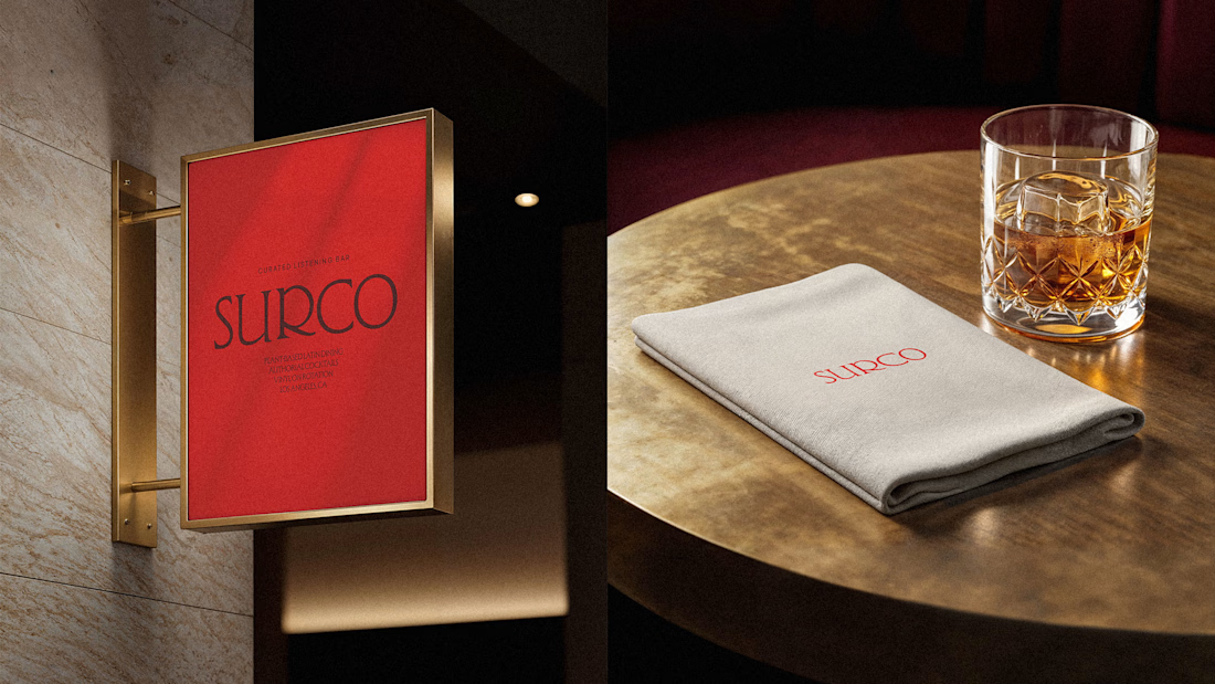
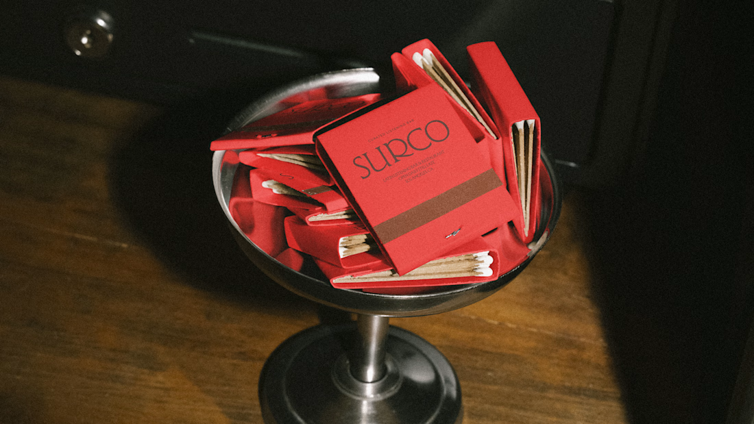
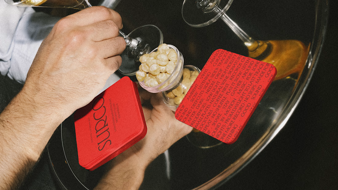
SURCO | Latin Bar & Restaurant Brand Identity
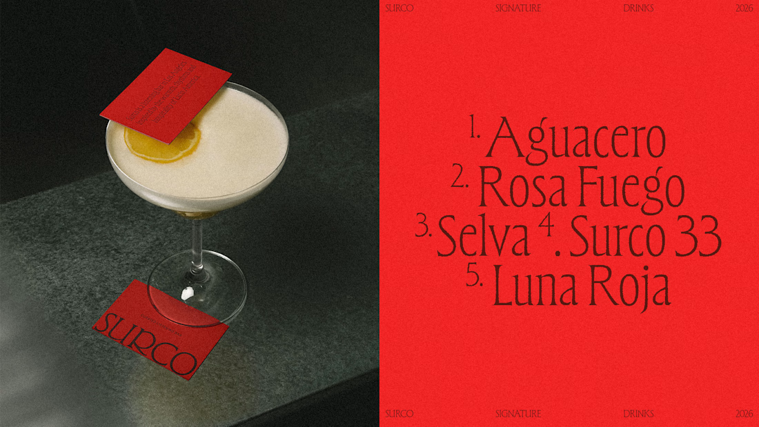
SURCO is a Latin bar and restaurant in Los Angeles where food, cocktails, vinyl and nightlife come together.
I developed a complete visual identity designed to feel warm, energetic and contemporary, without relying on the usual visual clichés associated with Latin restaurants. The system combines bold typography, a rich color palette, and art direction inspired by late nights, shared tables, music and the atmosphere of the bar.
The identity was extended across menus, signage, social media, printed materials and environmental applications, creating a flexible system that feels recognizable across every touchpoint.
Services: Brand Identity, Logo Design, Art Direction, Visual System, Graphic Design
Full project:
https://www.behance.net/gallery/255628447/Surco
Beautiful work!