The network for creativity
Join 1.25M professional creatives like you
Connect with clients, get discovered, and run your business 100% commission-free
Creatives on Contra have earned over $150M and we are just getting started
Back to feedPost
Taste Test
Hi Contra Community! 👋
I'm presenting this logo concept for Quintessa, an ultra-luxury brand, and I'd love to hear your honest feedback.
Which color combination best communicates luxury, trust, and exclusivity?
Also, if you have suggestions for improving the logo itself, I'm all ears. Your feedback is greatly appreciated!
3 voted
38%
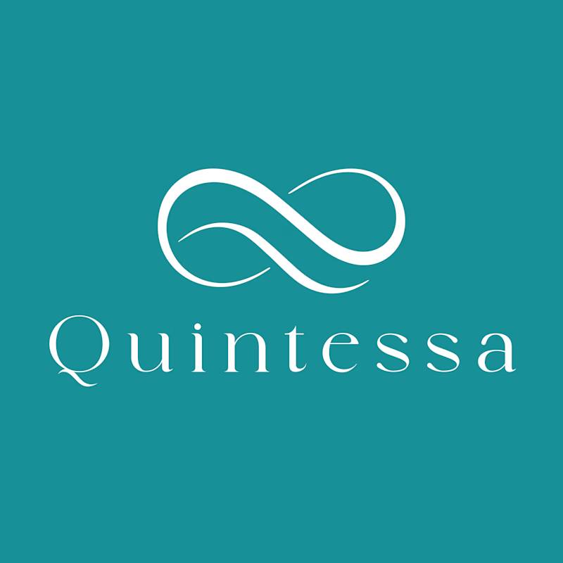
5 voted
62%
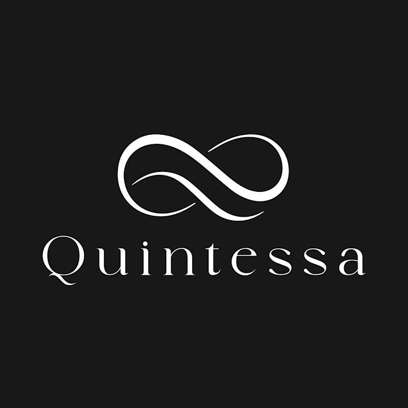
8 votes
Closed


If you were to choose the one that gives trust and reliabilty i would go with blue but just to give you a better and detailed advice could you please tell me what is Quintessa about?

Thanks for your interest. Quintessa is a group of companies they provide various luxury services like private jet, luxury yachts etc.

Muntashir, both are really great
Thanks!


Option 1


I noticed how the overlapping ribbon mark subtlely tapers right at the intersection points, creating a smooth sense of dimensional depth and continuous motion without needing heavy drop shadows or complex gradients. It balances really well with the clean stroke contrast of the...
Appreciate that! The taper makes the mark feel carved by motion, not built with layers.
We went fluid instead of geometric because Quintessa spans jets, yachts, and more — a loop suggests one seamless experience, while the serif keeps it grounded.
The network for creativity
Join 1.25M professional creatives like you
Connect with clients, get discovered, and run your business 100% commission-free
Creatives on Contra have earned over $150M and we are just getting started








Related posts

The client really liked Barcelona typical floor tiles, so I presented these logo options. Which one you liked the most?
4 voted
13%
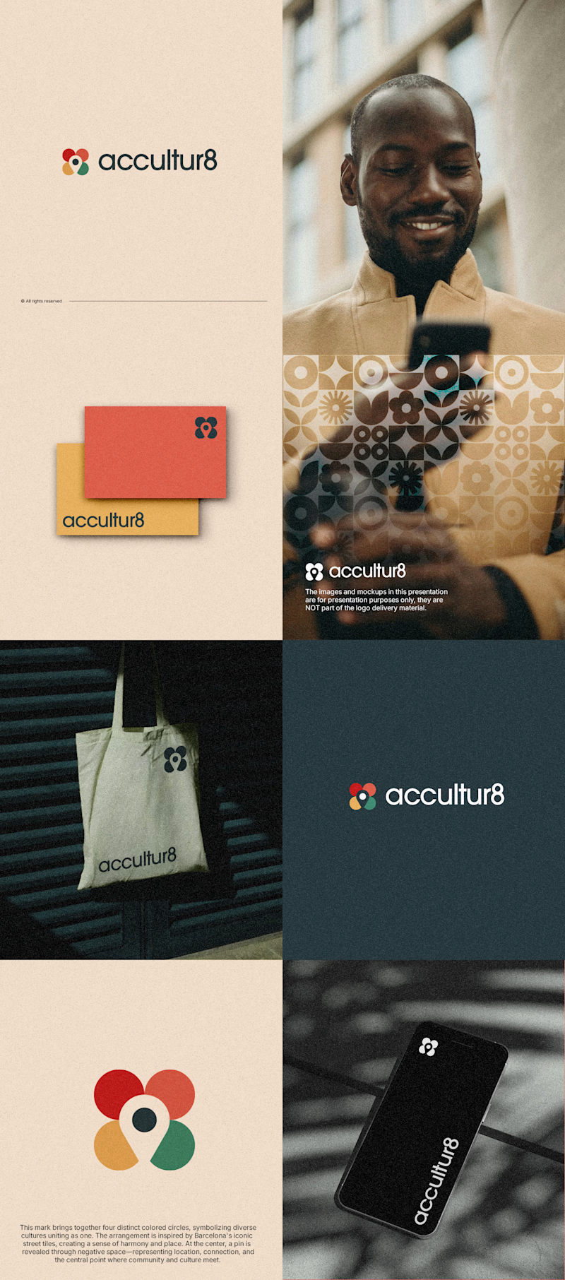
26 voted
87%
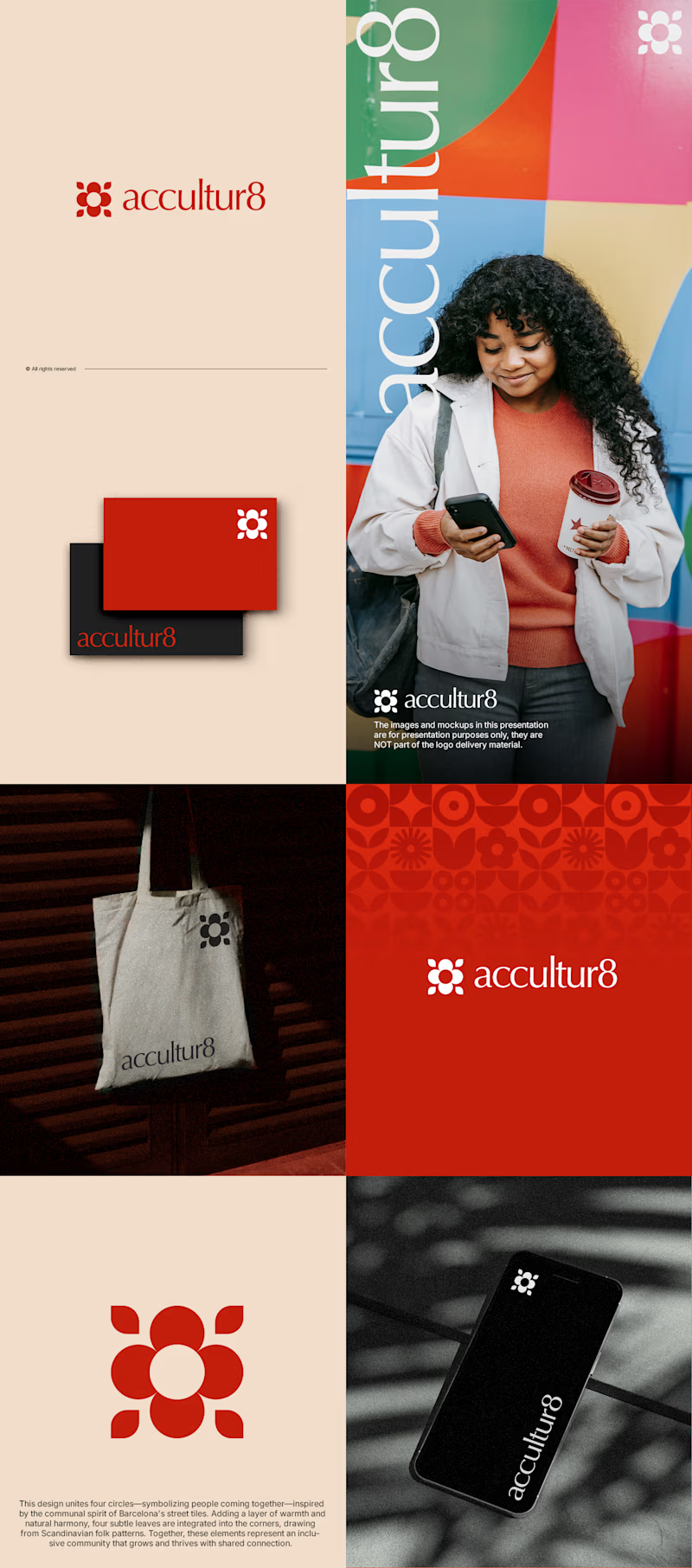
30 votes
Closed

Love option 2, which one do you like most ?

i create a 3D cube component for a Framer website to add creativity. which one is better dark or light? Check the live preview here
22 voted
51%
21 voted
49%
43 votes
Closed

Snap to the position in the last will feel more real

Two color directions for an AI governance explainer. A draft AI use policy becoming the questions nobody can answer yet.
20 voted
77%
6 voted
23%
26 votes
Closed

blue for sure 💯