The network for creativity
Join 1.25M professional creatives like you
Connect with clients, get discovered, and run your business 100% commission-free
Creatives on Contra have earned over $150M and we are just getting started
Back to feedPost

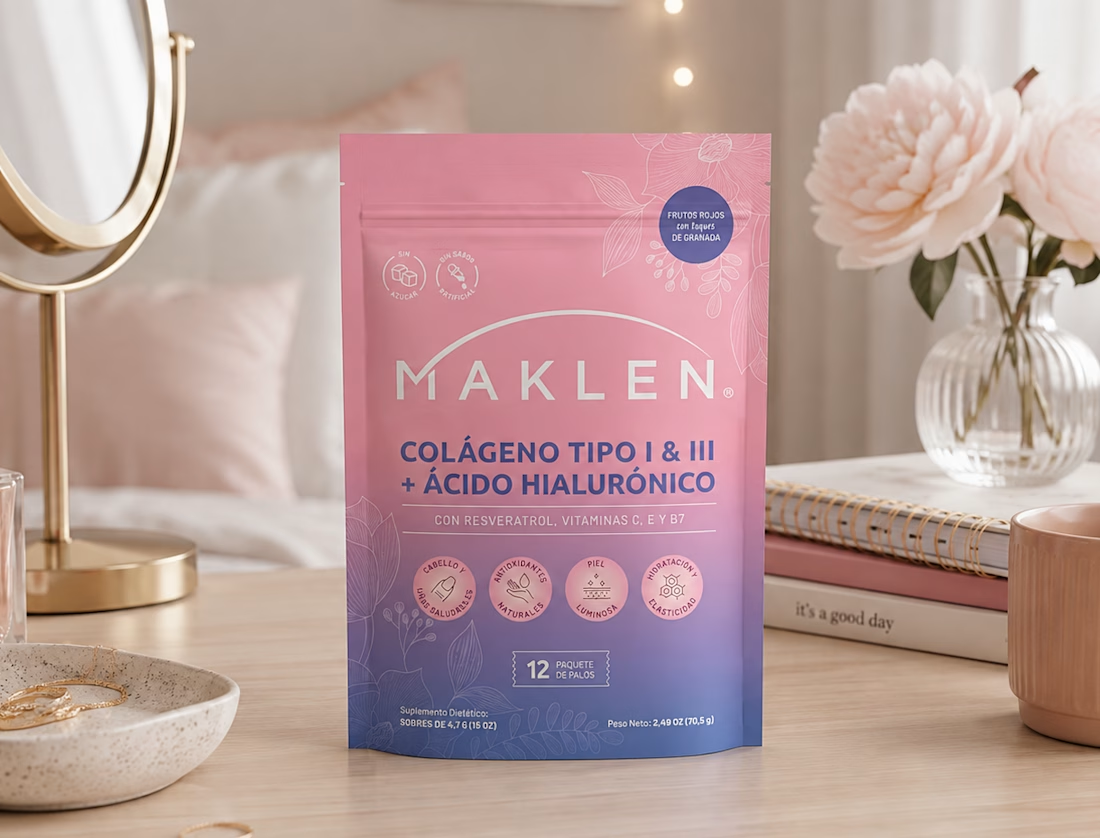
MAKLEN — Elevating Beauty & Wellness Through a Soft, Premium Packaging Identity

MAKLEN is a collagen supplement packaging concept designed to communicate beauty, wellness, and everyday self-care through a sophisticated and approachable visual language.
The design strategy is built around a soft pink-to-blue gradient, creating a visual transition that feels fresh, feminine, and contemporary while differentiating the product from the typically clinical appearance of health supplements.
The MAKLEN wordmark is positioned prominently at the center, establishing immediate brand recognition. Below it, the product formulation—Type I & III Collagen + Hyaluronic Acid—is given strong typographic emphasis to make the core proposition immediately understandable.
A carefully structured information hierarchy guides consumers from brand → formulation → supporting ingredients → beauty benefits → pack size, allowing multiple pieces of information to coexist without making the front panel feel crowded.
The delicate botanical line illustrations add an elegant natural cue and create a visual frame around the composition. Rather than using realistic beauty imagery, the botanical elements provide a more refined and timeless expression of wellness.
The four circular benefit icons create a clear visual system for communicating the product's beauty-related benefits, while the restrained blue typography introduces contrast and reinforces a sense of credibility and sophistication.
Overall, the packaging balances beauty appeal with functional communication, positioning MAKLEN as a modern wellness product that feels premium, feminine, natural, and easy to understand.


The network for creativity
Join 1.25M professional creatives like you
Connect with clients, get discovered, and run your business 100% commission-free
Creatives on Contra have earned over $150M and we are just getting started











Related posts

Brand Expressions -- Olivir




Thats so crazy!!!!!! Seeing this I feel we humans are still far better than AI

A little peek at the brand work we did for Elio Mortgage.
A warm, approachable identity full of warm vibrant colors paired with soft sun rising inspired gradients, inner glows and custom illustrations & more. Loved this direction!
Full case study coming soon, from process to final identity.
Plenty of logo explorations to share too!


That color palette takes the whole identity to a different level!! I loove it.

FOCUS — Creative Portfolio & Digital Art Website 🌸✨
A visually expressive website concept for a creative portfolio, built around digital art, bold imagery, and visual storytelling
The design combines vibrant pink tones, soft gradients, experimental typography, and immersive photography to create a distinctive editorial experience
Special attention was given to:
• Bold editorial hero composition
• Vibrant pink and dark color palette
• Experimental typography and visual details
• Immersive photography and digital artwork
• Creative project gallery and navigation
• Responsive mobile experience
• Clean layouts with a strong visual identity
The result is an expressive digital experience that puts creativity, emotion, and visual storytelling at the center of every screen 💗
Looking to create a standout portfolio or website for a creative brand? Let’s connect 🚀



