The network for creativity
Join 1.25M professional creatives like you
Connect with clients, get discovered, and run your business 100% commission-free
Creatives on Contra have earned over $150M and we are just getting started


The network for creativity
Join 1.25M professional creatives like you
Connect with clients, get discovered, and run your business 100% commission-free
Creatives on Contra have earned over $150M and we are just getting started





Related posts

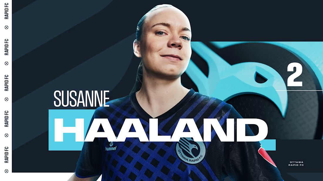
Sharing a project I'm really proud of: the 2025 broadcast design for the Northern Super League, Canada's new professional women's soccer league.
What made this one special is that the league had no visual history on TV. Every graphic viewers saw in that first season had to be created from zero, for a league that was introducing itself to the country.
The goal was a broadcast identity that feels as ambitious as the league itself: bold enough to stand out on screen, clear enough to follow at a glance, and flexible enough to carry six different clubs inside one consistent system.
The biggest lesson for me: when you design for a league that's just being born, you're not only packaging matches. You're helping define how people will remember its first season.
I'd love to hear from anyone working in sports or broadcast design: how do you approach building a visual system for a league that's launching from scratch?



Great Work demands great efforts

Doppel — Threat Graph
Making complex cybersecurity concepts clear through motion.
For the Doppel Threat Graph product film, I contributed to the visual development and animation. The product connects digital threats across multiple channels, revealing how individual signals form part of a coordinated attack campaign.
The challenge was to translate this technical functionality into a clear visual narrative—showing why the connections between threats matter and how they help reveal the bigger picture.
My work covered storyboard and motion exploration, animation, and scene refinement throughout the feedback process. The focus was on introducing information progressively and guiding attention toward the relationships central to the product’s value.
The result is an animated product film that introduces Doppel Threat Graph and makes its core functionality easier to understand. The project demonstrates how motion design can bring clarity to a complex software product.
Services: Storyboard Exploration · Motion · Animation


That's unbelievable great job 🎉🎉🔥🔥

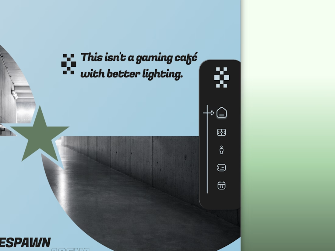
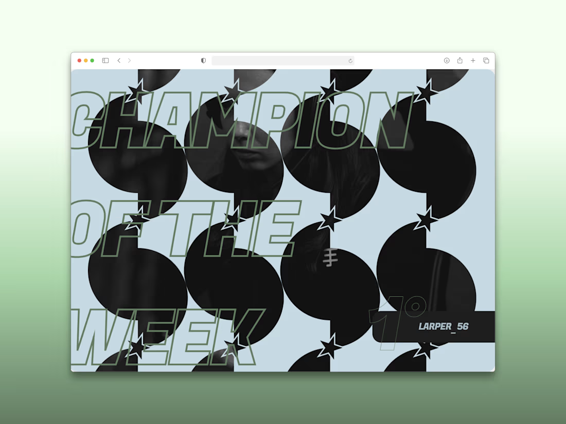
Every esports brand reaches for neon and a mascot.
RESPAWN ARENA reaches for a scoreboard.
Case study on the stadium-grade identity — typography, system, the whole build — dropping soon.