The network for creativity
Join 1.25M professional creatives like you
Connect with clients, get discovered, and run your business 100% commission-free
Creatives on Contra have earned over $150M and we are just getting started
Back to feedPost

Concept rebrand of The Plantier, a small plant shop, presenting a cohesive visual identity across logo, typography, color, packaging, merchandise, and brand materials.
*Independent concept project, not affiliated with the original company.


The network for creativity
Join 1.25M professional creatives like you
Connect with clients, get discovered, and run your business 100% commission-free
Creatives on Contra have earned over $150M and we are just getting started
Related posts

What if indigo is just ink that got patient?
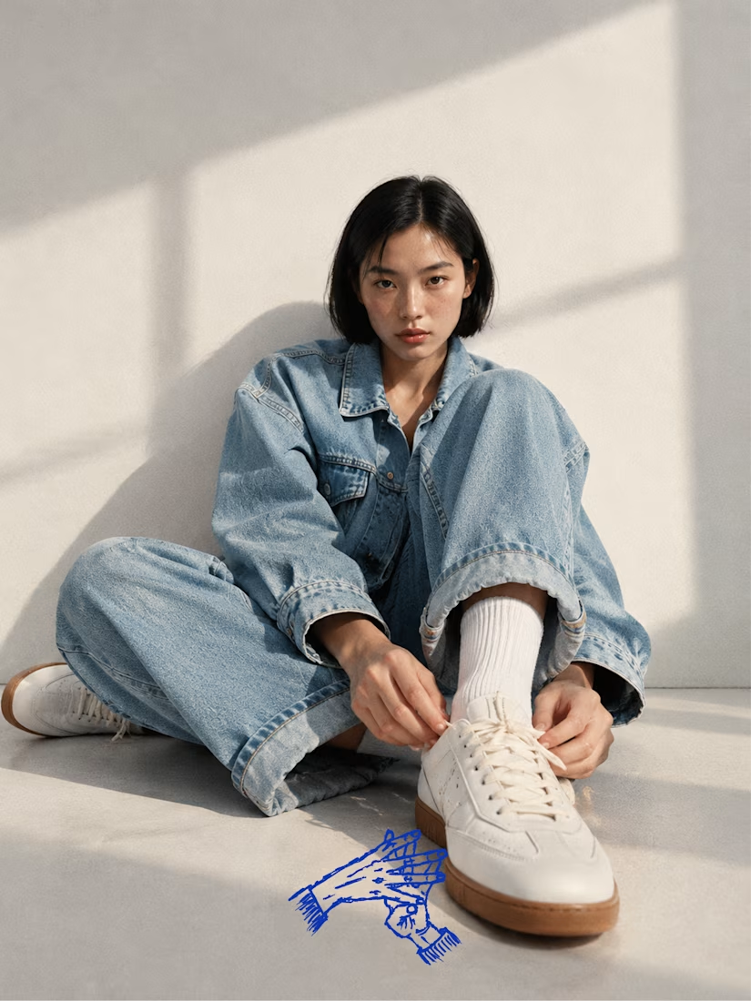
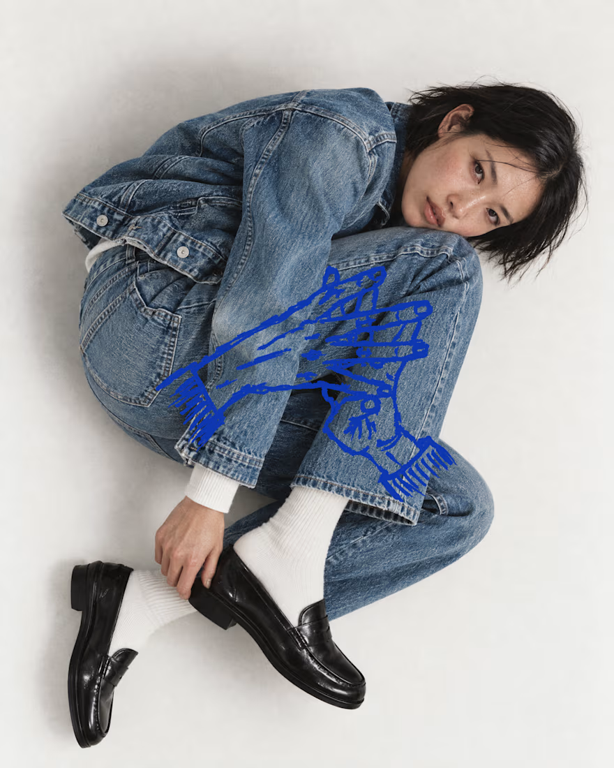
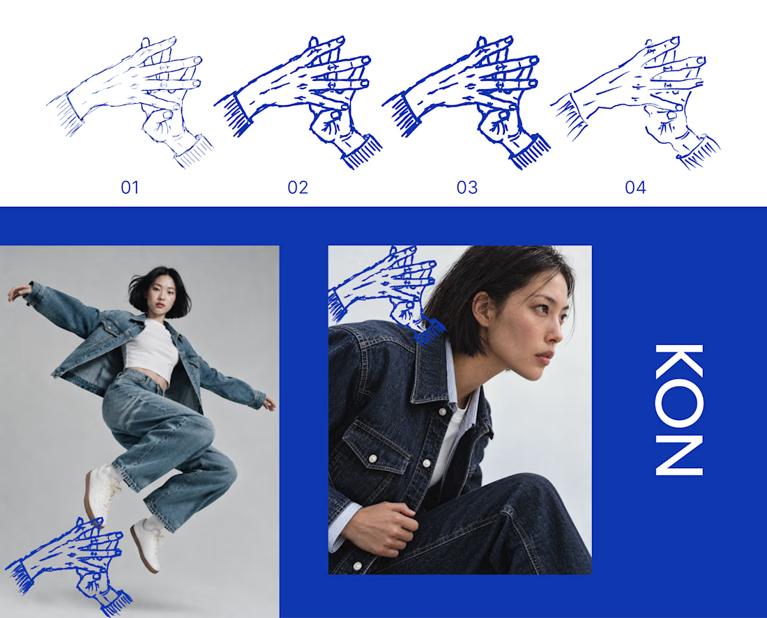
KON is a denim and streetwear label for people who live in hip hop and care how things are made. For Inktober’s final stretch, I took its hand mark through four ink passes, from a fine line to a heavy stroke to a dry brush. Each one sits on the last, the way cloth gets dipped again and again until the color holds.
Swipe to see the passes, then the mark out in the world on denim.
The full KON case study is coming soon.
Which part of your process do you repeat until it hits? Show me yours.

That's really great specially the photography

Brand new case study up! Had loads of fun with this one
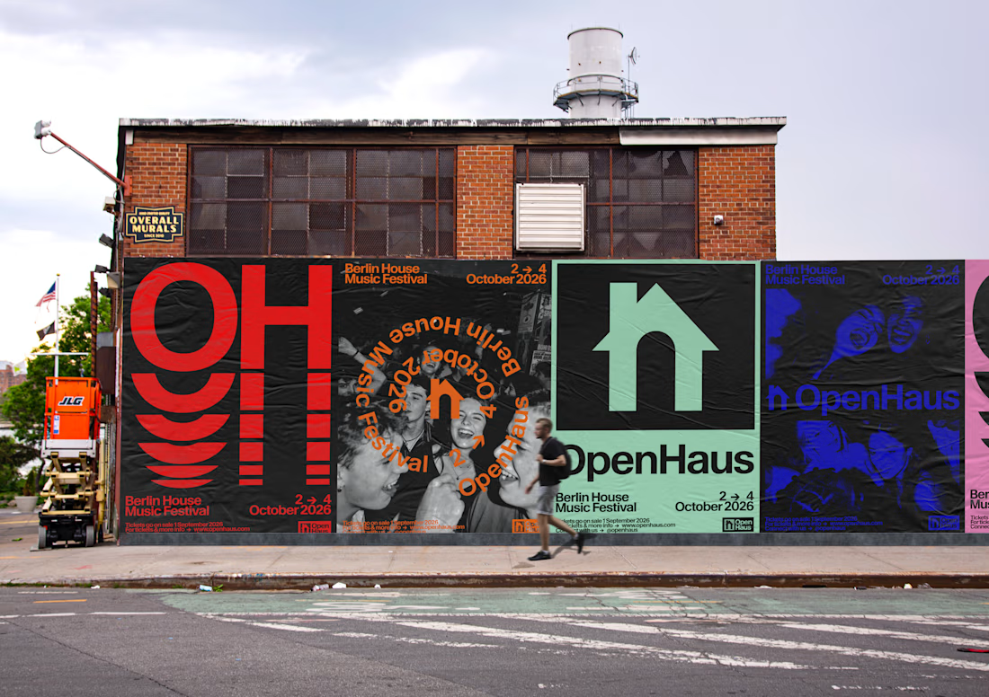
OpenHaus is a vibrant house music festival, made for anyone and everyone. The visual identity leans into bold, saturated color paired with bold typography and structured, grid-based layouts. It feels colorful and inviting on the surface, but stays grounded by a level of restraint that gives it a more considered feel.


Looks nice 👍🏻

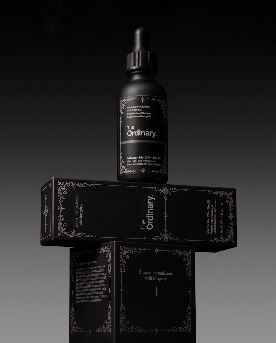
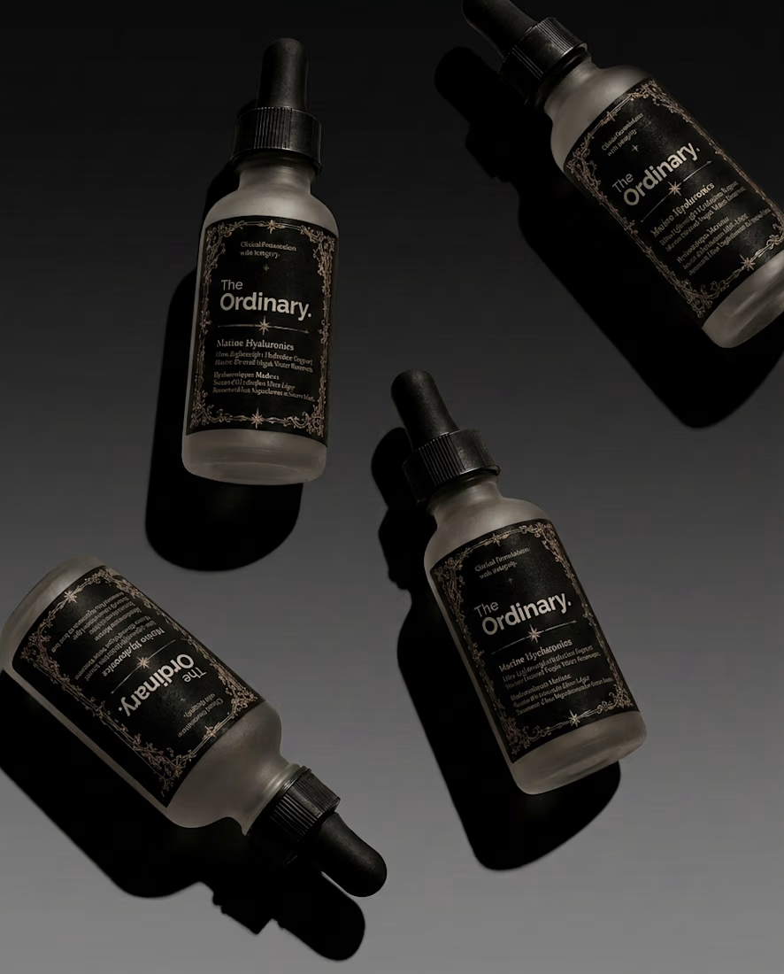
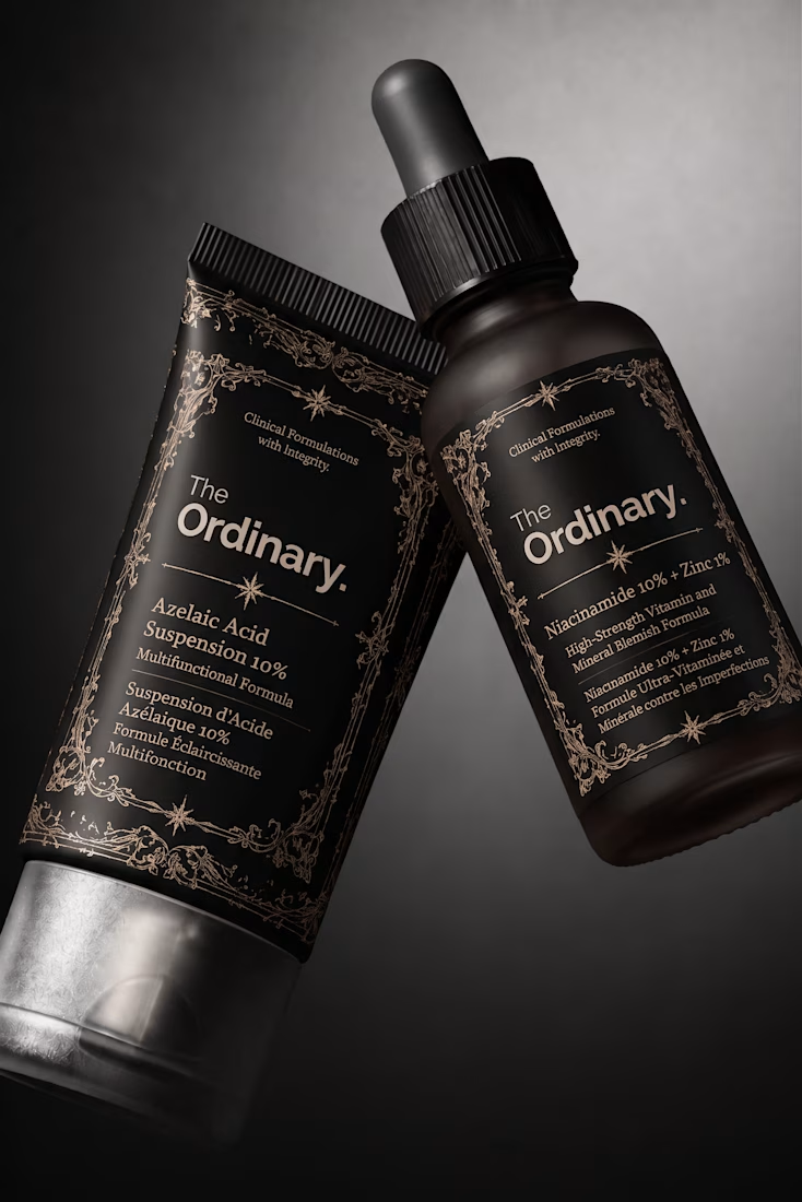
What if your favorite skincare brand got a Halloween makeover? 🕷️
For this little experiment, I’m giving The Ordinary a 𝔤𝔬𝔱𝔥 alter ego.
The challenge was keeping the things that make the brand instantly recognizable: its straightforward logo and typographic editorial layout, clinical packaging, and no-nonsense aesthetic.
Instead of turning it into a completely different brand, I wanted to push those same elements into darker territory with 𝔢𝔢𝔯𝔦𝔢 tones🕸️ , gothic details, and a more mysterious product presentation.
Even in costume, you should know exactly who you're looking at.
Which brand would you love to see get a Halloween makeover next? 👻


Keeping the logo untouched and only changing the mood works really well. Glossier next?