The network for creativity
Join 1.25M professional creatives like you
Connect with clients, get discovered, and run your business 100% commission-free
Creatives on Contra have earned over $150M and we are just getting started
Back to feedPost
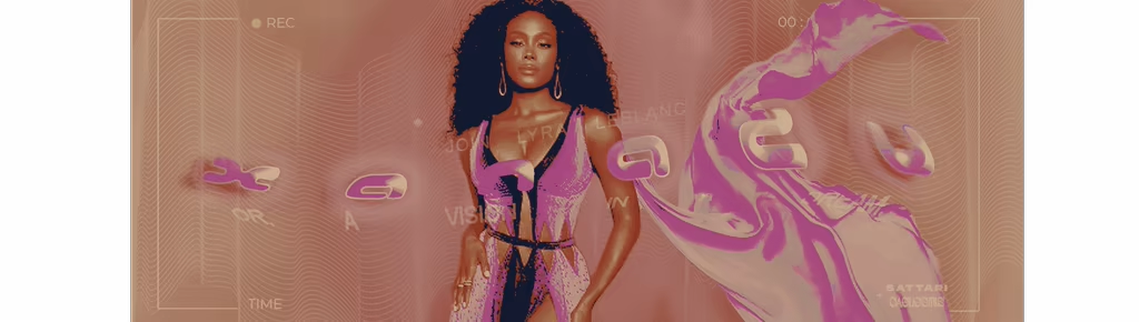
xanadu - event banner.
this is a .gif banner ad for a fictional island getaway, all names & brands in the copy below are self-created or used with permission from collaborators (ie. lyra leblanc isn't my own creation, but a friend's, & she's a sort of 'kim kardashian'-esque figure in my writing community's universe portrayed by actress shannon thornton).
the event was mapped out by a team of four, including myself, though this graphic is my own creation, using photoshop to edit free stock video footage for the .gif texture created in the background & free online sources for fonts, images, & the line/wire texturing in the background, which was warped to have a stable, subtle element set in front of the one in motion along with the text & camera framing.
i wanted, above all, to convey an almost magical tone through visuals to mirror the chosen name being 'xanadu'–– a nod to both the cult classic film & the definition as synonymous with a realm akin to many perceptions of heaven or nirvana–– while keeping a contemporary feel that felt real & conscious of our premise's use of modern technology as a pillar. it was important that the graphic stayed warm in terms of palette & color, especially when it came to making sure the central figure wasn't misrepresented through any sort of whitewashing. that led me to thinking more of sun & sand of beaches & the often colorful cocktails we find tailored to suit the season. the ocean got its nod through the movement in the background, so working up a palette that was vibrant & eye-catching as well as complementary to the model naturally started centered around the hot pink of her dress, then bled into inclusion of paler pinks, yellows, & light to medium oranges. in the midst of creation, a sunset's start came to mind, & i ran with the idea as inspiration, though i didn't want to recreate the image of a sunset, as locking into one setting felt too concrete for the flexible nature of the event i'd created with my team.
the two names near the lower right hand corner, sattari & caelestis, are both fictional sponsors in different fields, each highlighted in their styles through font but made simple to understand as sponsors with a '+'. the plus sign as an indicator of their involvement with the event as opposed to a larger, perhaps more standard, 'sponsored by...' in its place felt contemporary & 'technical', in adherence with the practicality of the wire details & to contrast with the billowing fuchsia of the garment behind it as well as the title's 'glowing' text effect & pathway being bent to lean back on the beachy feel.
The network for creativity
Join 1.25M professional creatives like you
Connect with clients, get discovered, and run your business 100% commission-free
Creatives on Contra have earned over $150M and we are just getting started
Related posts
Top notch
Amazing!!!
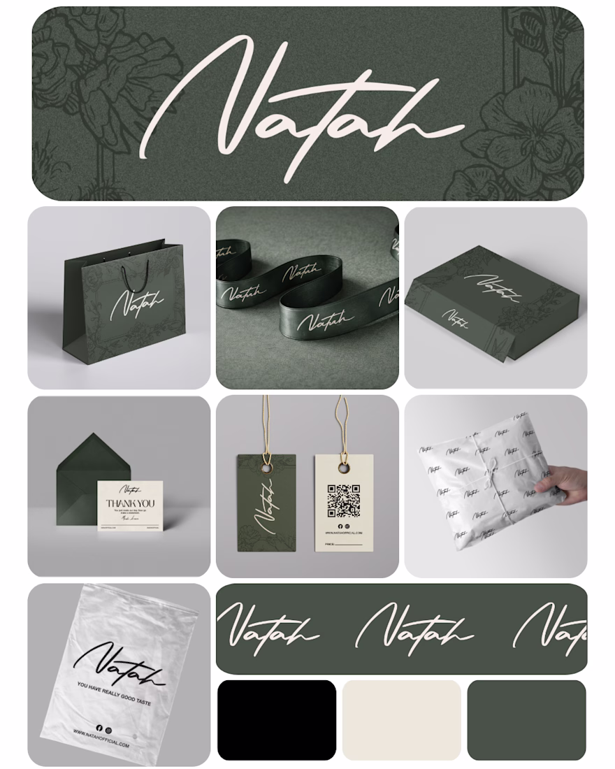
Branding kit designed for the fashion brand Natah, featuring a sophisticated visual identity that blends elegance, femininity, and modern luxury. From premium packaging and garment tags to shopping bags and tissue wraps, every element is crafted to deliver a cohesive and memorable brand experience. The earthy color palette and signature handwritten logo reflect Natah’s timeless and refined fashion aesthetic.
Challenges
View allTrending
Claude
Claude has entered the design space. How are you using Claude Design?
Contra University
Learn from expert creatives how to earn more using next-gen AI tools.
creativeaiflow
Creative AI workflows are evolving. What tools do you use, and what are their strengths and weaknesses?
portfolioreview
The best portfolios tell a story, not just show a grid. Share yours for feedback.
freelancerlife
Freelancer life is wins, pivots, and everything in between. What’s yours right now?