The network for creativity
Join 1.25M professional creatives like you
Connect with clients, get discovered, and run your business 100% commission-free
Creatives on Contra have earned over $150M and we are just getting started
Back to feedPost

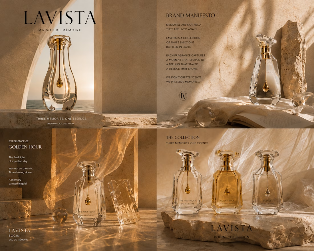
What if perfume wasn't about scent... but about memory?
Over the past few days, I've been exploring a fictional luxury fragrance brand called LAVISTA.
This isn't a real client project—it's a personal creative exploration where I'm experimenting with AI-powered creative direction, editorial storytelling, and luxury product visualization.
Instead of building a fragrance around traditional perfume notes, I started with emotions.
Three fragrances.
Three memories.
• The First Touch
• Golden Hour
• Silence
The idea is simple:
You don't wear a fragrance. You wear a memory.
These are a few behind-the-scenes frames from the early concept development. I'm still refining the bottle design, typography, packaging, and overall visual language before turning it into a complete campaign.
I'd love to hear your thoughts.
Which concept resonates with you the most?
#CreativeDirection #BrandDesign #LuxuryBranding #AIArt #VisualStorytelling #EditorialDesign #ProductDesign #ConceptDesign #PerfumeDesign


The network for creativity
Join 1.25M professional creatives like you
Connect with clients, get discovered, and run your business 100% commission-free
Creatives on Contra have earned over $150M and we are just getting started
Challenges
View all


Related posts

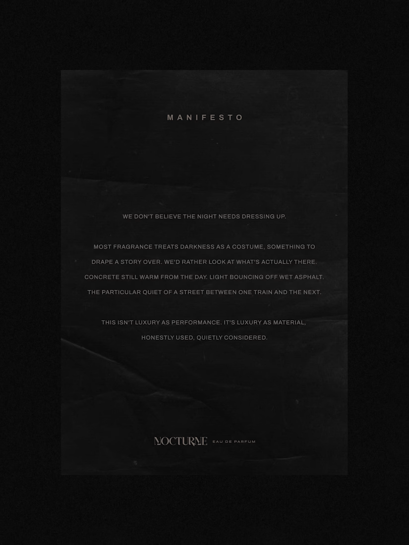
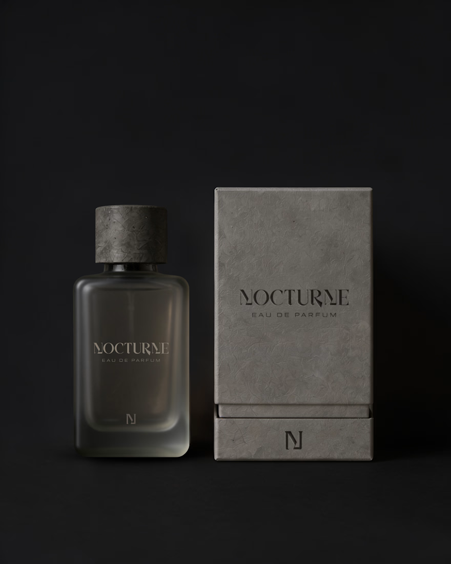
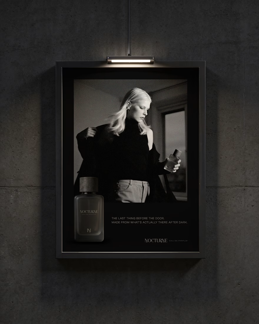
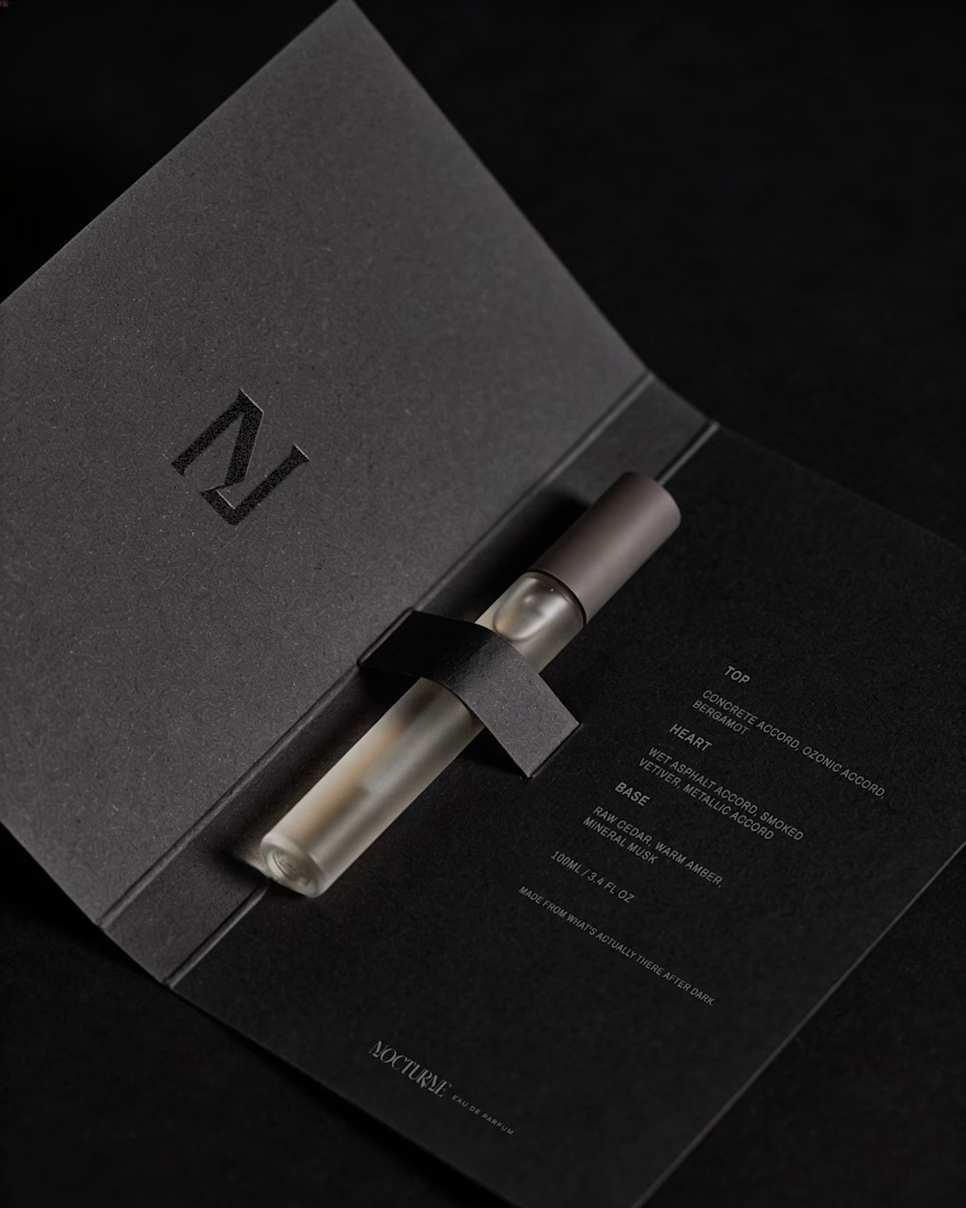
Nocturne is a self-initiated fragrance house I built from the ground up, treated with the same process I'd bring to any client: strategy first, then design.
The brief was familiar: a fragrance inspired by the city after dark. Most fragrance branding solves that with common approaches such as moonlight, mystery, or gold foil details. I wanted to solve it with something more specific: what does after dark actually look like in an urban environment? Concrete, streetlight, wet pavement, the quiet stretch between one train and the next.
That question shaped everything downstream. An archetype chosen deliberately against category convention, Creator and Explorer rather than the more expected Lover or Magician. A material-first approach to the bottle and packaging. Sandblasted glass, a textured concrete-like cap, no gold, no ornament. And a running checklist I held every decision against throughout the project.
The case study covers the strategy behind Nocturne, not just the finished system: positioning, personality, the reasoning behind each material and typography choice, and how those decisions translated into the bottle, packaging, and campaign work.
I'd love to hear what you think, especially if you enjoy seeing the thinking behind a visual identity as much as the final result.



Good Work!


A brand can look beautiful and still feel forgettable.
For ÉLAN NOIR, I wanted the identity to communicate something more specific: elegance, mystery, and quiet confidence.
That meant looking beyond the logo and thinking about how the typography, color, layout, packaging and overall visual language could create one consistent feeling.
That’s how I approach brand identity and packaging design.
Not just making individual pieces look good, but building a visual system that gives a brand something recognizable to grow with. I’m currently open to working with founders and brands in:
→ CPG → Food & Beverage → Wellness → Lifestyle → DTC → Consumer products
Whether you're building a new brand, launching a product, expanding your SKUs, or refreshing an existing identity, I'd love to hear what you're working on.
What makes a brand instantly recognizable to you?
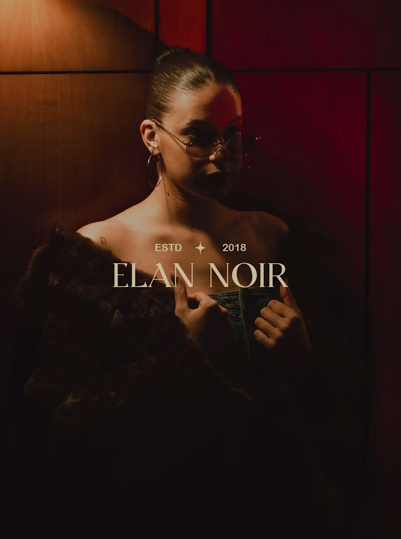
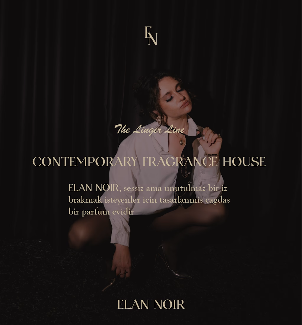
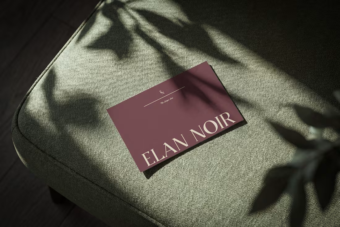
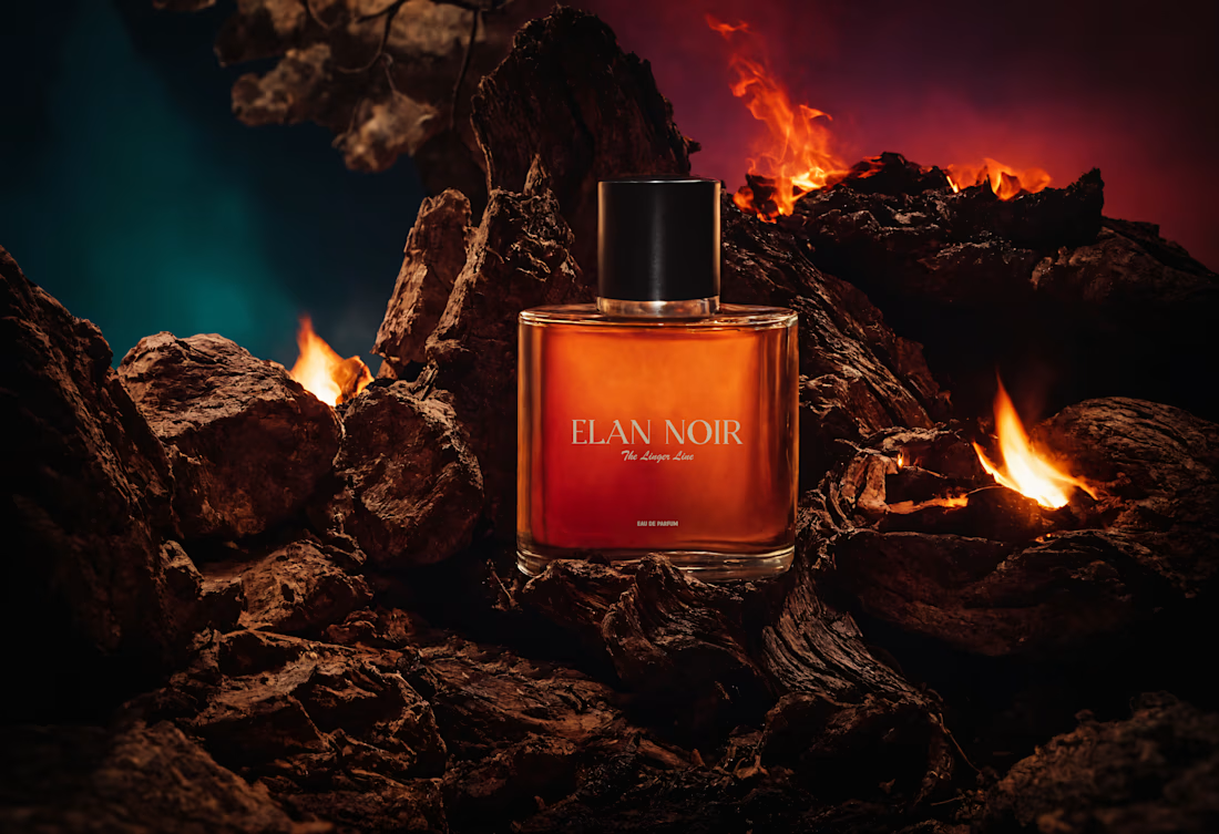

For me it's repetition of one non-logo asset — a crop, a paper stock, a specific shade — showing up often enough that people recognise it before they read anything. The low-key lighting is doing that job here; does it survive a retailer shooting the bottle on plain white?

Created a motion for Rekann using Astra 6 + After Effects + Figma - exploring a faster workflow from storyboard to an editable motion foundation.


