The network for creativity
Join 1.25M professional creatives like you
Connect with clients, get discovered, and run your business 100% commission-free
Creatives on Contra have earned over $150M and we are just getting started
Back to feedPost

1. Concept & Narrative
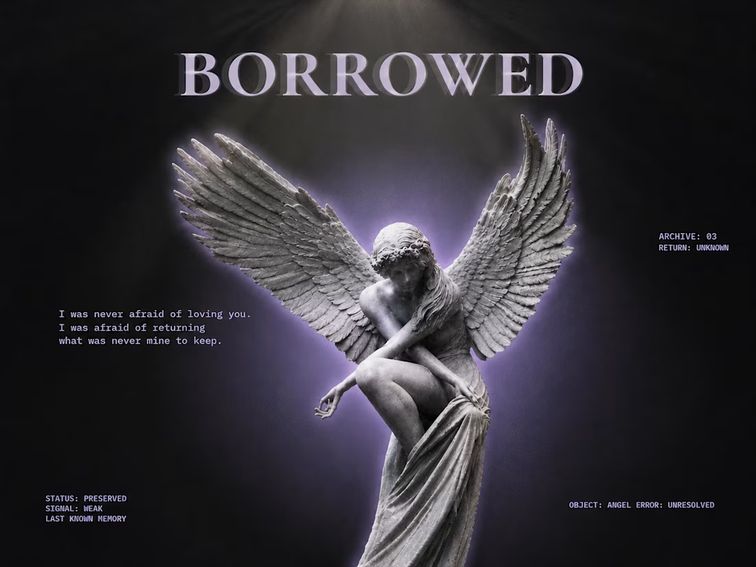
BORROWED is an editorial poster exploring the themes of emotional transience, impermanence, and soft grief. The core concept centers around the idea that some feelings and connections are temporary—held briefly rather than owned. The visual language bridges classical sculpture with modern brutalist layout elements, creating a stark contrast between timeless emotion and cold digital archiving.
2. Visual Composition & Imagery
Central Subject: A classical winged angel sculpture, serving as an emblem of vulnerability and elegance.
Lighting & Glow: A soft, ethereal violet aura radiates behind the sculpture, separating it from the dark background and giving it a dreamlike, lingering presence.
Depth & Motion: Subtle offset shadows and layered duplicates behind the statue create a sense of movement, displacement, and fading memory.
3. Typography & Hierarchy
Display Headline: High-contrast serif typography (BORROWED) anchors the top of the canvas, establishing a bold, editorial tone.
Poetic Text: Left-aligned, clean typewriter-style typography introduces a quiet, reflective quote ("I was never afraid of loving you..."), grounding the piece emotionally.
Archival Metadata: Monospaced technical tags (STATUS: PRESERVED, SIGNAL: WEAK, ARCHIVE: 03) are positioned around the outer margins, framing the design as a documented entry in a personal archive.

The network for creativity
Join 1.25M professional creatives like you
Connect with clients, get discovered, and run your business 100% commission-free
Creatives on Contra have earned over $150M and we are just getting started





Related posts


Only one will win, and you get to decide which.
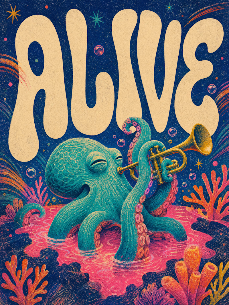
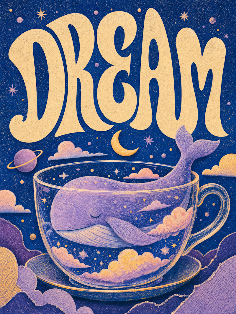
Two AI-generated images. Same creative intent. Different visual outcomes.
The images were generated with AI, but the art direction, visual decisions, composition, styling, and overall creative direction came from me as the human behind the work.
Now comes the real taste test.
Which one has the stronger visual language? Which one feels more intentional, more refined, and more memorable?
11 voted
69%
5 voted
31%
16 votes
Closed

Outstanding work

Hey everyone! 👋
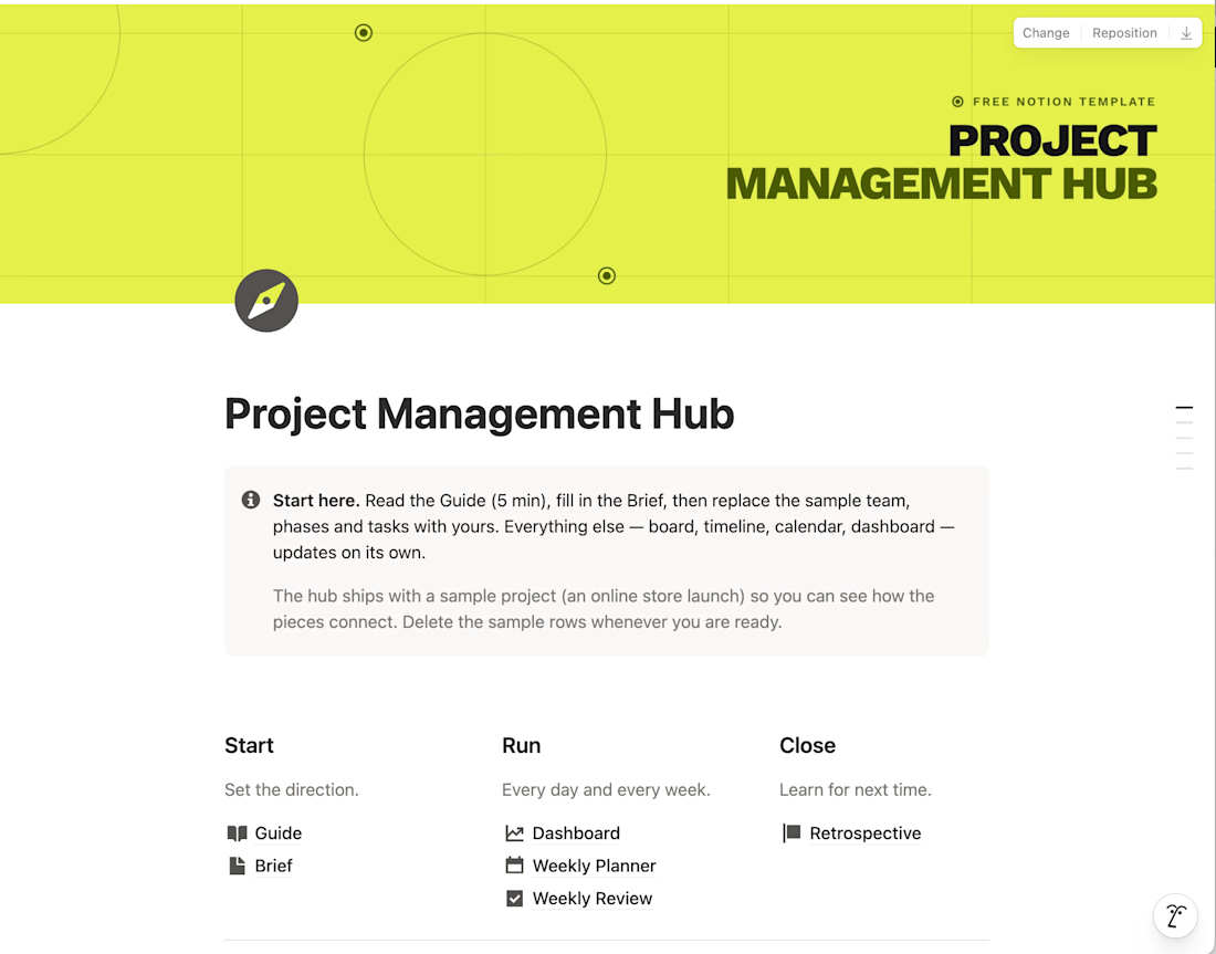
I built a Project Management Hub in Notion to run projects from brief to retrospective in one calm, minimalist workspace. It's for sale on Gumroad, but I'm sharing it for free with the Contra community.
It includes a guide, project brief, dashboard, weekly planner and review, plus 7 linked databases (tasks, phases, team, budget, risks and more). A sample project shows how everything connects.
It's for your personal use only, so please keep it within the Contra network.
Hope it helps! Let me know what you think 🙌


Love this!!

Designing Brand identity ✨
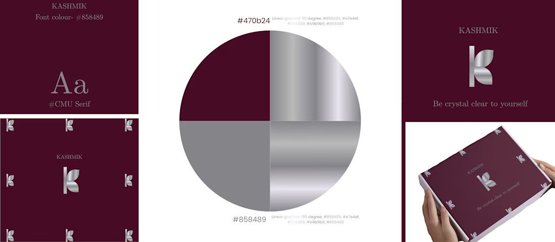
SILVER + DARK PINK = Luxury.
KASHMIK- 'Be crystal clear to yourself' , is a journal brand which is made to give you a feel of luxury and openness to yourself. The colour chosen is show how bold you are, how unique you are.

That's really great for luxury brands great job 🎉🎉