ᴀʙʜɪʟᴀꜱʜᴀ ꜱʀɪᴠᴀꜱᴛᴀᴠᴀ
Versatile graphic designer specializing in custom posters
New to Contra
ᴀʙʜɪʟᴀꜱʜᴀ is building their profile!
1. Concept & Narrative
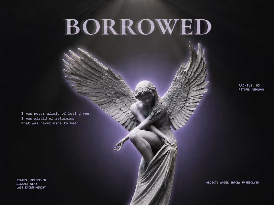
BORROWED is an editorial poster exploring the themes of emotional transience, impermanence, and soft grief. The core concept centers around the idea that some feelings and connections are temporary—held briefly rather than owned. The visual language bridges classical sculpture with modern brutalist layout elements, creating a stark contrast between timeless emotion and cold digital archiving.
2. Visual Composition & Imagery
Central Subject: A classical winged angel sculpture, serving as an emblem of vulnerability and elegance.
Lighting & Glow: A soft, ethereal violet aura radiates behind the sculpture, separating it from the dark background and giving it a dreamlike, lingering presence.
Depth & Motion: Subtle offset shadows and layered duplicates behind the statue create a sense of movement, displacement, and fading memory.
3. Typography & Hierarchy
Display Headline: High-contrast serif typography (BORROWED) anchors the top of the canvas, establishing a bold, editorial tone.
Poetic Text: Left-aligned, clean typewriter-style typography introduces a quiet, reflective quote ("I was never afraid of loving you..."), grounding the piece emotionally.
Archival Metadata: Monospaced technical tags (STATUS: PRESERVED, SIGNAL: WEAK, ARCHIVE: 03) are positioned around the outer margins, framing the design as a documented entry in a personal archive.
0
29
The Concept
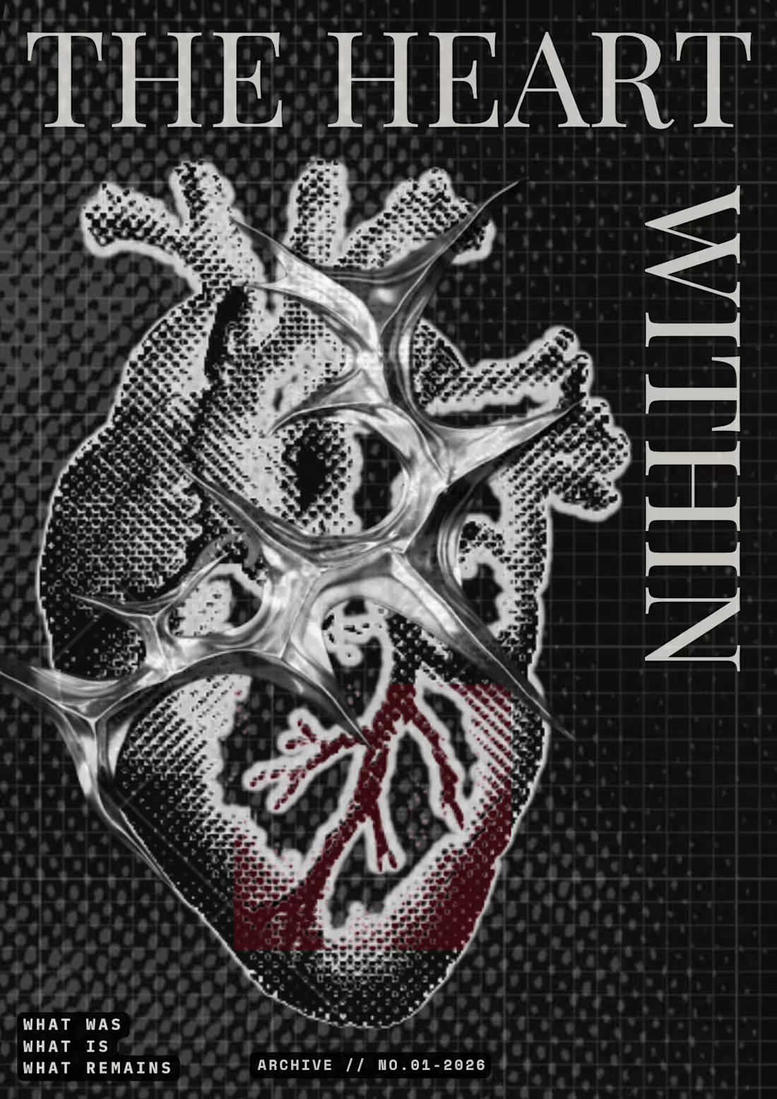
A visual study on emotional resilience, raw vulnerability, and structural isolation. This poster contrasts organic human anatomy with metallic, industrial geometry to explore the tension between softness and self-preservation.
The Meaning & Narrative
Anatomical vs. Industrial: The halftone anatomical heart represents core human emotion and vulnerability, while the sharp, liquid-chrome cage overlaid on top symbolizes armor, defense, and self-protection.
The Grid Background: The dark, technical grid background creates a clinical, archived feel, treating emotional depth like a classified or documented specimen.
Typography: Bold serif typography paired with dark aesthetic block text at the bottom ("WHAT WAS / WHAT IS / WHAT REMAINS" and "ARCHIVE // NO.01-2026") grounds the poster in a high-fashion, editorial archive style.
0
43
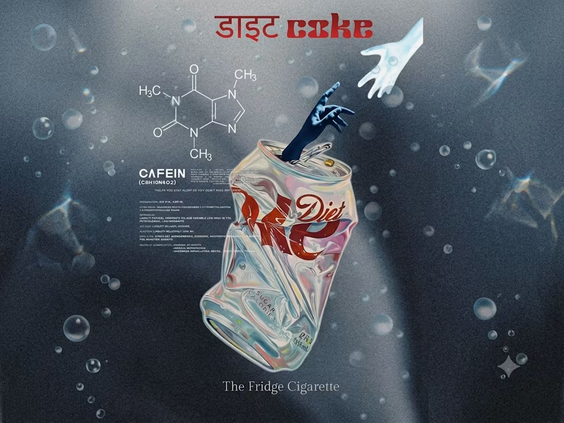
The Concept
This piece is a visual exploration of modern consumer culture, transforming an everyday pop-culture staple like Diet Coke into a high-impact editorial poster.
The Meaning
I wanted to blend commercial imagery with a raw, editorial aesthetic—exploring how everyday icons, nostalgic branding, and bold typography interact to evoke a specific mood and visual language.
The Process
I built this design from scratch by combining curated product imagery with custom typographic layouts, gritty paper textures, and deliberate composition choices to give it an authentic, high-concept feel on Canva.
3
1
106