The network for creativity
Join 1.25M professional creatives like you
Connect with clients, get discovered, and run your business 100% commission-free
Creatives on Contra have earned over $150M and we are just getting started
Back to feedPost
The Concept
This piece is a visual exploration of modern consumer culture, transforming an everyday pop-culture staple like Diet Coke into a high-impact editorial poster.
The Meaning
I wanted to blend commercial imagery with a raw, editorial aesthetic—exploring how everyday icons, nostalgic branding, and bold typography interact to evoke a specific mood and visual language.
The Process
I built this design from scratch by combining curated product imagery with custom typographic layouts, gritty paper textures, and deliberate composition choices to give it an authentic, high-concept feel on Canva.

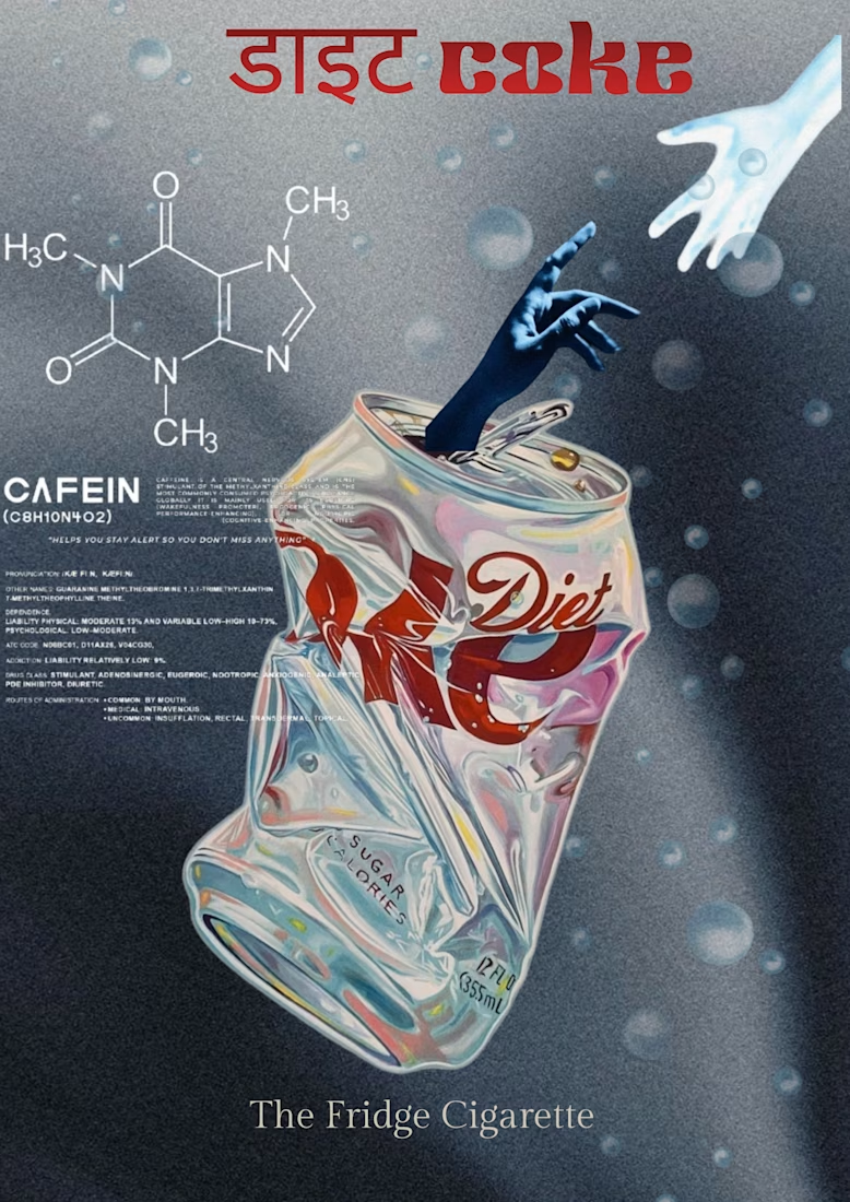

The quiet serif tagline under that loud red headline gives the poster a dry, editorial tone. Is the Devanagari "डाइट" a separate typeface from the Latin "coke", or did you adjust one to sit with the other?

Thanks so much for the feedback :)
They're separate typefaces, and I manually adjusted the baseline and optical scale so the Devanagari sits in natural balance with 'coke'. Really appreciate you noticing that editorial contrast!
Matching optical weight instead of point size is the right call across scripts, since Devanagari headlines tend to look heavier than Latin at the same size.
The network for creativity
Join 1.25M professional creatives like you
Connect with clients, get discovered, and run your business 100% commission-free
Creatives on Contra have earned over $150M and we are just getting started





Related posts

Winder is a bold brand identity built around a geometric W-inspired symbol, combining sharp angles and forward movement to represent progress, speed, and direction.
The identity uses a striking red and deep burgundy palette, supported by clean typography and a consistent visual system across brand guidelines, digital applications, and product mockups.
Progress in Motion.




Great logo it feels it really has an identity 🎉🎉
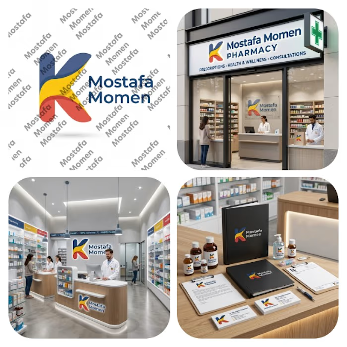
That's my pharmacy logo design it was special by it's color palette and smooth shapes
This design focus on (professionalism, trust, authenticity, showing business identity)
This design is special because it's color palette can be used in the business itself from furniture notes it will be suitable on them
Thanks for everyone who support me ❤️


She was beautiful. Everyone said it. But her husband never saw it.
Isabella was forced into marriage with Adrian. Rich, cold, and cruel. He never cherished her. From day one, he told her his heart belonged to someone else — his first love.
And his first love was her stepsister.
He married Isabella only for business. At home, he treated her like trash. He insulted her, ignored her, made her feel invisible.
Then he started cheating. Not behind her back — in front of her face. With her own sister, Chloe. He would bring Chloe into their house, touch her, laugh with her while Isabella stood there trying not to cry.
She cried for a year. Every night.
Until one day, she stopped.
She looked in the mirror and said, "No more."
If he wanted to humiliate her, she would give him something to really regret.
She had been secretly dating someone else. Liam. He knew she was married. He knew everything. And he didn't judge her — he adored her. He was gentle, protective, everything Adrian was not.
A few weeks later, Isabella found out she was pregnant.
It wasn't Adrian's. It was Liam's.
And for the first time in a long time, she smiled.
She wasn't going to run away. She and Liam had a plan. A quiet plan to teach Adrian, her stepmother, and her sister a lesson they would never forget.
The wife he treated like trash was about to become his biggest regret.
I ghostwriter, and I can help you for your next project. Even if you’re an Ai story teller I can help you plot every both the lip sync and story just message me. Thanks



Incredible atmosphere and emotion! The visual tone sets a great mood for the story. ✨