The network for creativity
Join 1.25M professional creatives like you
Connect with clients, get discovered, and run your business 100% commission-free
Creatives on Contra have earned over $150M and we are just getting started
Back to feedPost
Taste Test


Only one will win, and you get to decide which.
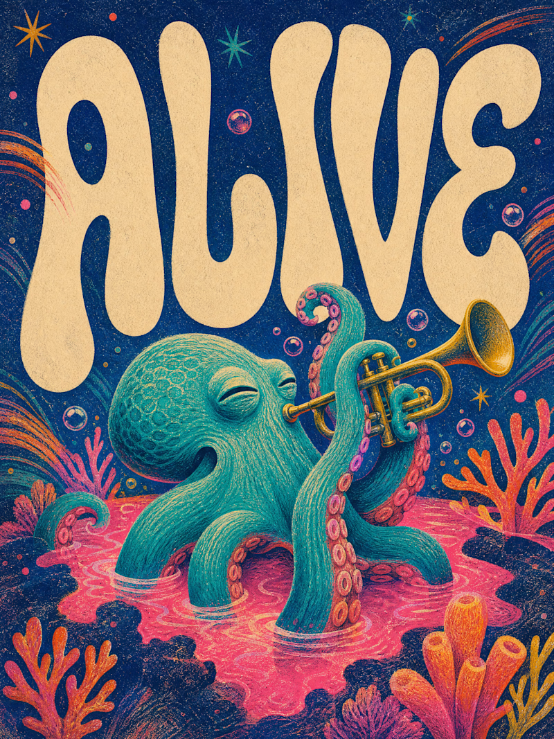
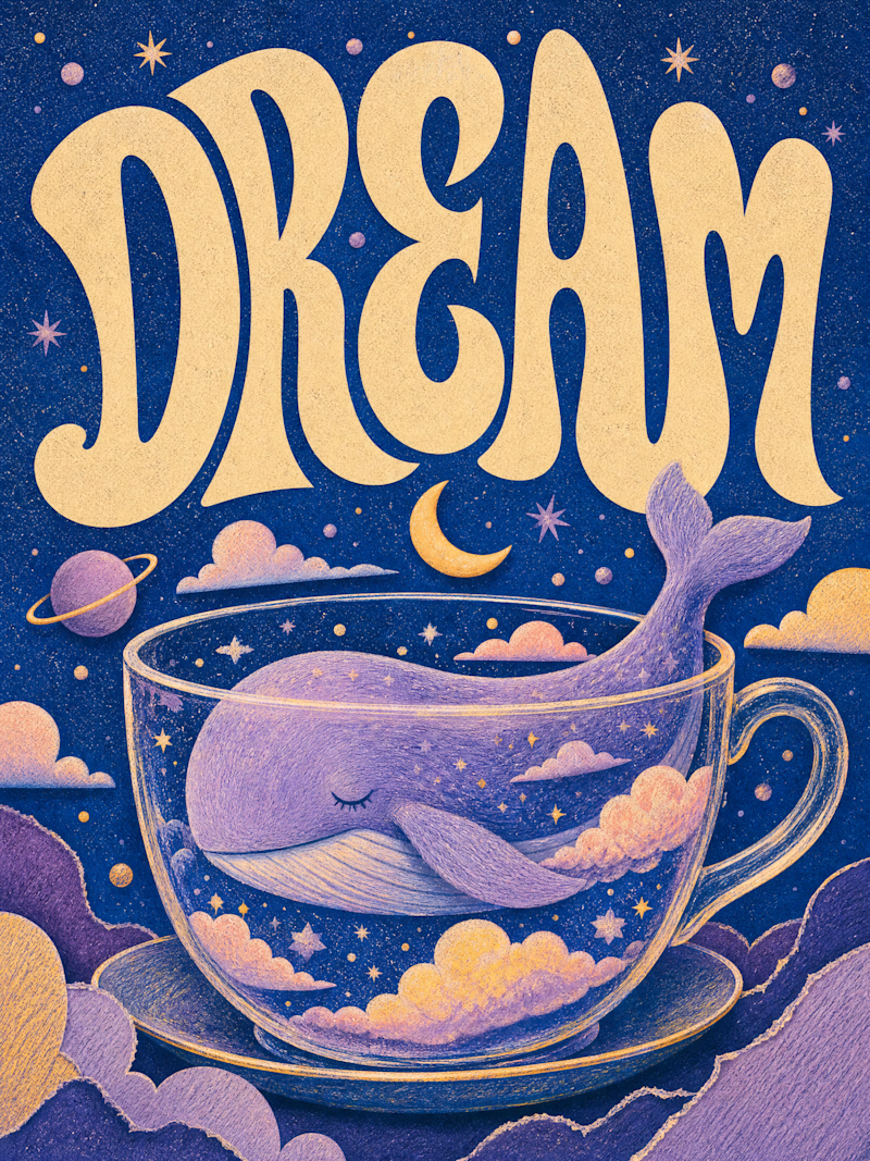
Two AI-generated images. Same creative intent. Different visual outcomes.
The images were generated with AI, but the art direction, visual decisions, composition, styling, and overall creative direction came from me as the human behind the work.
Now comes the real taste test.
Which one has the stronger visual language? Which one feels more intentional, more refined, and more memorable?

13 votes
Ends in 1d


Alive for me. The lettering wraps around the trumpet nicely and the octopus has real character.

I love both, but i have to chose only one haha
The network for creativity
Join 1.25M professional creatives like you
Connect with clients, get discovered, and run your business 100% commission-free
Creatives on Contra have earned over $150M and we are just getting started





Related posts

Currently building a new identity for an AI + fintech company in Dubai.
Still early, but this is one of the directions we’ve been exploring for the brand.
The idea was to avoid the usual “AI company” visual language and build something that feels more established, precise, and quietly futuristic.
We’ve been playing with geometry, light, and a much more restrained visual system around the mark.
Still developing this one, so I’m curious:
Would you push this direction further, or keep it this restrained?

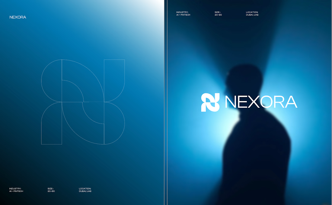

Honestly the logo presentation is impressive

Continuing my series of short motion videos for a crypto project.
Which coin looks better? (Rendered on a transparent background, by the way.)
If your product needs something similar, feel free to reach out :)
67 voted
74%
24 voted
26%
91 votes
Closed

B took the lead for me

Two short motion ads for Instaheadshots, an app that turns ordinary selfies into studio-quality professional headshots with AI.
🎬 Ad 1: "Slide to Unlock" (10s)
A product-flow spot. It opens on a glowing slide-to-unlock button, then shows the app's processing and generating screens as a casual selfie becomes a polished headshot. It ends on the brand and a "Try Instaheadshots" CTA.
🎬 Ad 2: "Everyone's Upgrading" (20s)
A social-proof spot. Notification cards stack up as Sarah, Daniel and Priya each post a new profile photo within one week. The punchline is "everyone is using the exact same Instaheadshots to upgrade," which works on FOMO and ends on a clear CTA.
What I did: concept, motion design, UI animation, kinetic typography, sound sync
7 voted
39%
11 voted
61%
18 votes
Closed

Option 2..Depicts what the app does instantly.